13 images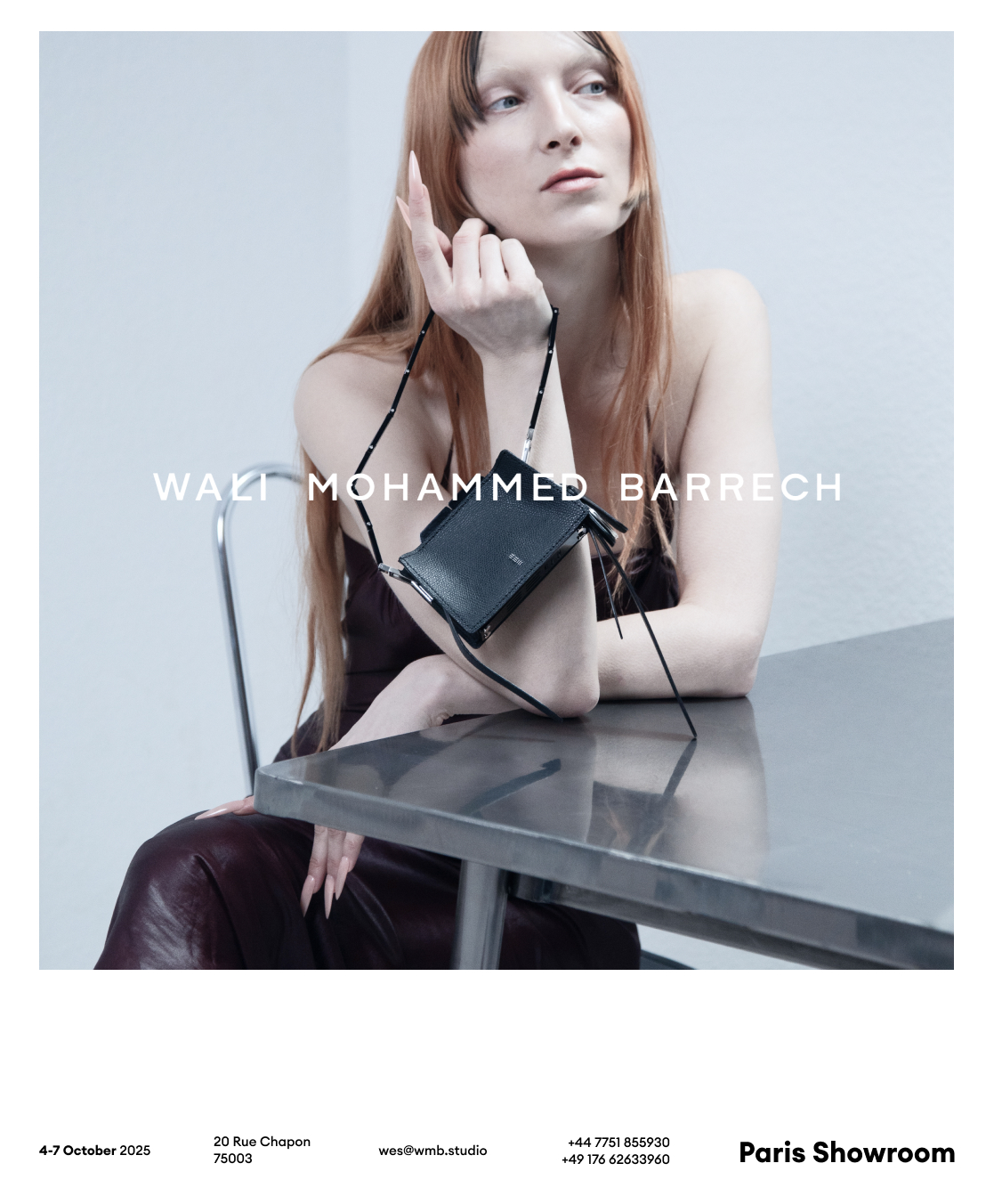
14 images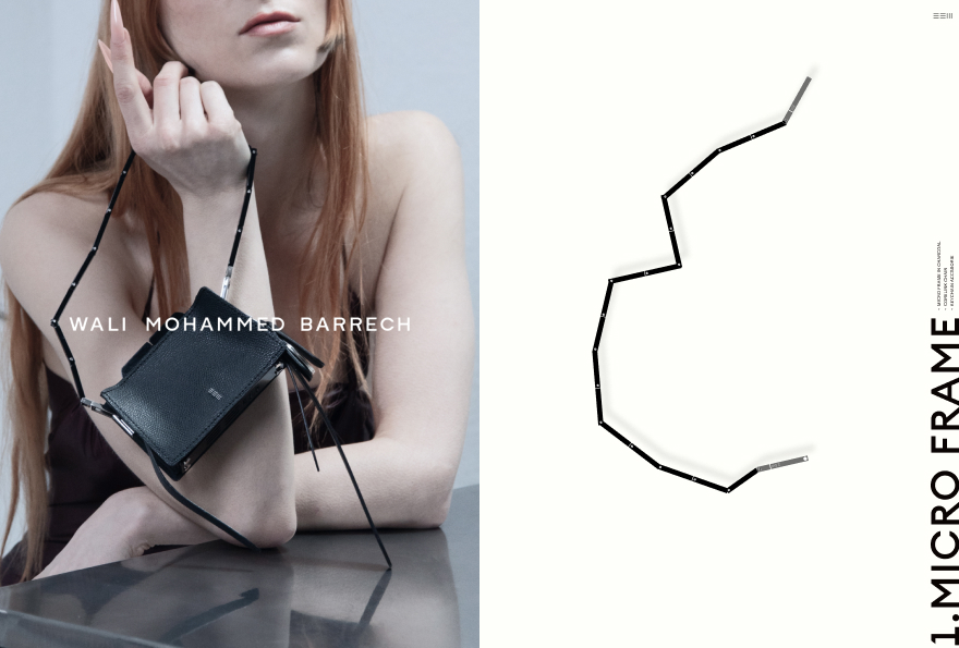
2 images
3 images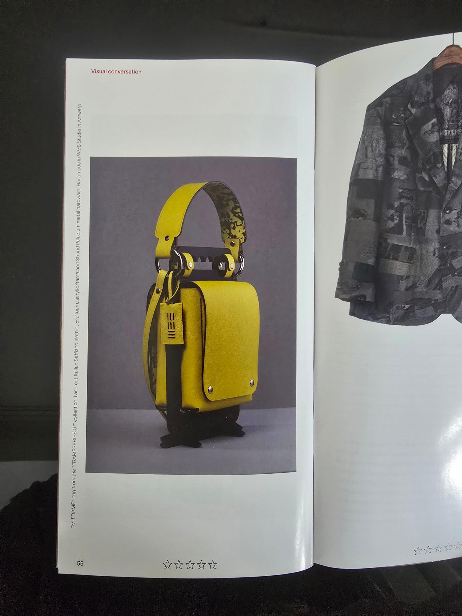
3 images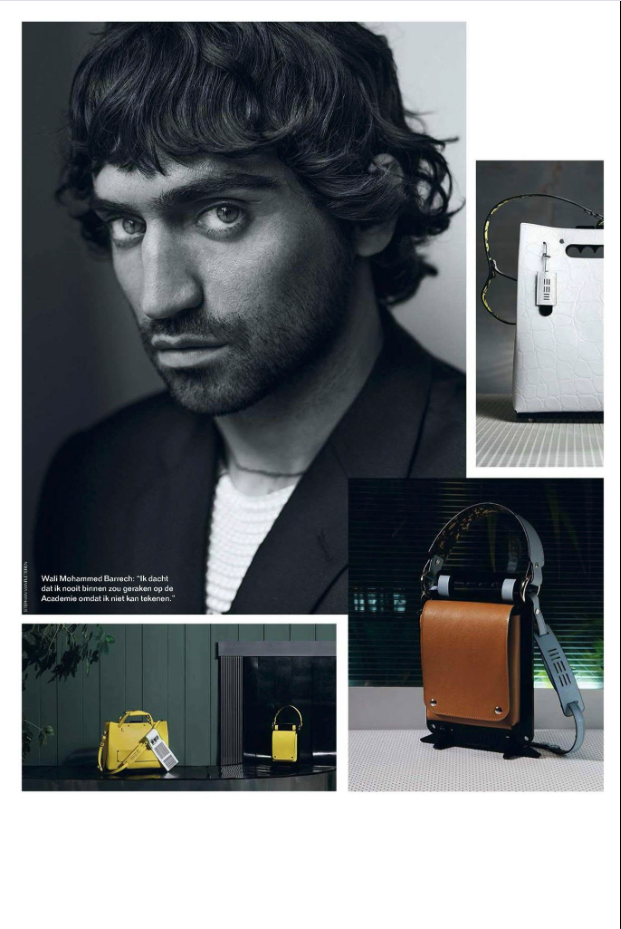
6 images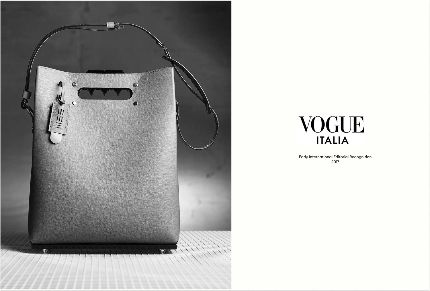
4 images
2 images
3 images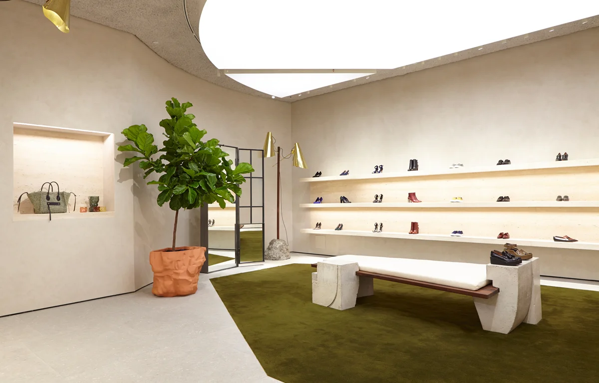
14 images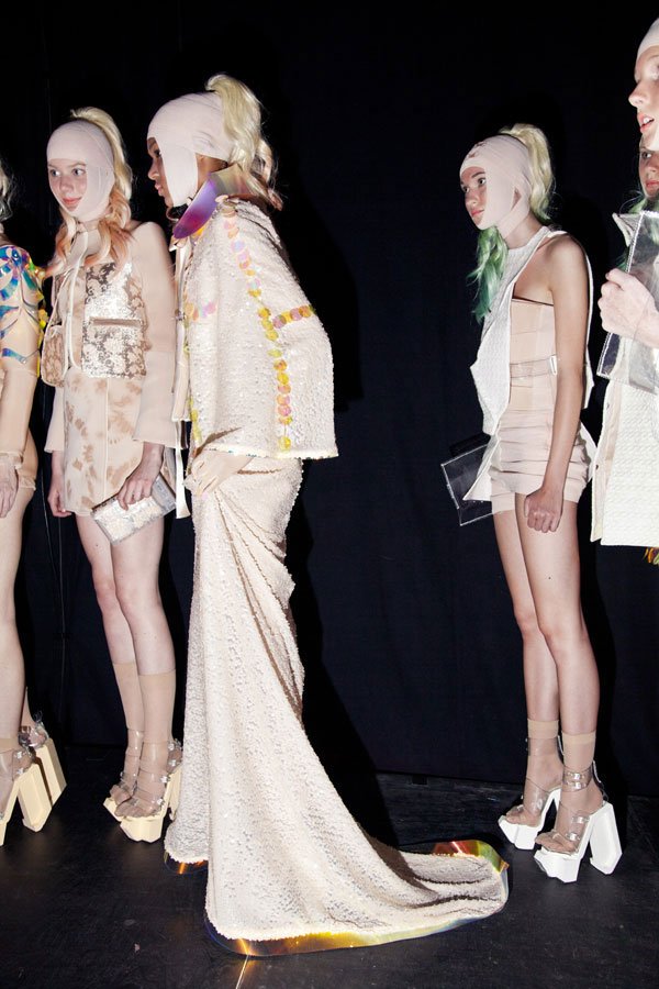
4 images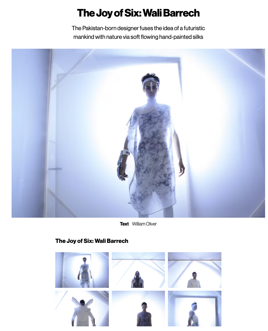
14 images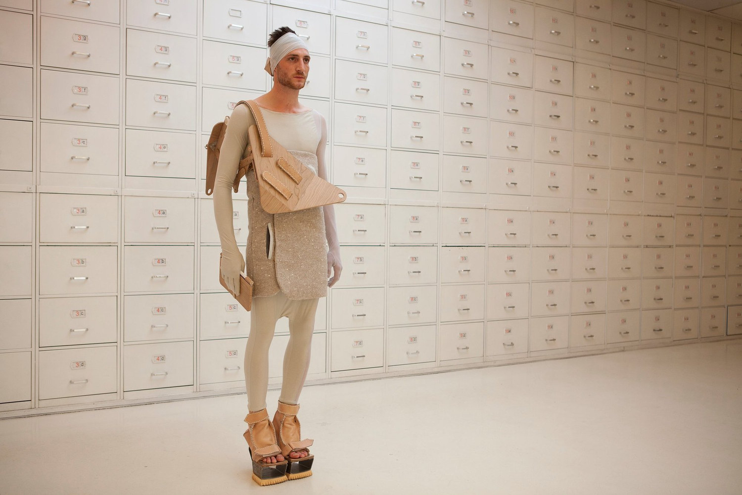
9 images
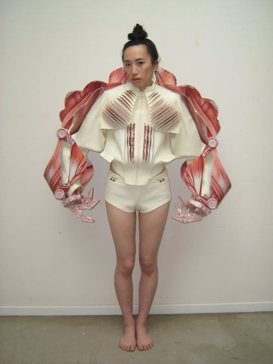
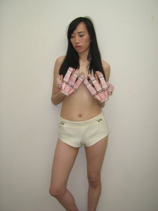
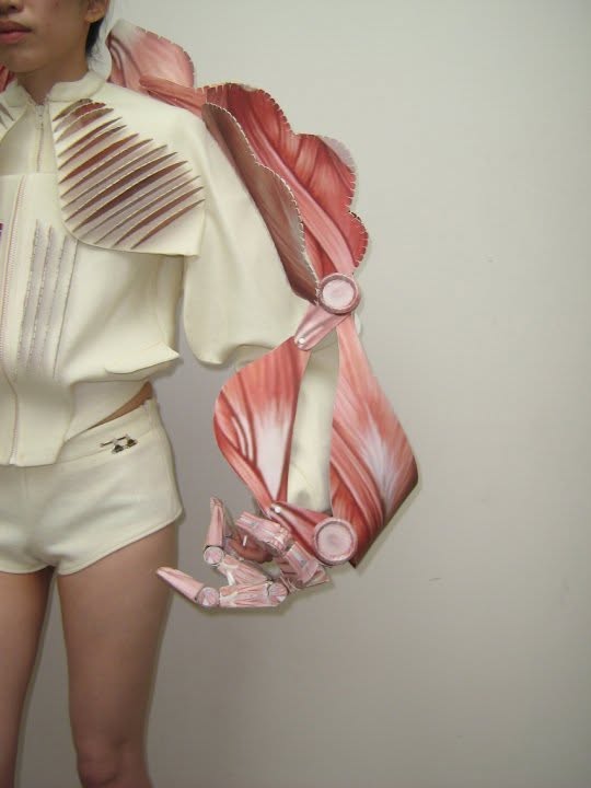
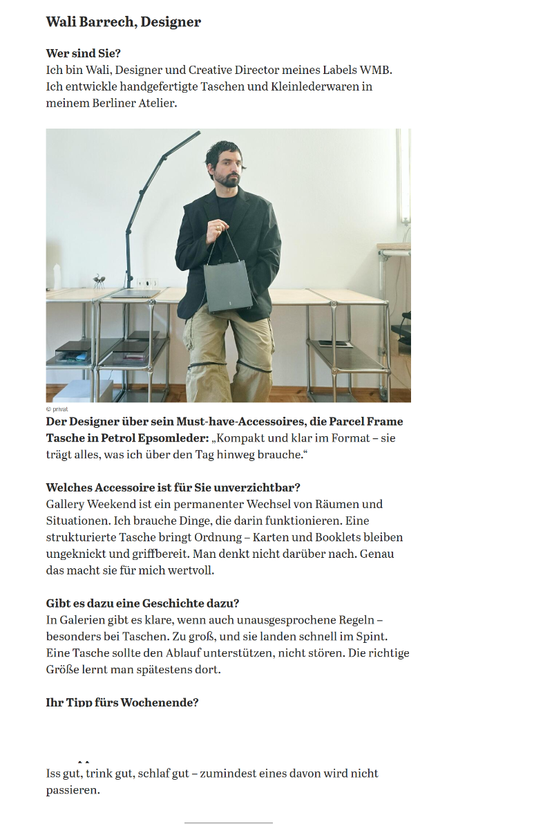
Wali Mohammed Barrech is a Berlin-based creative director, designer and founder of WMB.
He grew up in a family of leather makers. His grandfather was a tailor and furrier, while his parents ran their own tannery and leather manufacturing businesses. Material, construction and production were part of everyday life long before they became a professional discipline. Born in Karachi and raised between Pakistan and Germany, he went on to complete Bachelor’s and Master’s degrees in Fashion Design at the Royal Academy of Fine Arts Antwerp, where he became the first Pakistani graduate of the fashion department.
His practice began in fashion, with collections presented at Copenhagen Fashion Week and exhibited internationally, before turning towards product. Unwilling to build his bags around existing hardware, he spent several years developing his own modular system of closures and mechanical components, taking them from first sketches through engineering, prototyping and production with specialised Italian manufacturers. That established the way he has worked ever since: approaching each project as a continuous process, from research and strategy to engineering, manufacturing and communication.
Today his work moves between product development, creative direction and brand strategy across fashion, accessories, footwear and aesthetic medicine. Whether designing a mechanical component, developing a visual identity or directing a campaign, each project is treated as a single system rather than a collection of separate disciplines. He lectures at art and design institutions in Germany, Denmark and Switzerland, and serves on the thesis examination board at the Basel Academy of Art and Design FHNW.
Alongside commissioned work, he continues to develop WMB as an independent practice. From its Berlin atelier, he and his team produce fine leather goods in small editions and made-to-order pieces for a private international clientele.
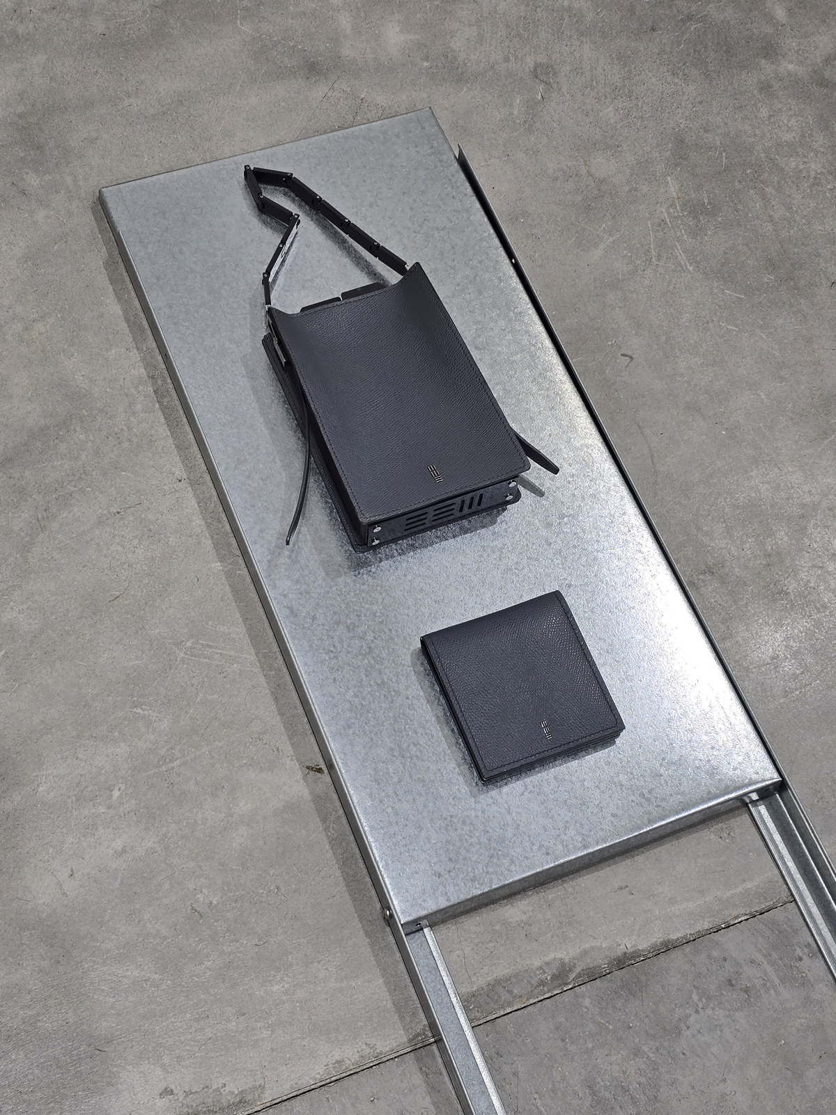
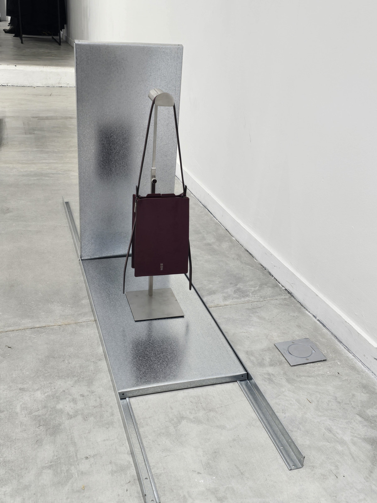
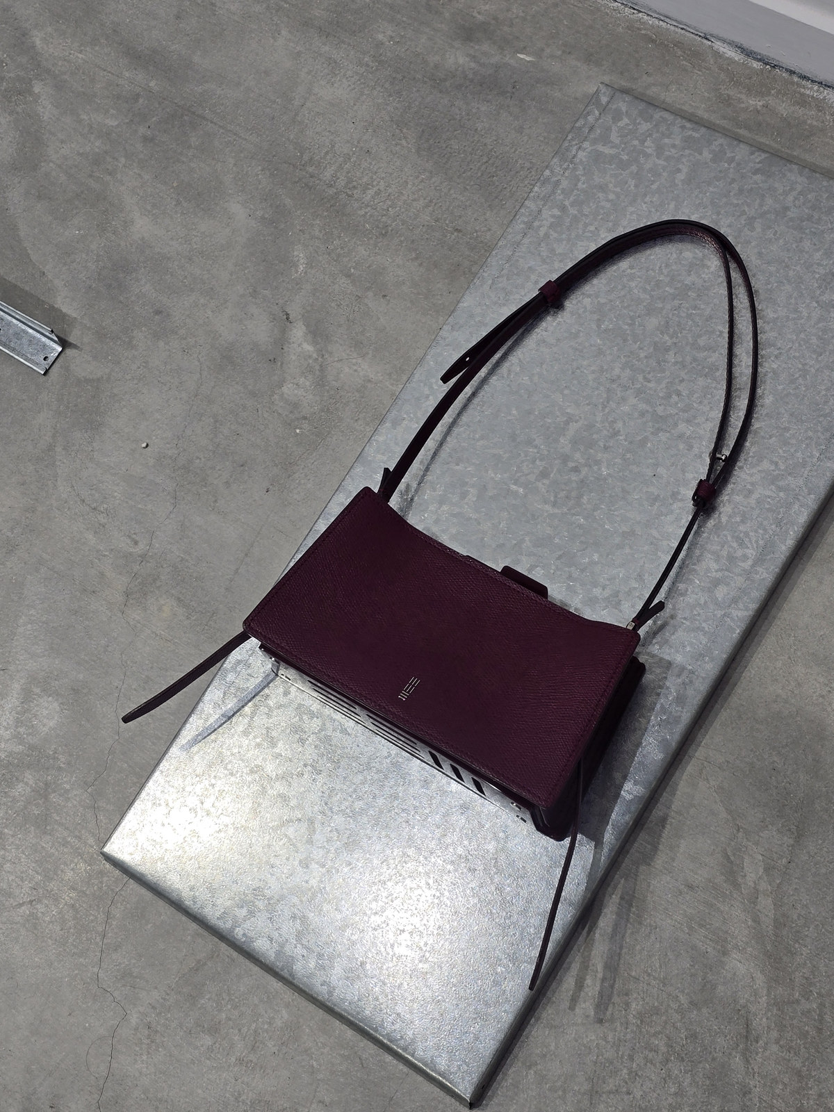
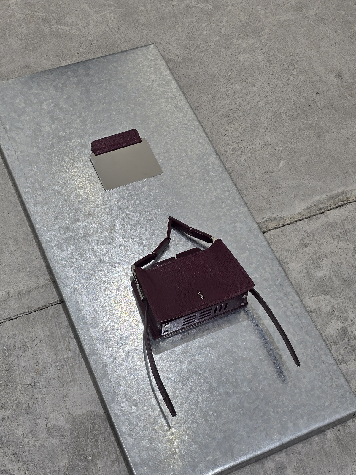
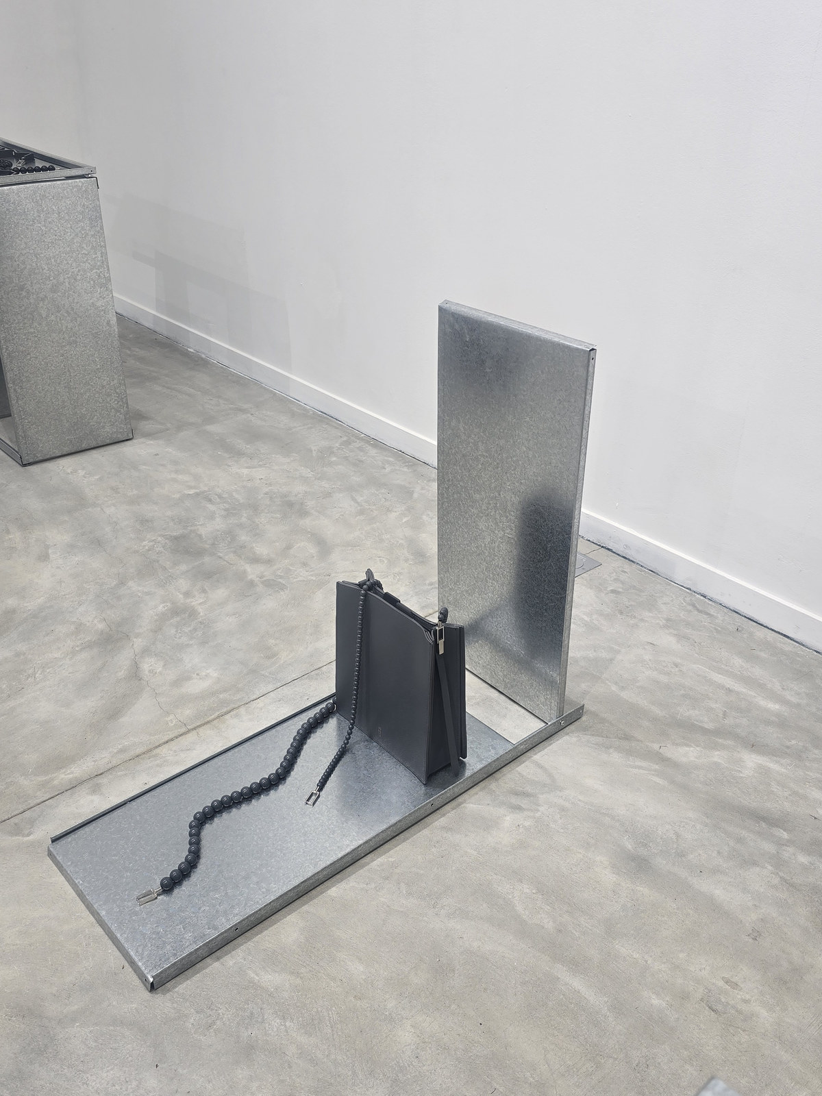
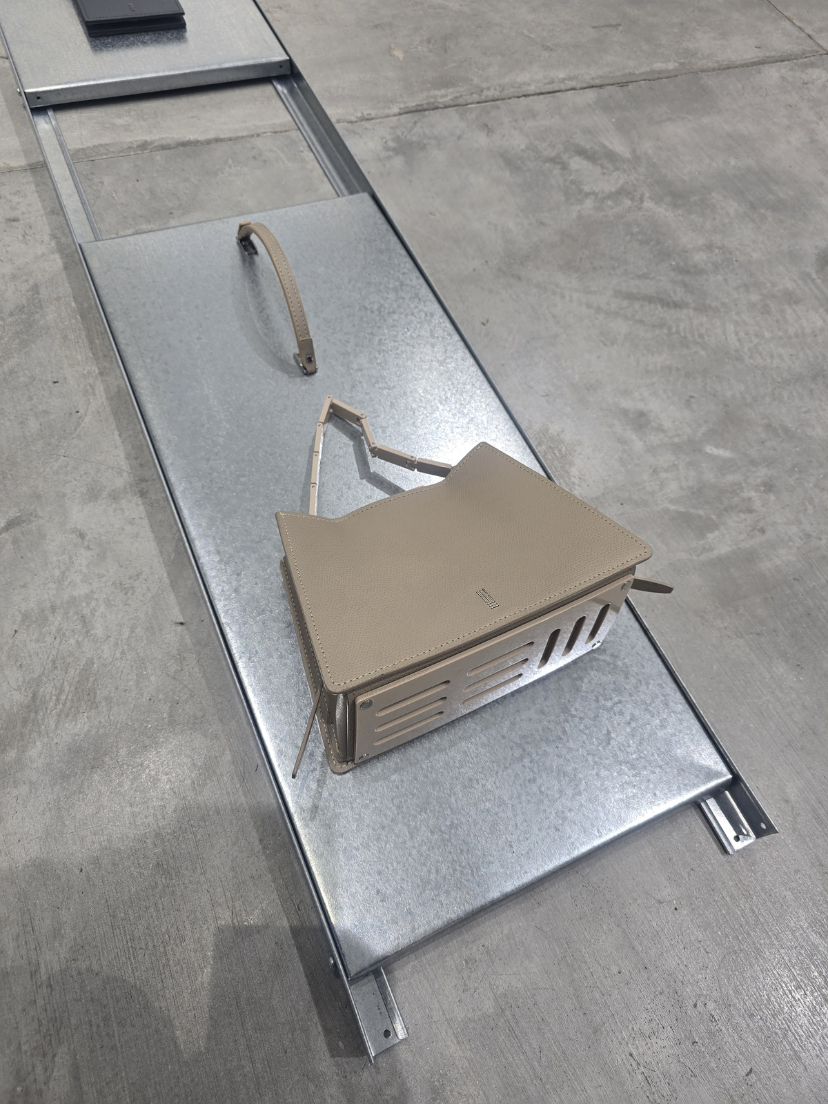
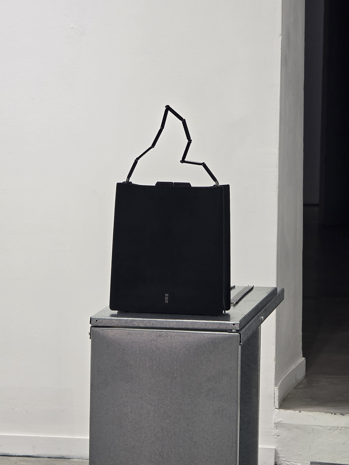
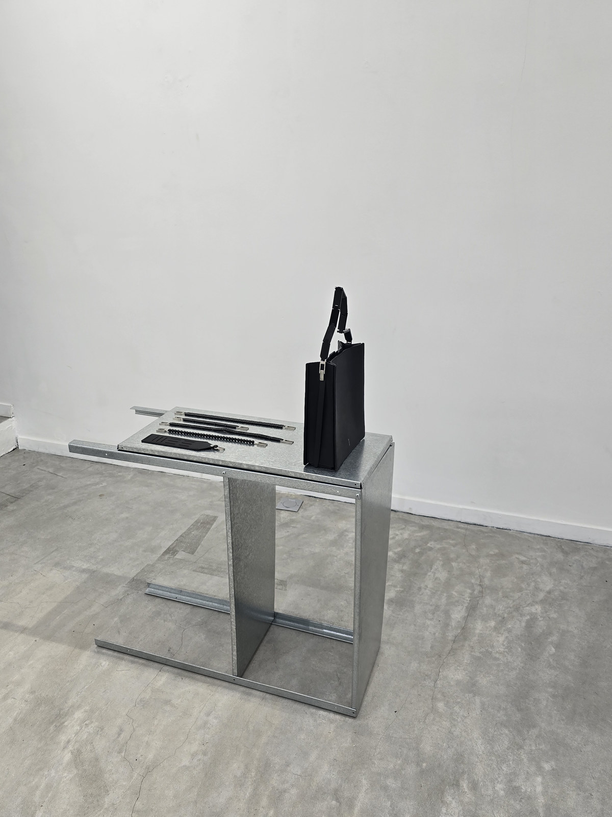
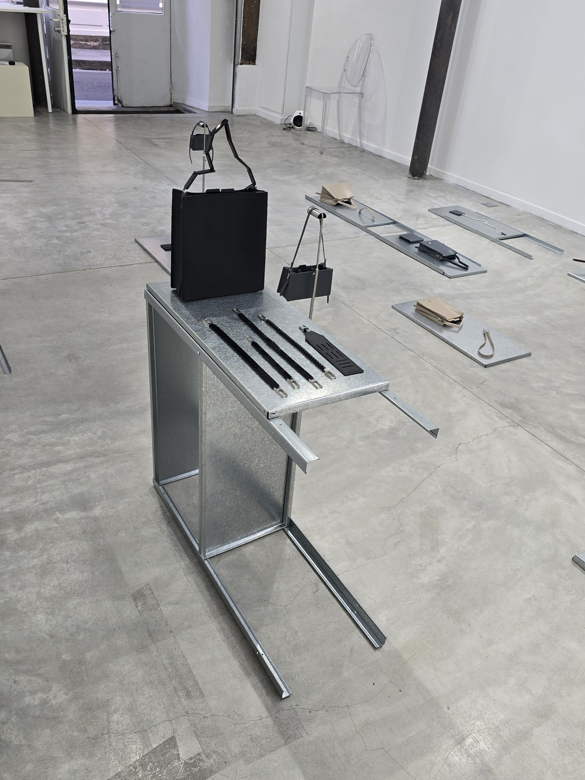
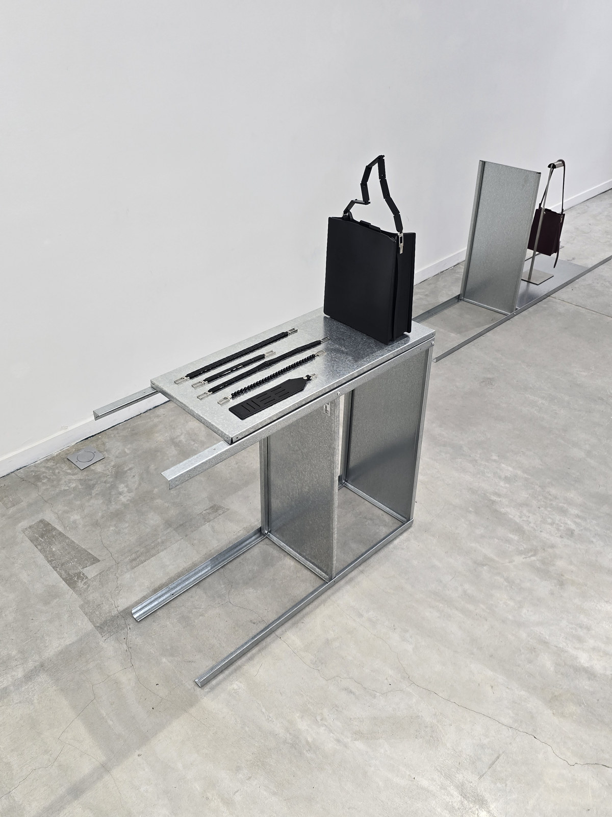
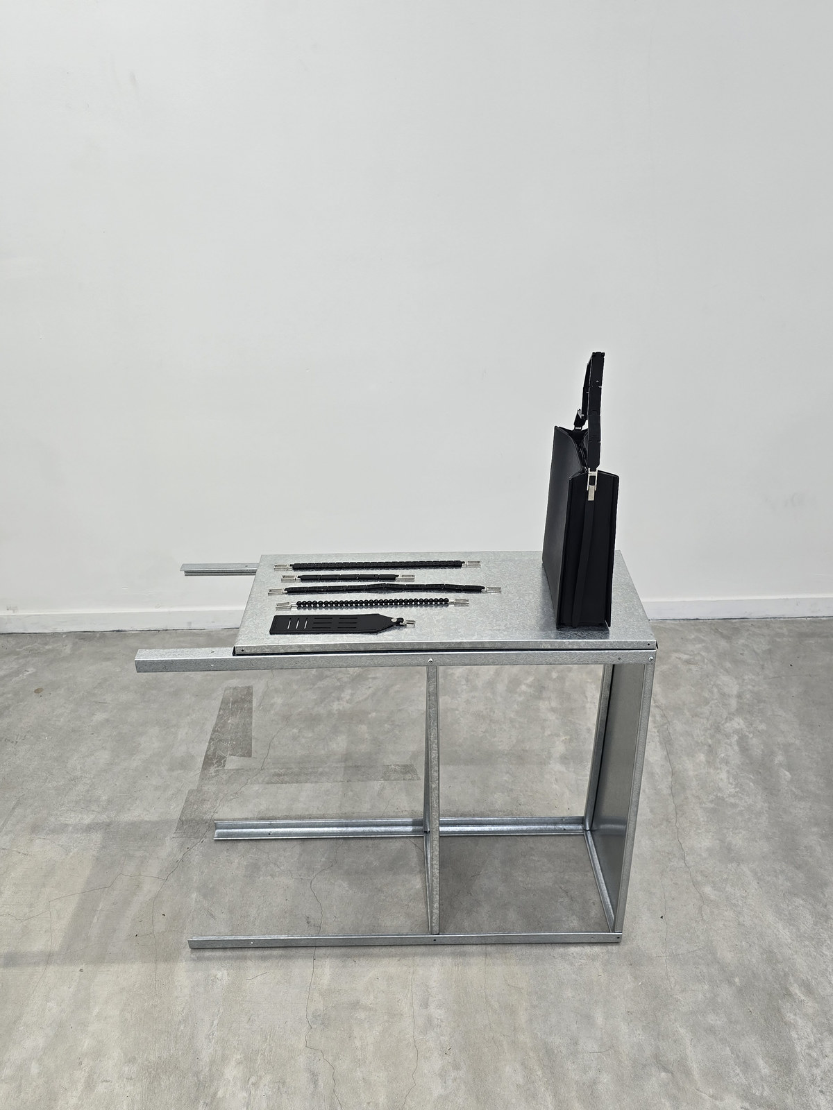
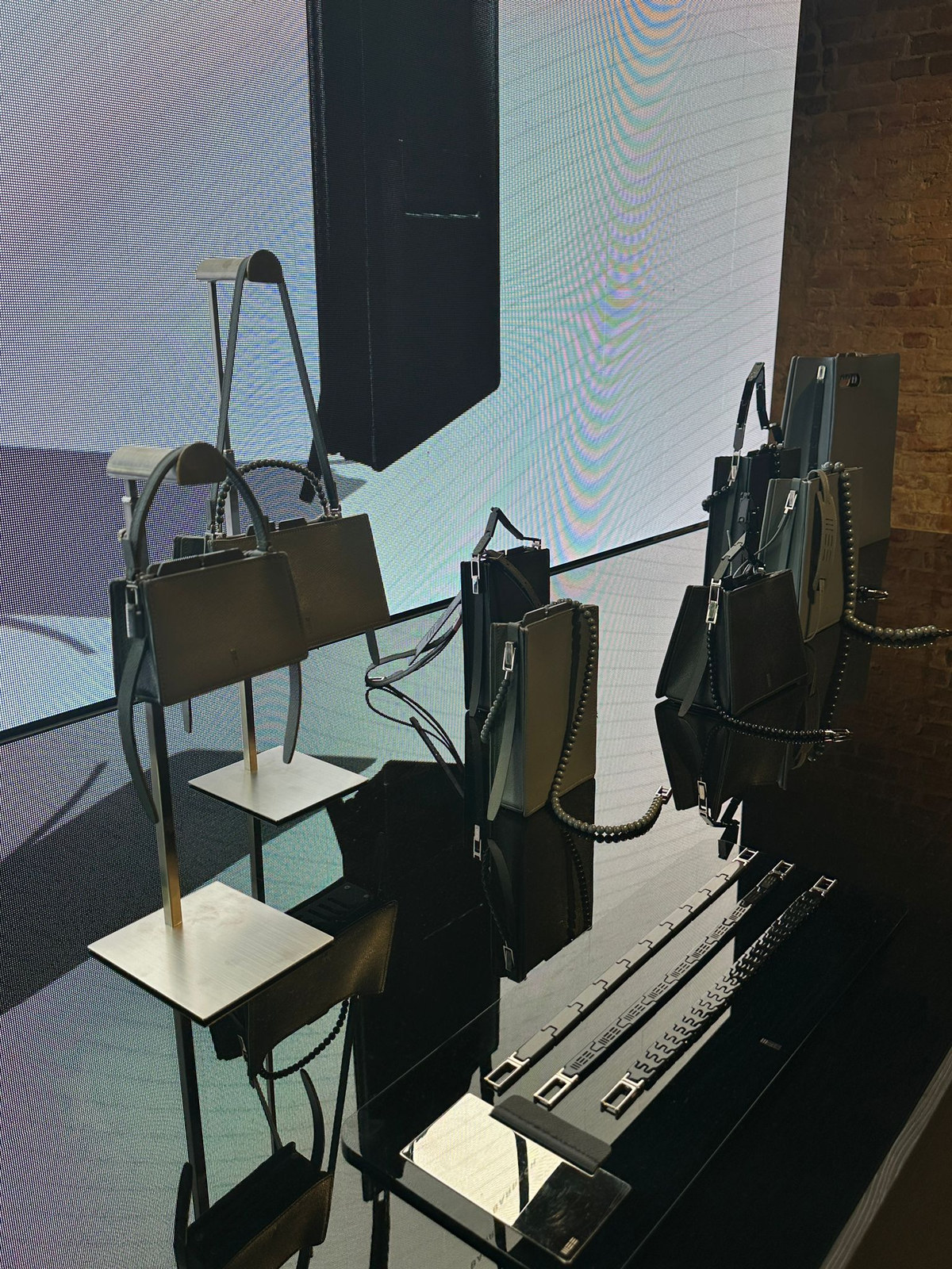
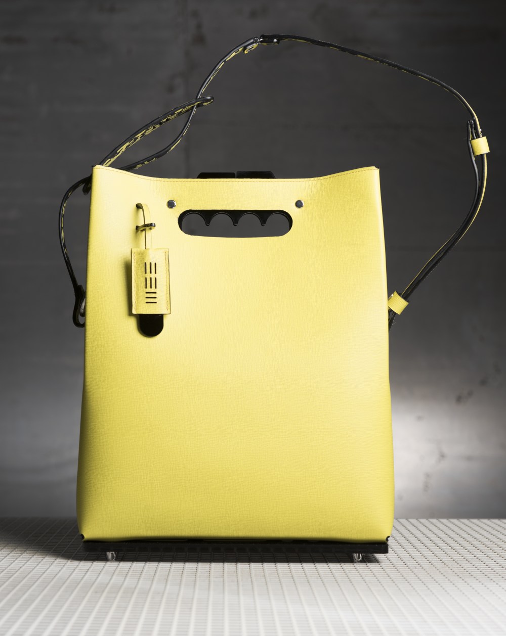
WMB Frameseries
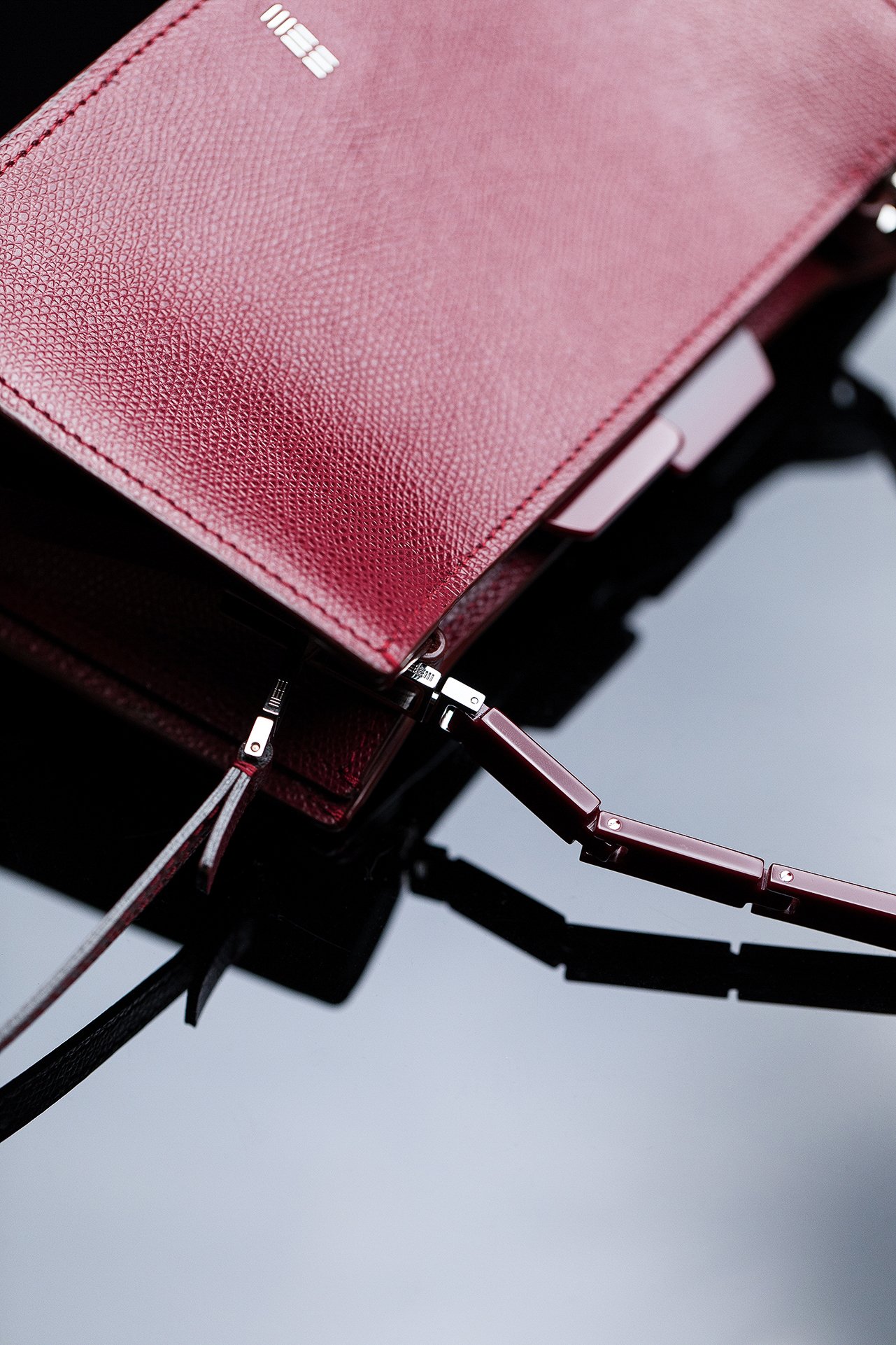
01 Premise THE challenge
The requirement was a carrying system in which hardware, not silhouette, is the constant
— and in which every component can be removed and replaced without cutting the leather.
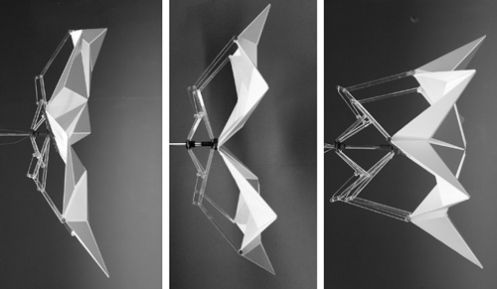
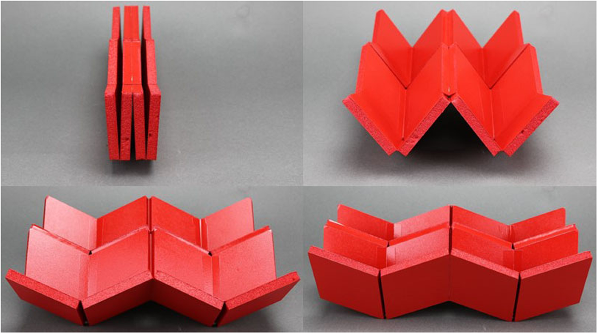
02 Research MECHANICAL PRECEDENTS
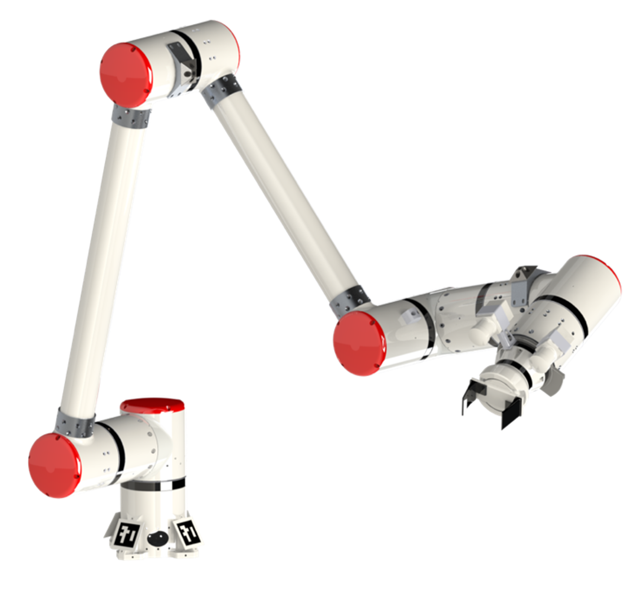
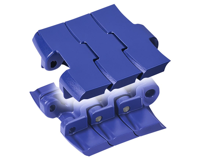
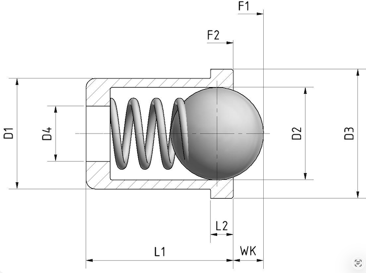
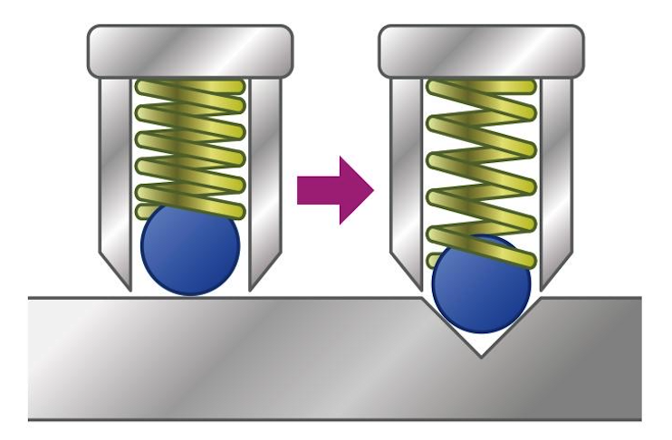
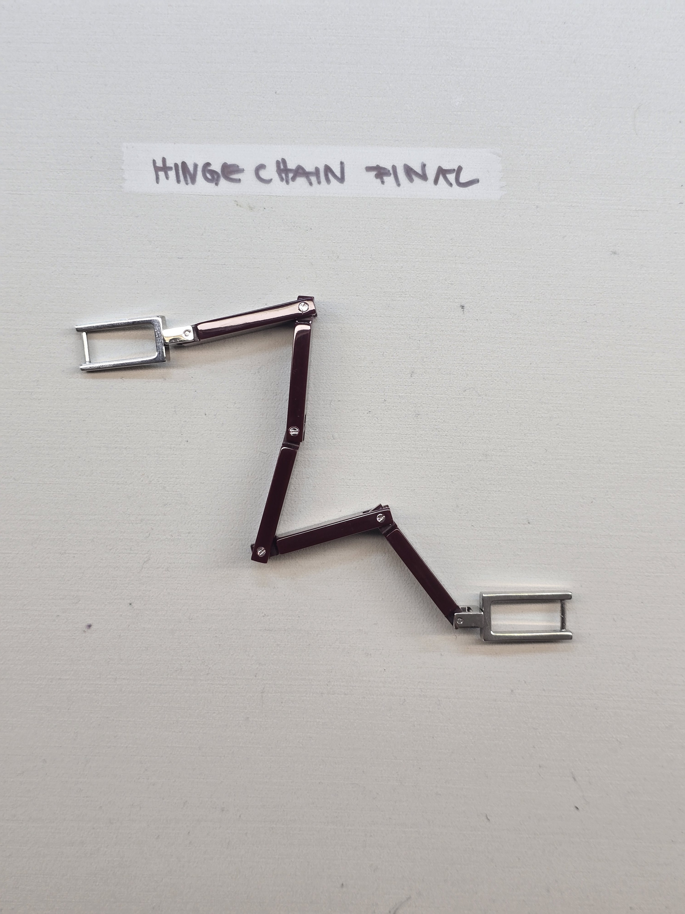
Three behaviours were studied before any leather was cut: articulation, locking and controlled deployment. Each was drawn from mechanical hardware rather than from leather goods, and each produced a component.
03 Design Principles FIVE RULES THE WORK PRODUCED
Shared Hardware
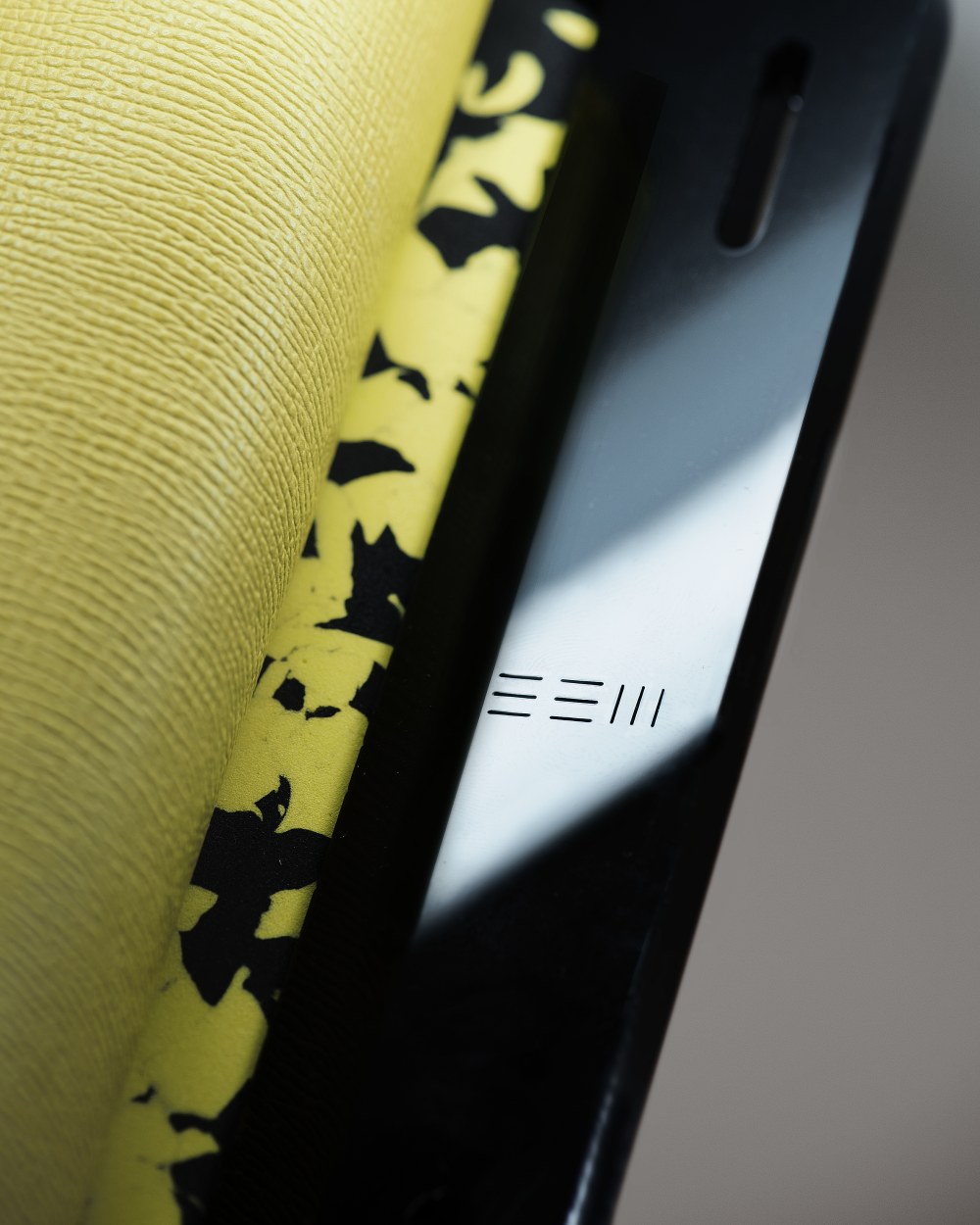
The same closure, lock and attachment system are used across every format, creating a consistent hardware architecture throughout the range.
Structural Hardware
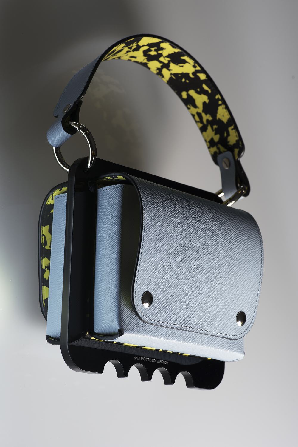
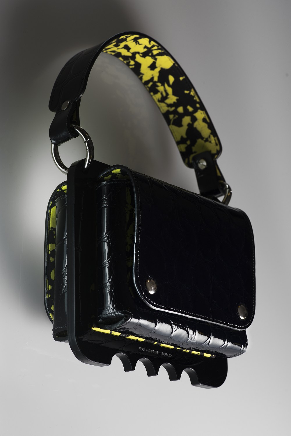
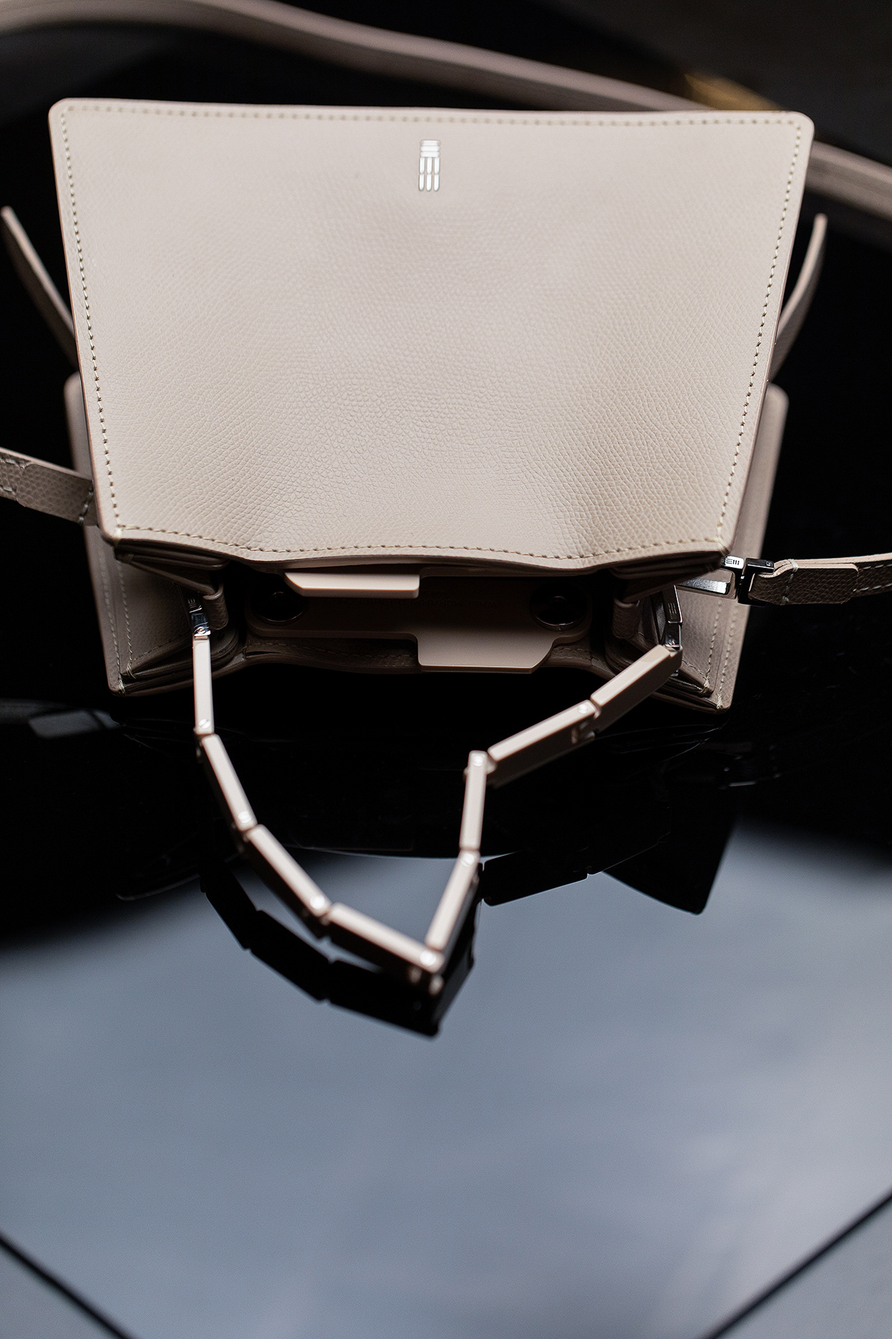
The hardware supports the construction as well as the object. The lock, bottom plate and attachment points define both structure and proportion.
Repairable Assembly
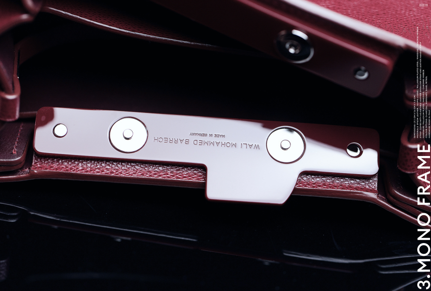
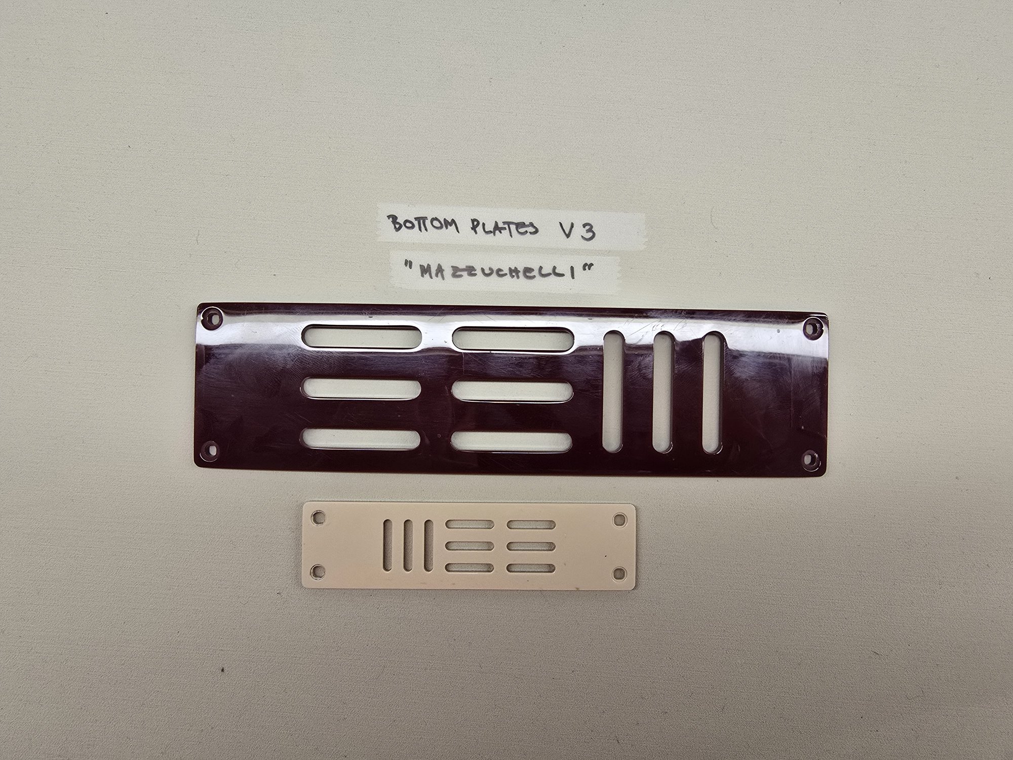
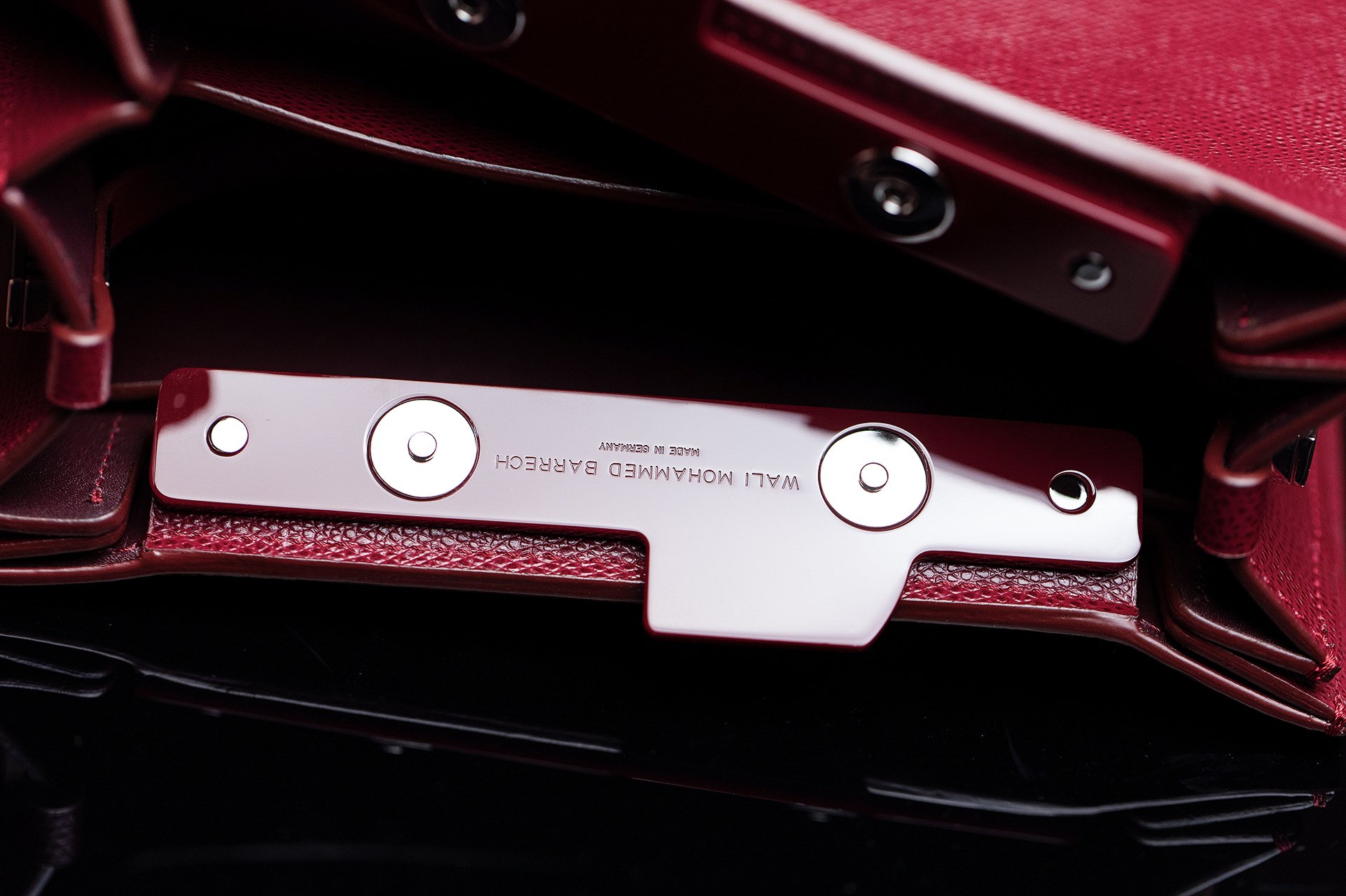
The bottom plate is screwed rather than riveted. Hardware can be removed and replaced without cutting the leather.
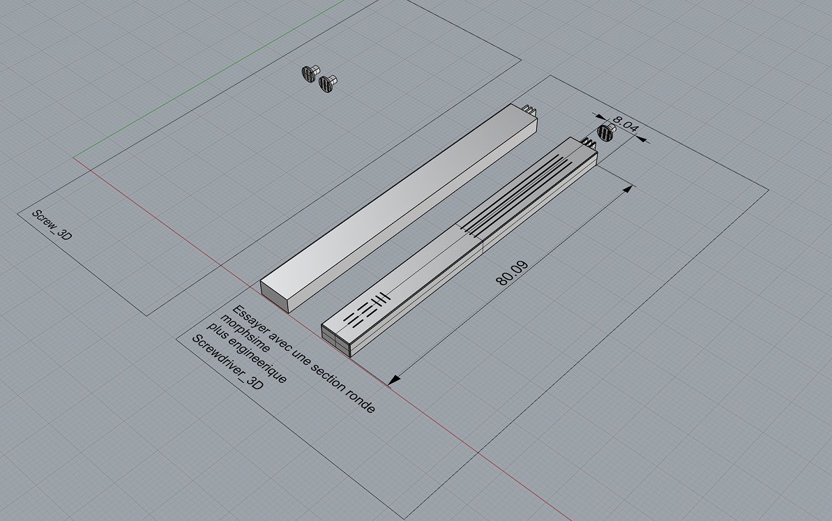
Consistent Geometry
The platform was developed in CAD, allowing proportions and hardware geometry to remain consistent across all six formats.
Functional Detailing
Every hardware element serves a functional purpose. No component exists solely for decoration.
04 The Range SIX FORMATS, FOUR HARDWARE SETS
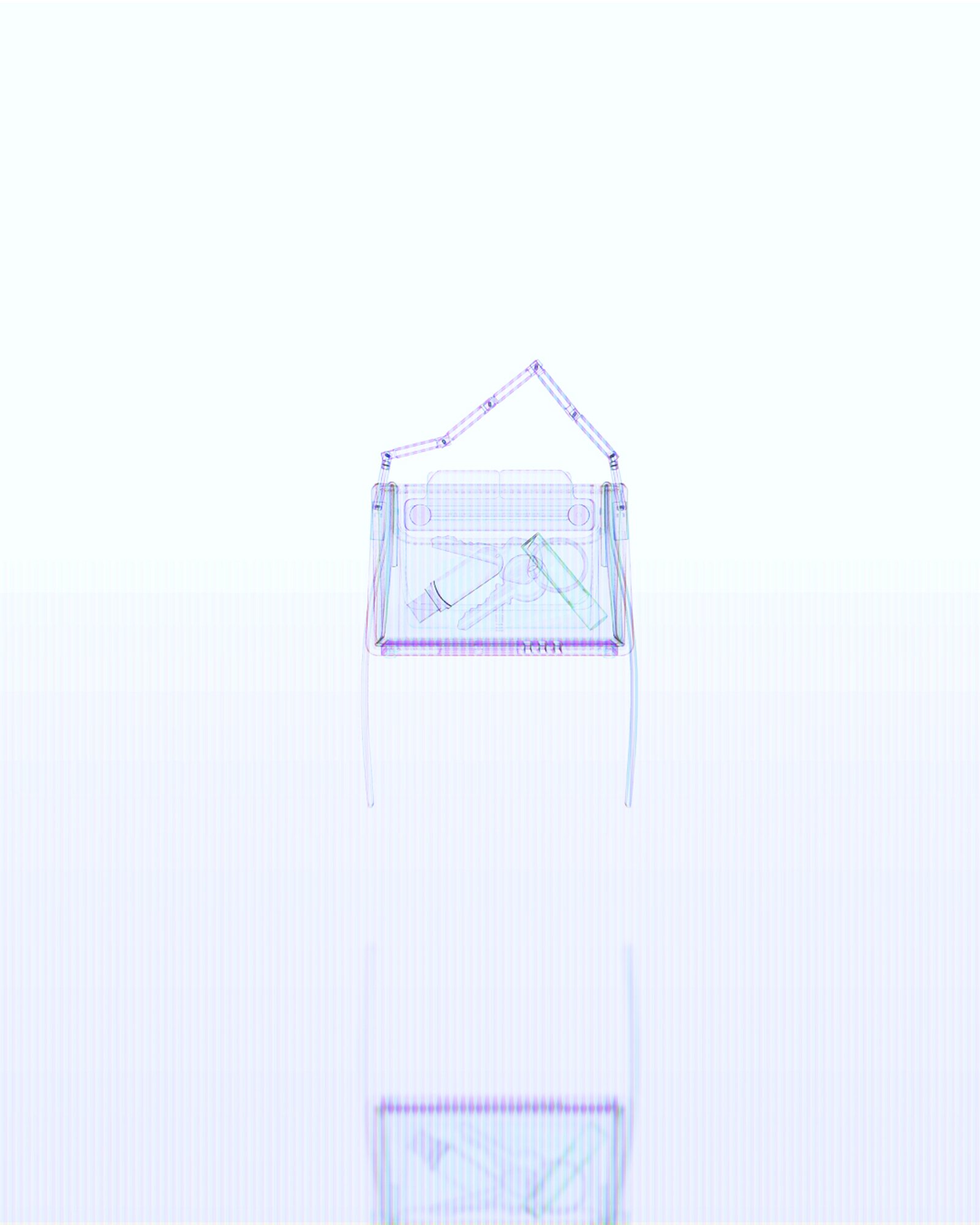
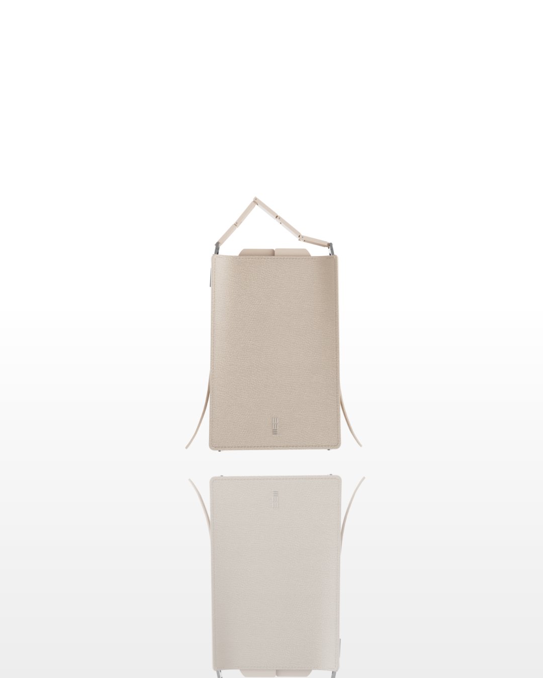
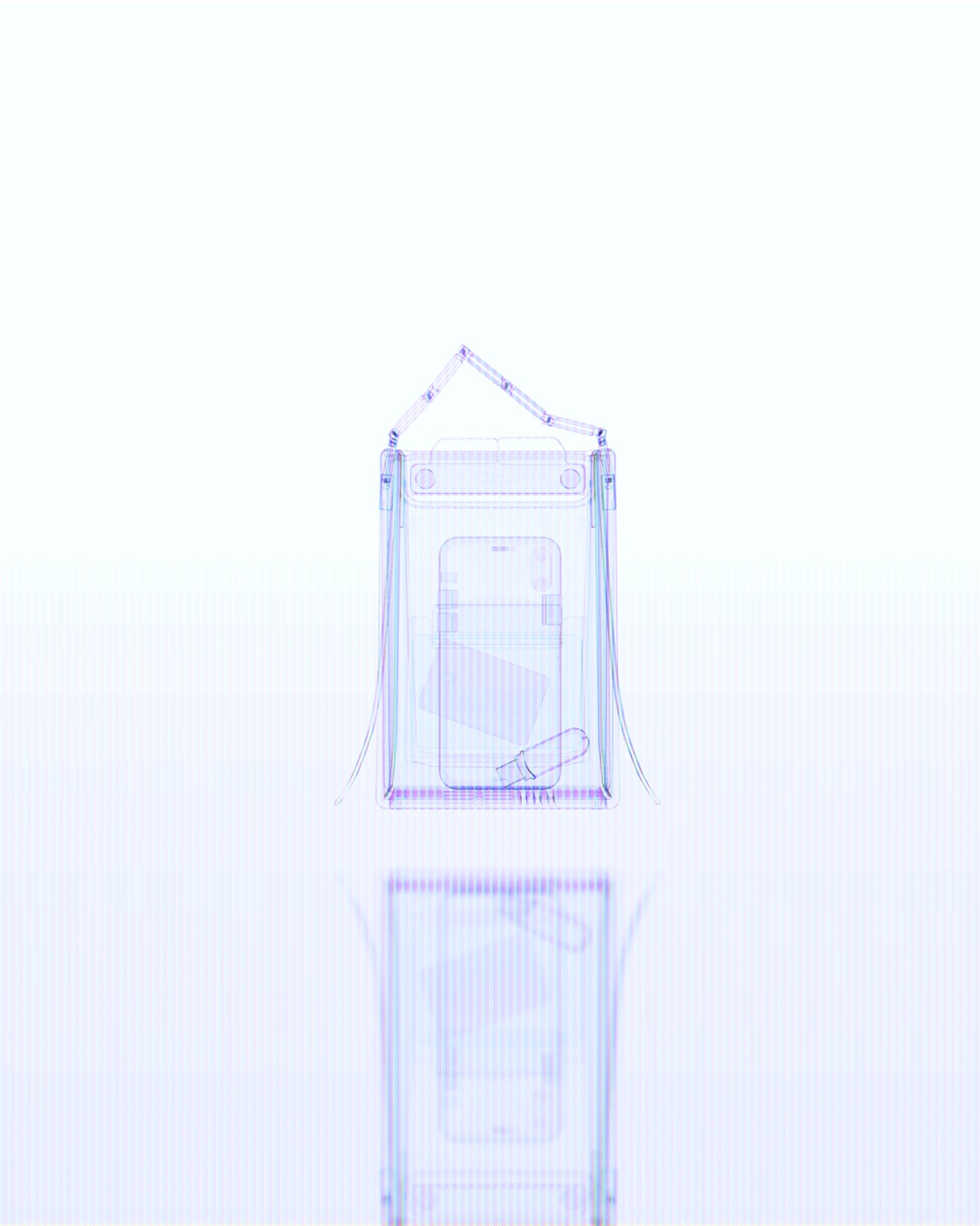
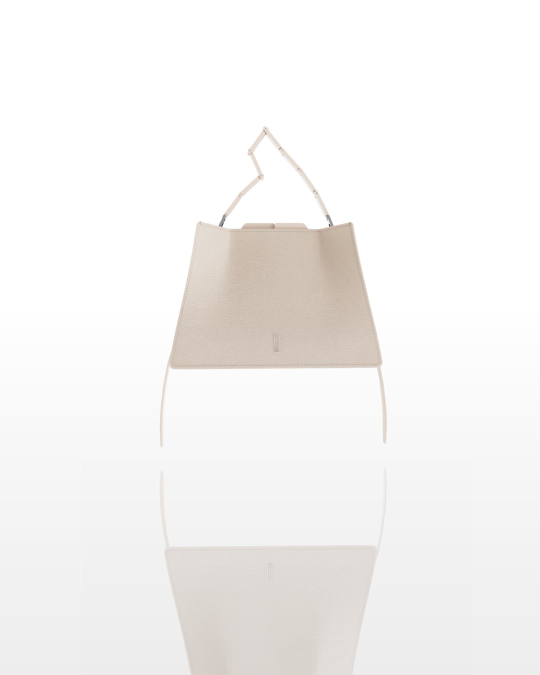
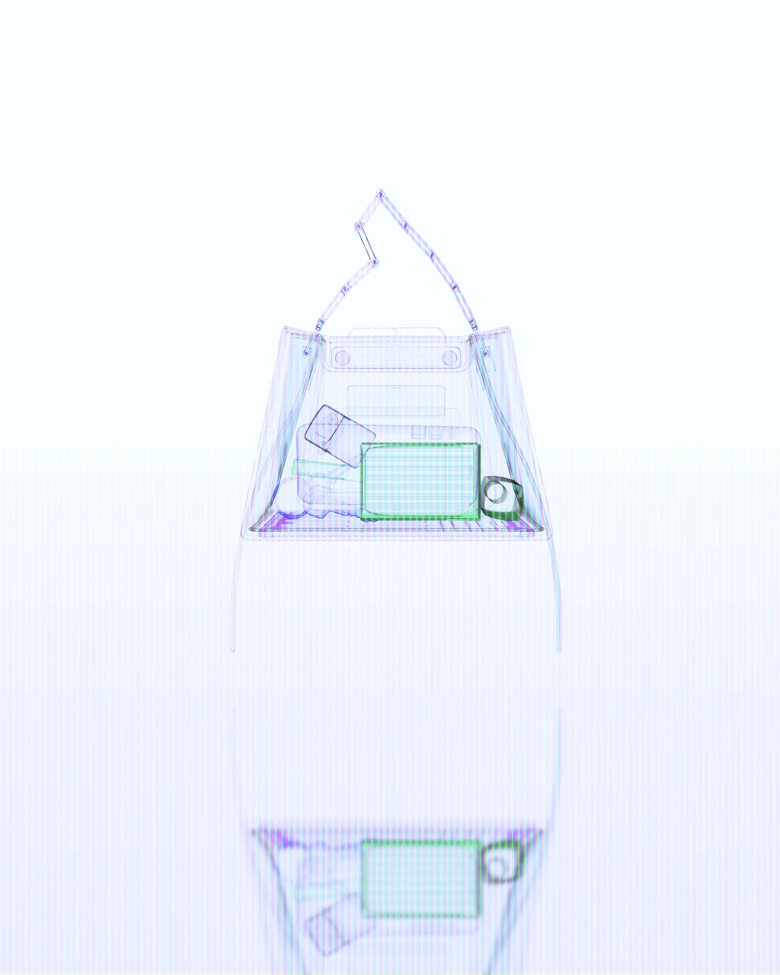
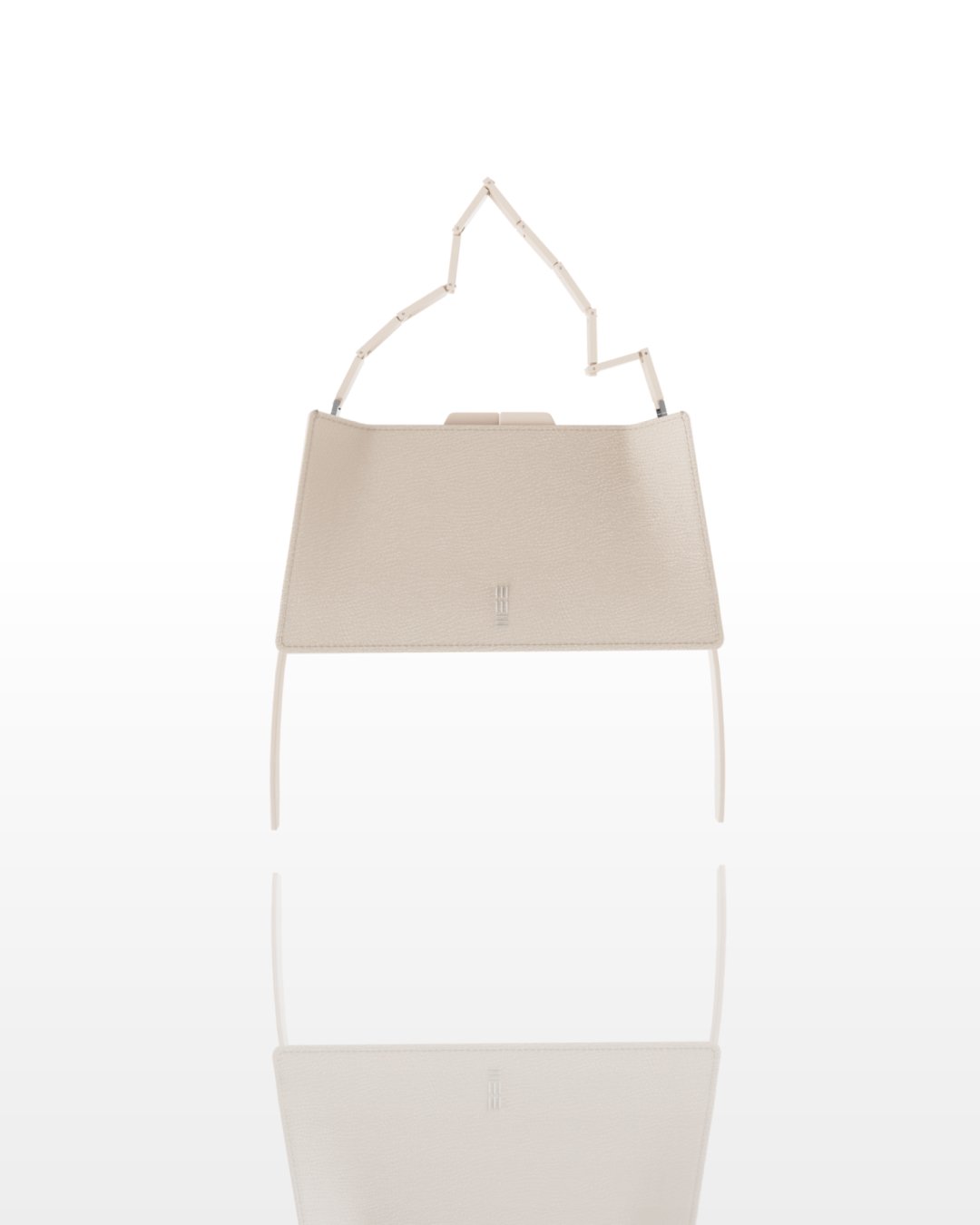
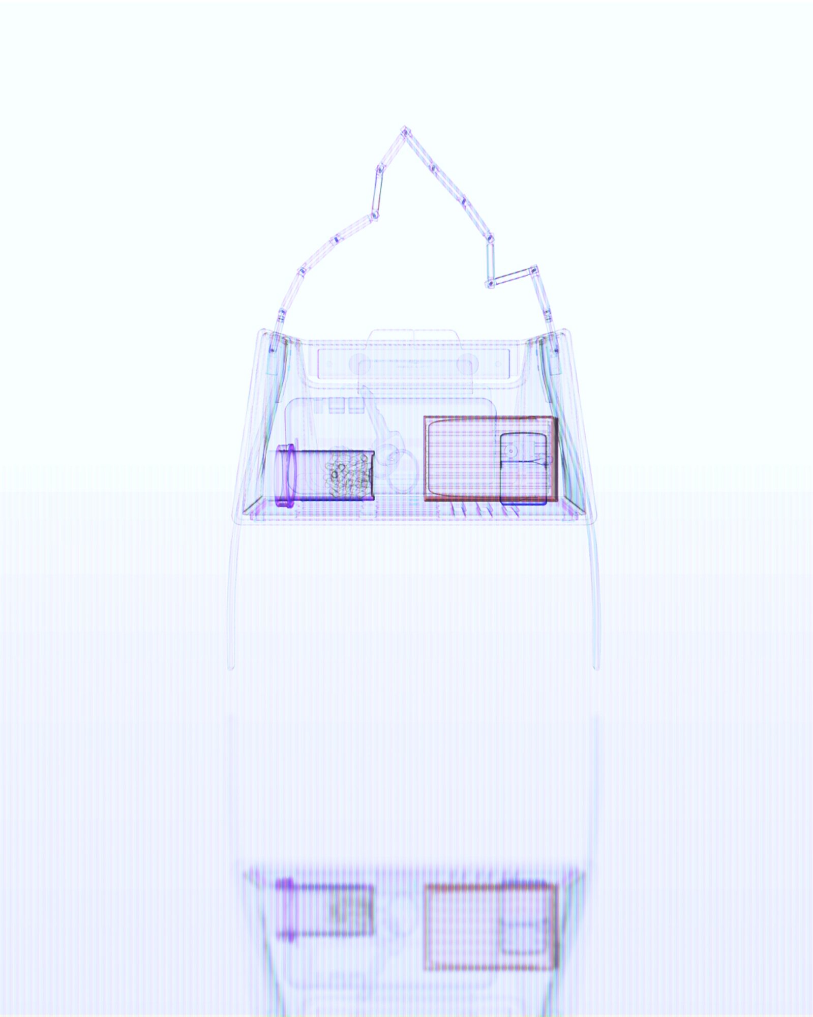
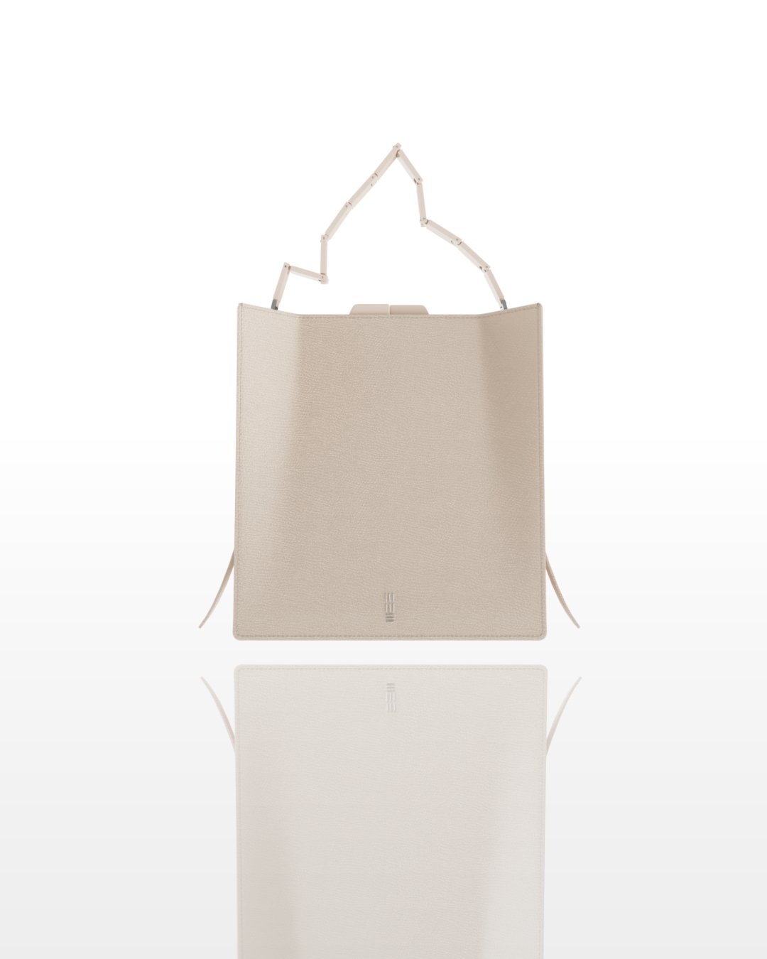
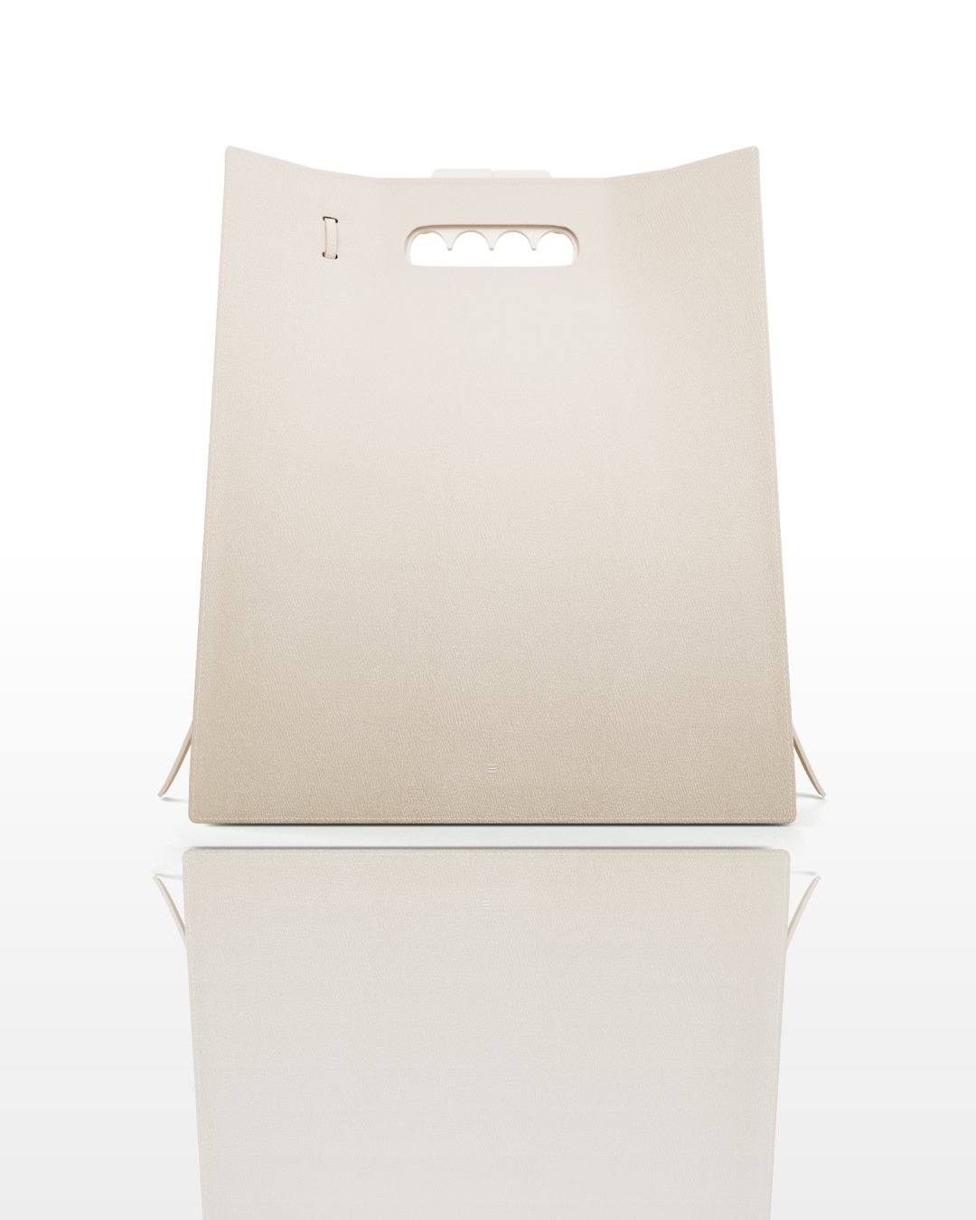
| Format | W × D × H (mm) | Hardware set | Intended contents | |
|---|---|---|---|---|
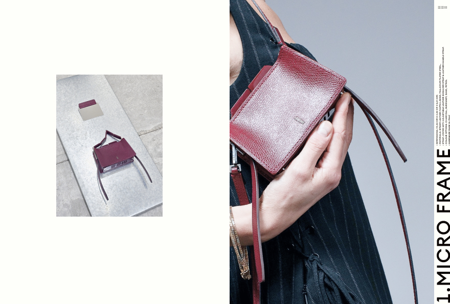
| 01 | Micro Frame | 123 × 43 × 80 | A | Cards · keys · phone |
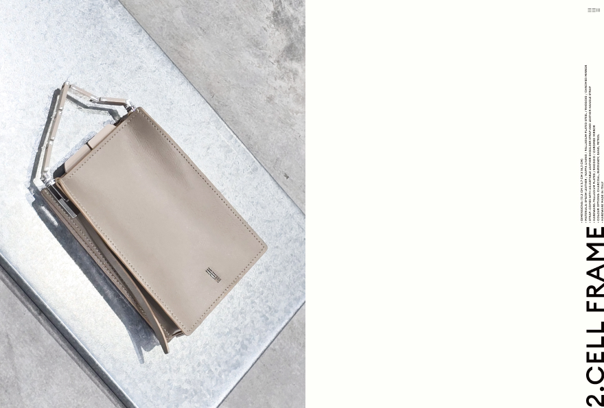
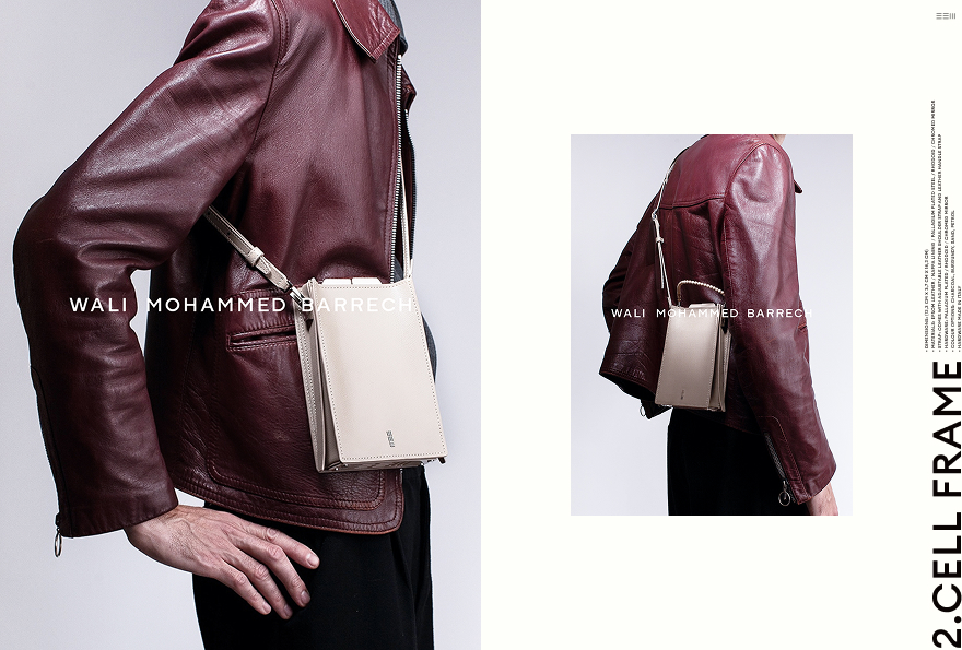
| 02 | Cell Frame | 123 × 37 × 183 | A | USB drive · Cards · lighter · keys · phone |
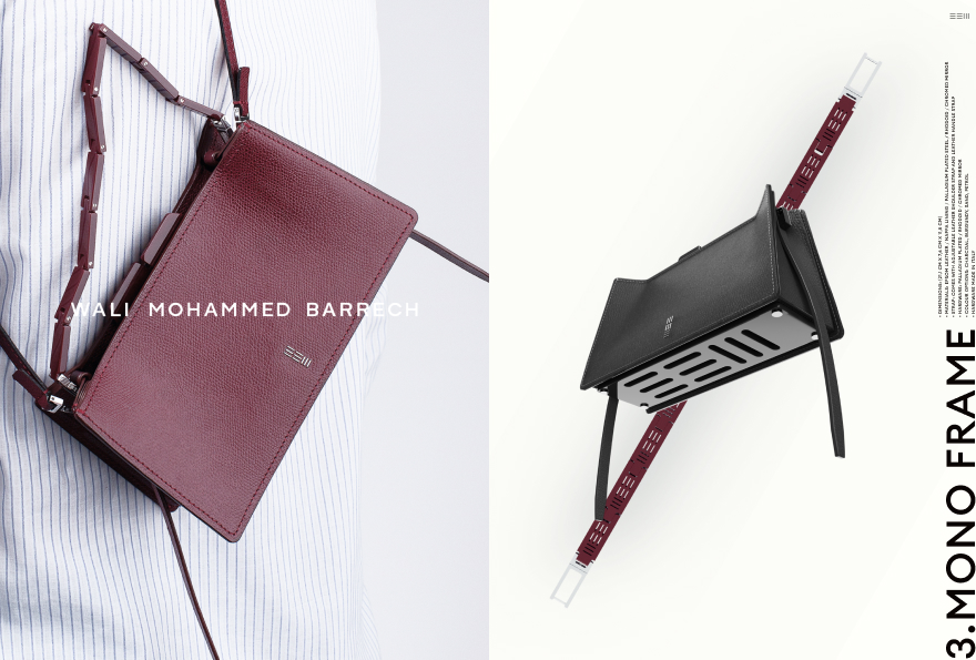
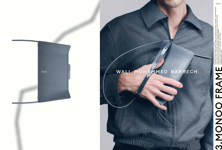
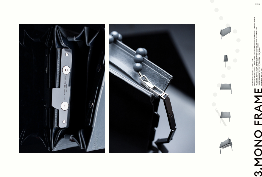
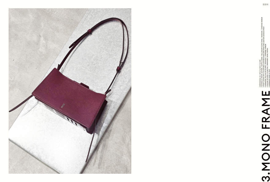
| 03 | Mono Frame | 211 × 76 × 115 | B | Pill case · cigarette pack · USB drive · lighter · keys · phone |
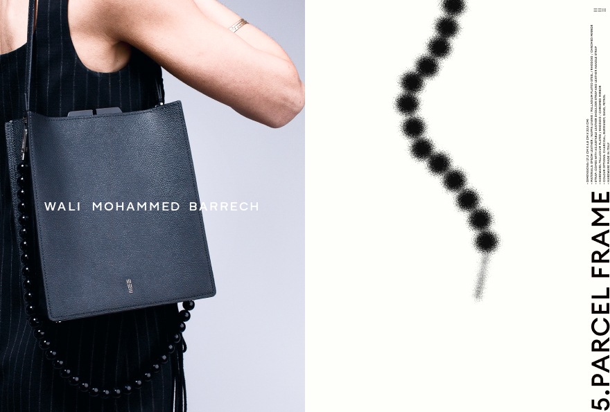
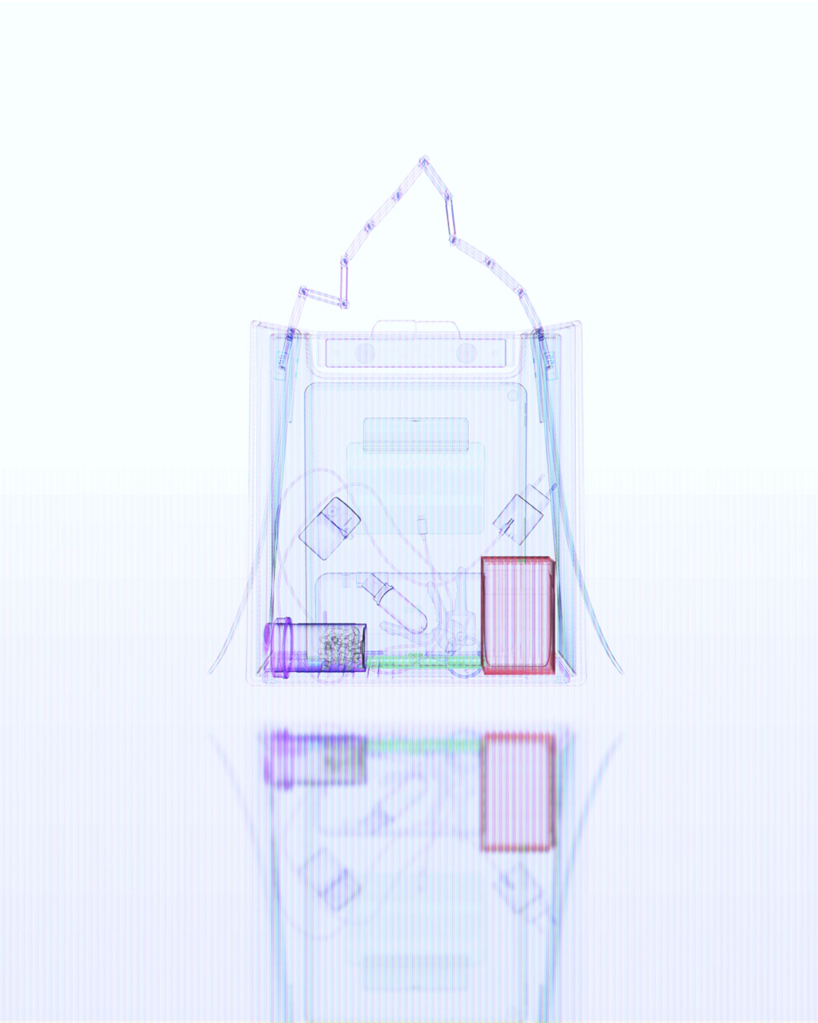
| 04 | Parcel Frame | 212 × 68 × 228 | B | Tablet · notebook · charger · cigarette pack · USB drive · lighter · keys · phone |
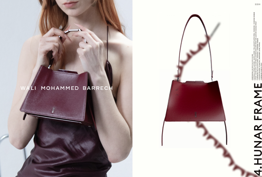
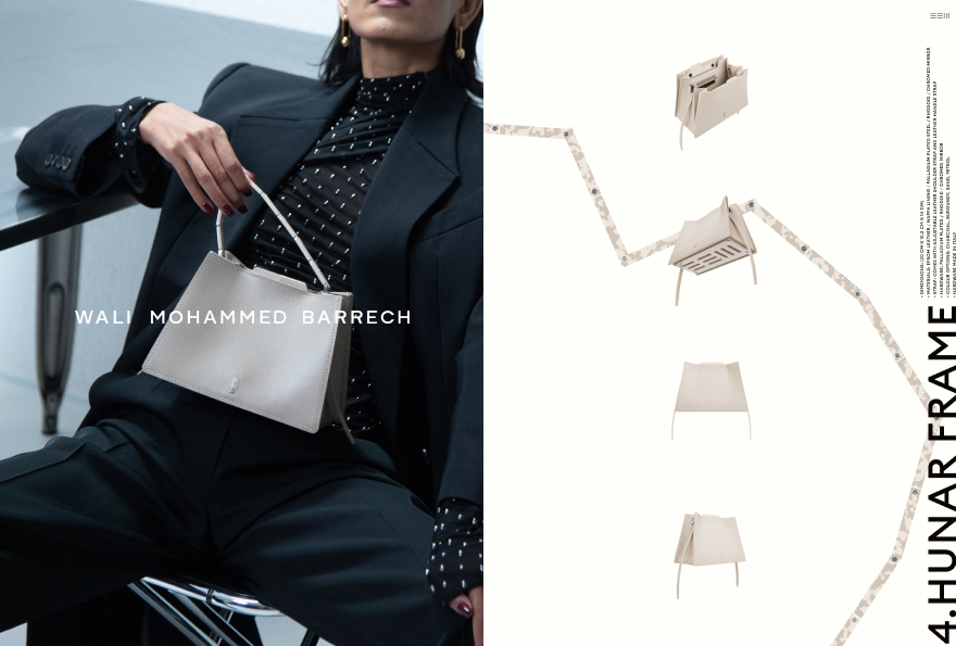
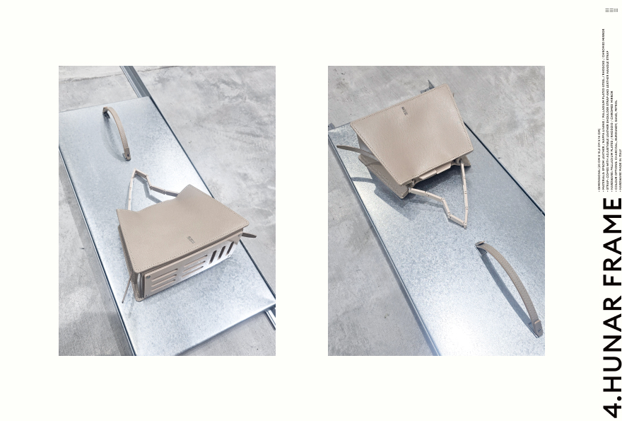
| 05 | Hunar Frame | 200 × 102 × 140 | C | Daily objects |
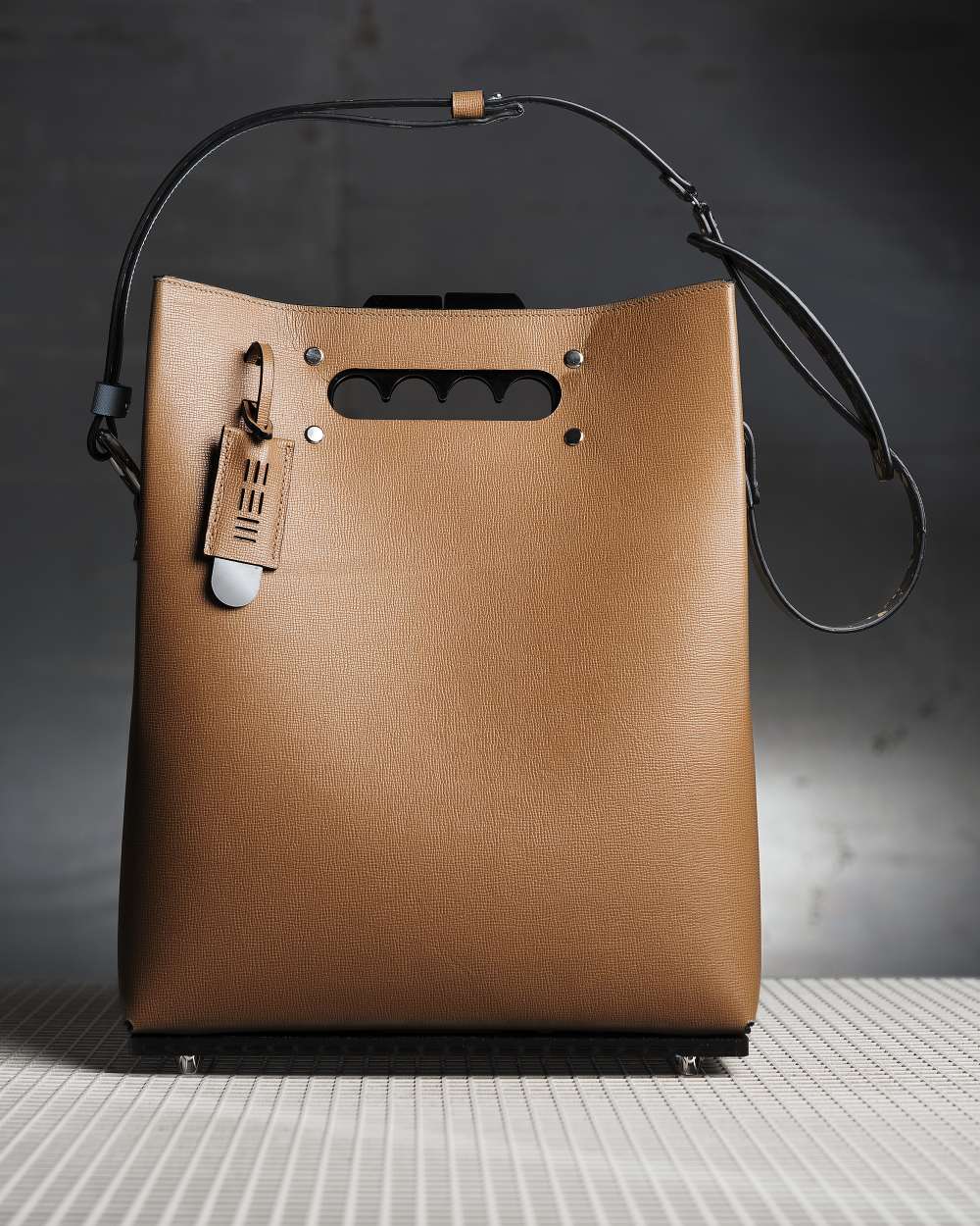
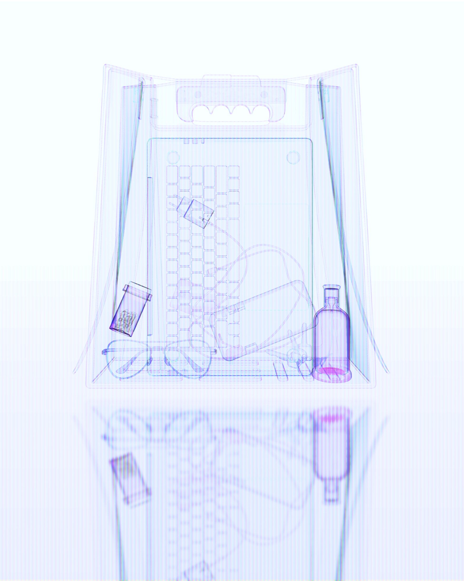
| 06 | Maxi Frame | 360 × 123 × 406 | D | Laptop · documents · daily objects |
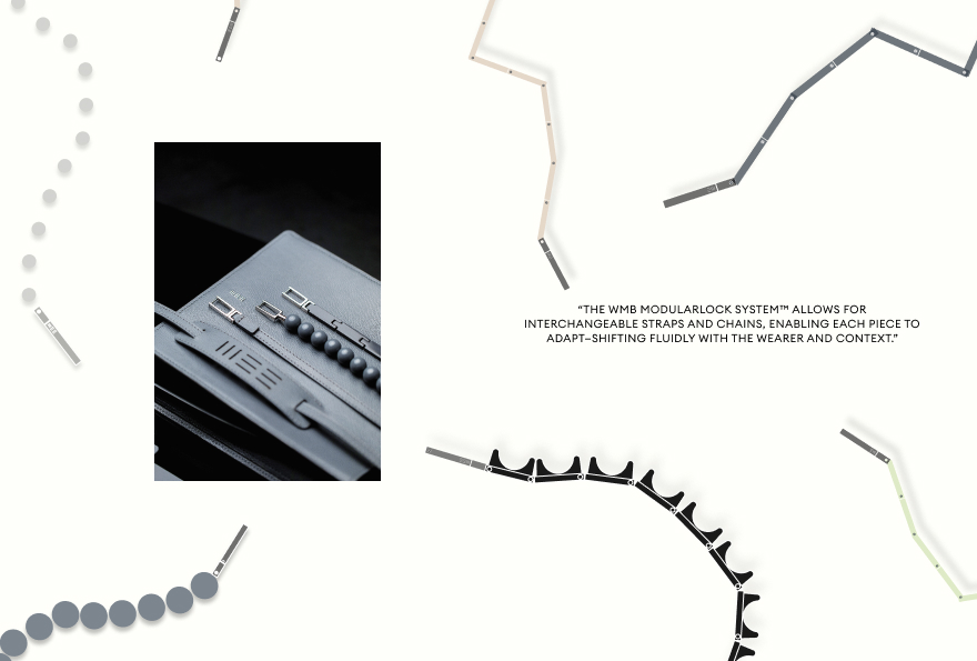
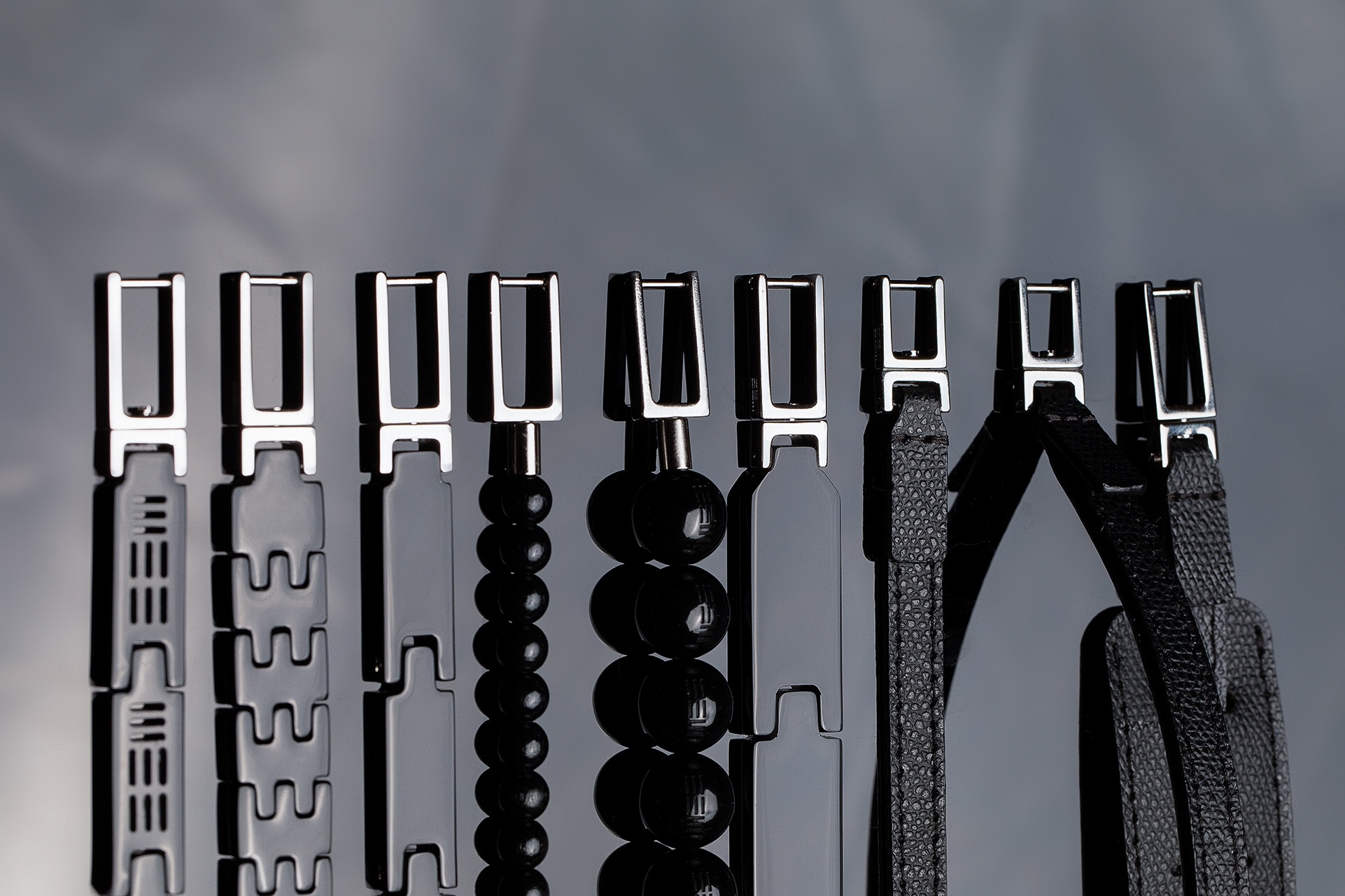
05 The WMB Modular Lock system ONE MECHANISM, MULTIPLE CONFIGURATIONS
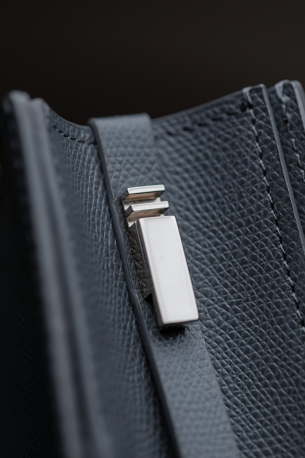
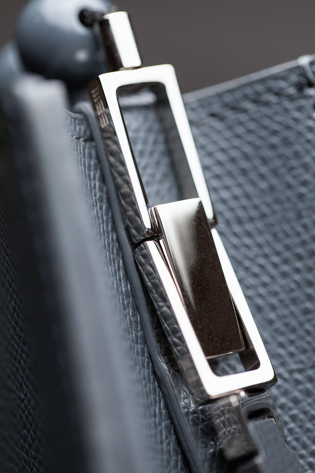
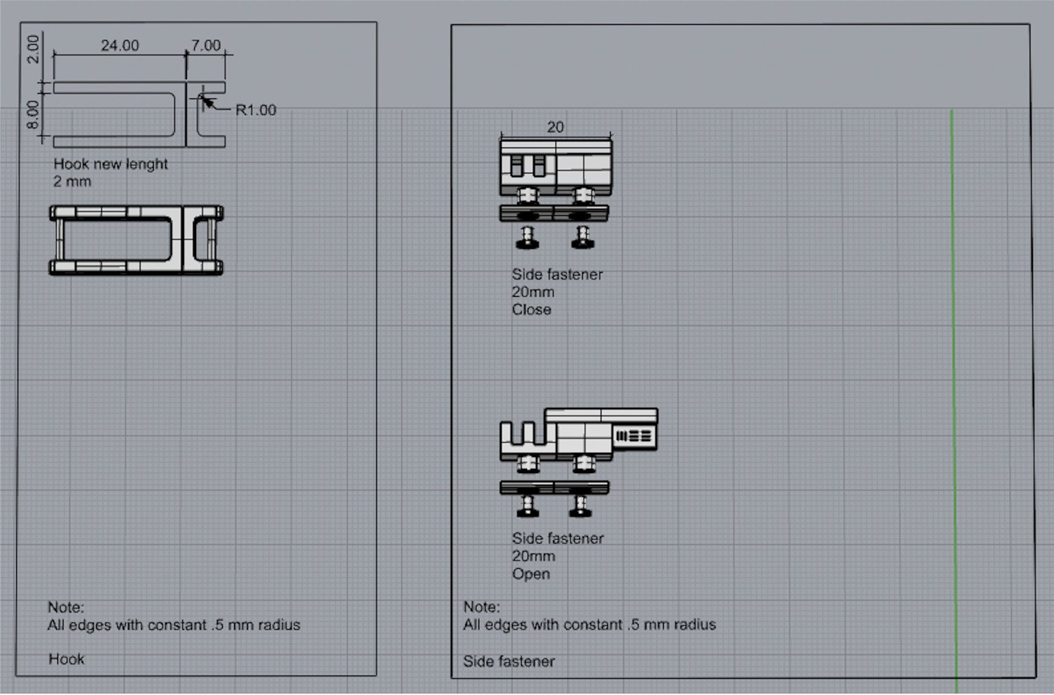
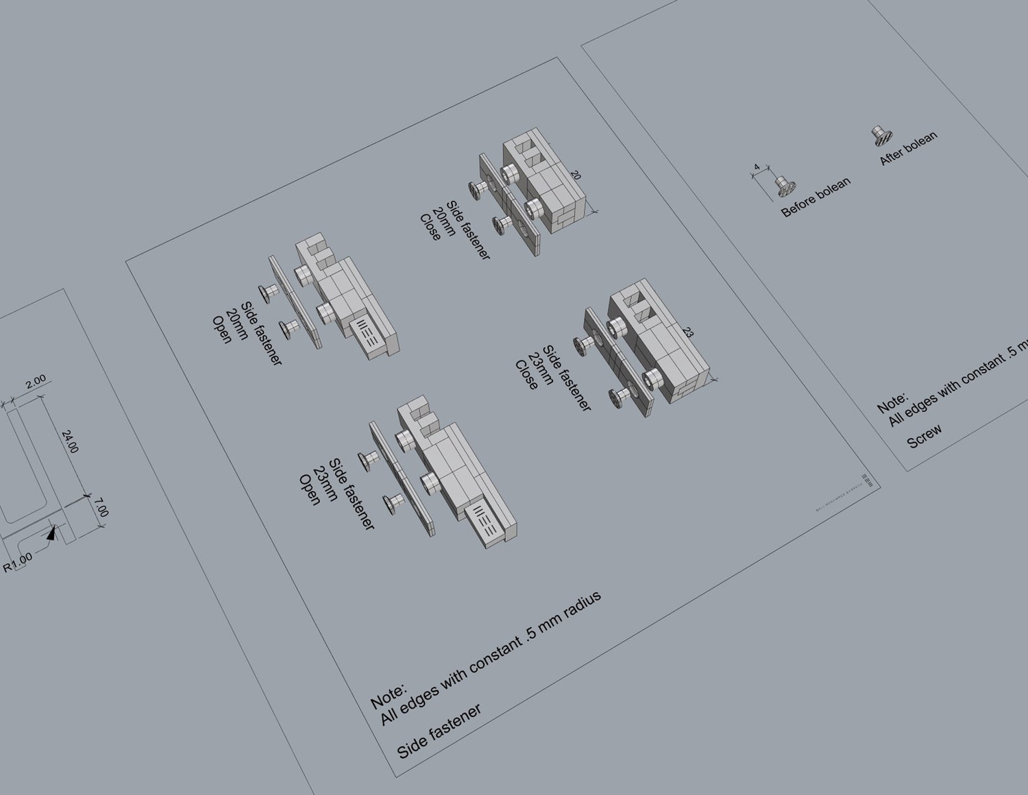
At 20 mm the lock required manufacturing tolerances beyond standard leather goods hardware. All edges to a constant 0.5 mm radius. Four prototype rounds were completed before the mechanism was production ready.
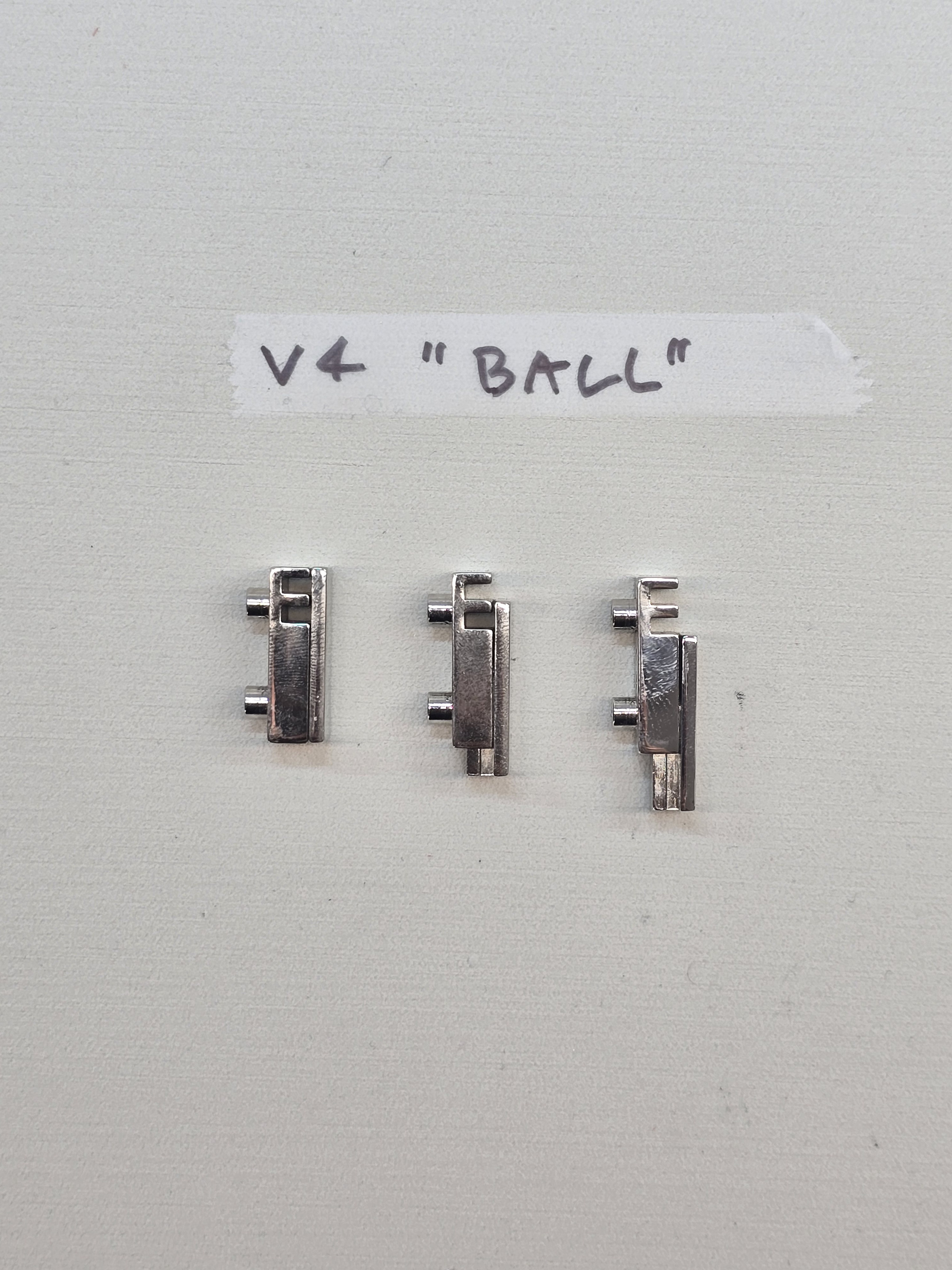
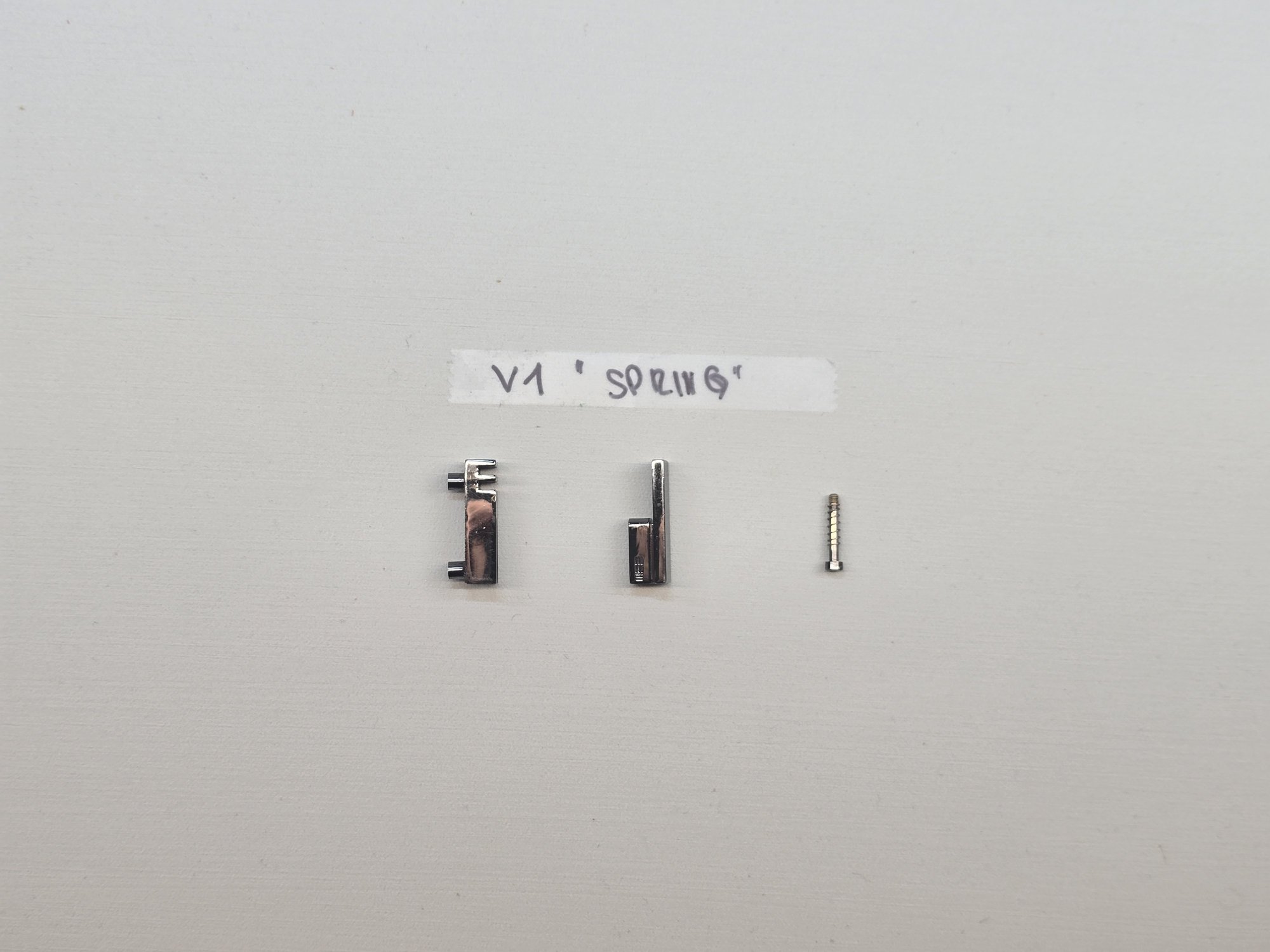
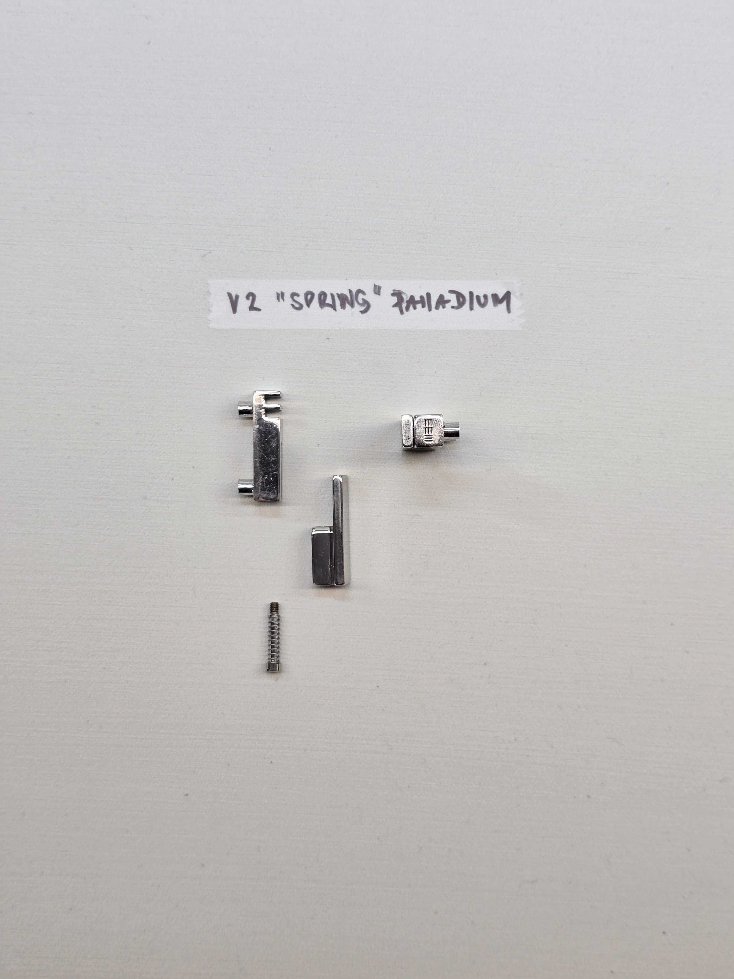
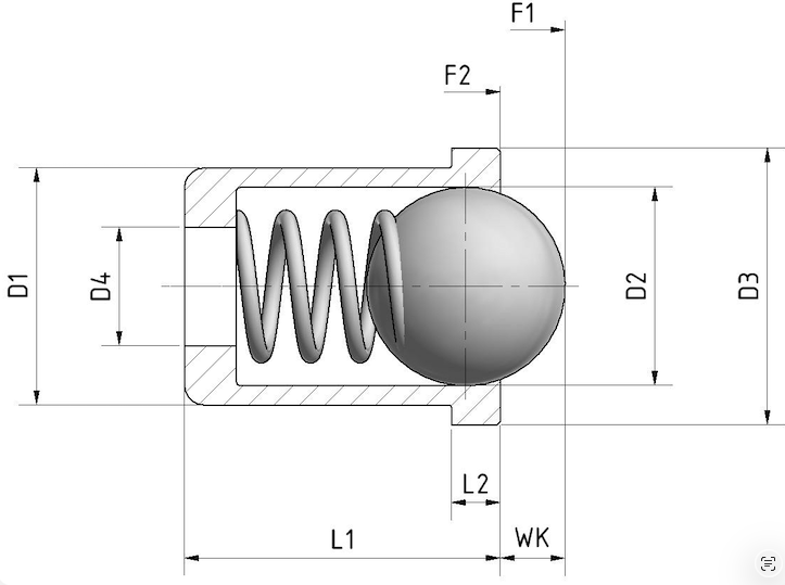
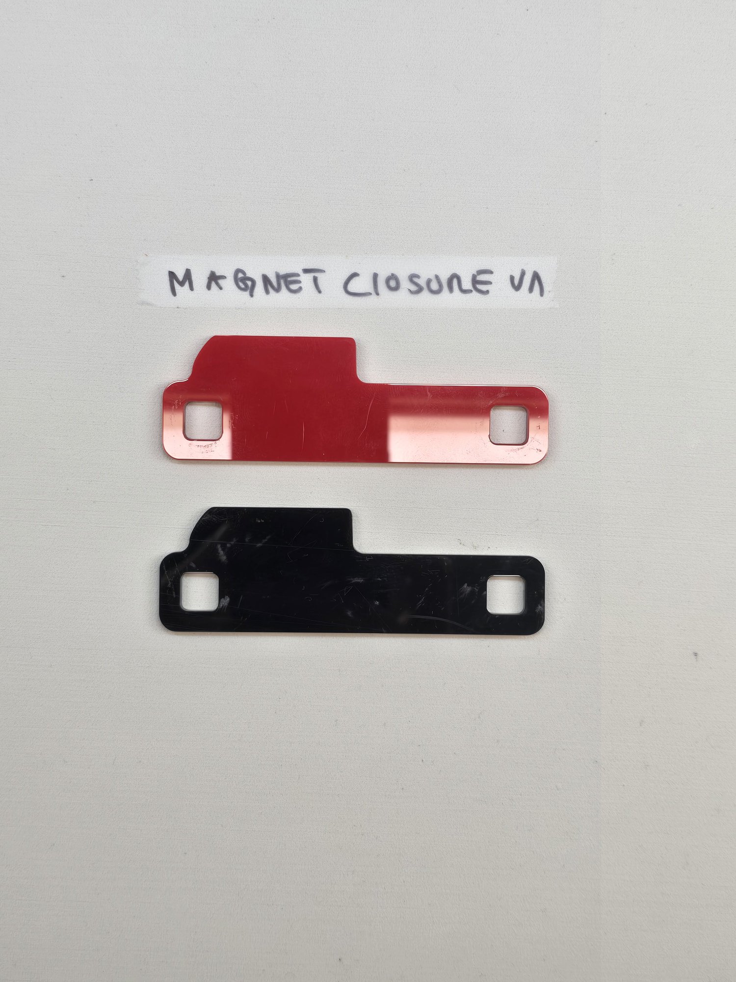
The first lock used an internal spring. To generate enough return force the housing had to grow, and a lock that announces itself defeats its own purpose. The spring was abandoned for a ball detent, which held the same function inside a smaller envelope.
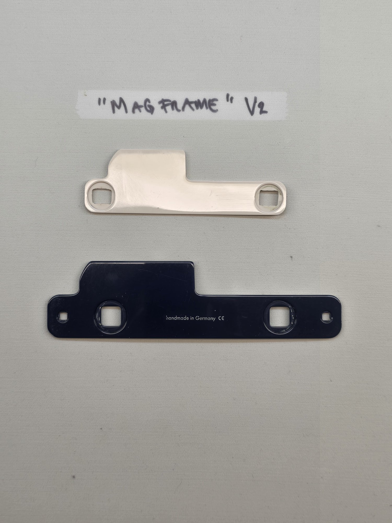
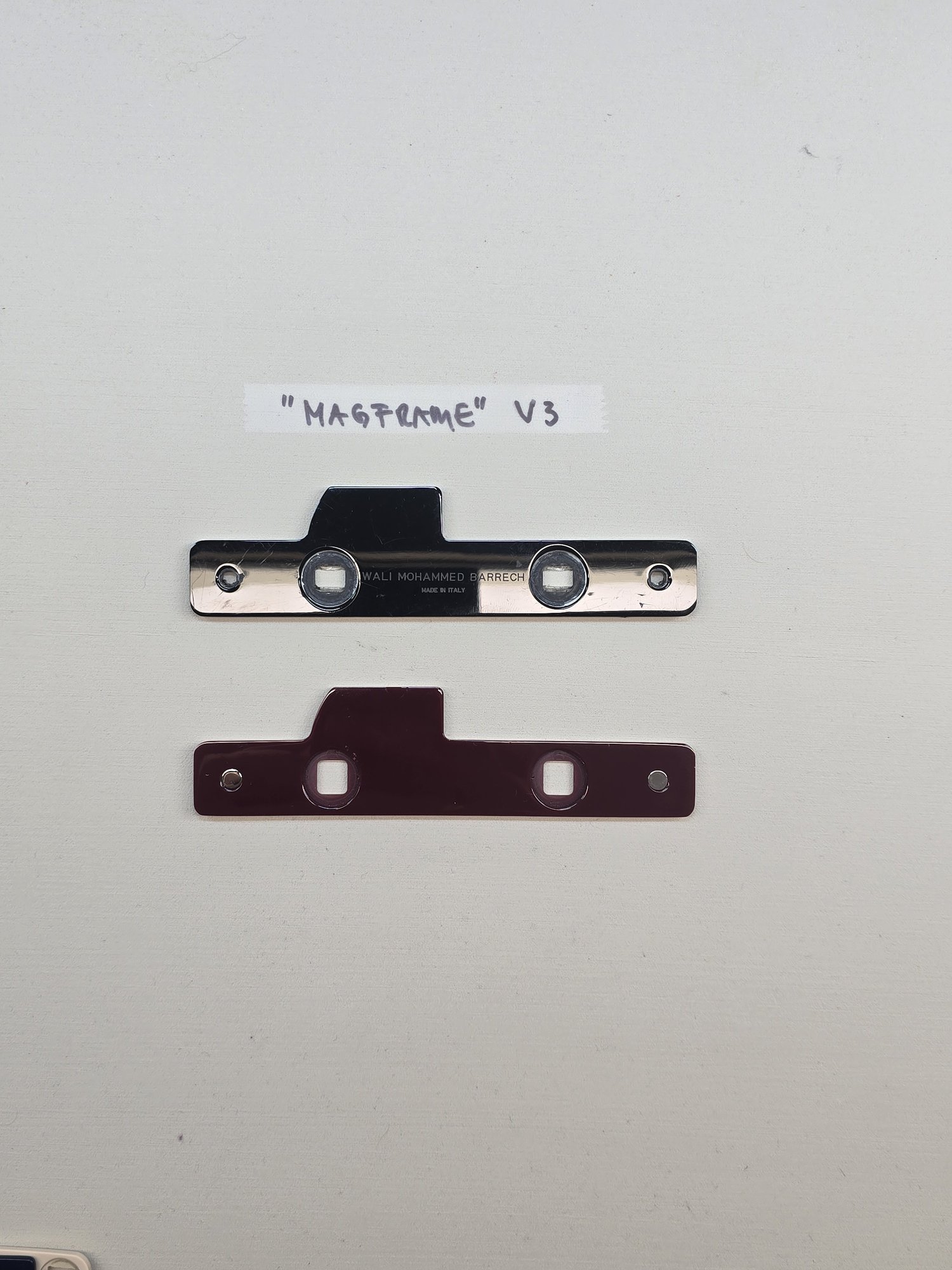
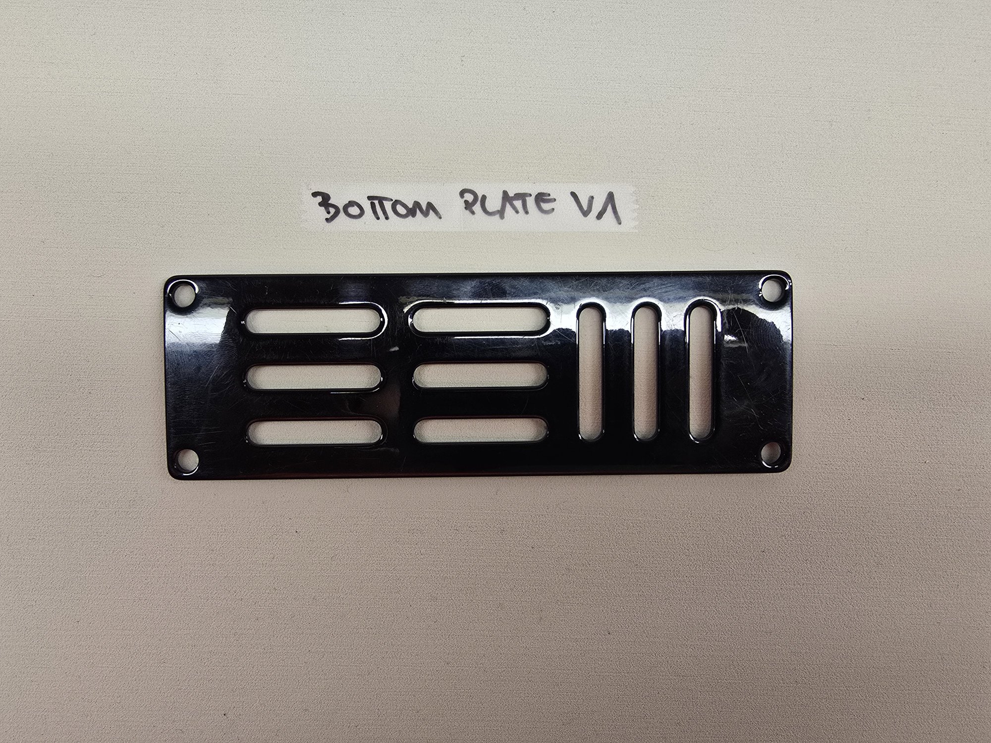
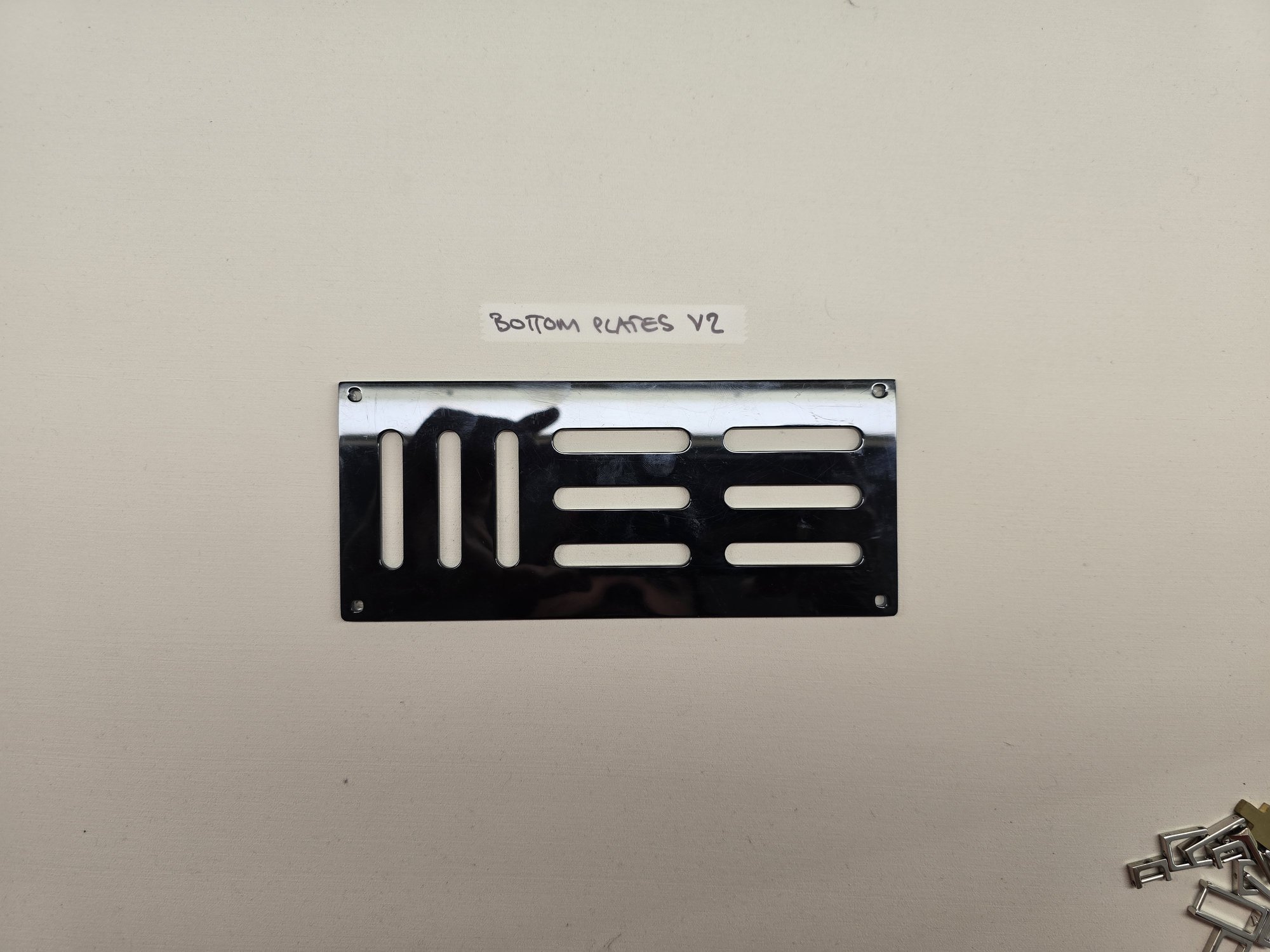
06 Component Platform FIVE COMPONENTS, DIMENSIONED AS A SET
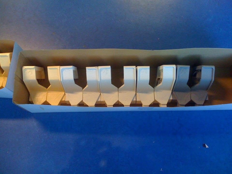
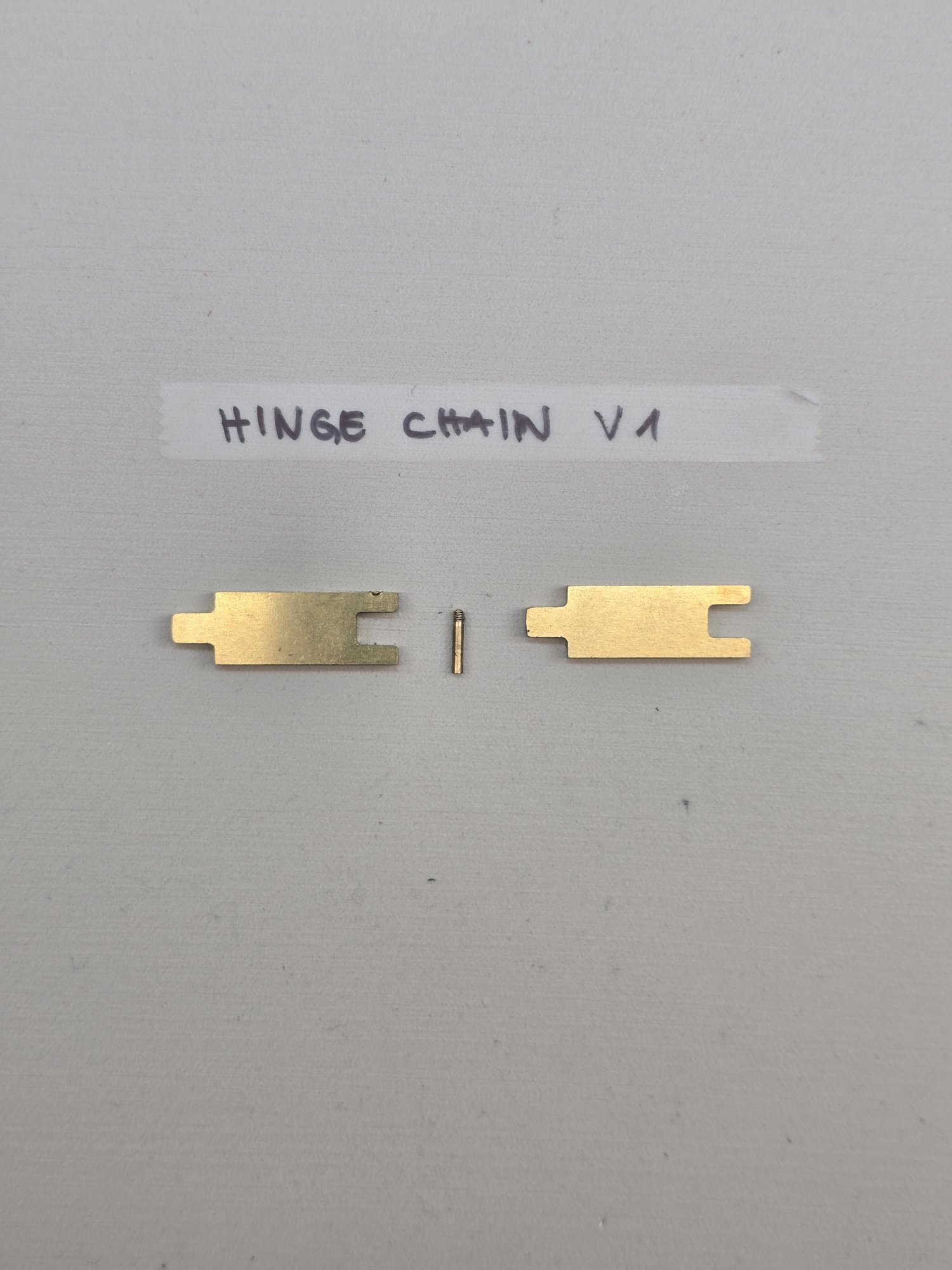
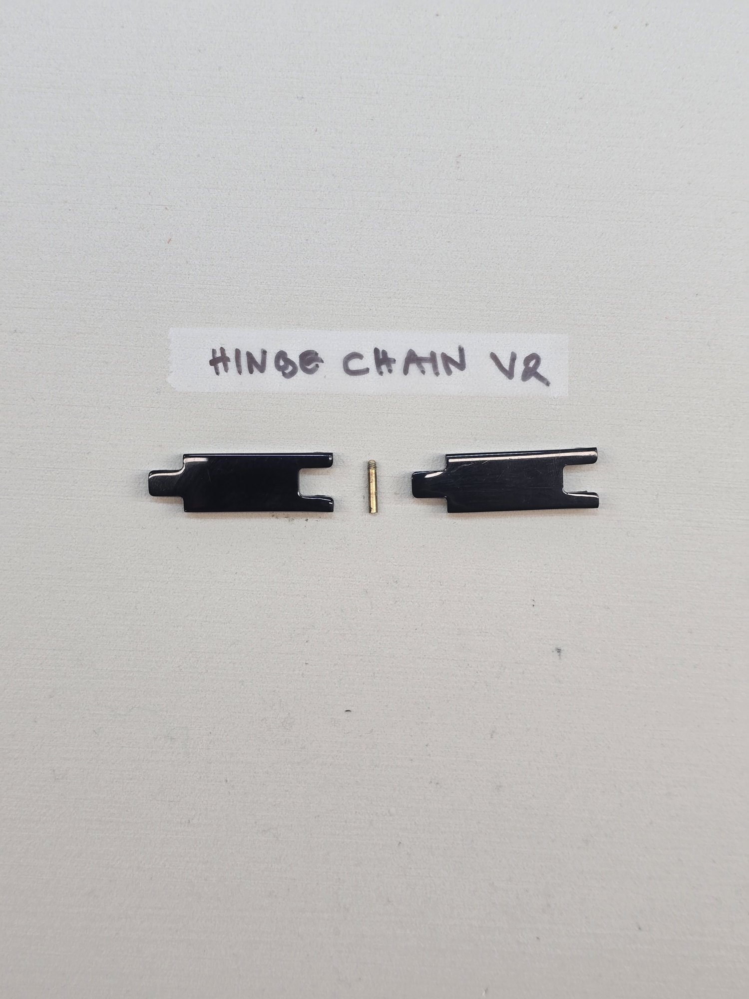
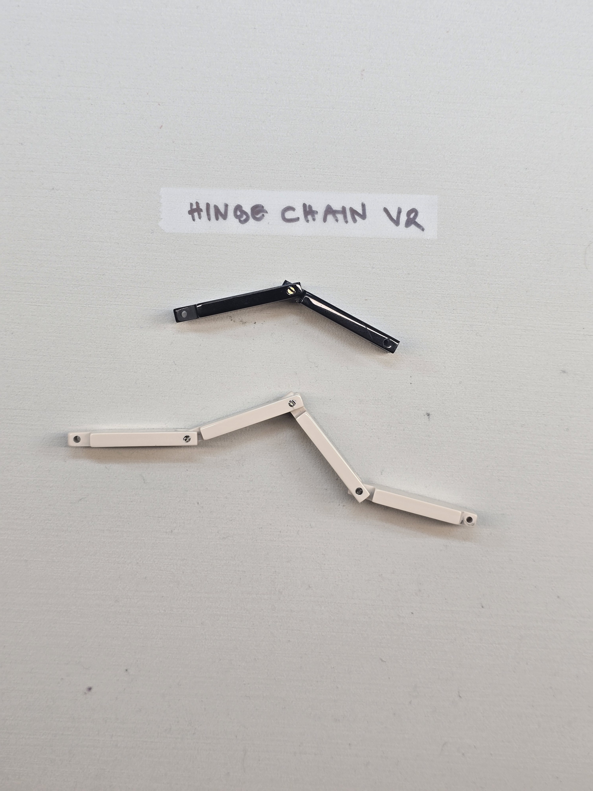
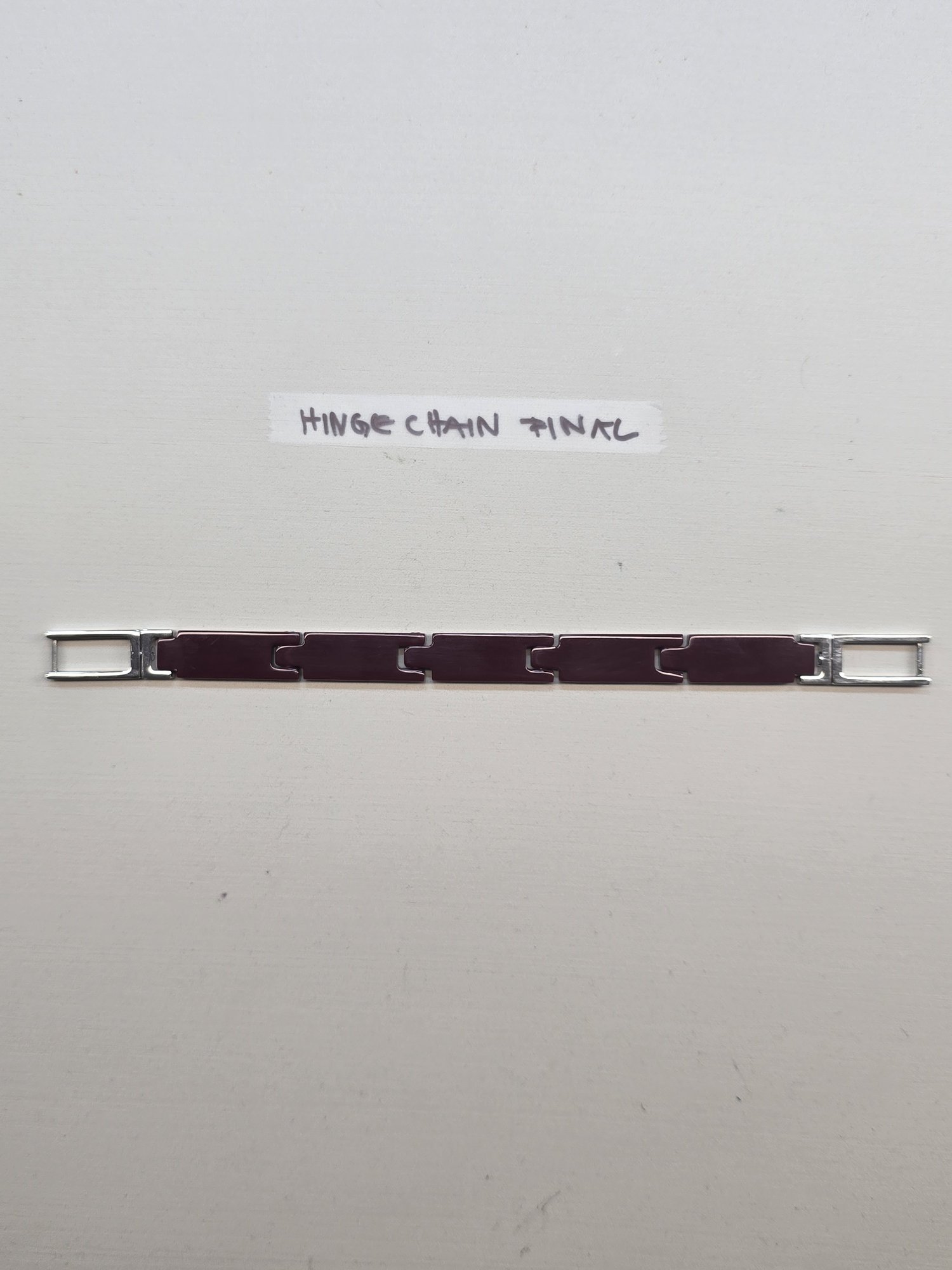
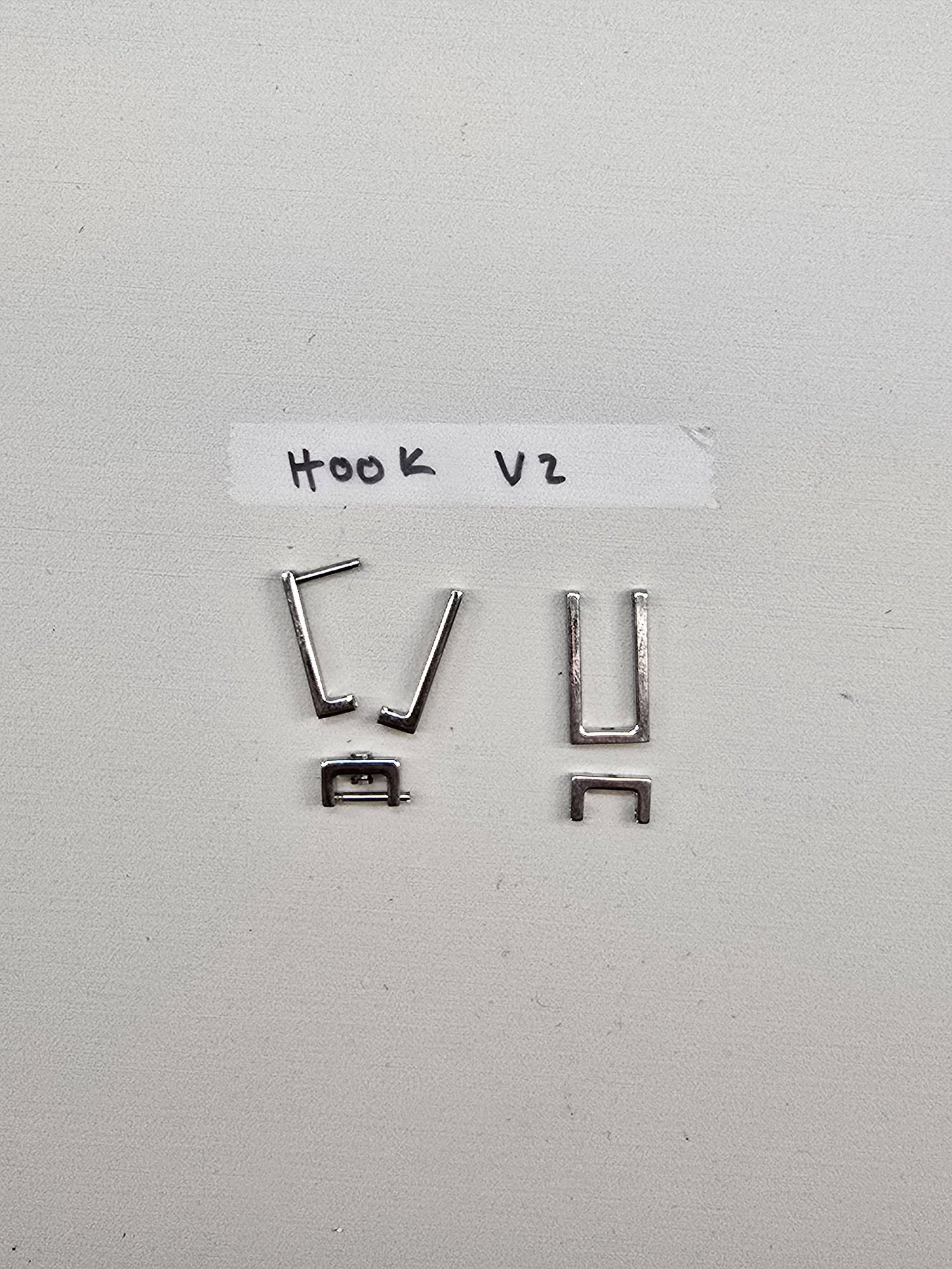
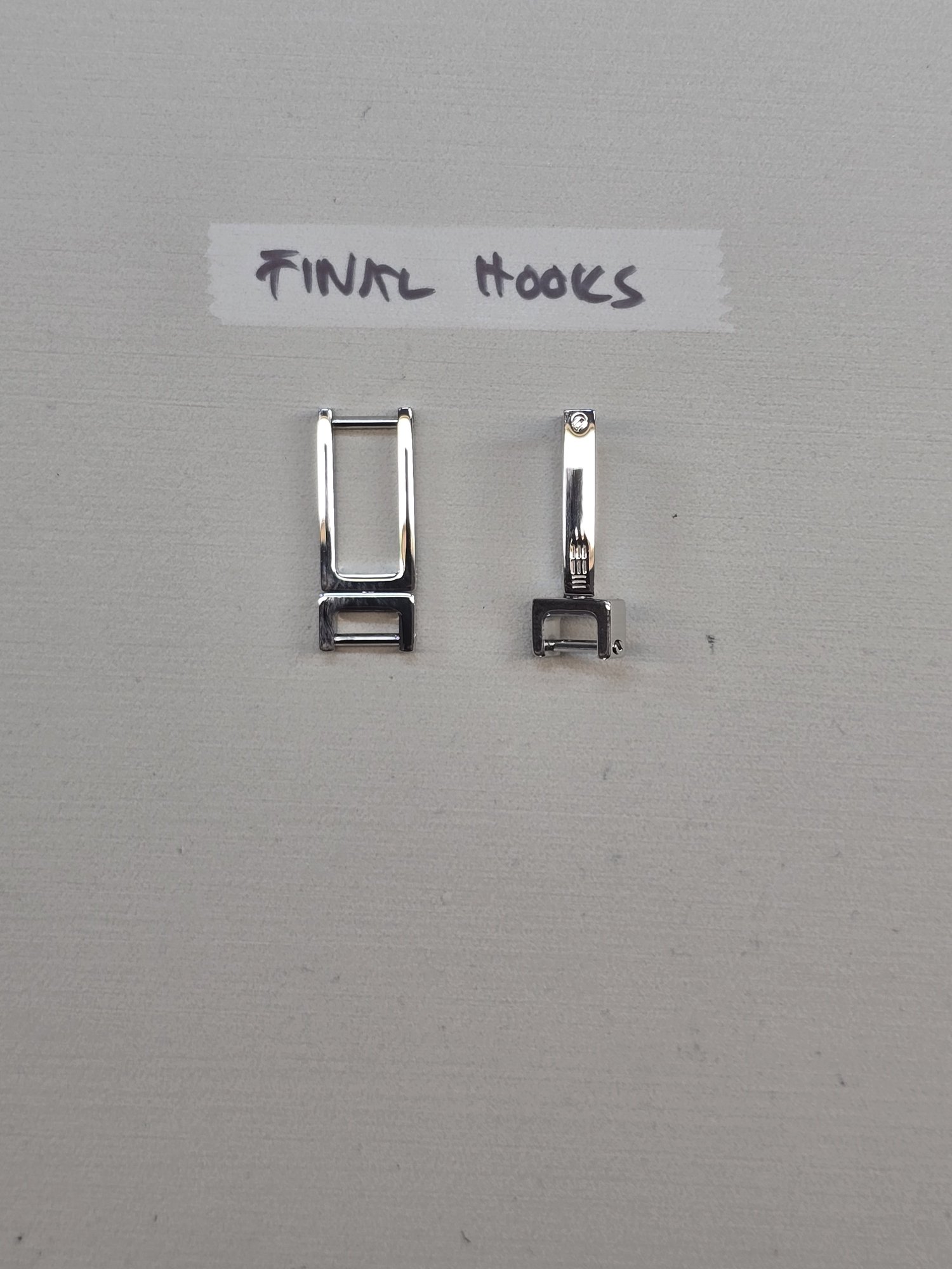
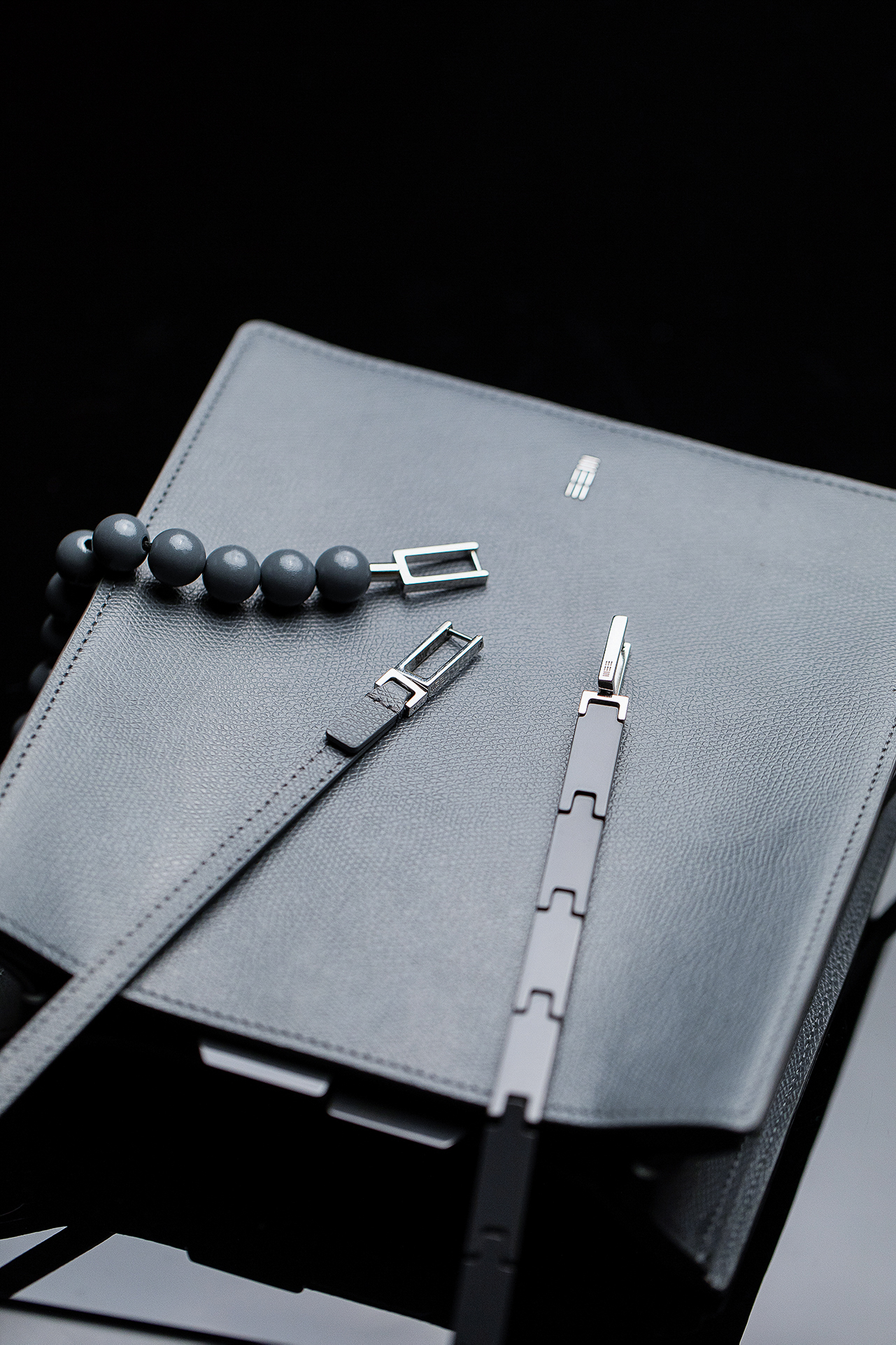
Four components, four resolutions. Each component was taken from prototype to final independently.
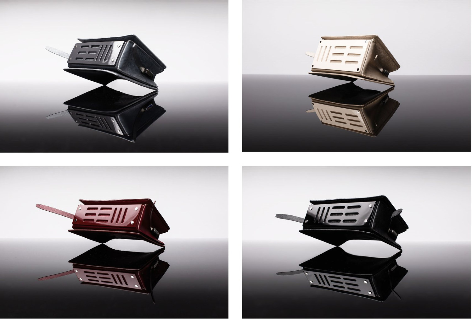
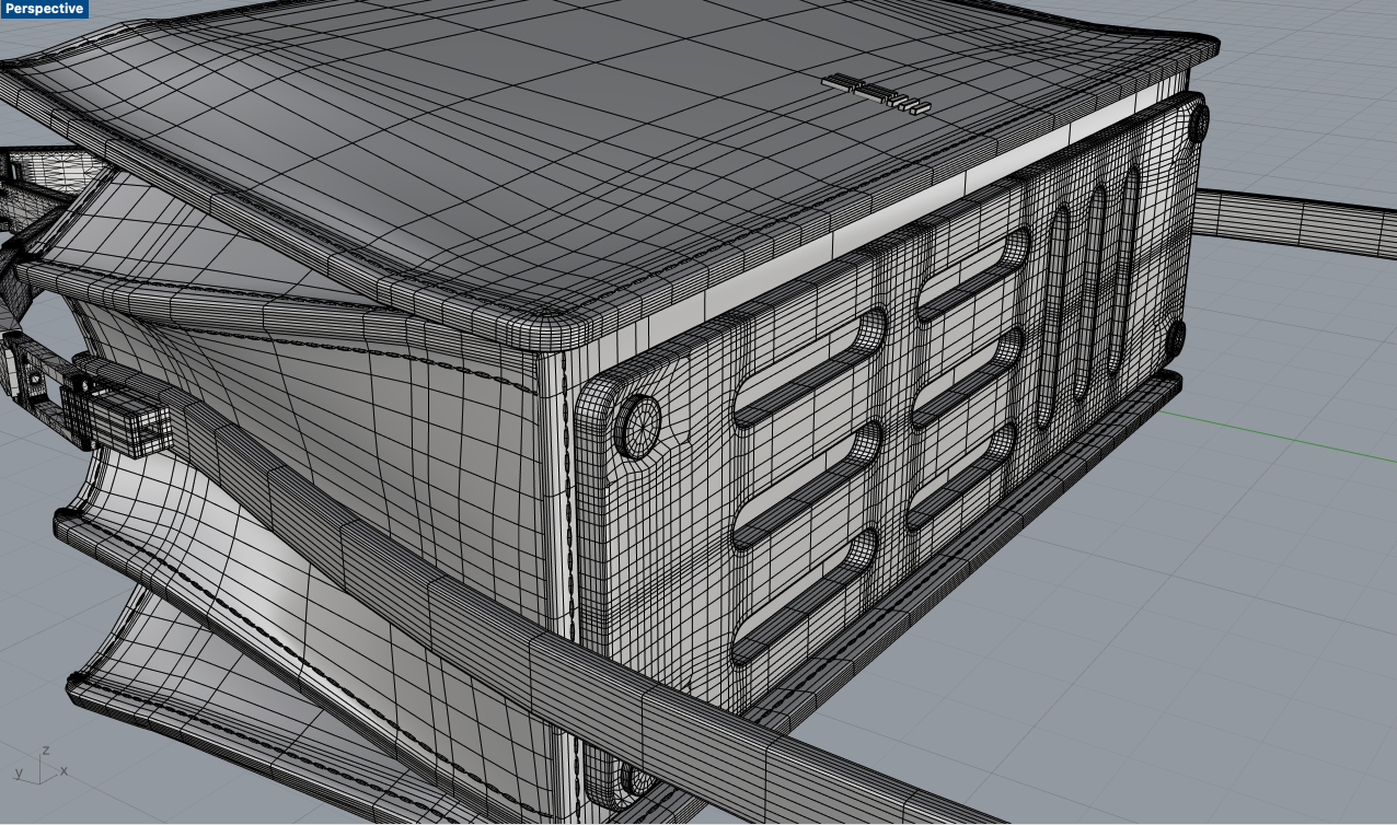
The plate is screwed, not riveted. Every hardware component on every object can be removed and replaced without cutting the leather.
07 Technical Package DRAWN TO BE MANUFACTURED
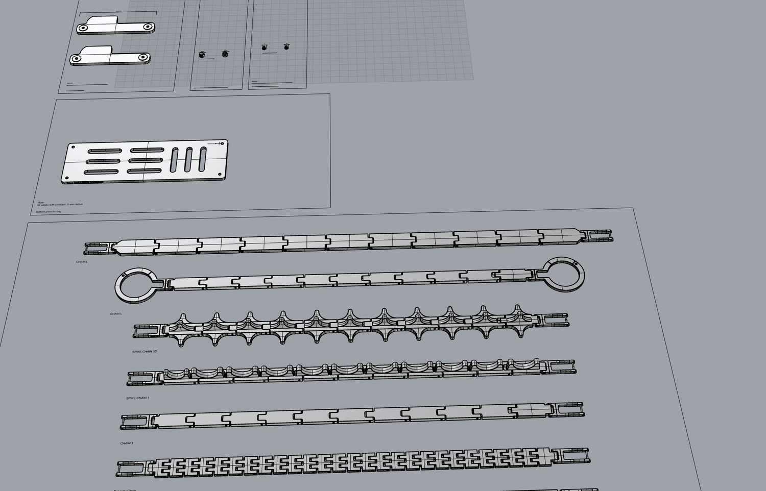
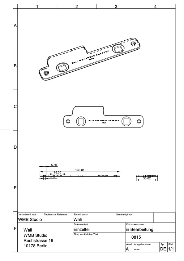
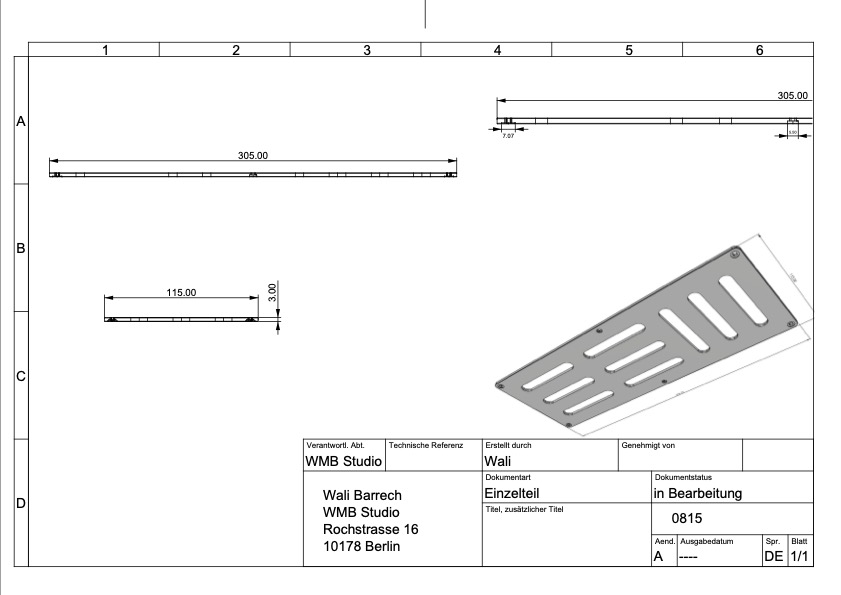
Hardware was issued to the supplier as dimensioned drawings. Parts were made to specification, not selected from a catalogue. Drawings are held in millimetres.
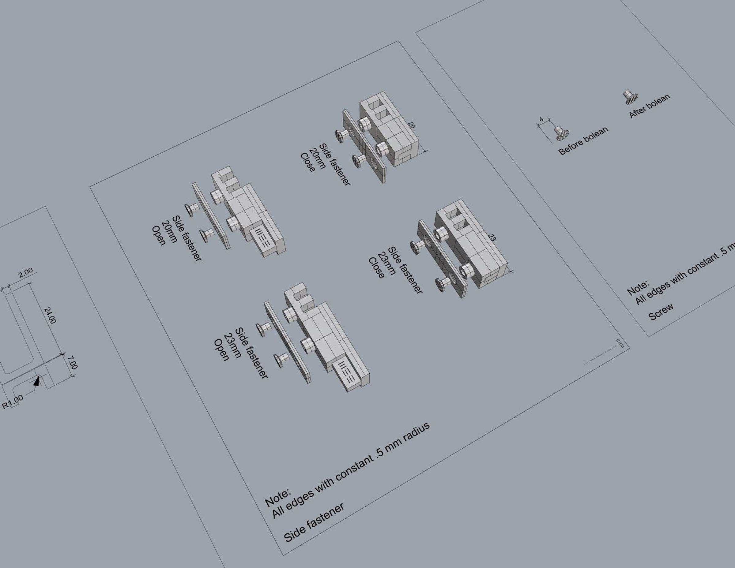
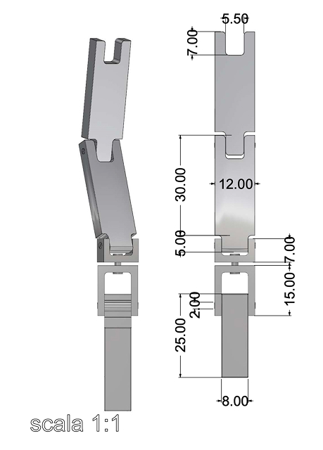
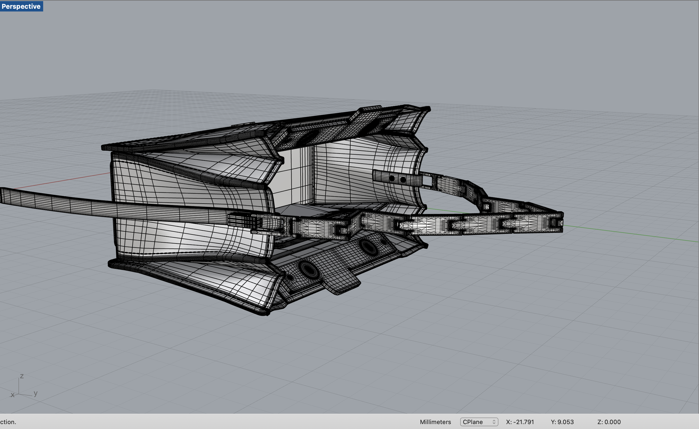
Working files. Geometry was resolved in Rhino before any part was cut.
08 Material and Manufacture WHY THESE MATERIALS
Epsom-grain calf and Mazzucchelli Rhodoid acetate were developed in parallel with the hardware system. The challenge was not to find luxurious materials, but materials that could coexist without competing.
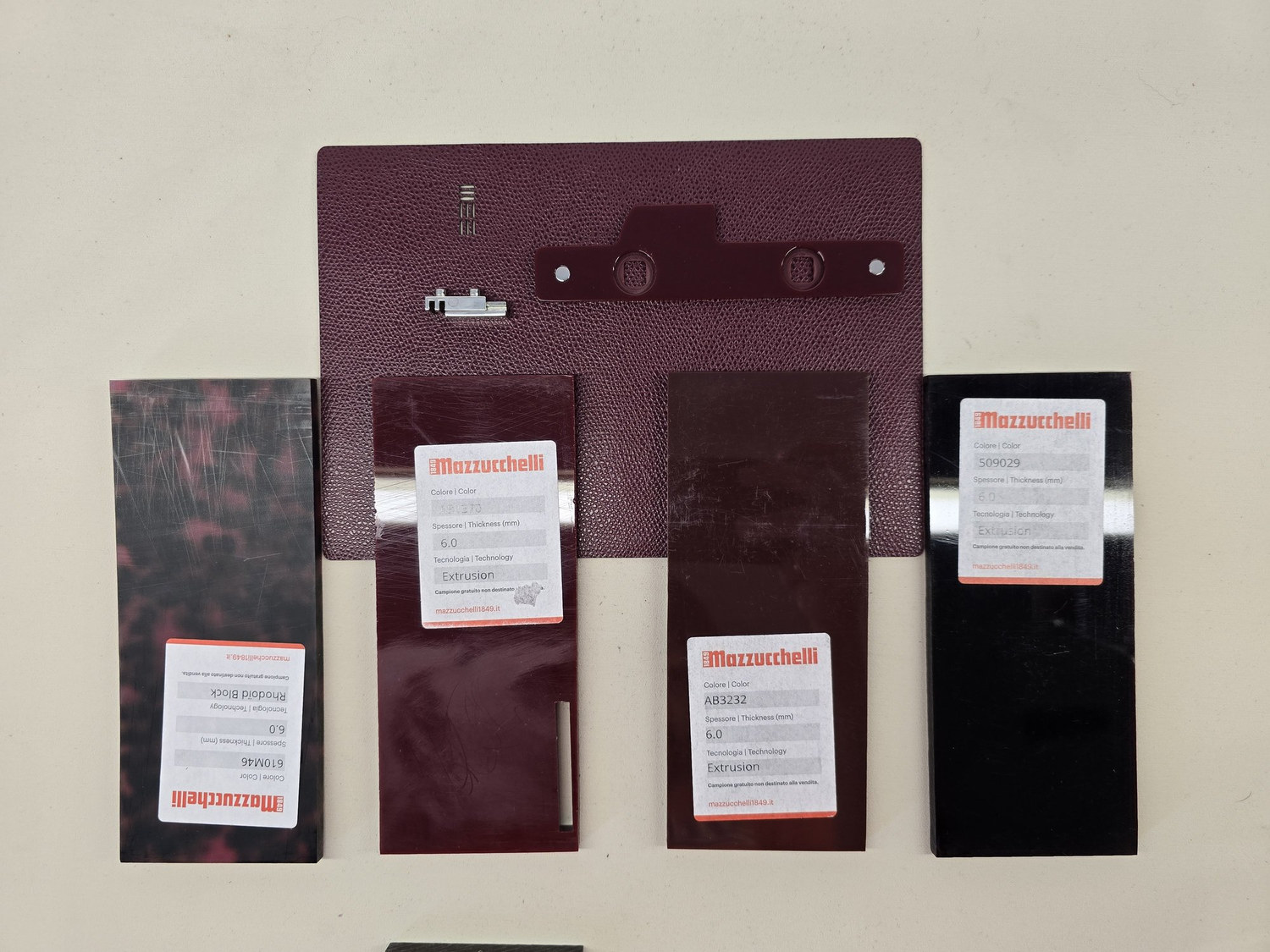
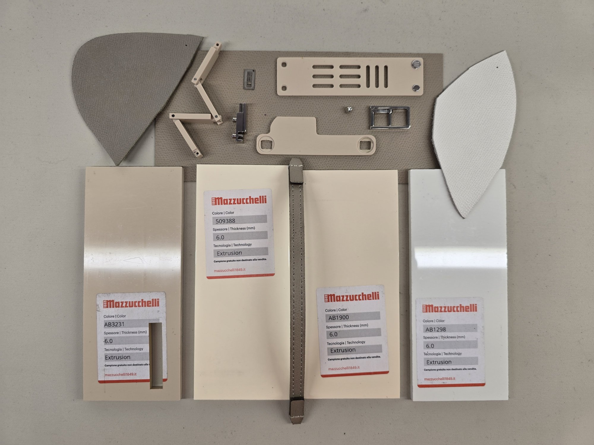
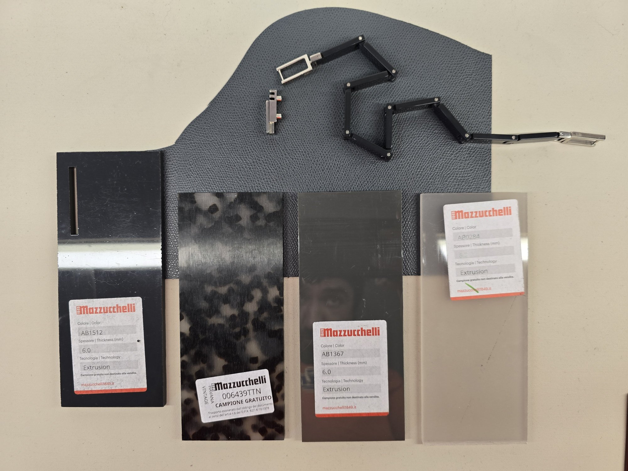
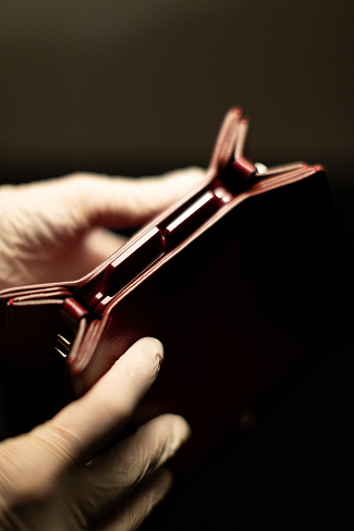
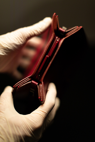
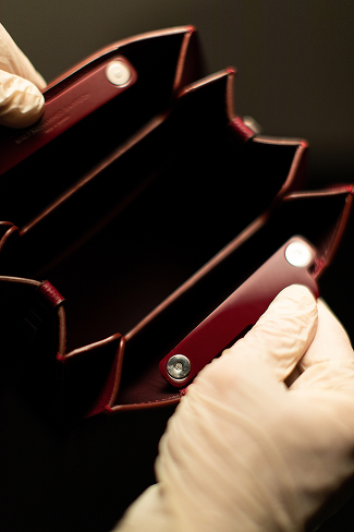
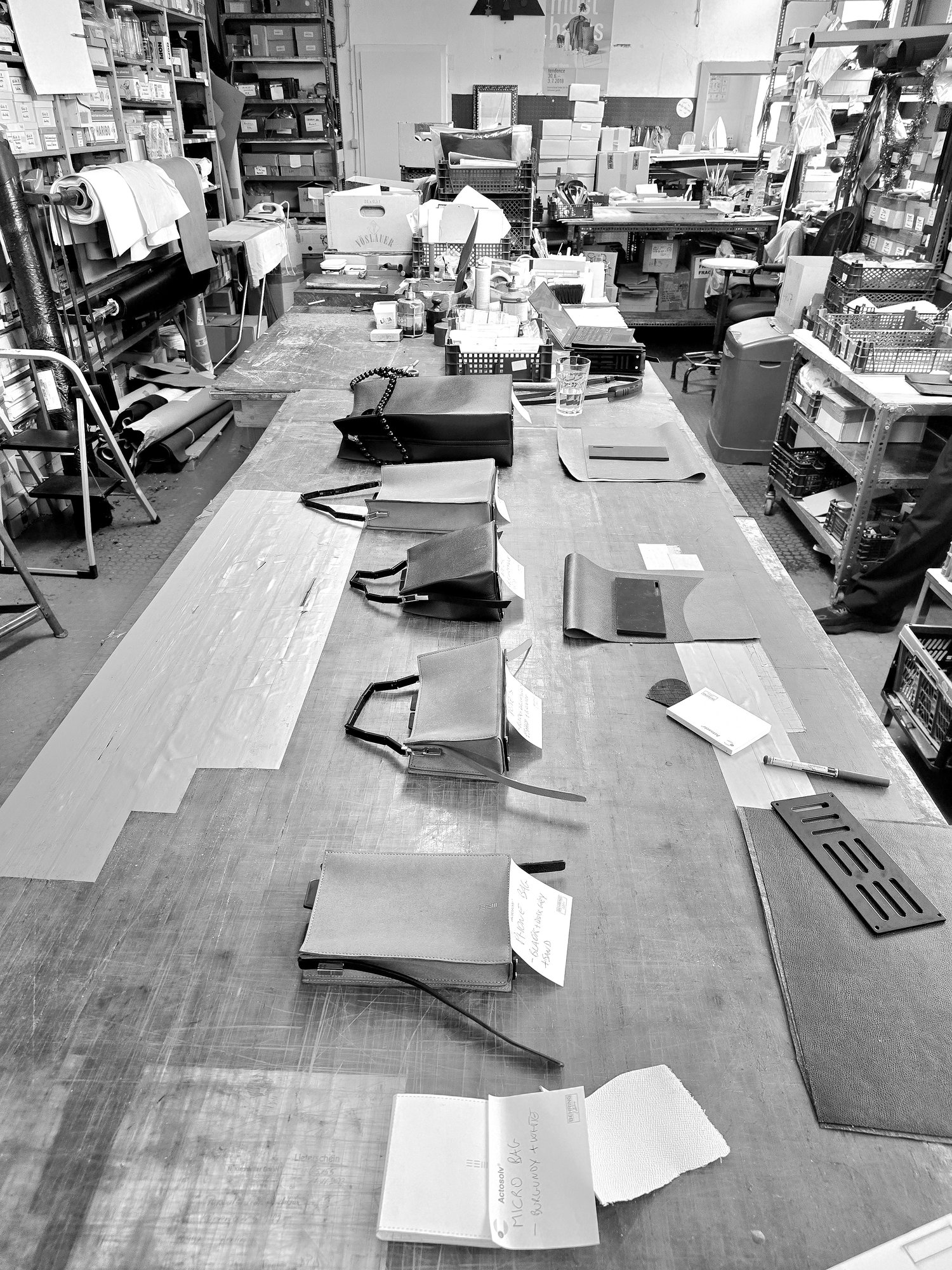
Hardware components are produced to drawing by an external suppliers. Bags are cut, assembled and finished by hand in the Berlin Atelier.
09 The System, Online EXAMINED RATHER THAN DESCRIBED
The six formats, their components and their colourways were rebuilt as a rotatable configurator, so the modular architecture can be examined directly rather than described.
Drag to interact and inspect.
10 Outcome WHERE IT STANDS
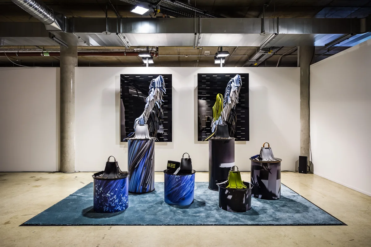
The collection launched in Berlin in 2025, followed by a dedicated showroom presentation in Paris.
The launch was supported by a still and moving image campaign, extending the design language consistently across product, communication and retail.
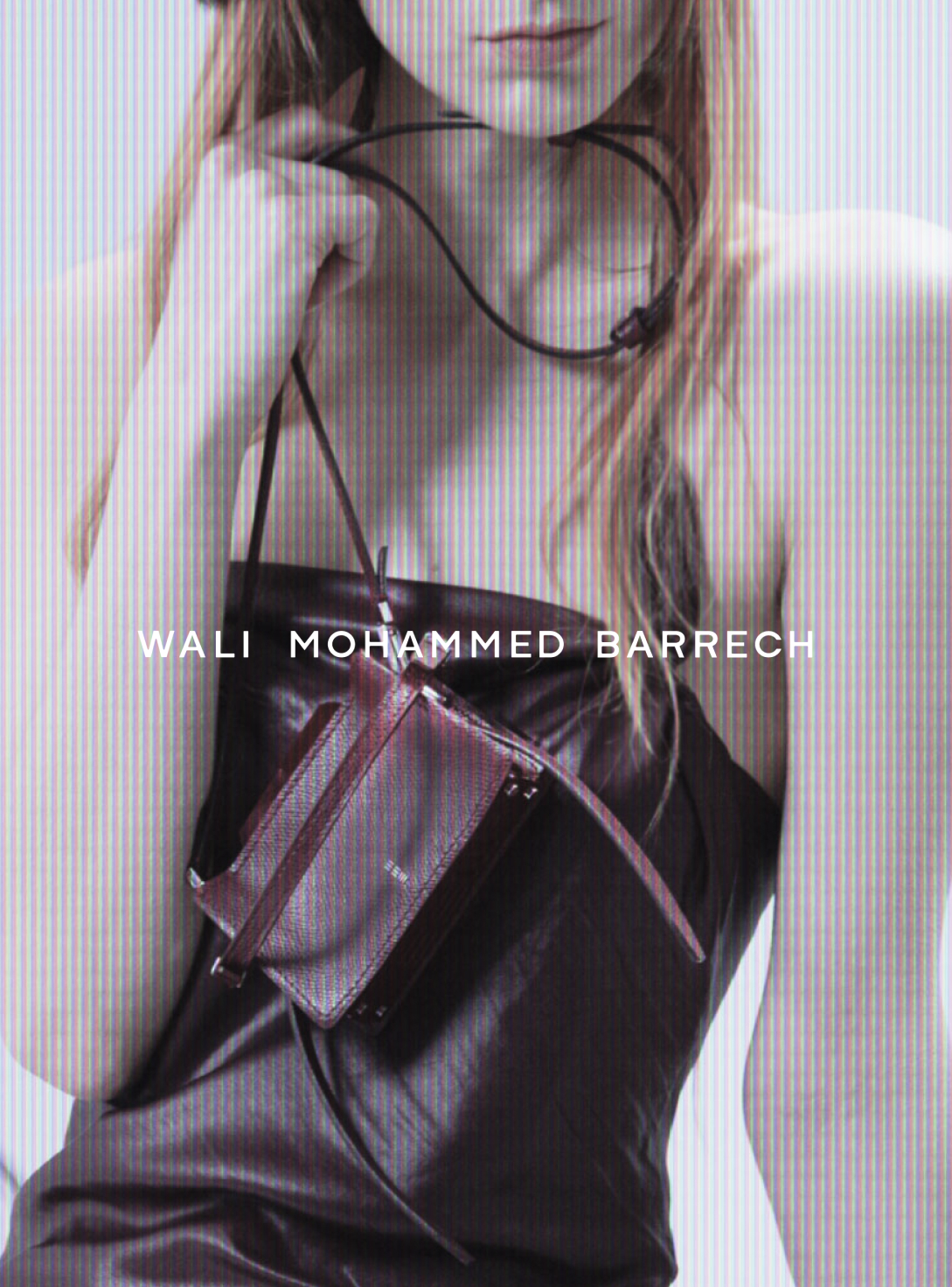
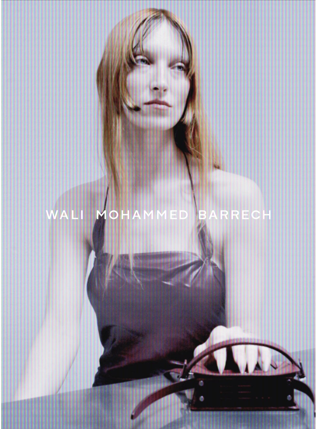
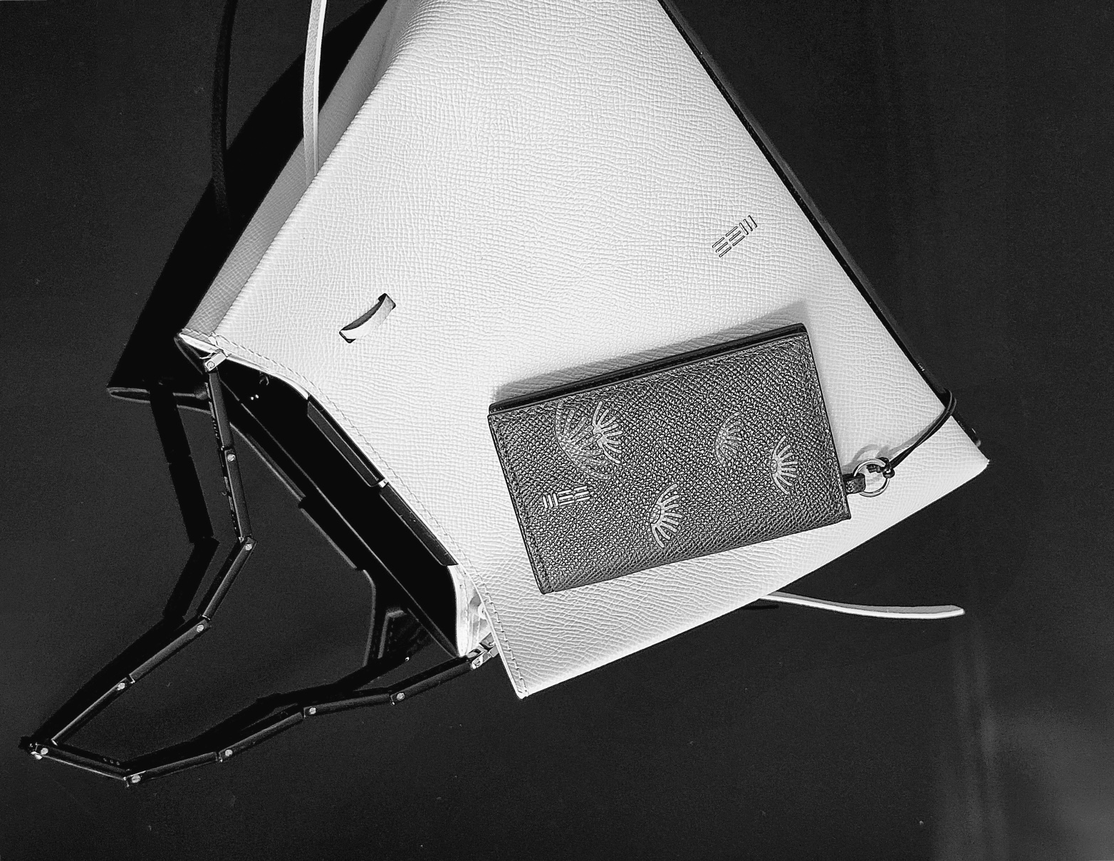
Since 2026, the system has expanded beyond bags to include a growing family of small leather goods, developed around the same hardware language and construction principles. Each piece is produced to order in the WMB Berlin atelier.
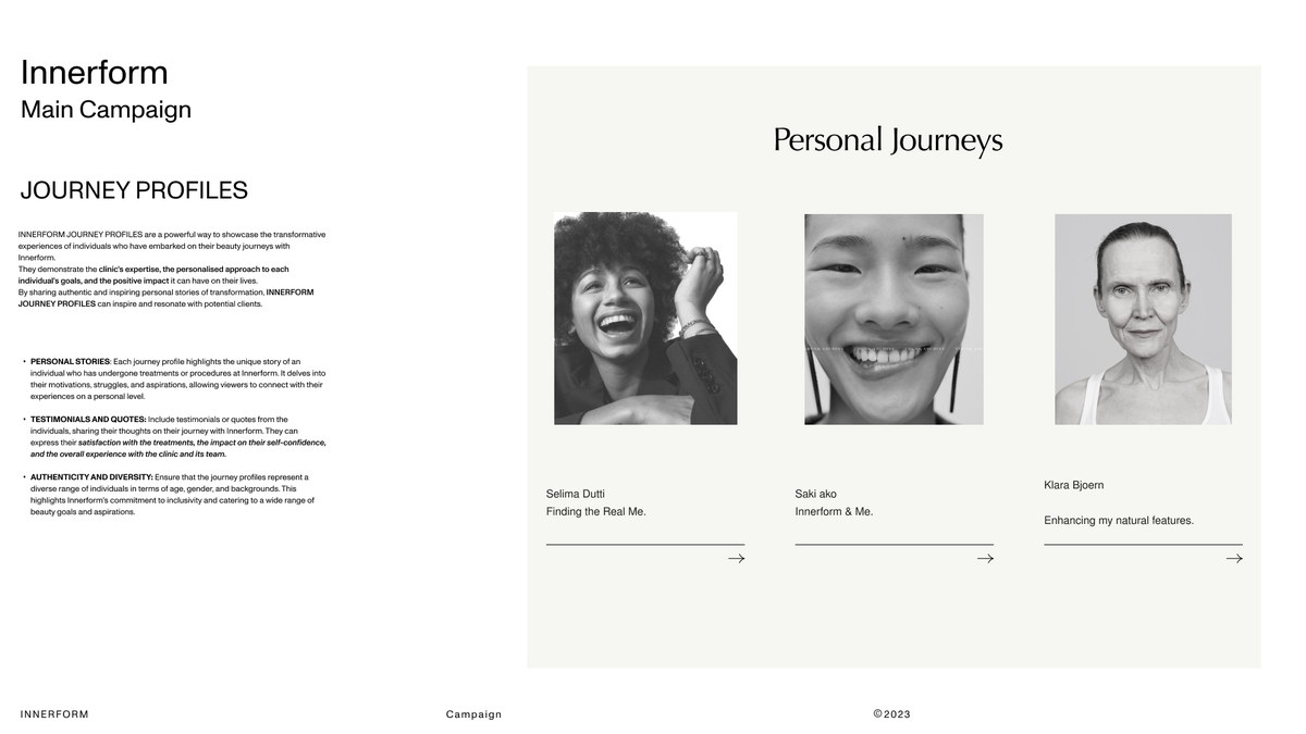
Innerform
01 Premise THE challenge
The cosmetic surgery market sells insecurity. Across almost every leading Berlin clinic the same pattern held: idealised, heavily retouched imagery, youth as the dominant aspiration, and information consistently second. The question was whether a clinic could make patients feel informed before they felt persuaded.
02 Listening MARKET STUDY · BERLIN · 2022
Every leading Berlin clinic was analysed against the same criteria: imagery, tone, information hierarchy, and what the patient is asked to do first.
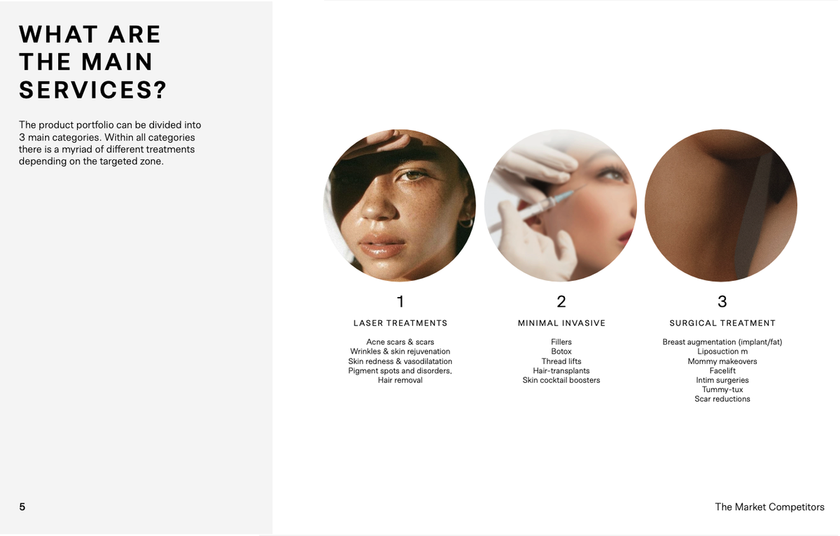
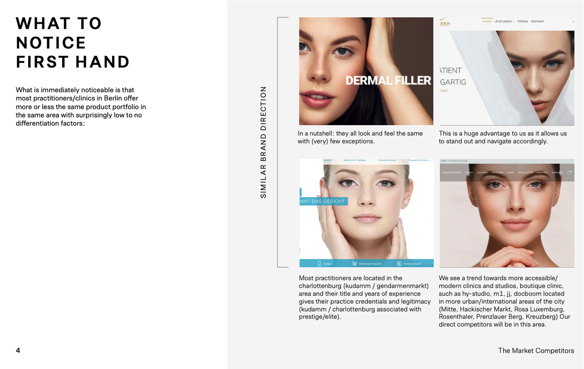
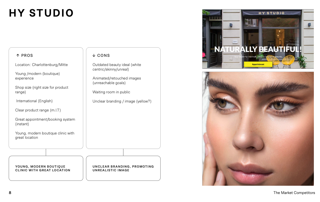
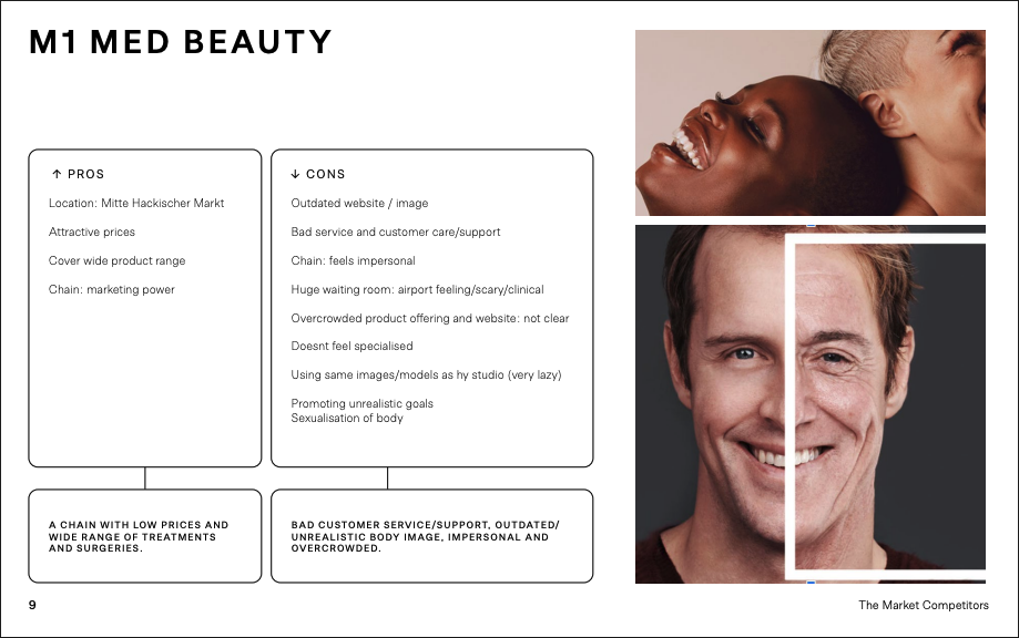
Two in three patients arrive already seeking a full consultation, before choosing any procedure. Patients were not struggling to choose. They were struggling to understand.
“I spent weeks searching online because I couldn’t find clear answers.”
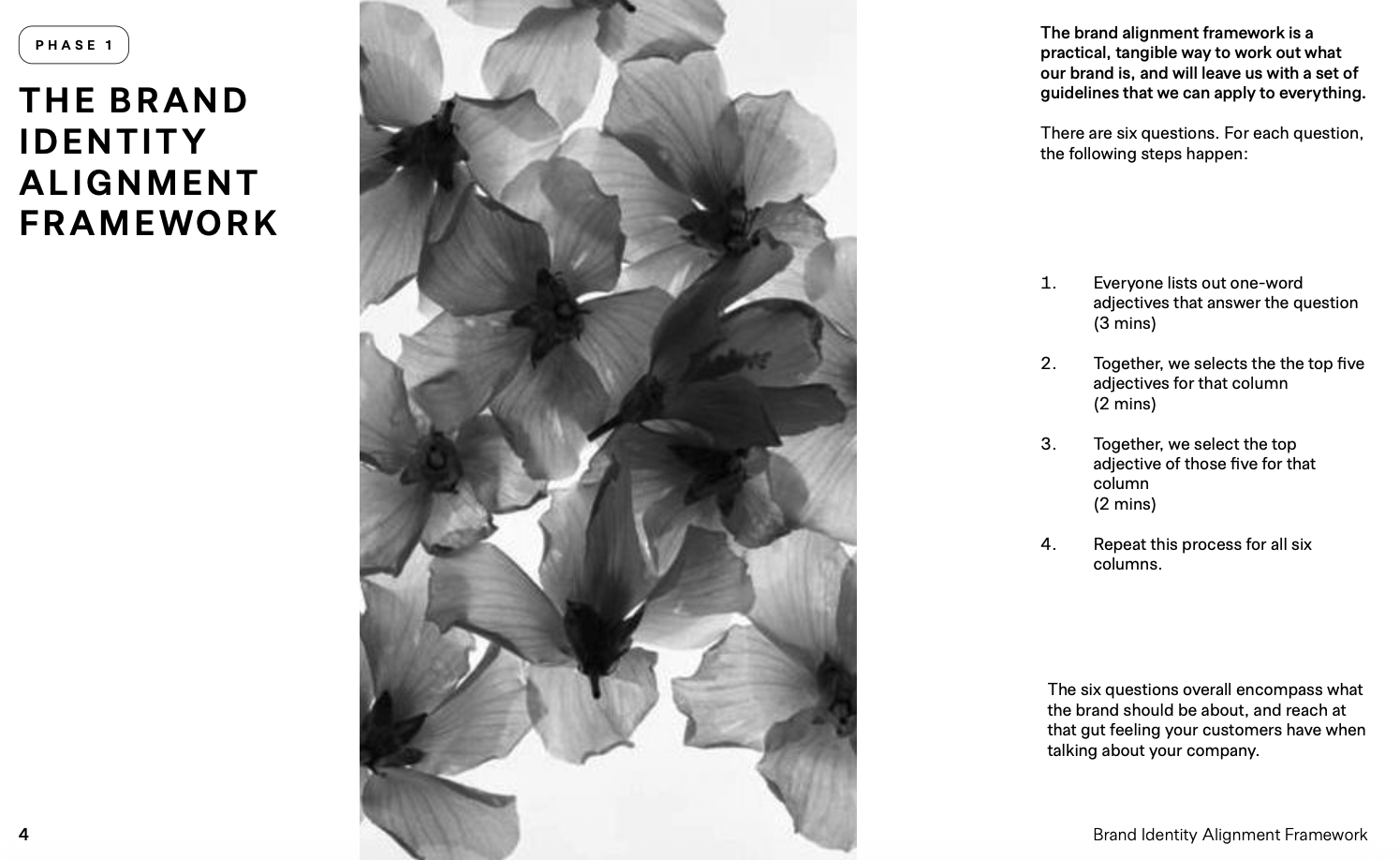
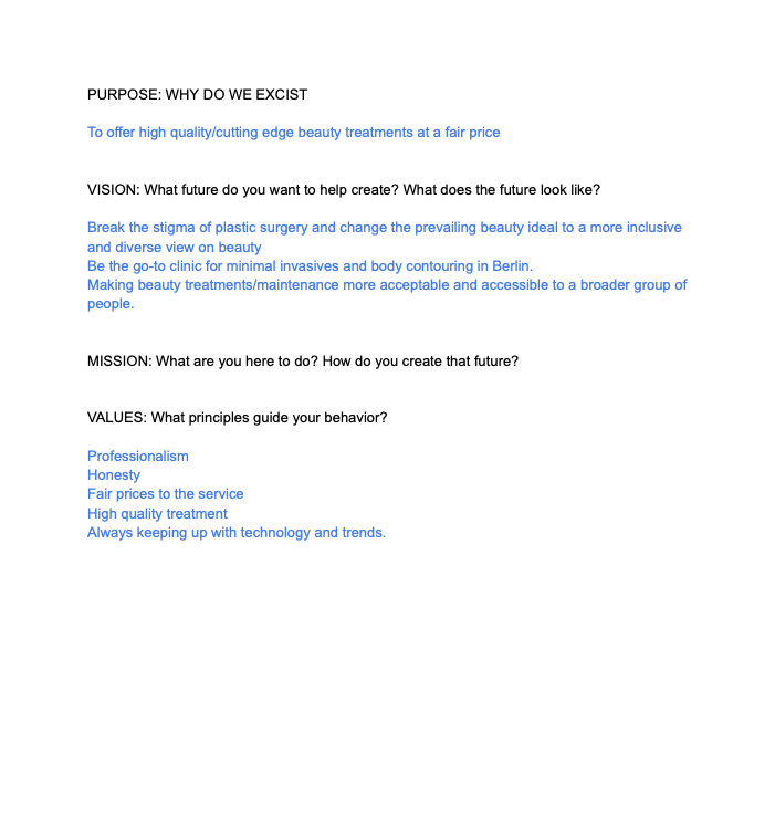
03 Strategy THE BRAND ALIGNMENT FRAMEWORK
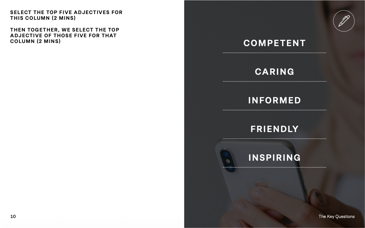
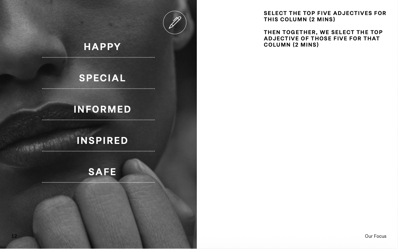
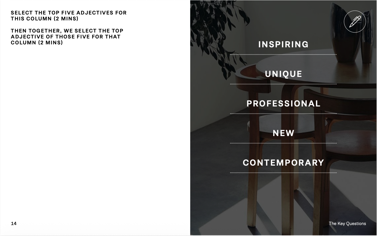
The brand was defined before it was designed. Six questions, run as a timed exercise: each participant lists one-word adjectives, the group narrows to five, then to one. Repeated for all six columns.
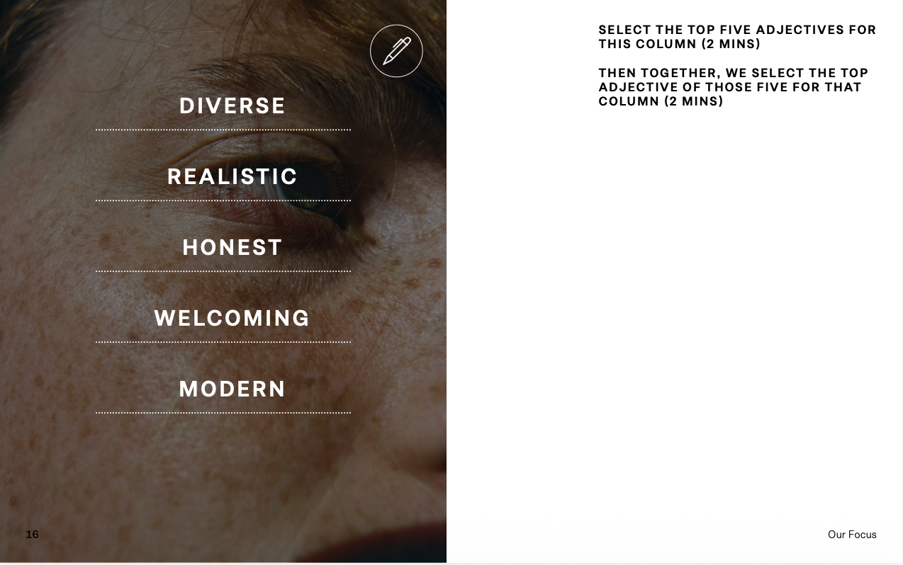
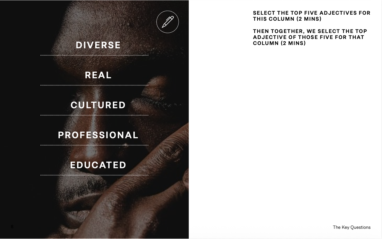
| Question | Selected five | Chosen | |
|---|---|---|---|
| 01 | Culture | Professional · Inclusive · Modern · Honest · Designed | Professional |
| 02 | Customers | Diverse · Real · Cultured · Professional · Educated | Diverse |
| 03 | Voice | Competent · Caring · Informed · Friendly · Inspiring | Informed |
| 04 | Benefit | Happy · Special · Informed · Inspired · Safe | Safe |
| 05 | Value | Inspiring · Unique · Professional · New · Contemporary | Contemporary |
| 06 | X-factor | Diverse · Realistic · Honest · Welcoming · Modern | Honest |
The framework produced the rule the whole project runs on: information before persuasion.
04 Three Principles WHAT THE FRAMEWORK PRODUCED
Human before clinical
The clinic was designed to feel like a place of care rather than a place of treatment. Consultation became a human conversation first, with the clinical environment deliberately receding into the background.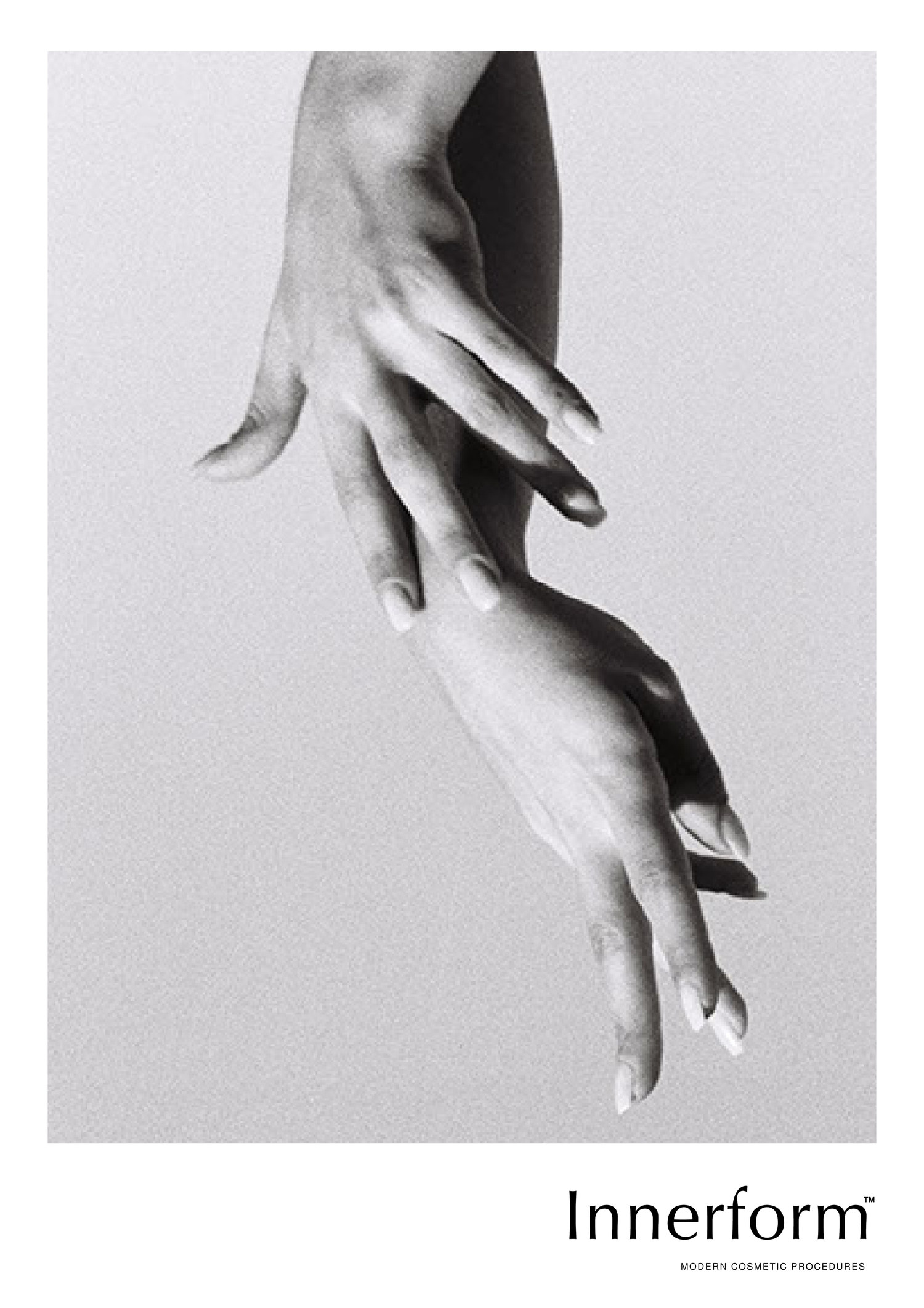
Knowledge before persuasion
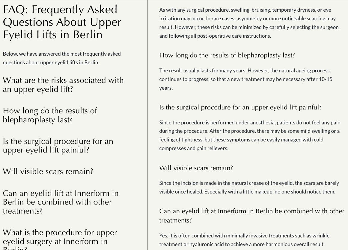
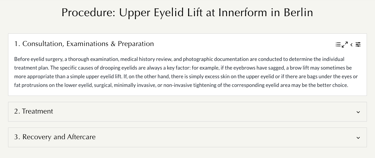
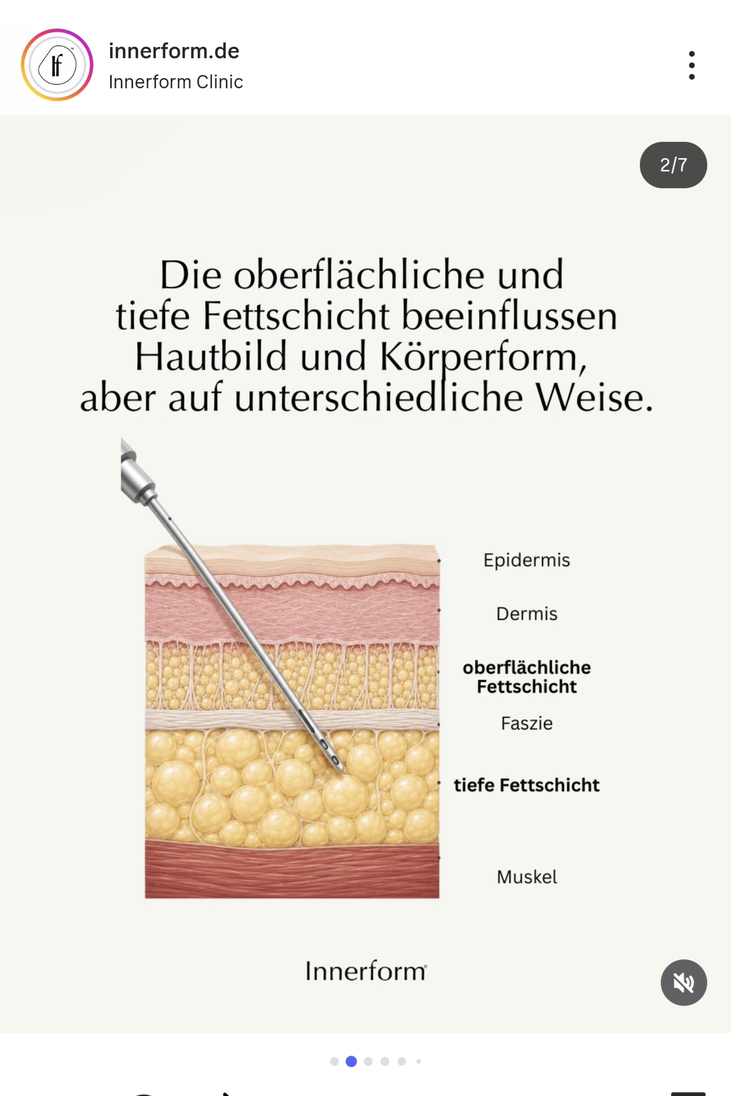
Information came before commitment. Every procedure page begins with consultation and ends with recovery. The same rule applied to social media, print and the consultation itself. The
Confidence through restraint
Every touchpoint was reduced to its essential elements. Confidence came from clarity, not volume.

05 Name EIGHTY NAMES, FOUR DIRECTIONS, ONE PRINCIPLE
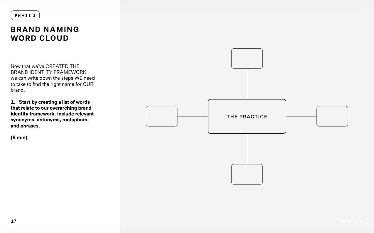
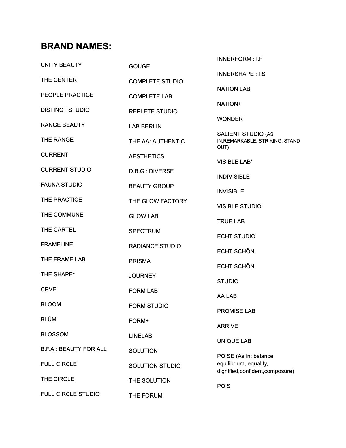
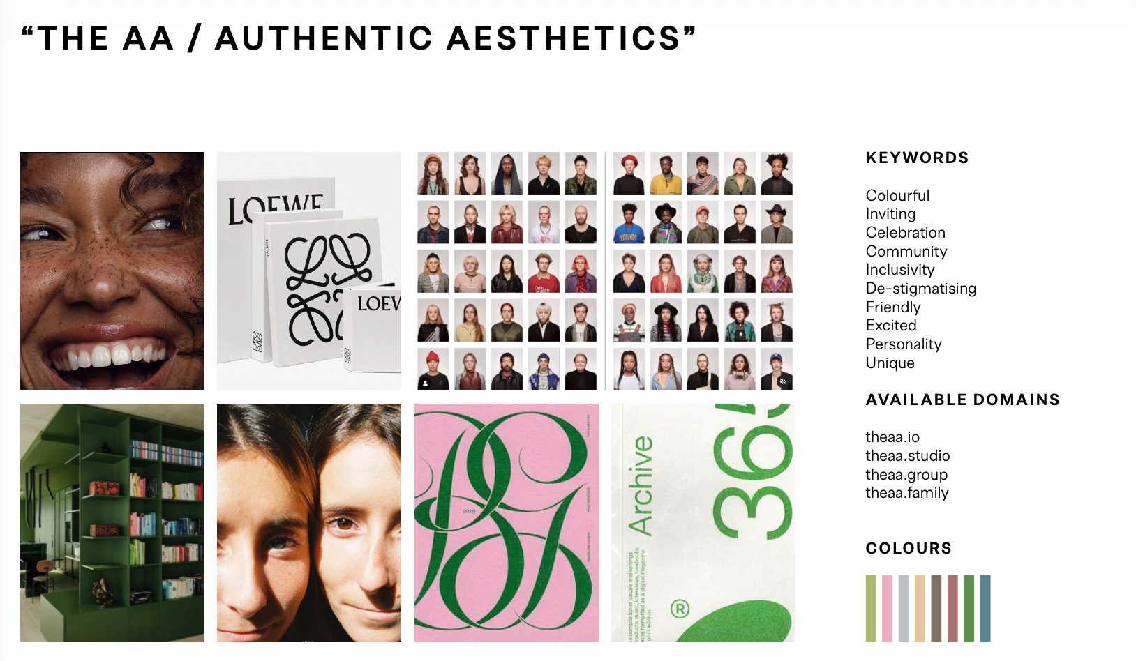
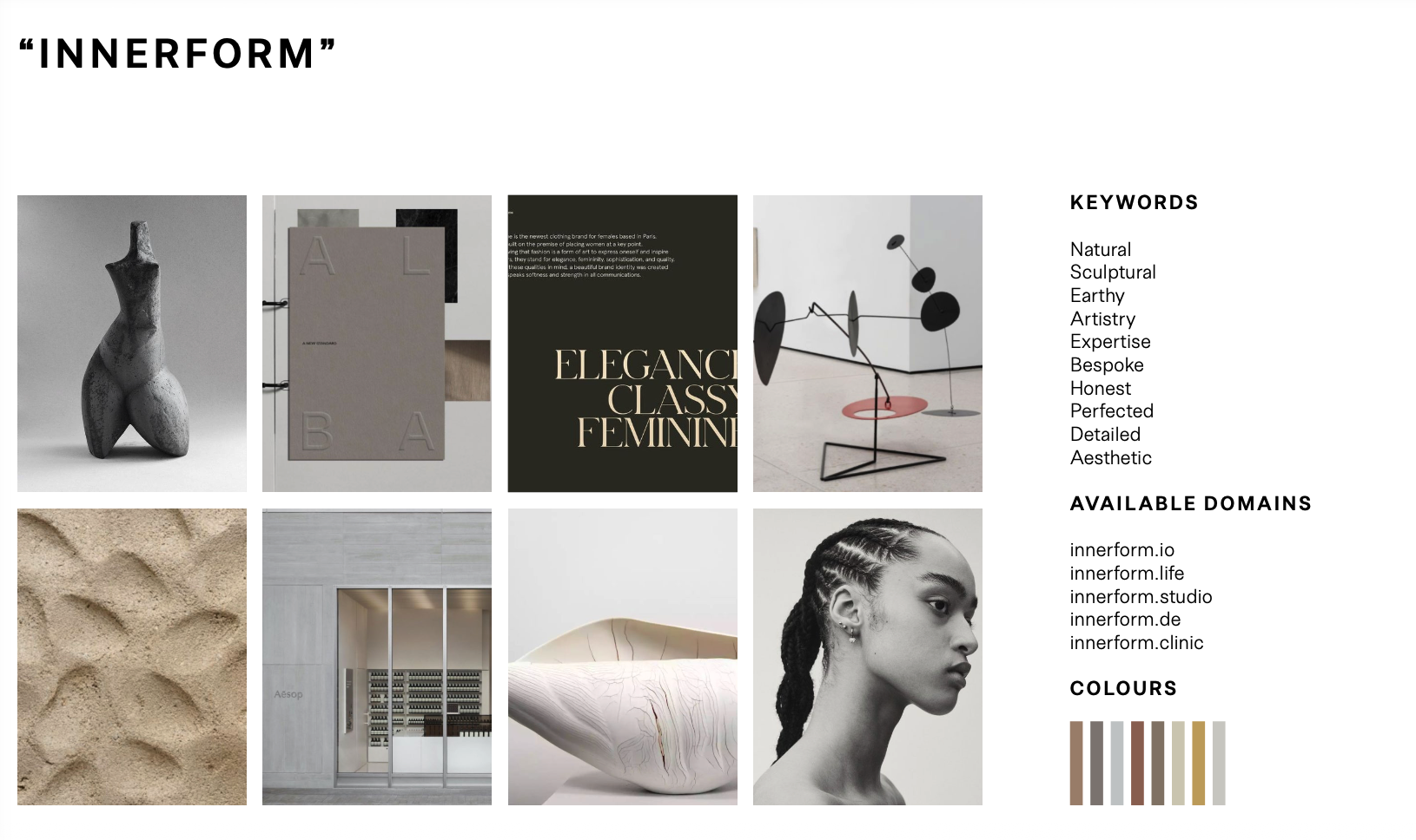
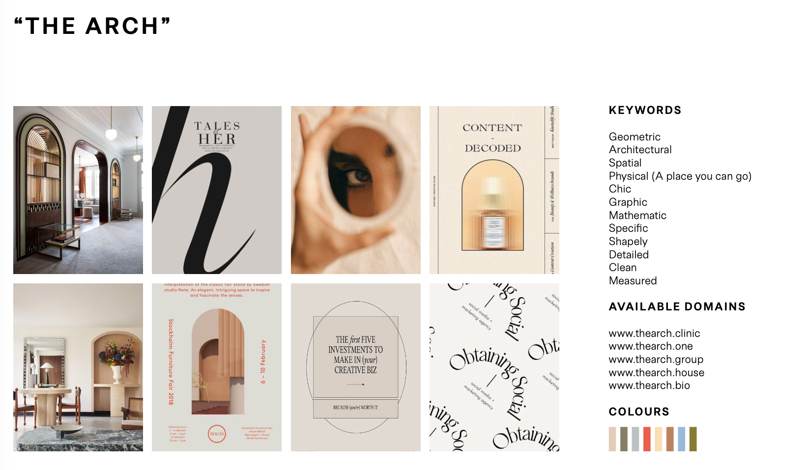
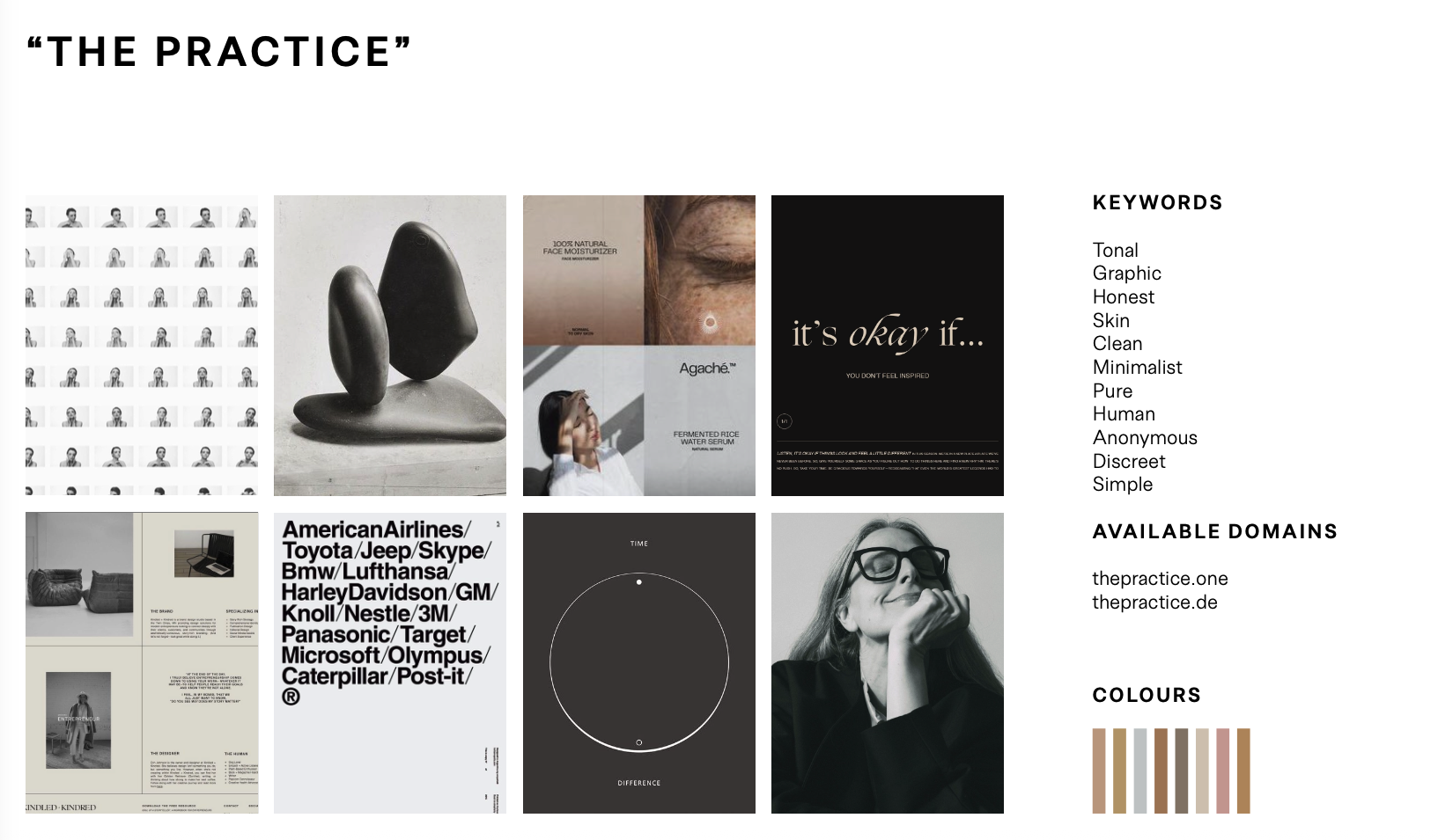
The brand did not exist. Rather than choosing a name immediately, four directions were each developed into a complete identity system — keywords, imagery, palette, available domains — before any decision was made.
| Direction | Keywords | Verdict | |
|---|---|---|---|
| 01 | Innerform | Natural · sculptural · earthy · artistry · expertise · bespoke · honest | Chosen |
| 02 | The Arch | Geometric · architectural · spatial · chic · mathematic · measured | Rejected |
| 03 | The AA / Authentic Aesthetics | Colourful · inviting · celebration · community · inclusivity | Rejected |
| 04 | The Practice | Tonal · graphic · honest · skin · clean · minimalist · anonymous | Rejected |
Three directions expressed a mood. One expressed a principle. Innerform was the only name that could be tested against the patient experience. “Inner,” the essence. “Form,” its sculpture.
06 Identity THE MARK AND THE SYSTEM
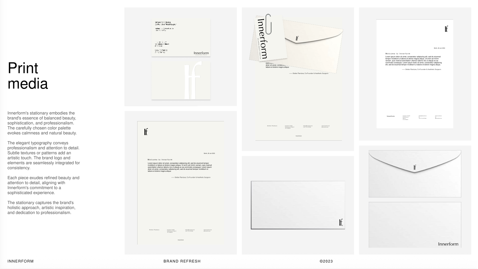
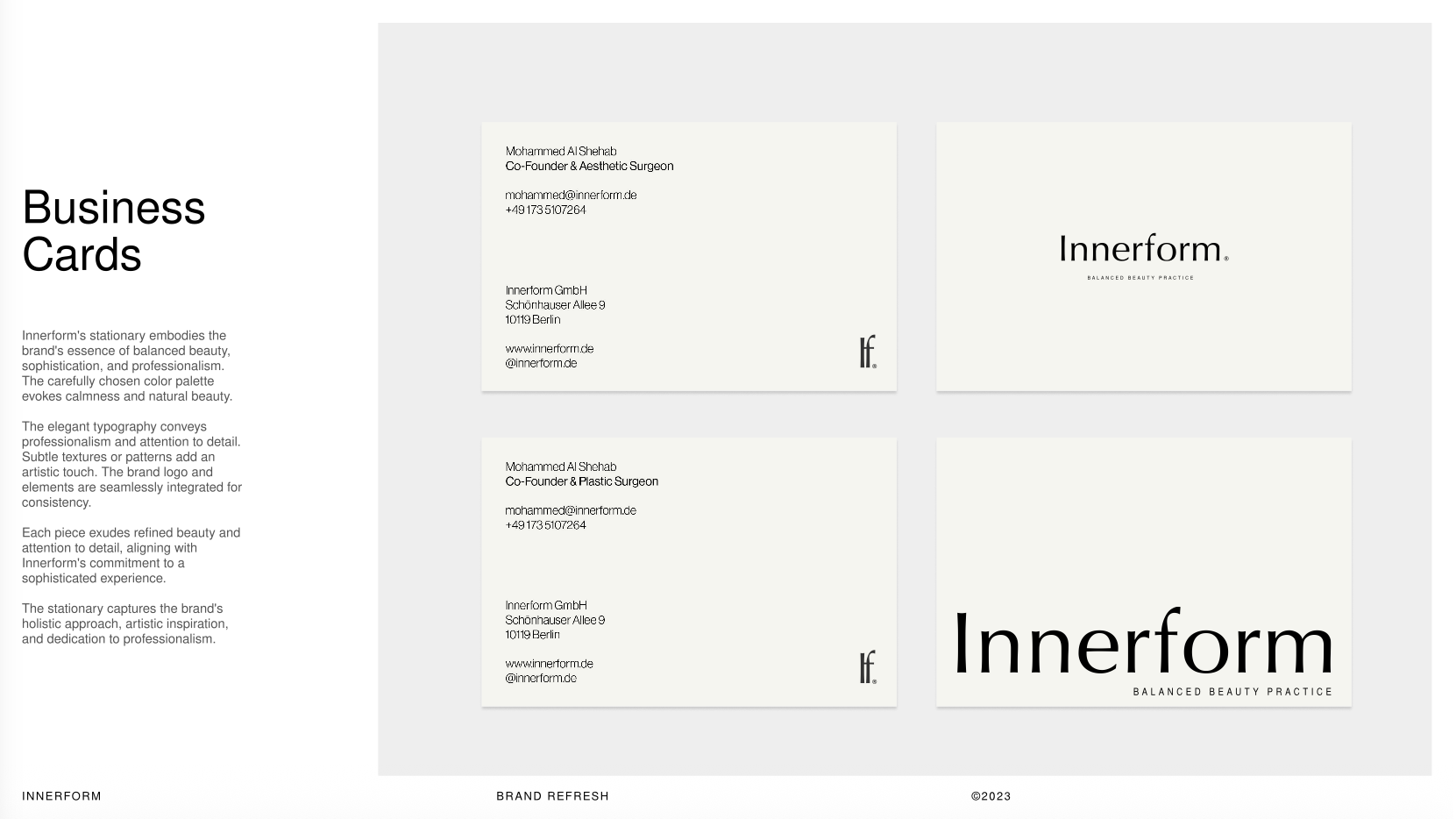
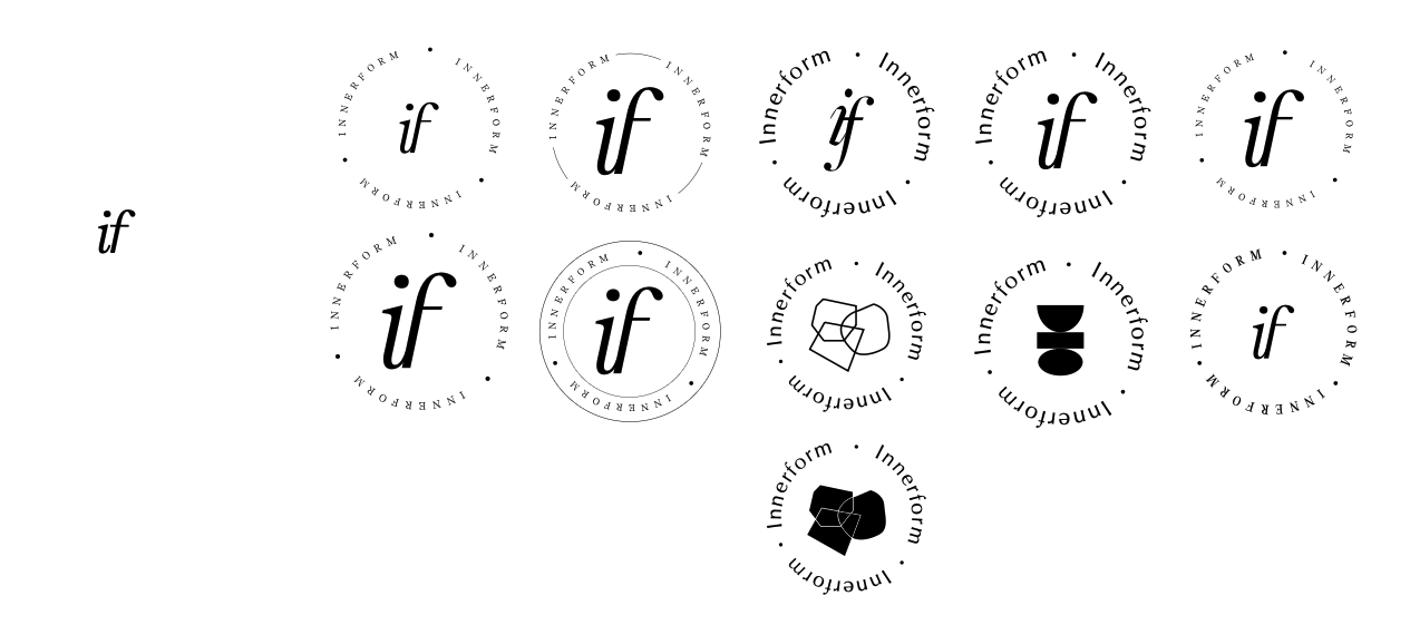
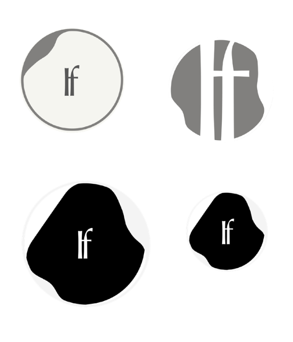
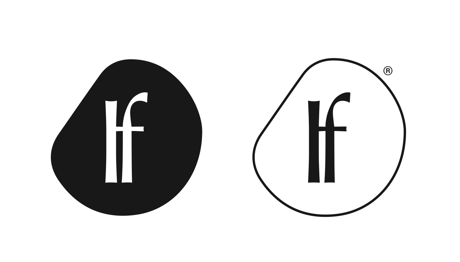
The mark went through the same reduction as the strategy: Many variants, tested, narrowed, resolved to one.
07 The Body as Sculpture CAMPAIGN
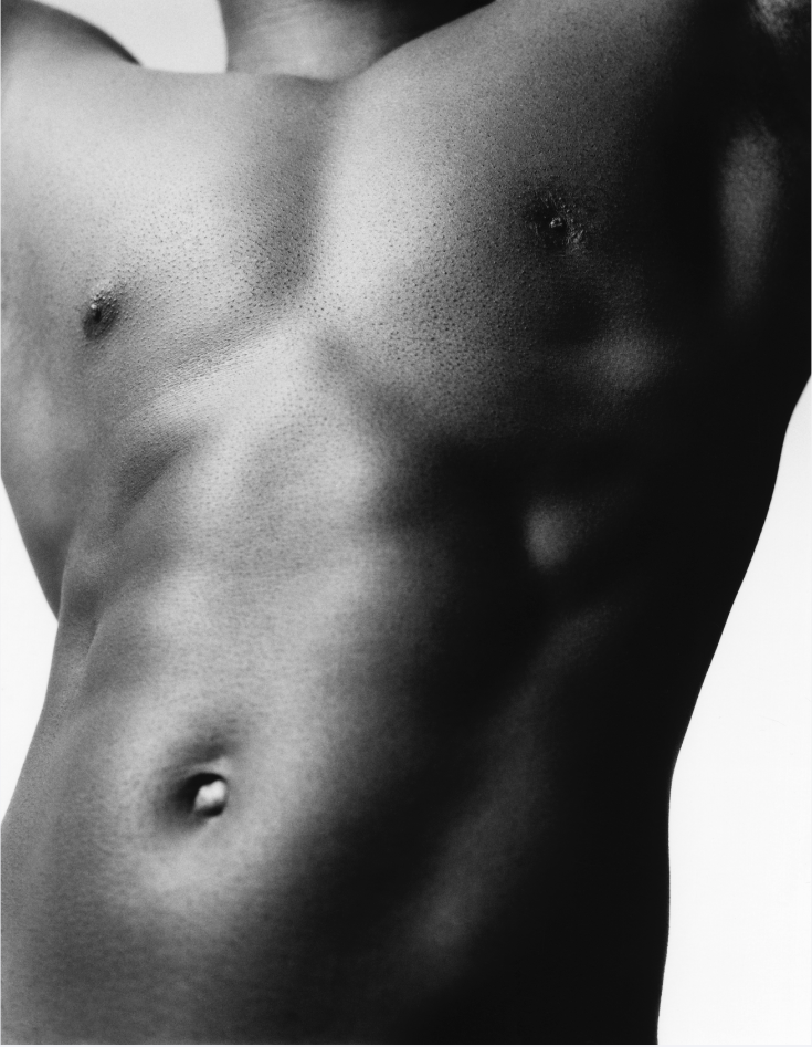
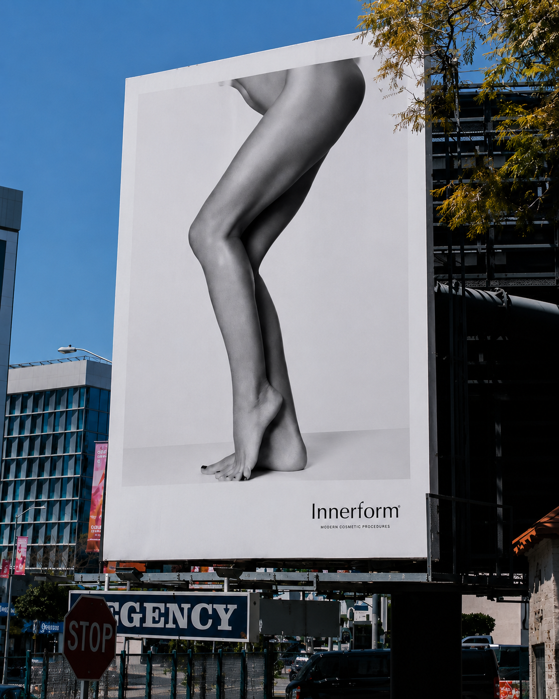
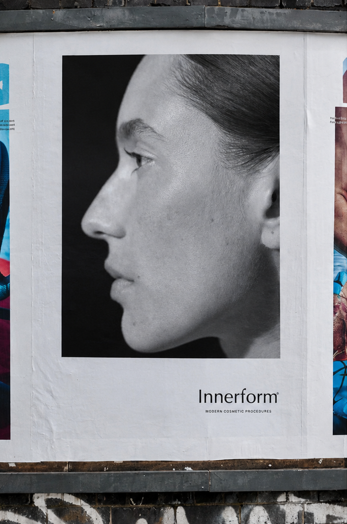
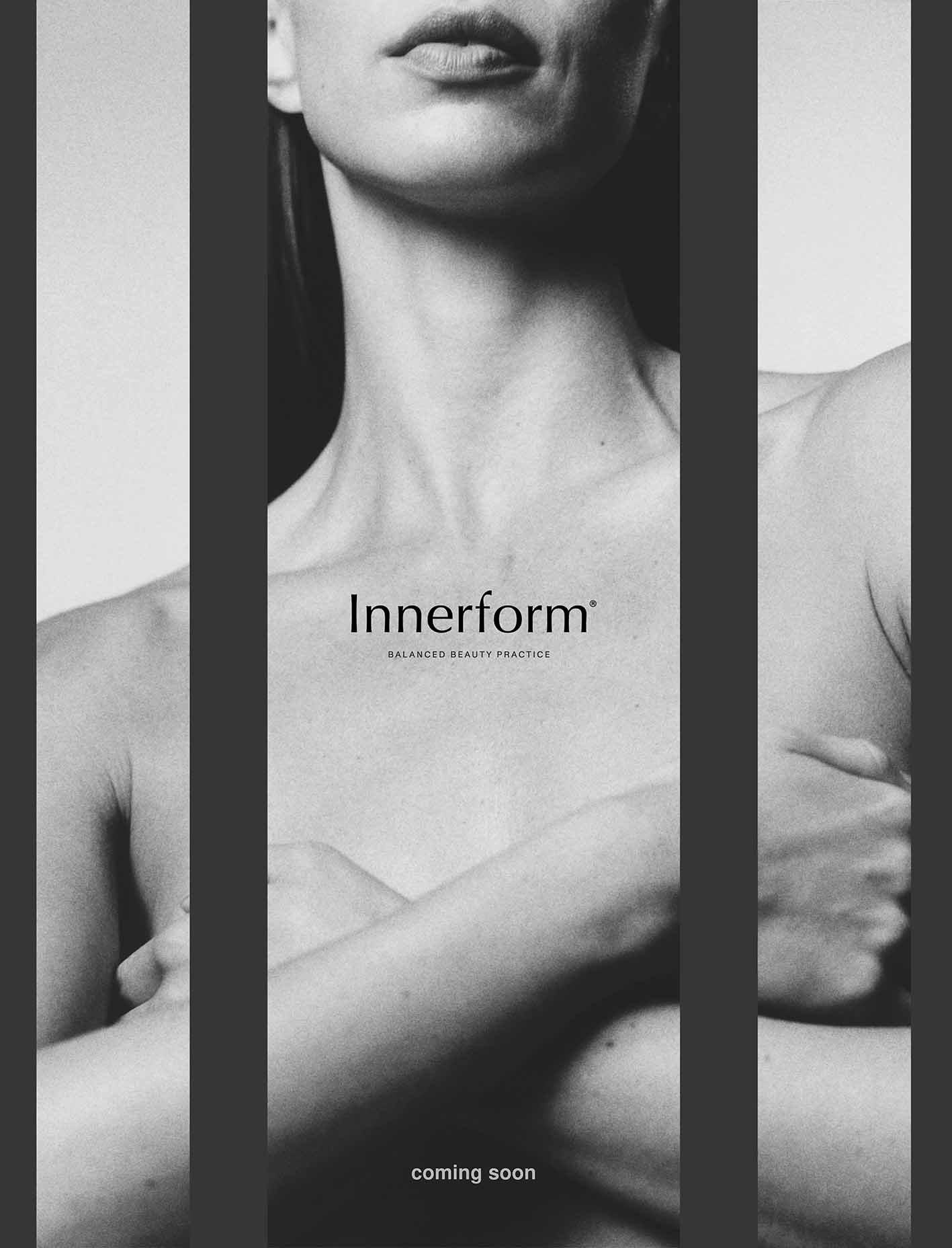
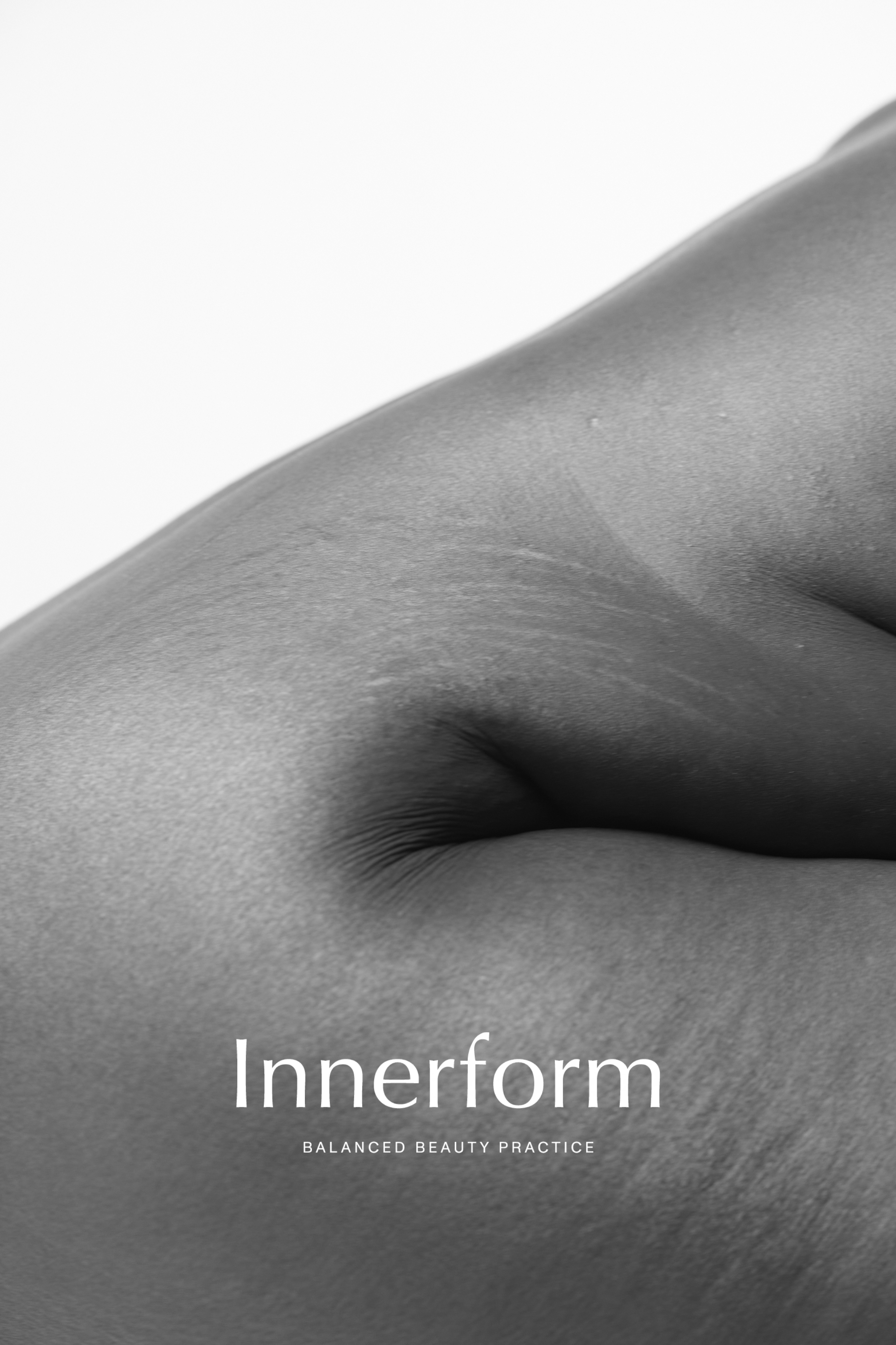
Drawing from the tradition of sculptural photography, the campaign presents the body as form rather than anatomy. Monochrome compositions celebrate light, texture and proportion, reflecting Innerform’s philosophy of enhancing rather than correcting the human body.
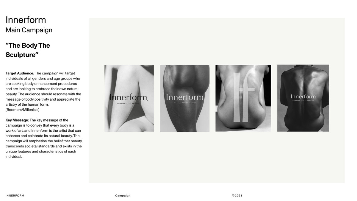
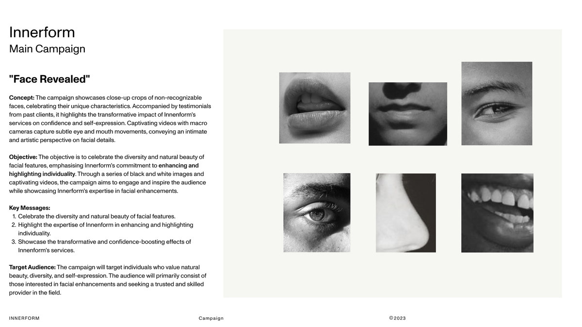
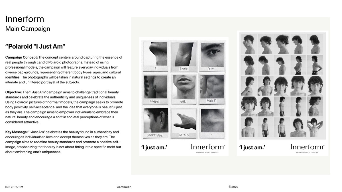
Budget allowed two productions: the Body Sculpture photography and the campaign films. The remaining three concepts were developed to concept and not shot.
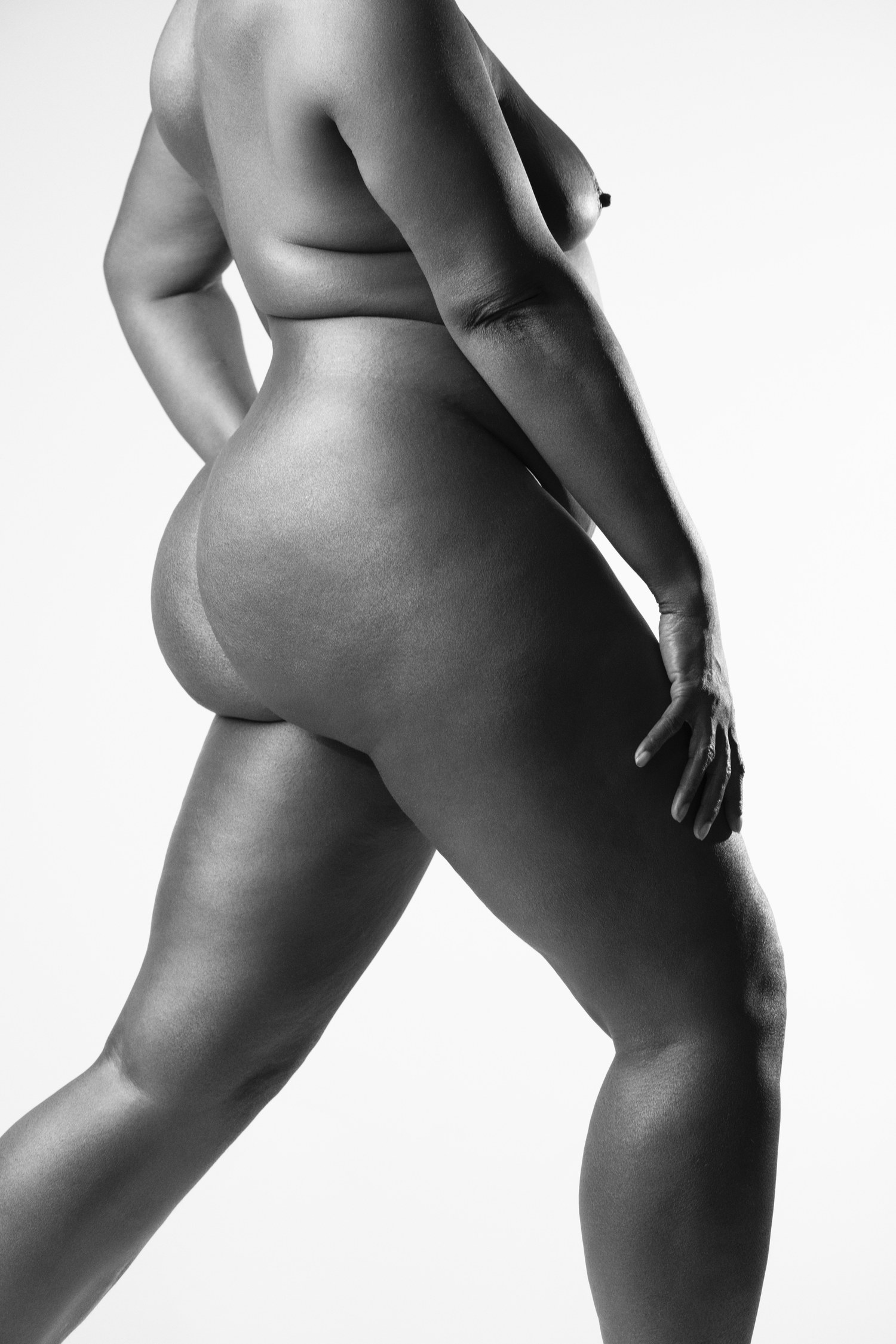
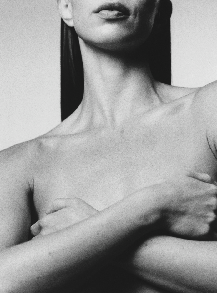
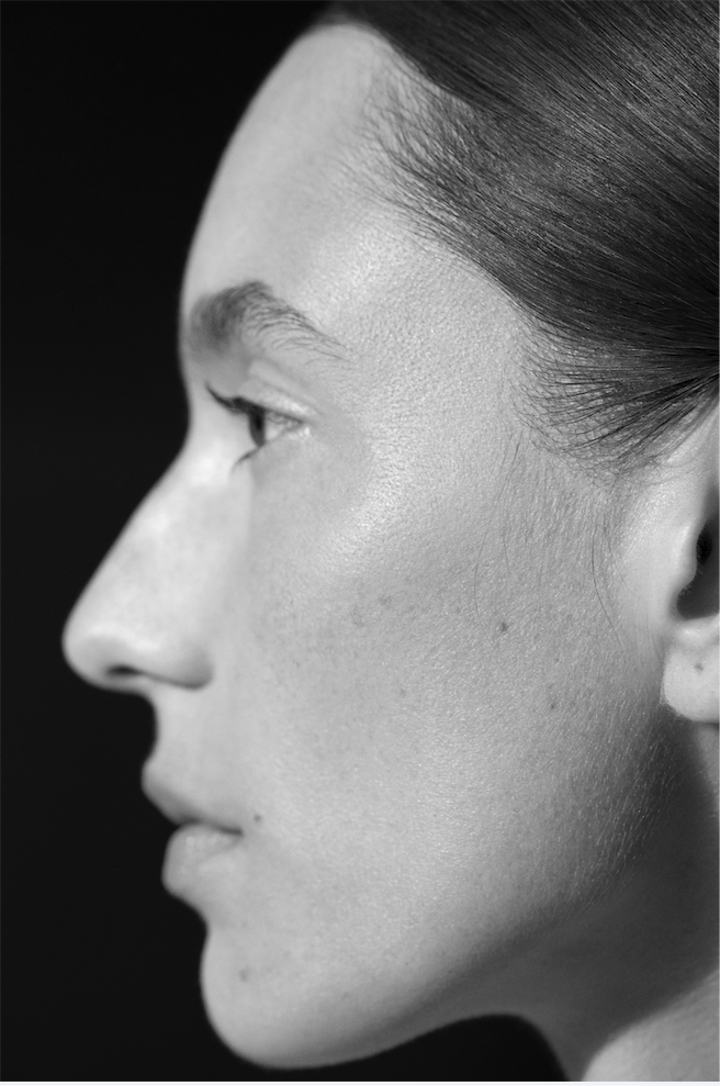
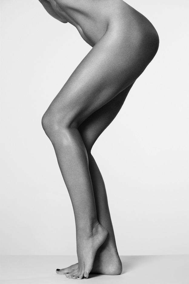
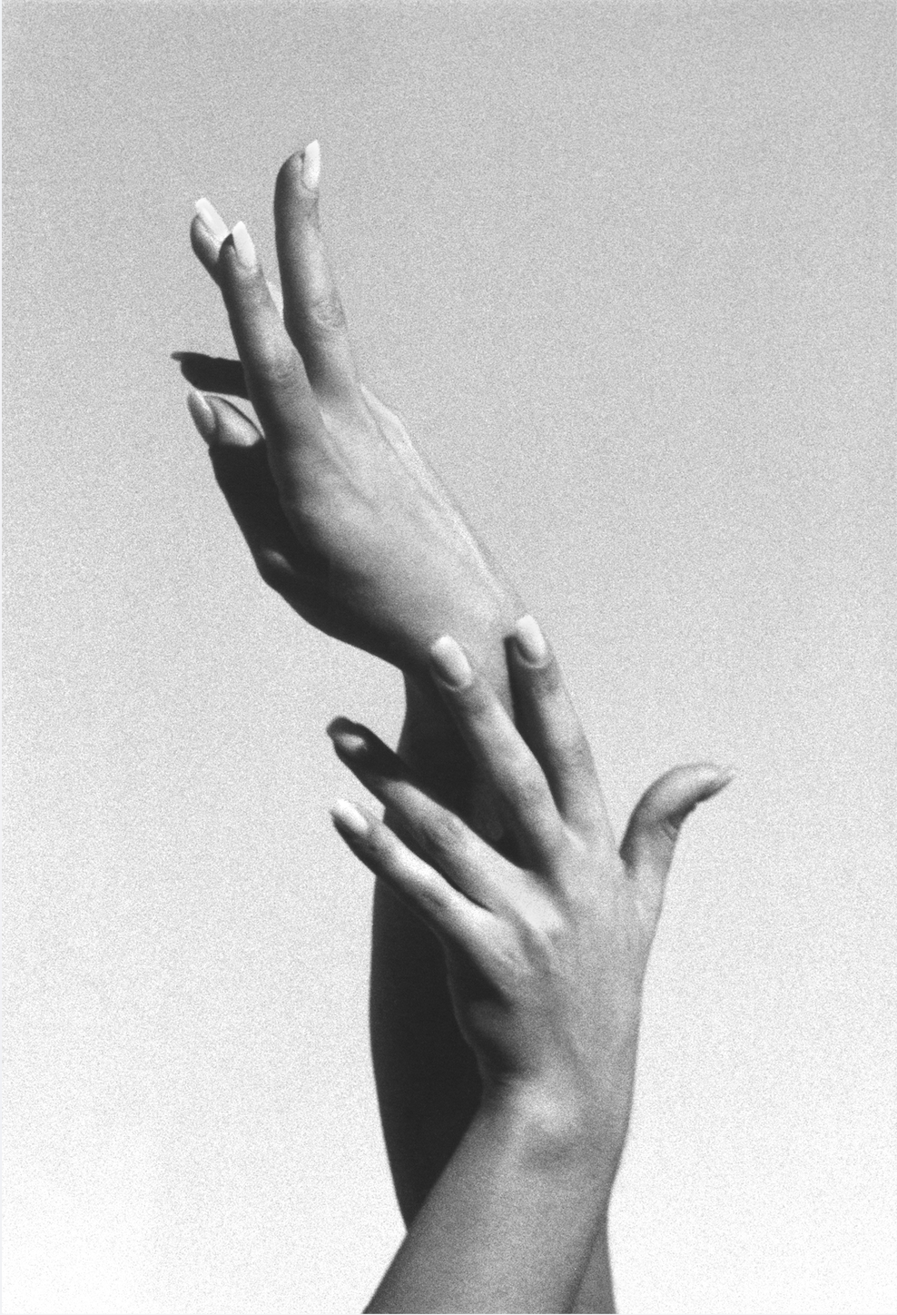
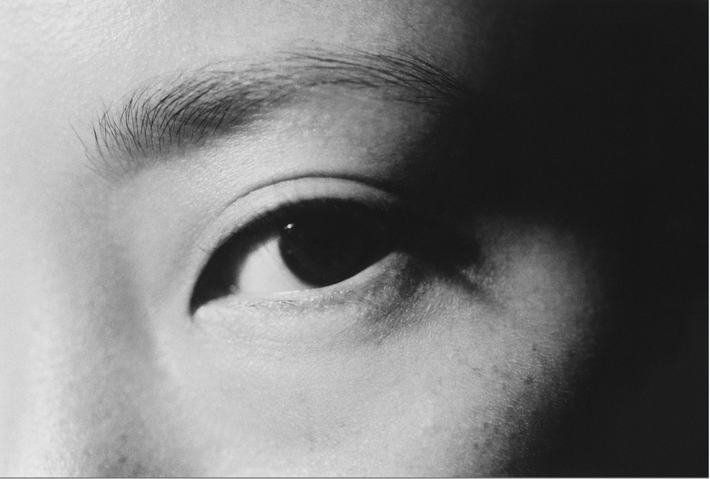
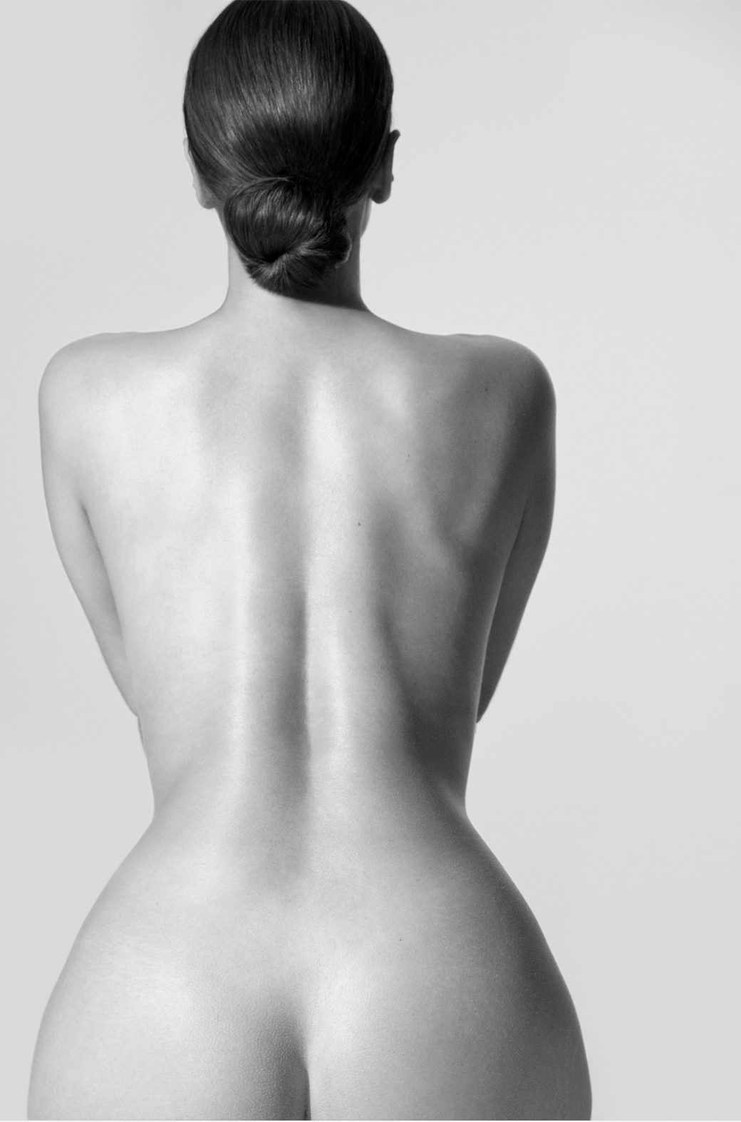
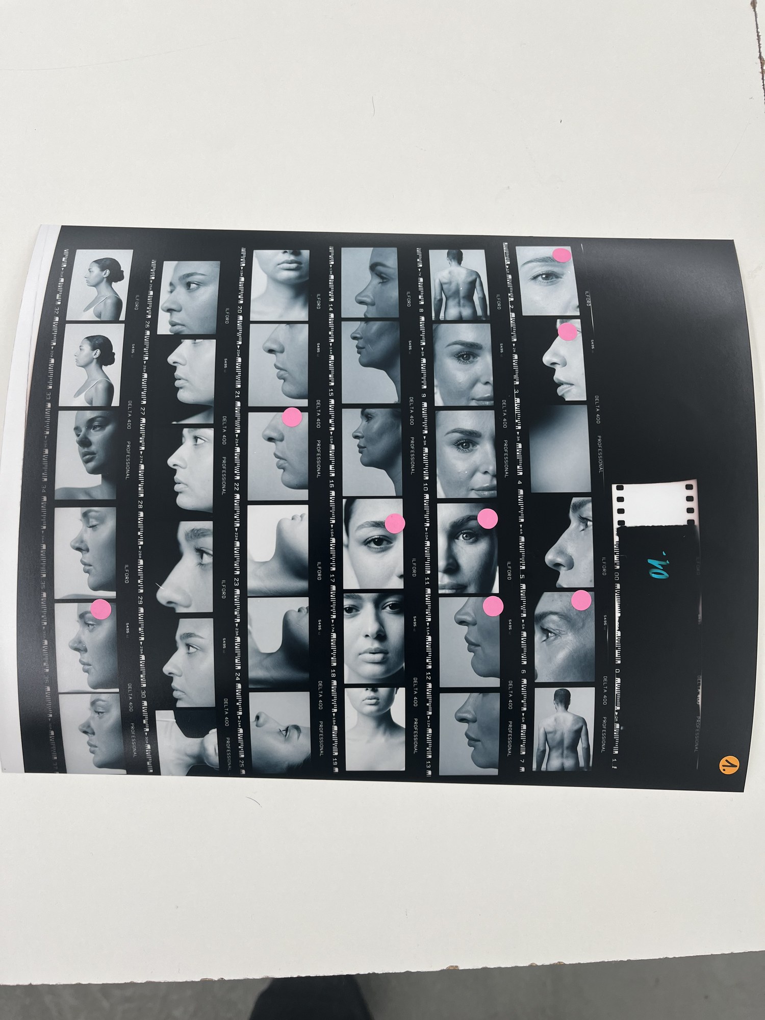
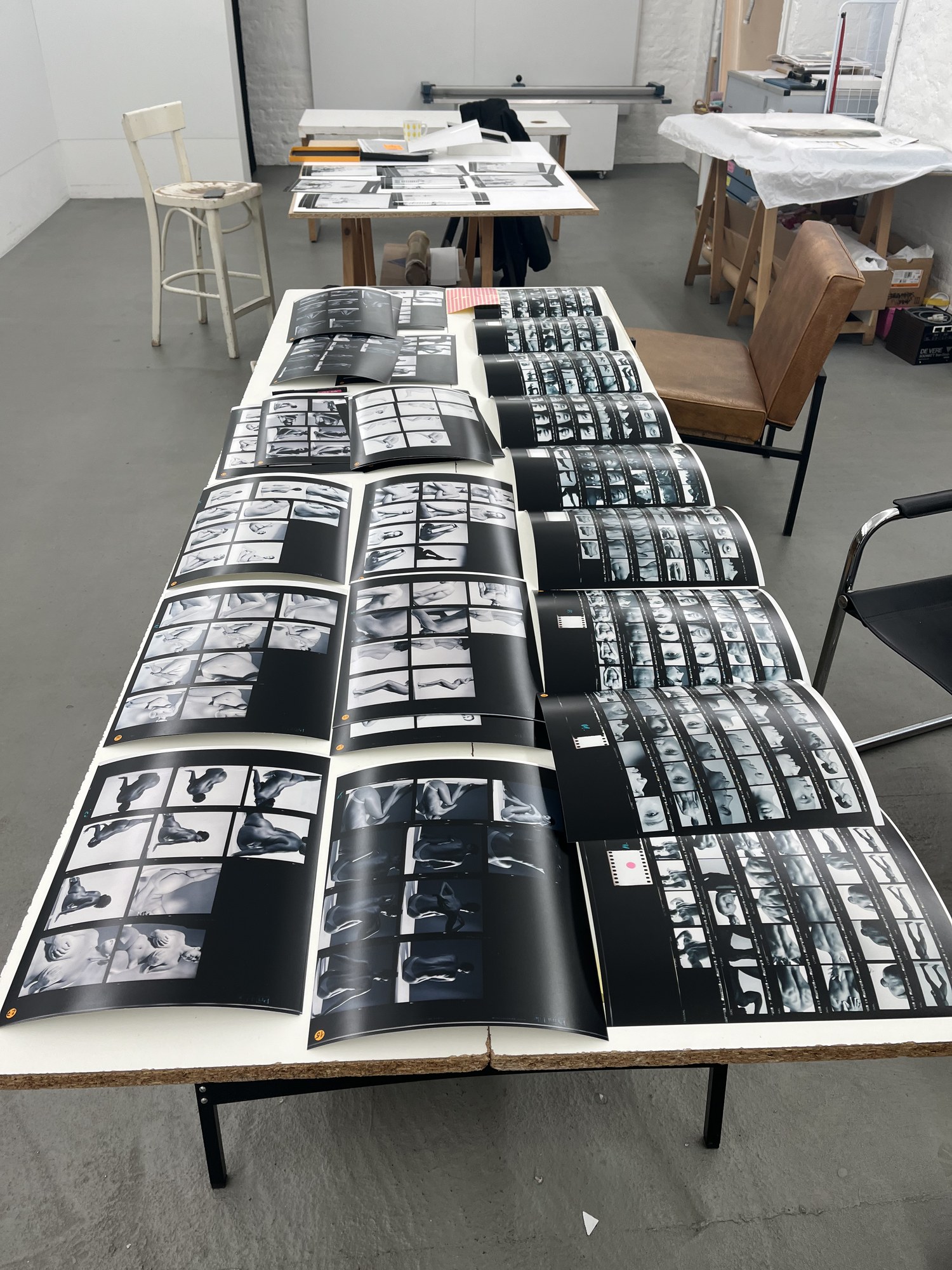
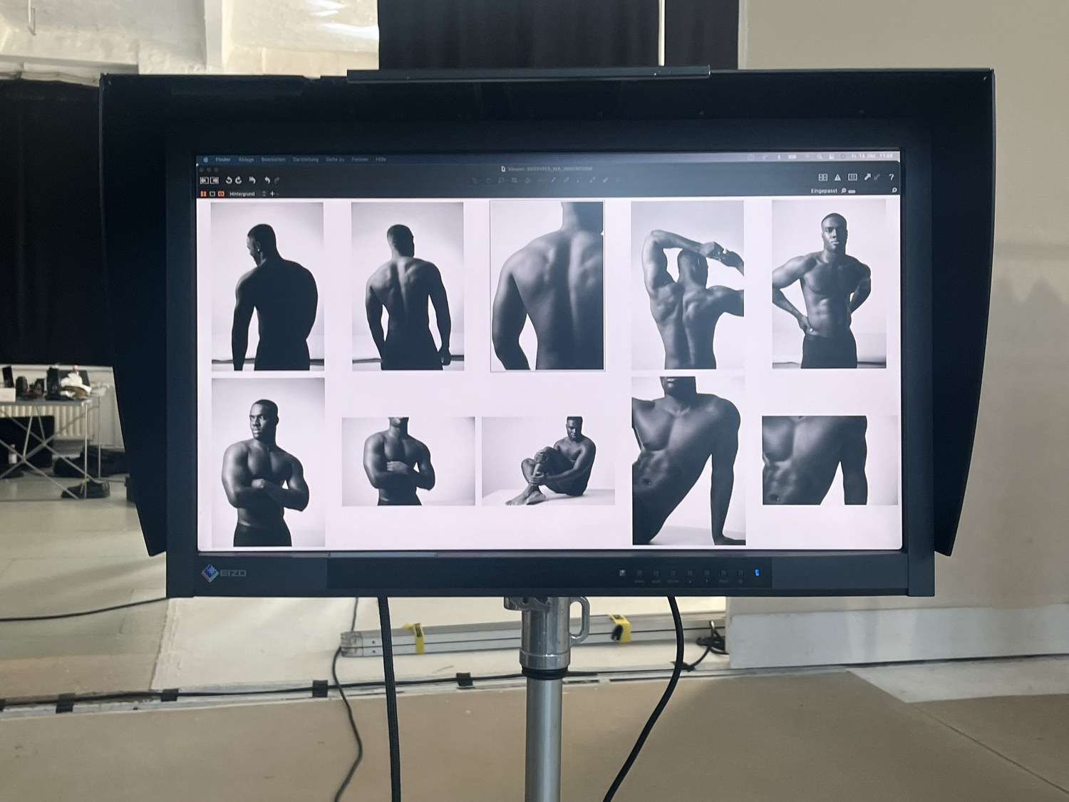
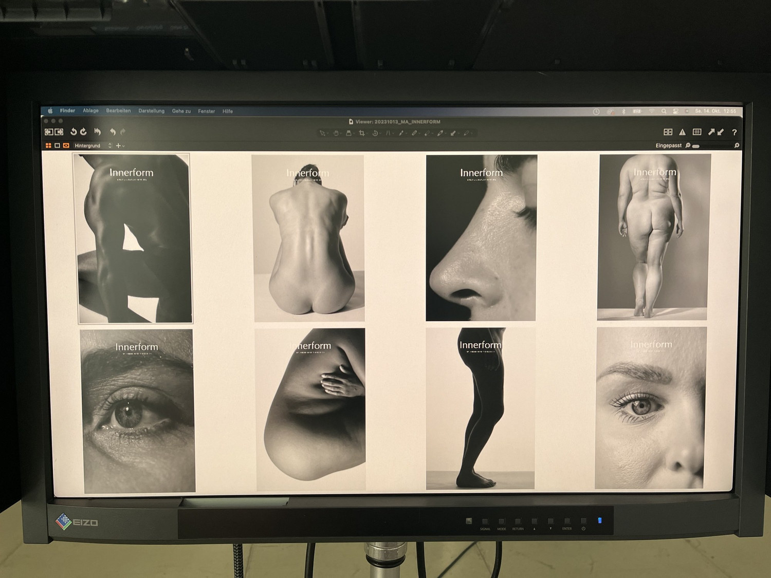
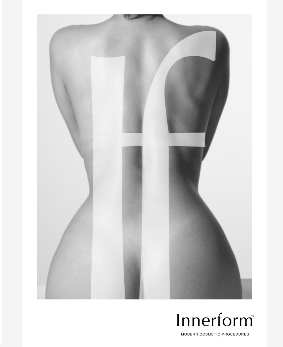
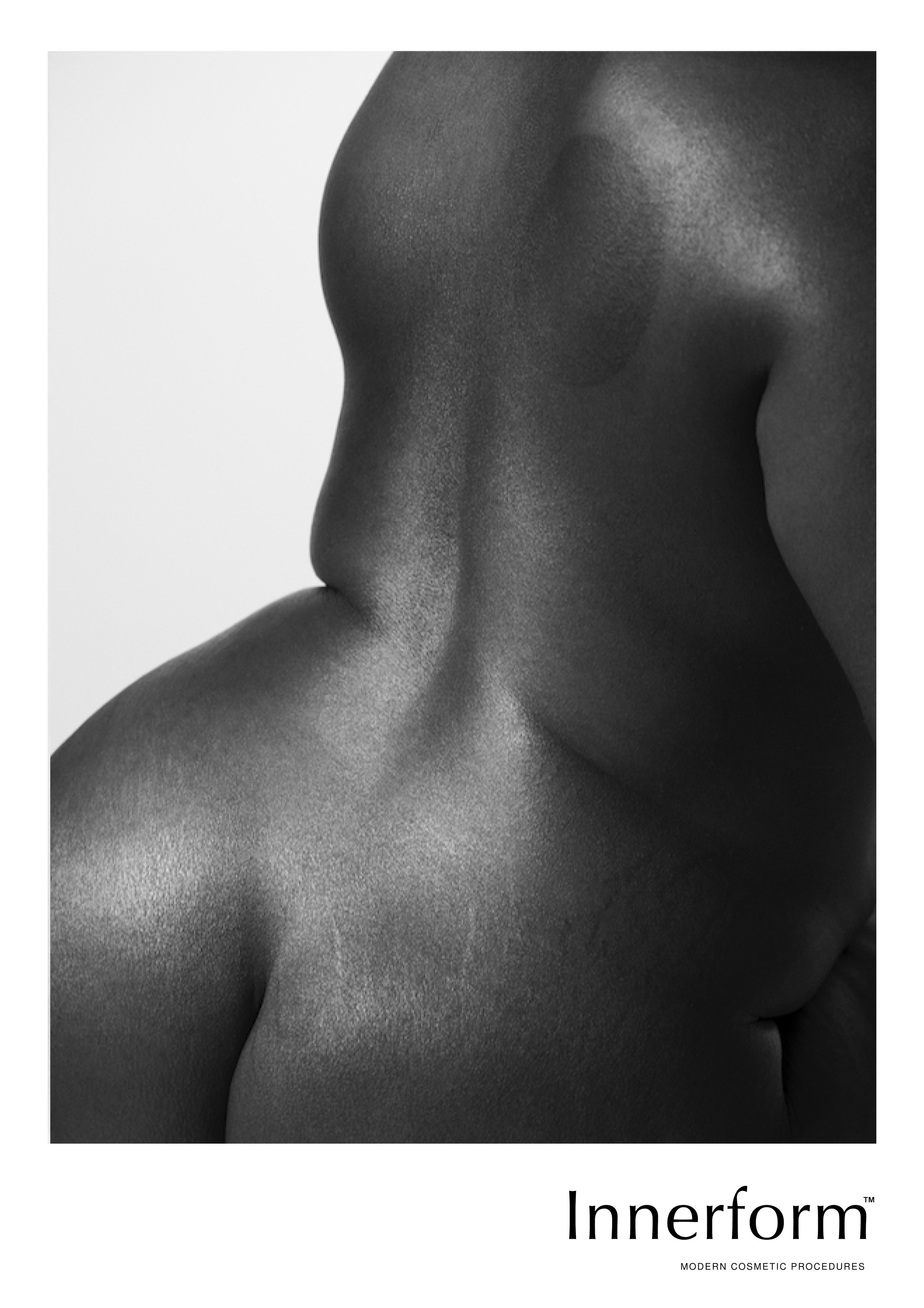
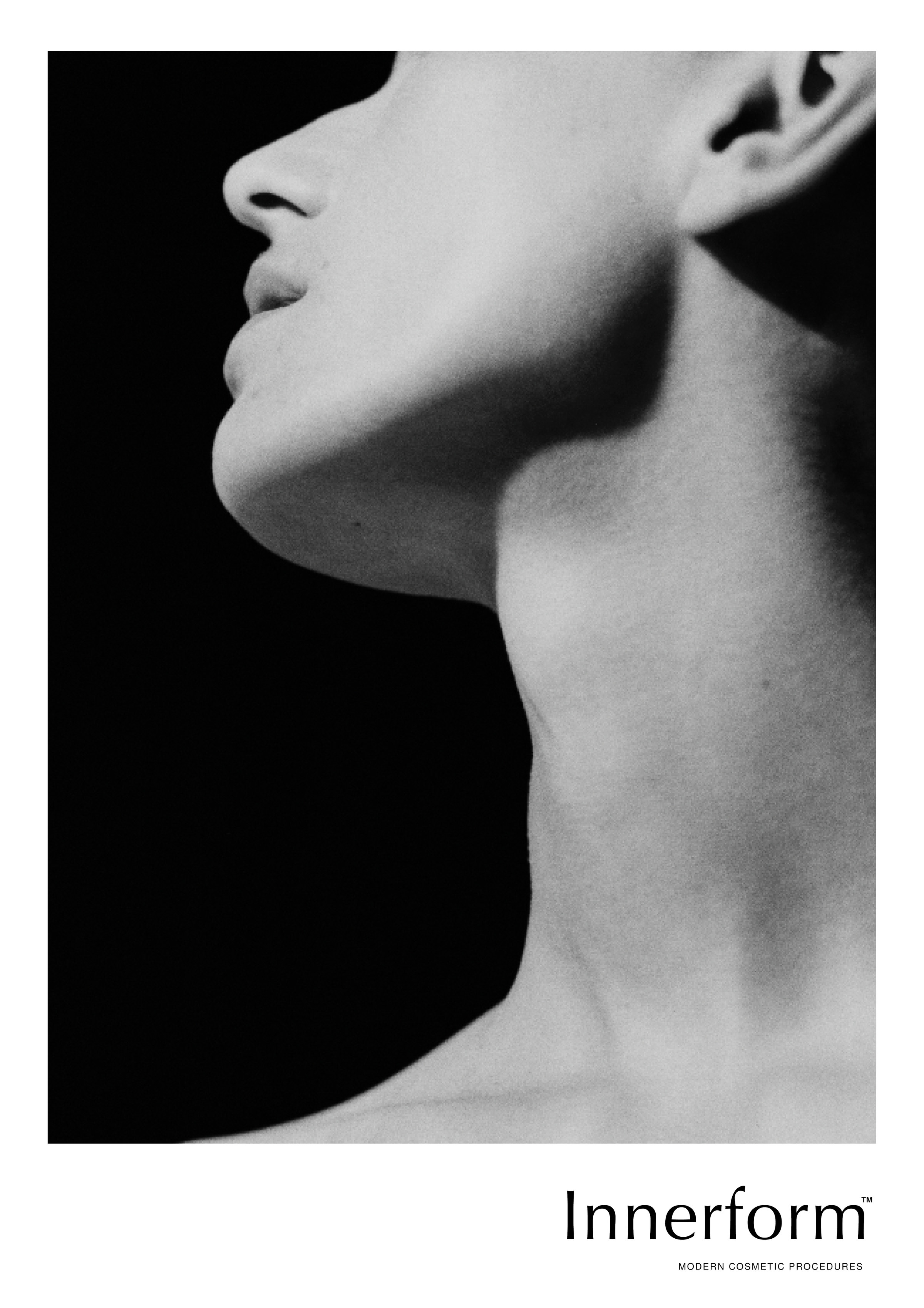
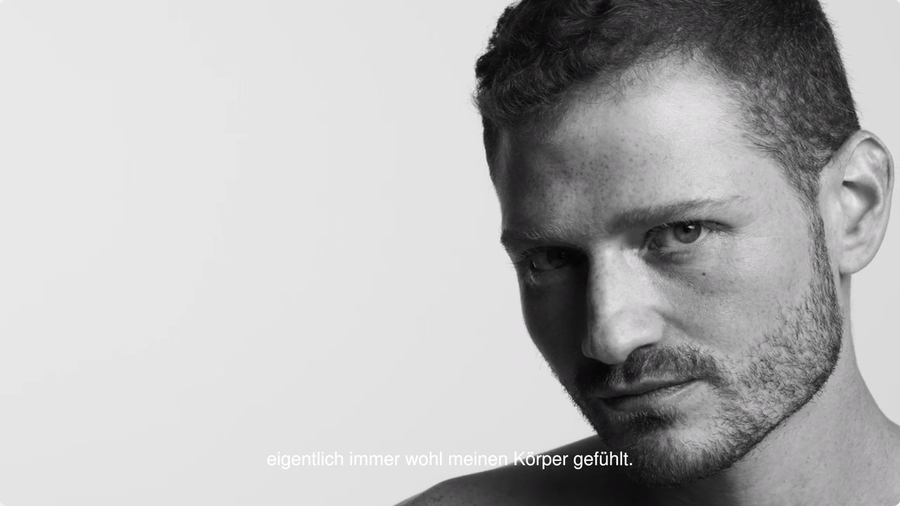
Each poster was reduced to three elements: one image, the Innerform wordmark, and the descriptor Modern Cosmetic Procedures.
No offers, no claims, no idealised promises.
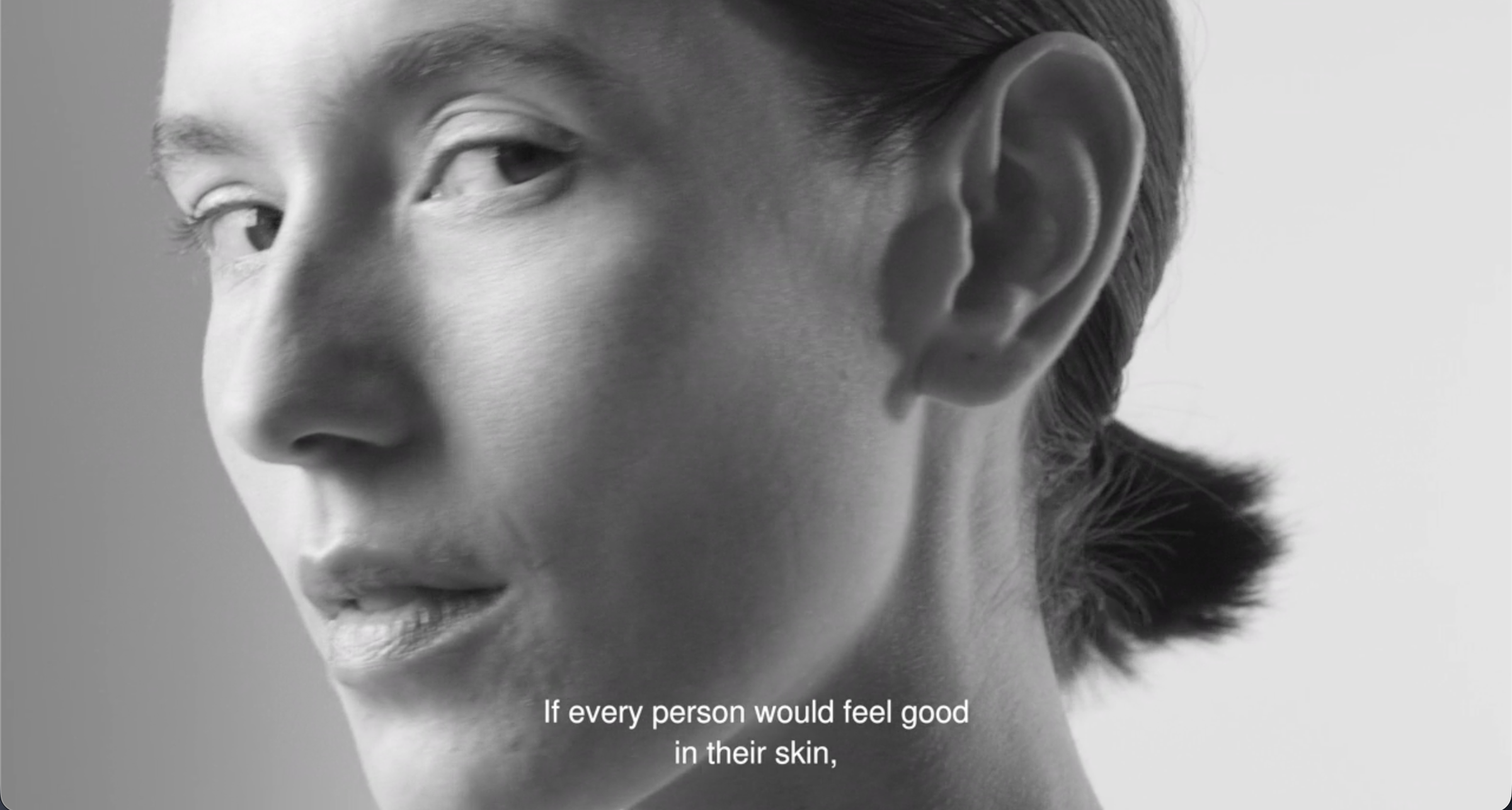
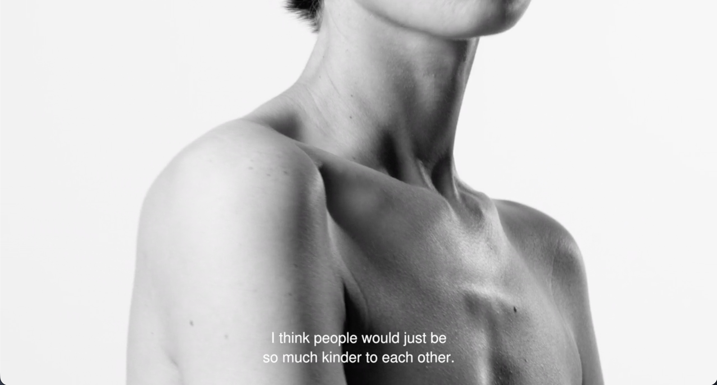
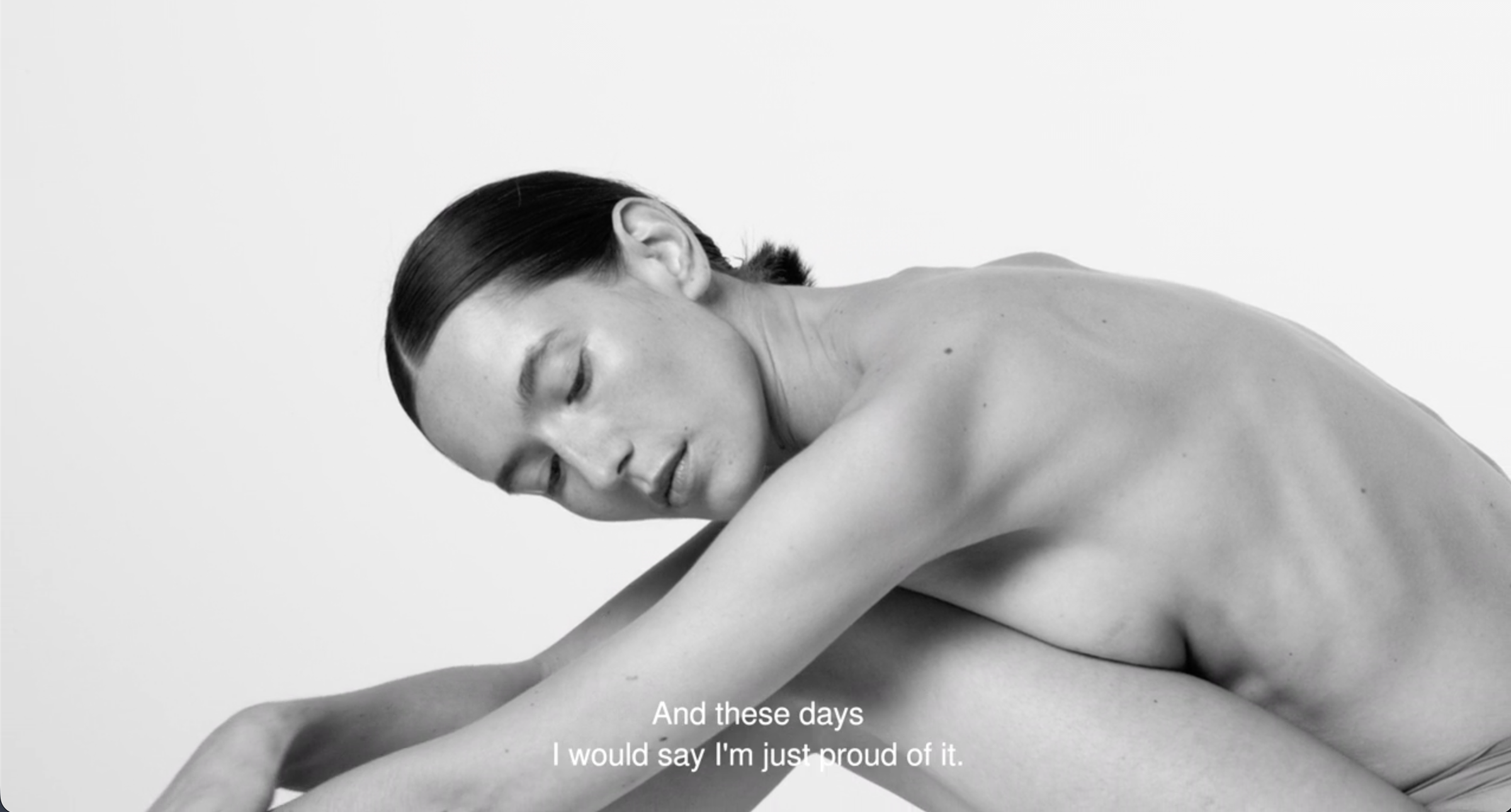
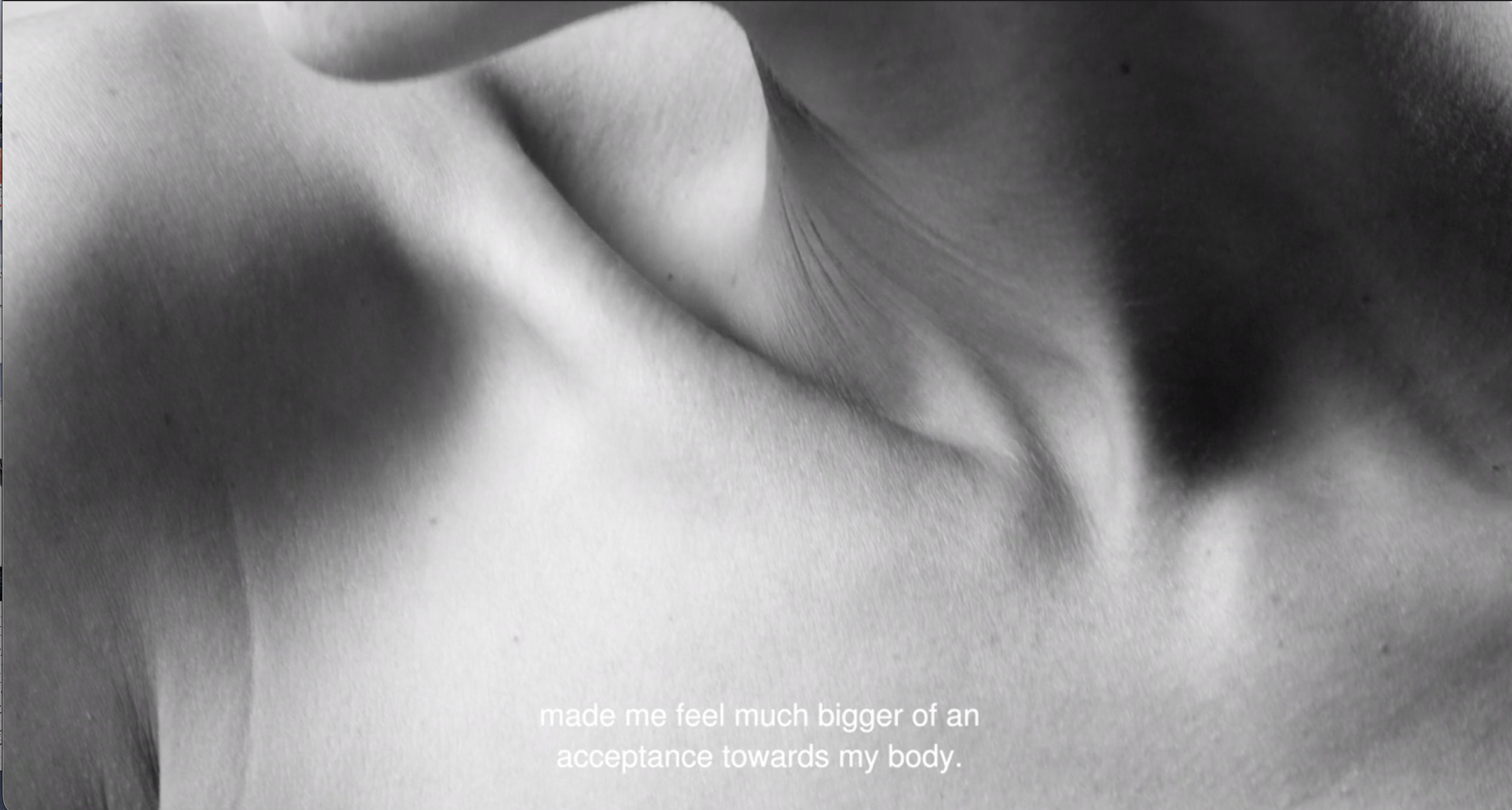
08 In the City NO CLAIM, NO PROCEDURE LIST, NO PROMISE
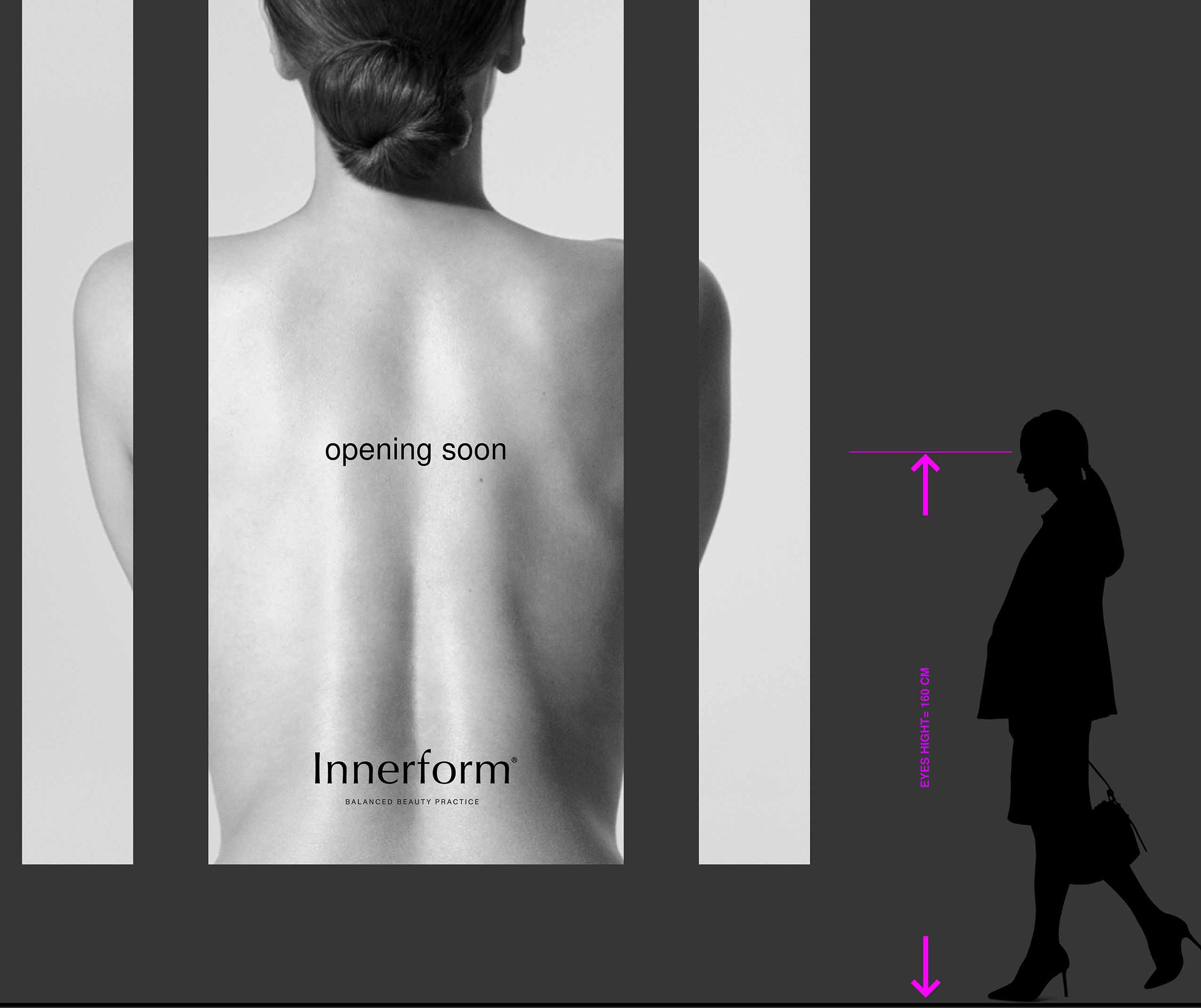
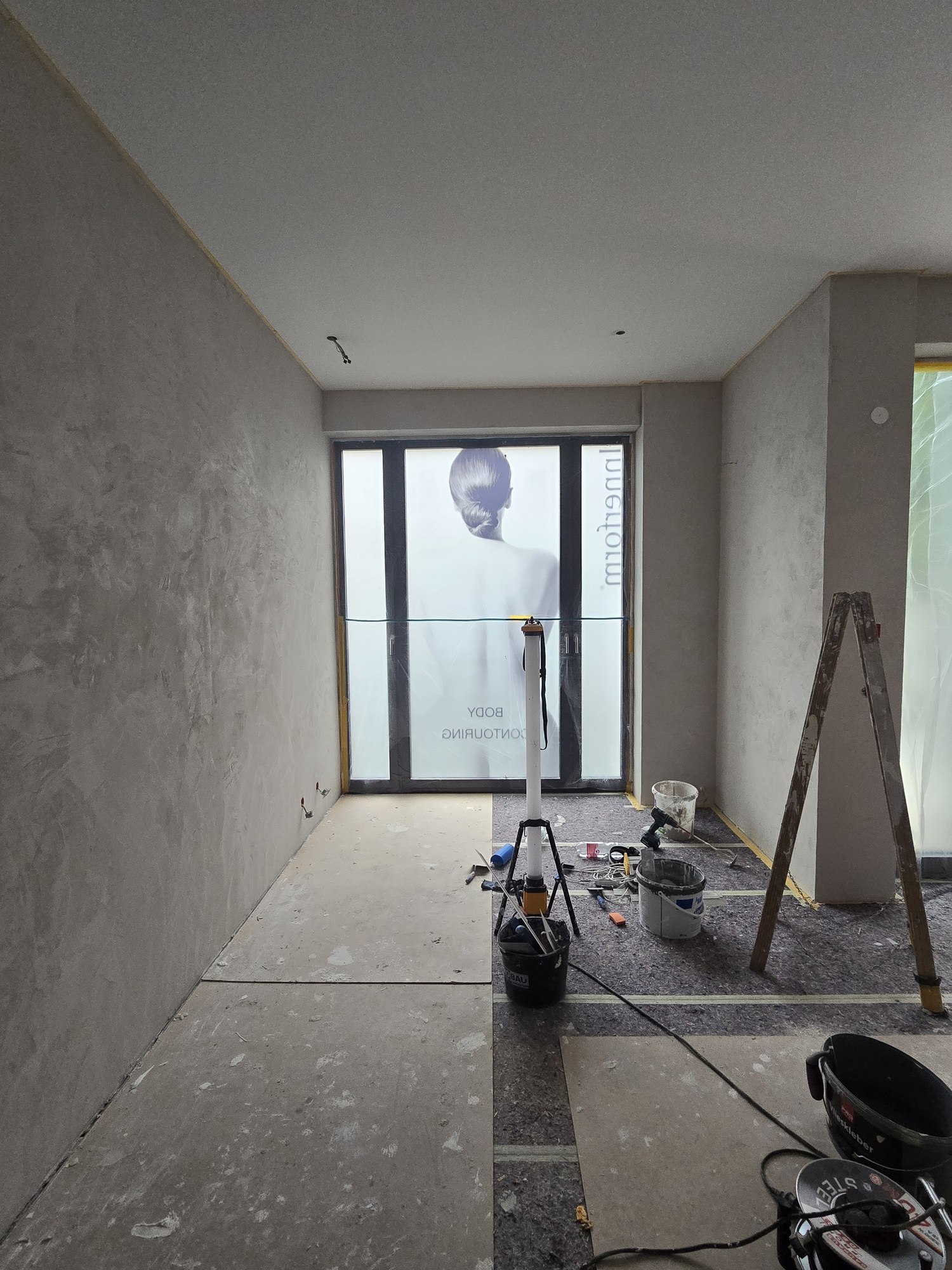
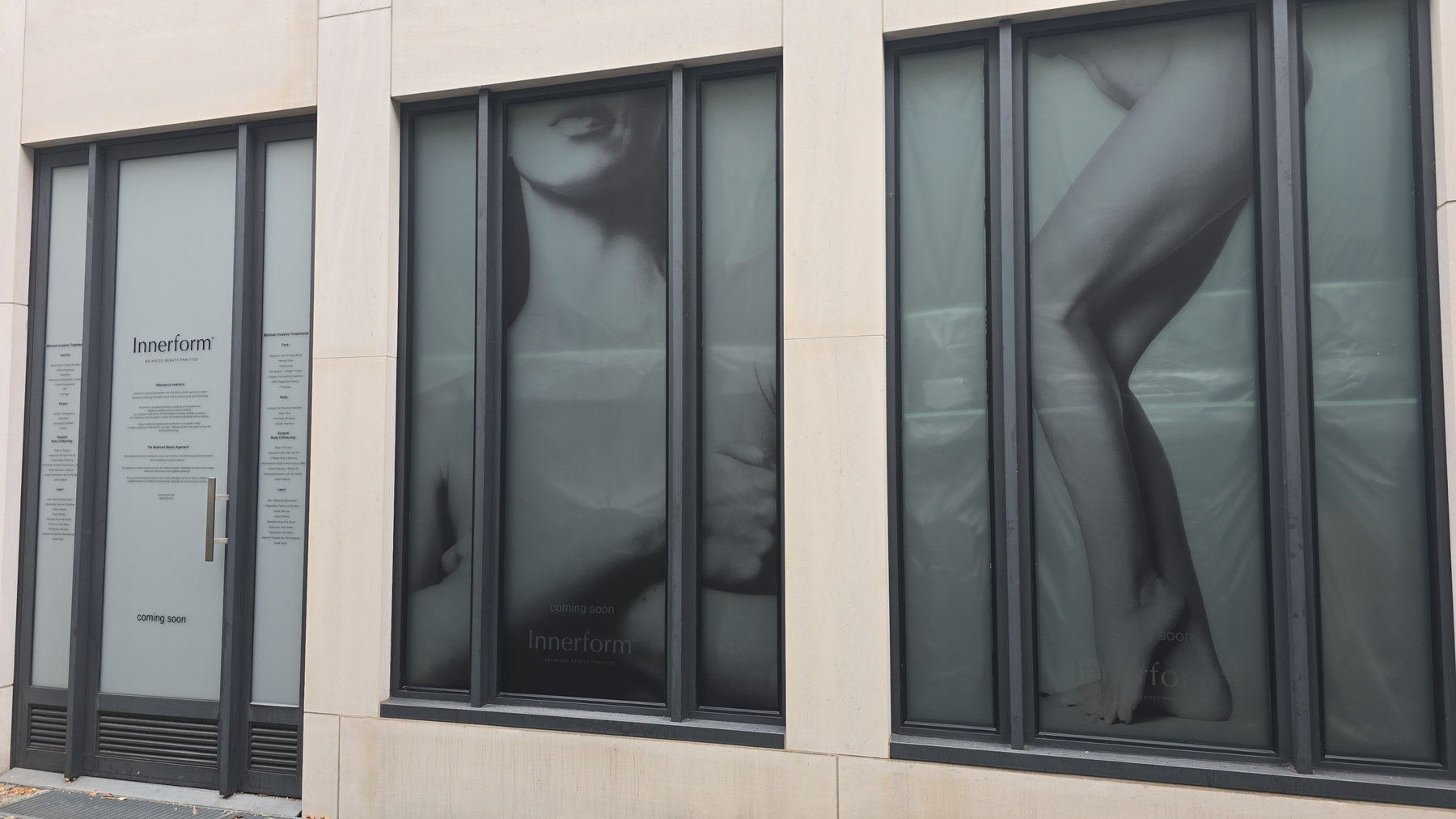
Before opening, the storefront carried the campaign. Window graphics were set against a standing patient — reading height fixed at 160 cm before any artwork was drawn.
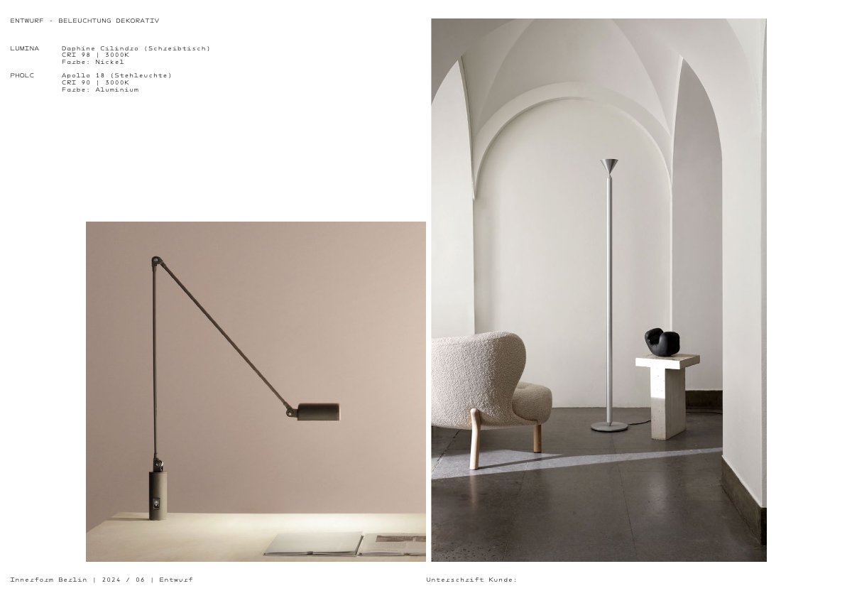
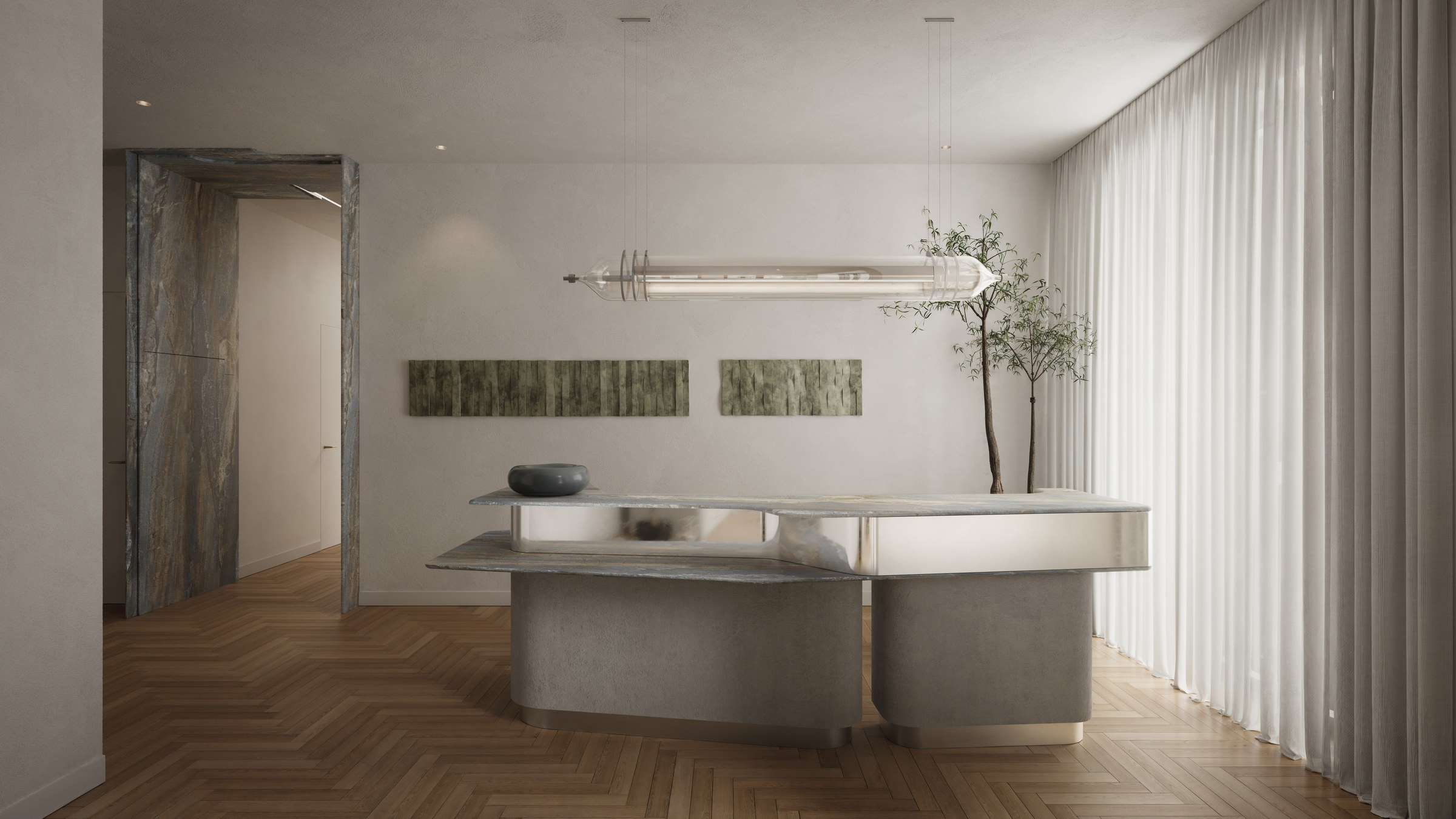
09 Spatial Experience WITH POURNOIR — DOUMAN POUR, BERLIN
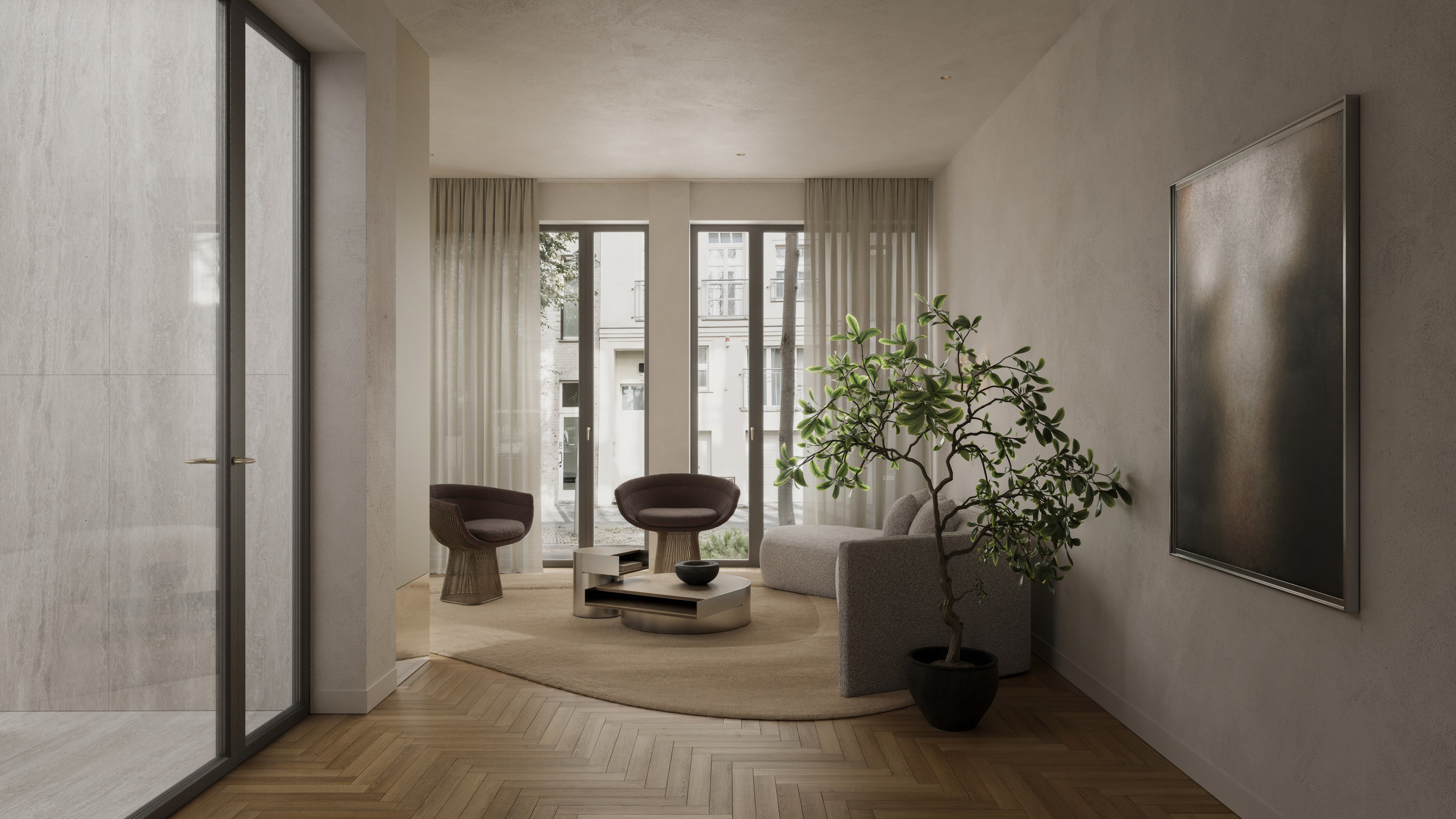
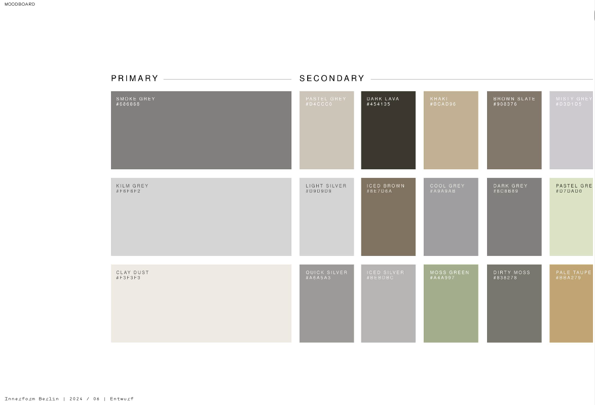
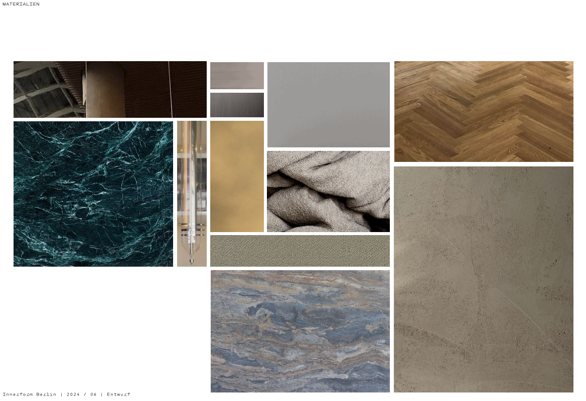
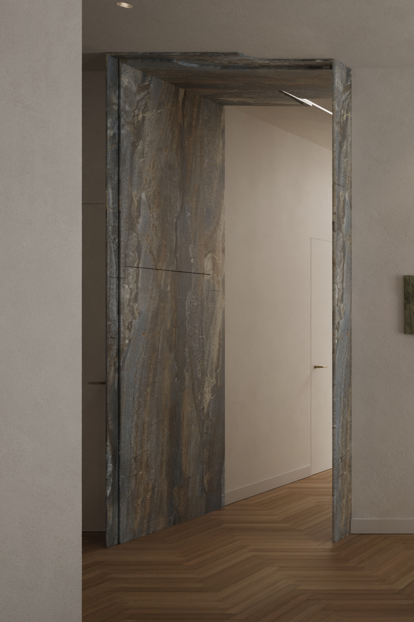
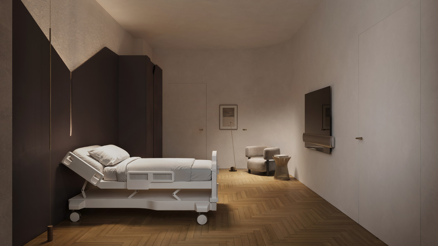
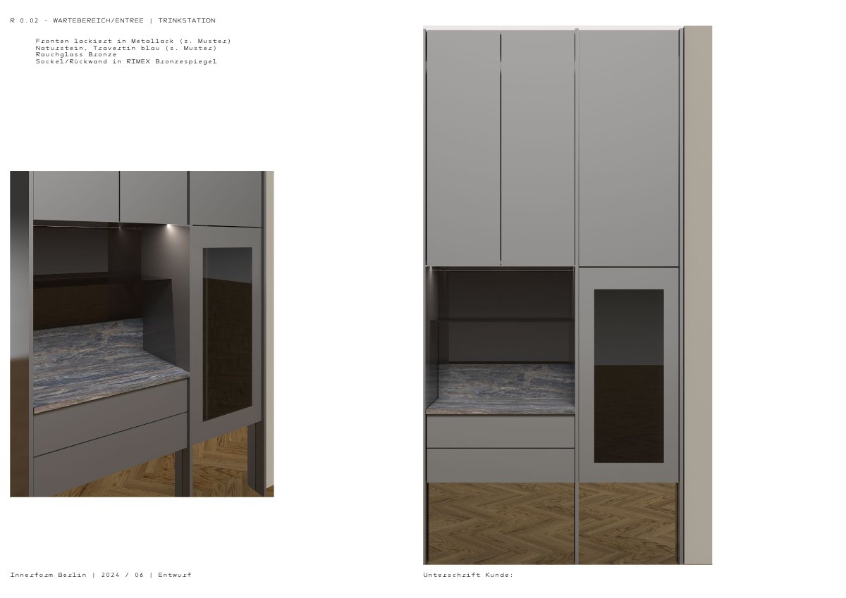
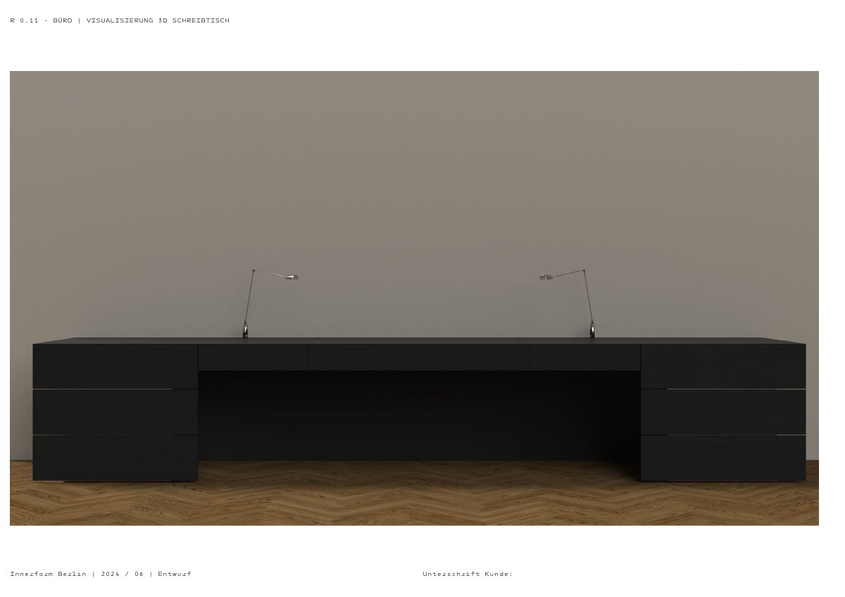
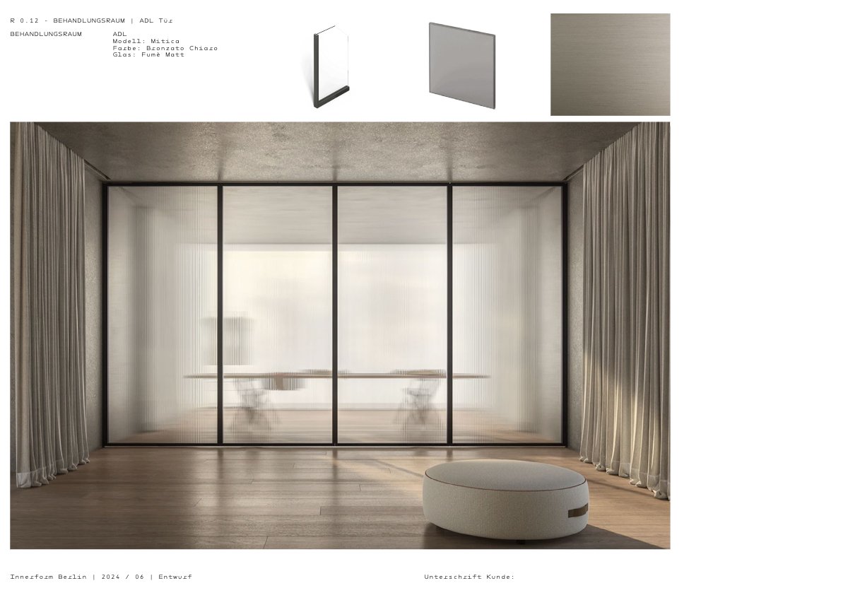
Zoning and service runs, resolved before any surface was chosen.


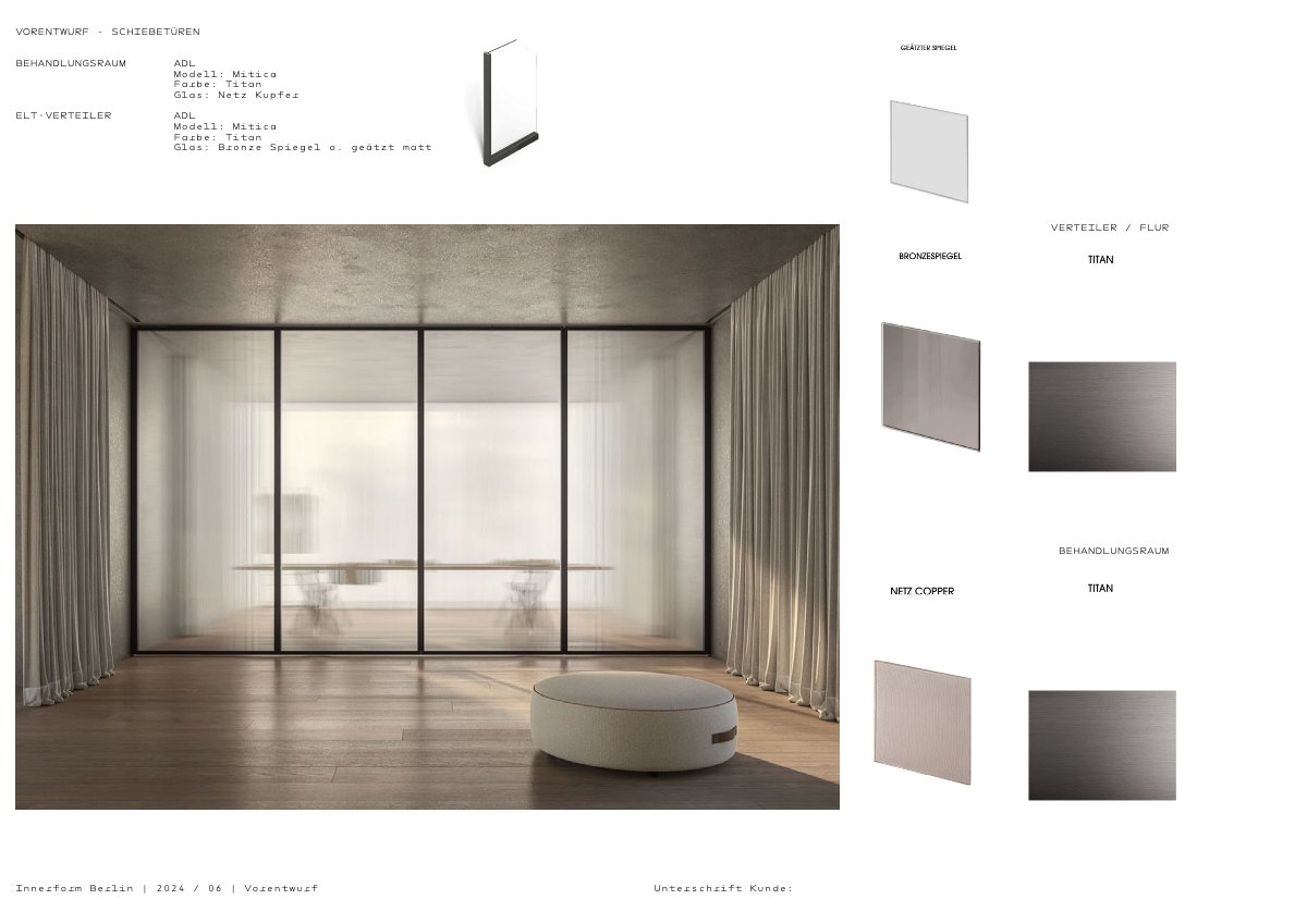
Detail. Each element drawn with its specification and its position in plan.


10 Outcome WHERE IT STANDS
Following its launch in 2024, Innerform has continued to grow successfully. In 2026, the practice expanded its premises to include a dedicated operating theatre and private recovery suite, reflecting the strength of the concept and the long-term success of the brand.
— Colophon
Aeyde
01 Premise THE SITUATION
The footwear range had grown category by category, without a shared specification across its core products.
The SS21 working brief still named “developing a signature look and feel” as a central objective.
02 Direction AEYDE GOES INTO NEW LUXURY
By identifying Aeyde’s strongest differentiators and future opportunities, four guiding principles were defined to inform every aspect of the brand moving forward.
One system, not a catalogue
Clear families and categories across the portfolio, so the range reads as a single body of work rather than a sequence of seasons.
Commitment 02
Real people, not influencers
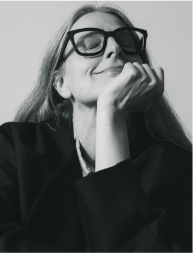
Replace influencer casting with women whose work and values carry what the brand claims. Ageless rather than of-the-moment.
Commitment 03
Production made visible
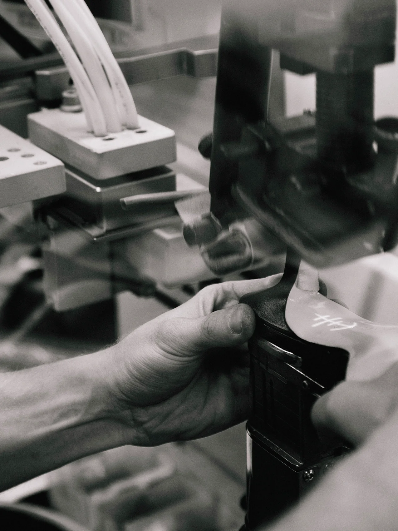
The factory documented as an extension of the studio. Craftsmen named, their skills shown, the making of the object as part of the object.
Commitment 04
Prove quality, don’t claim it
Transparency and traceability instead of sustainability language. Show the process; let the price explain itself.
03 Product Coherence SHARED SPECIFICATION
Commitment 01, executed
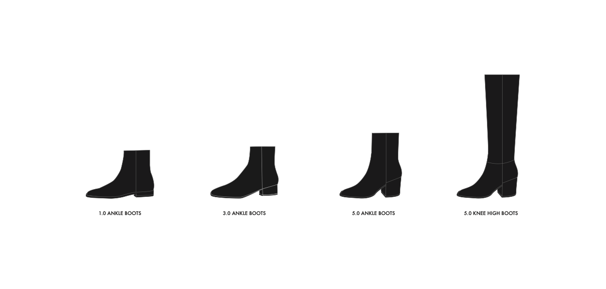
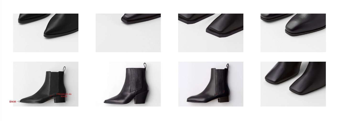
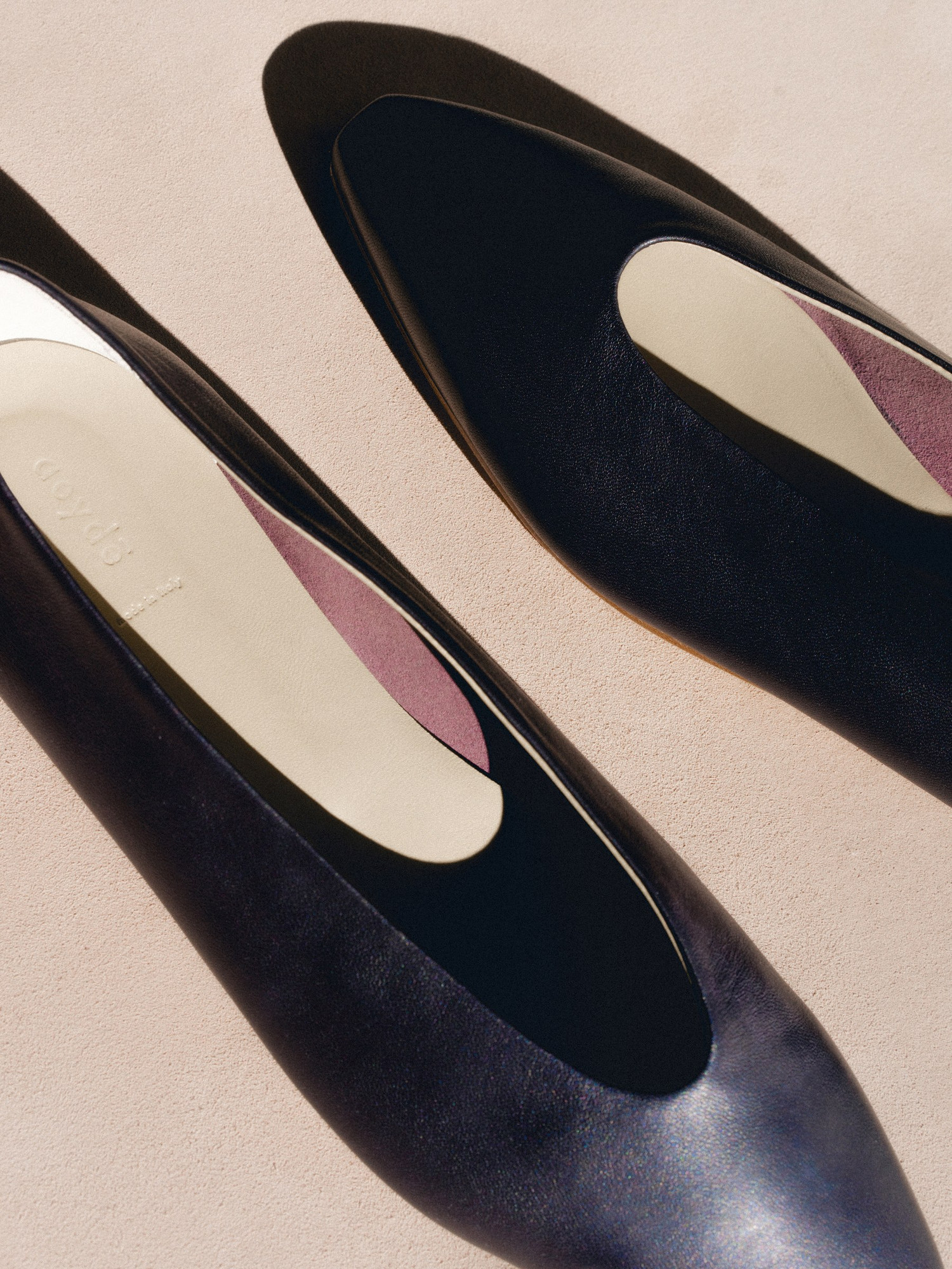
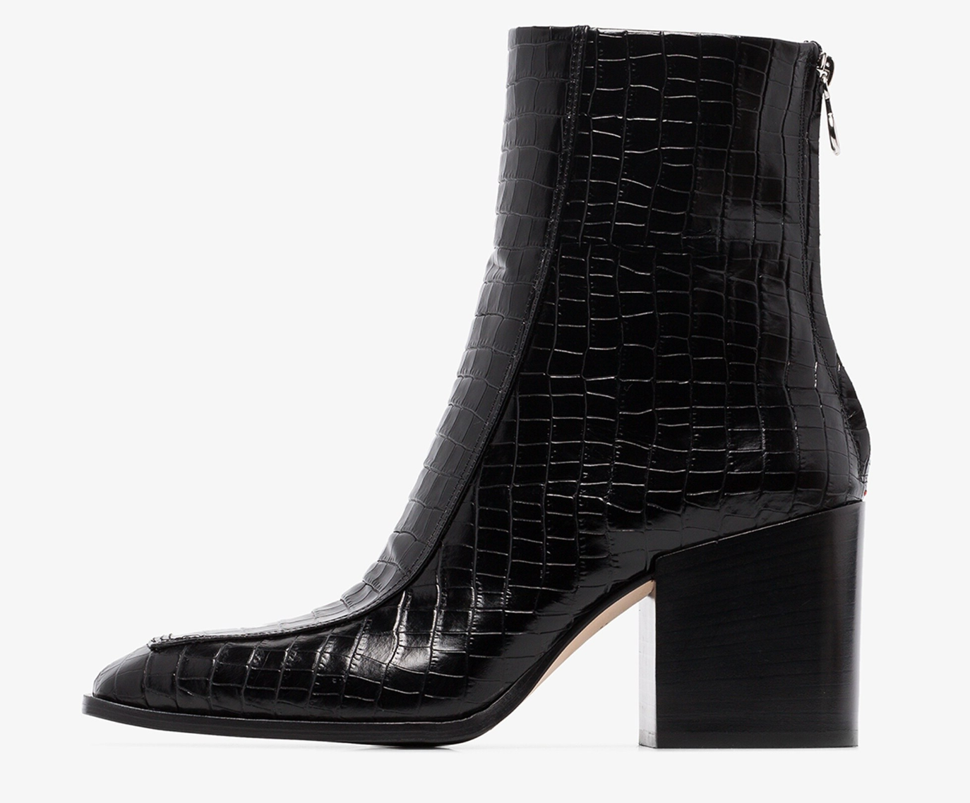
A family architecture was established by grouping products according to toe shape rather than category. Each family followed a common construction specification—from rand and elastic width to key proportions—creating a recognisable visual language that strengthened consistency across the entire collection.
| Element | Specification | |
|---|---|---|
| 01 | Sole thickness | 8 mm |
| 02 | Rand | One, shared |
| 03 | Elastic width | One, shared |
| 04 | Base leather | One, shared |
| 05 | Toe family | Square · pointed · rounded |
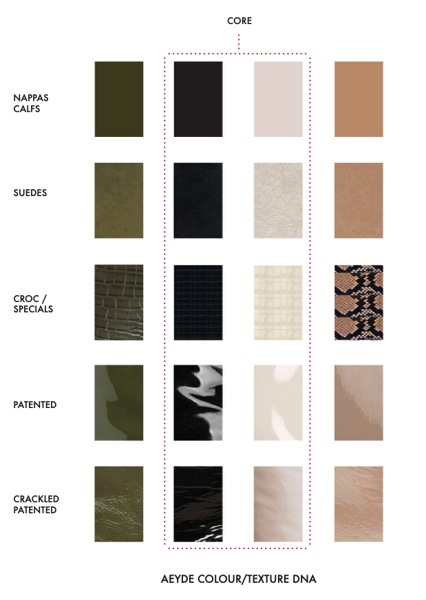
05 Branding PLACEMENT ACROSS COMPONENTS
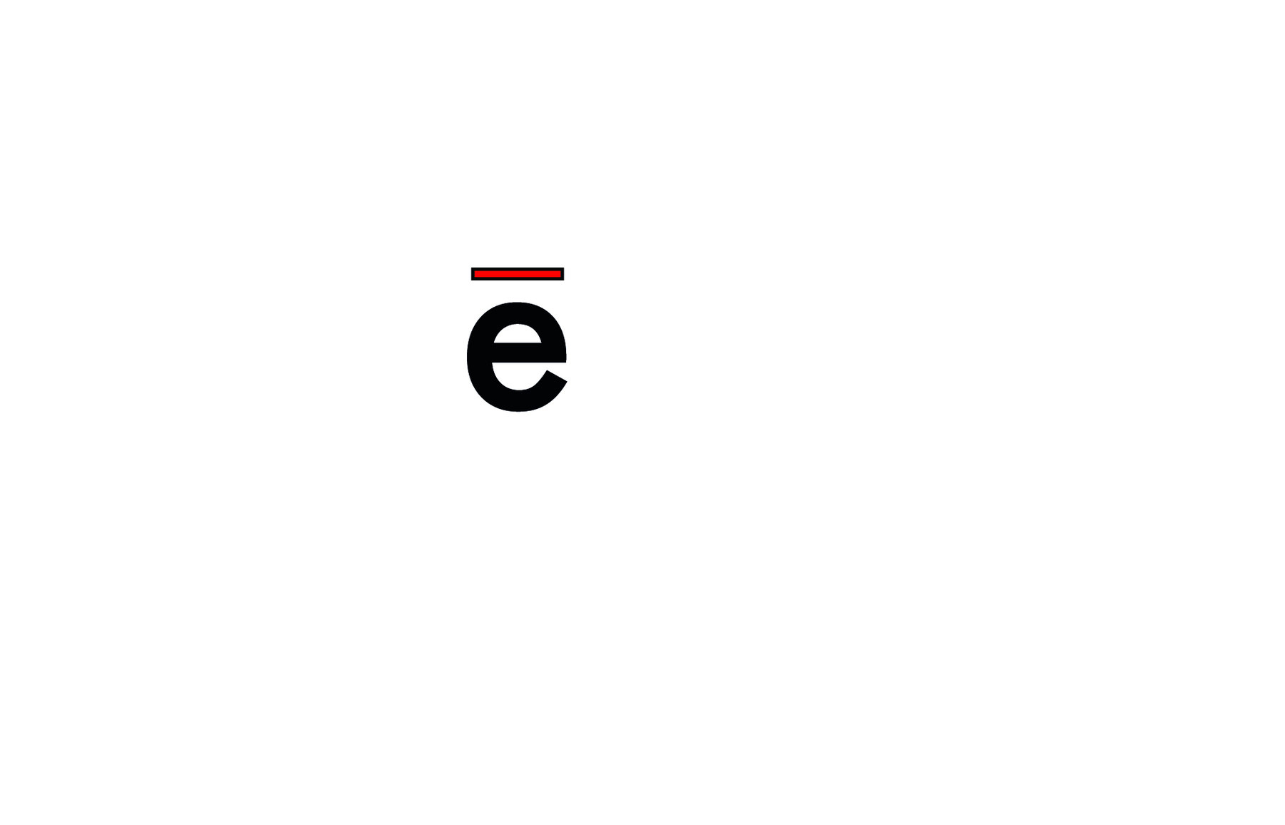
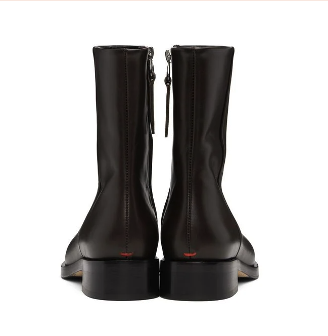
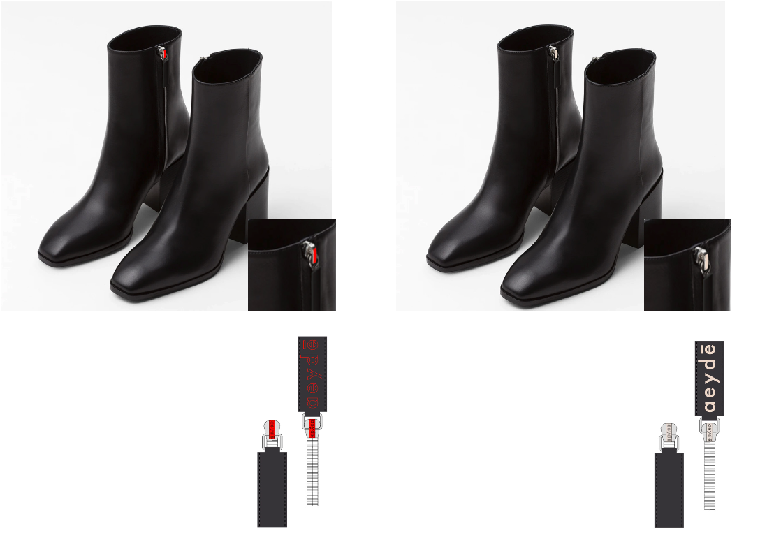
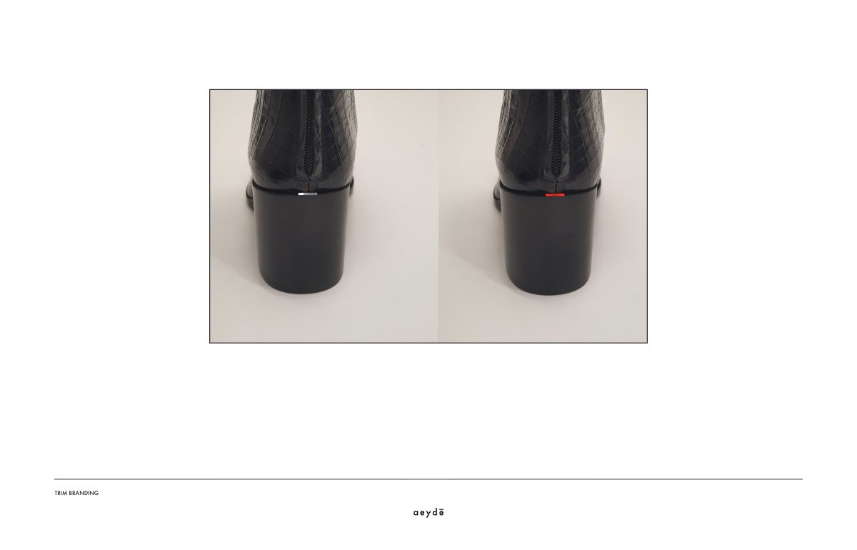
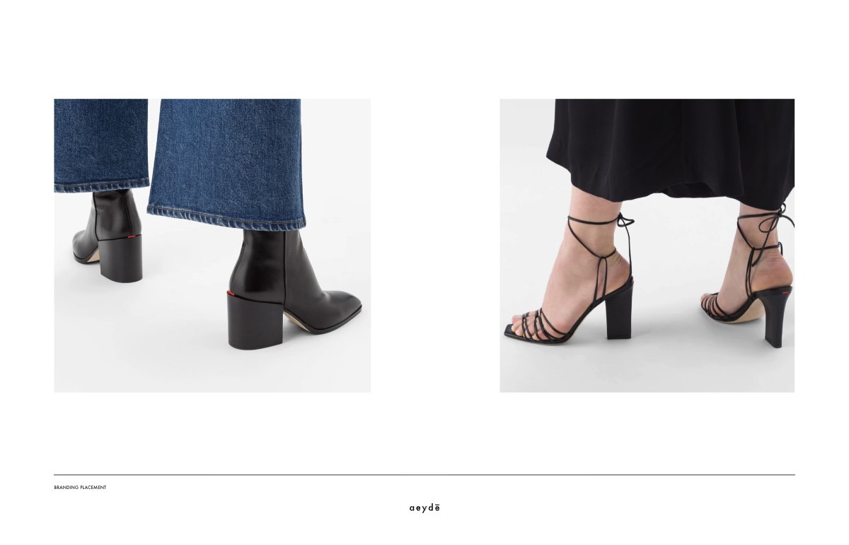
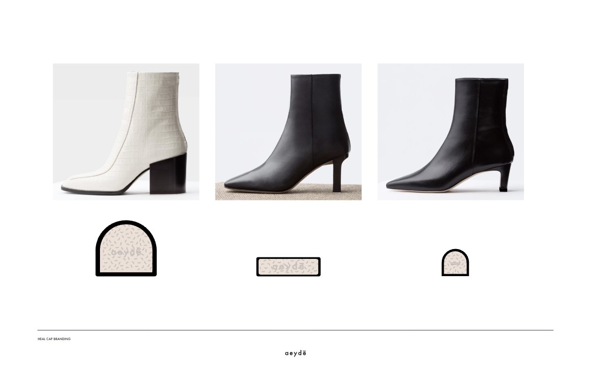
Rather than introducing a new branding device, an existing visual cue was translated into the product itself. The macron accent inspired the rear stitch, transforming it into a distinctive red signature repeated throughout the collection.

06 Brand Character THE AEYDE WOMAN
Commitment 02, executed
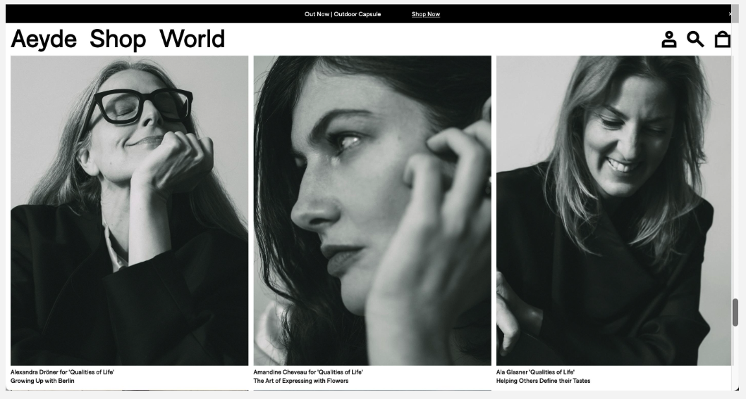
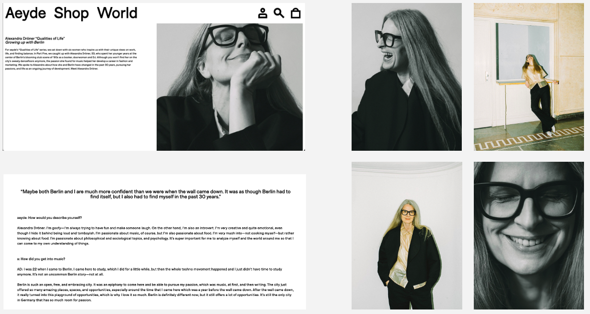
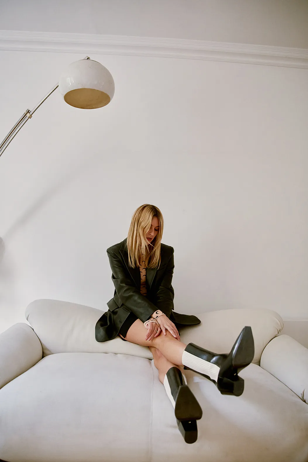
The brief proposed replacing generic influencer casting with a serial portrait format — women chosen for their own work, interviewed in their own language, profiled individually.
Directed 2019. Published 2021.
07 Made in Italy MAKING ORIGIN VISIBLE
Commitment 03, executed
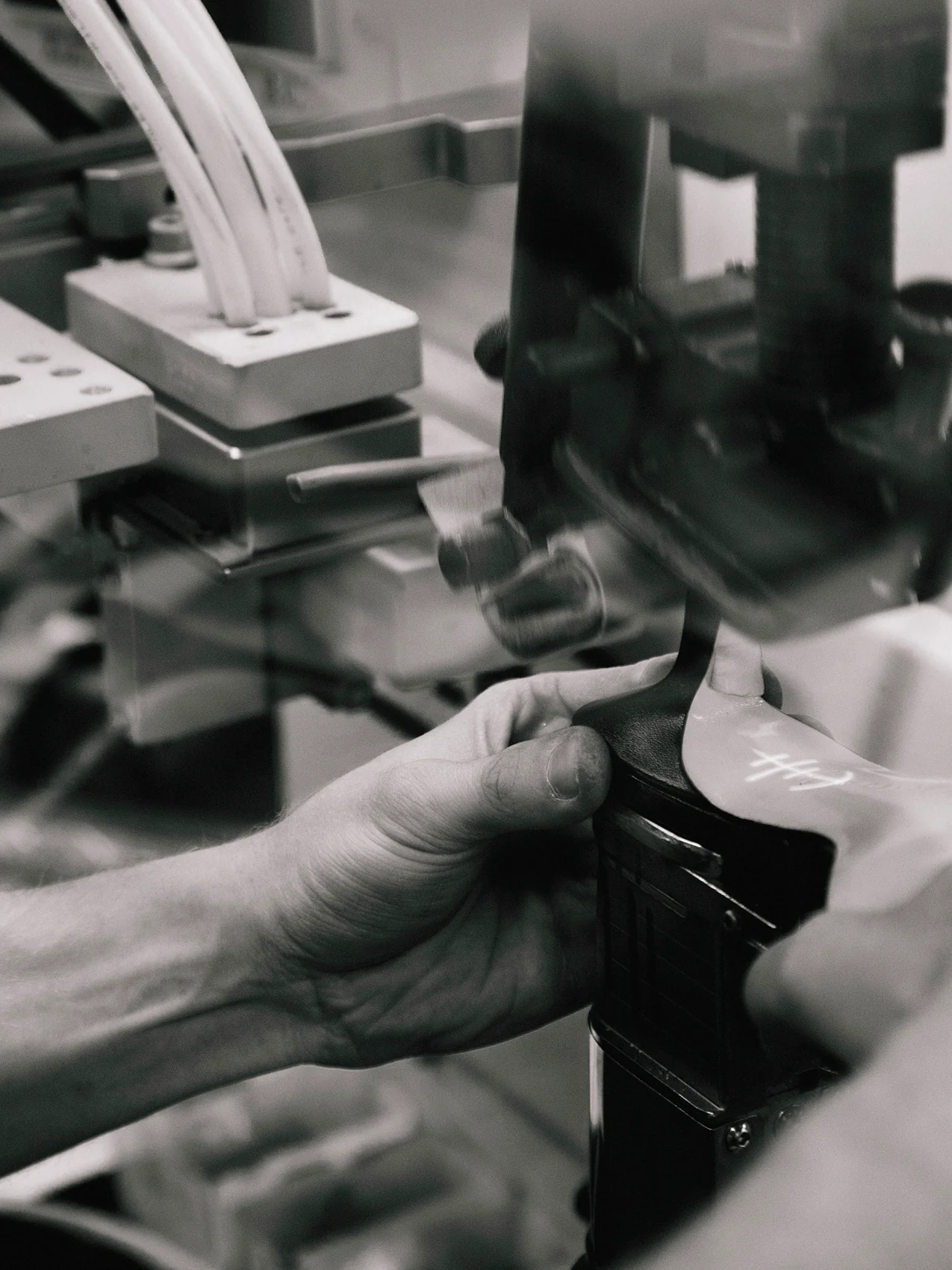
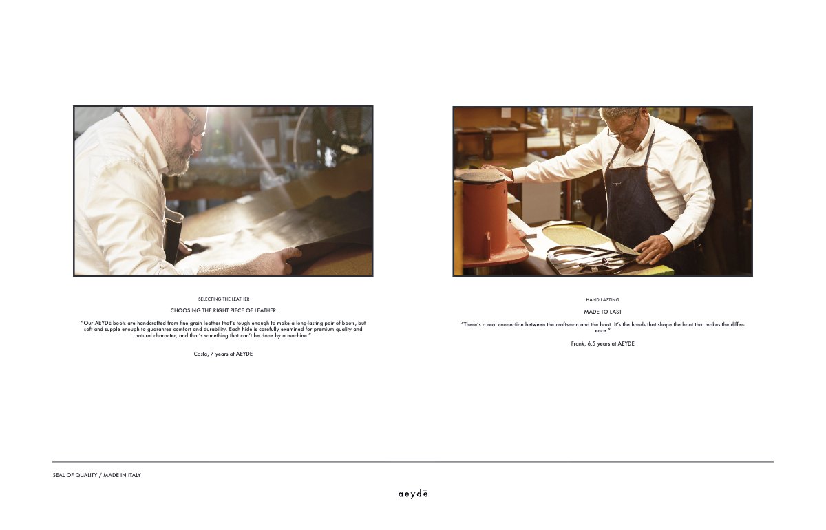
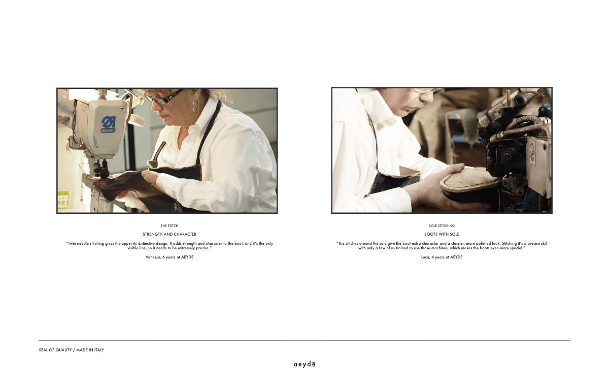
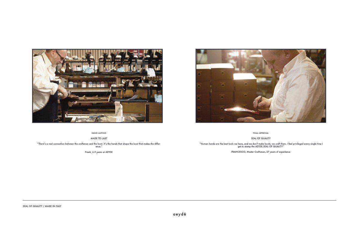
The factory was to be documented as an extension of the studio: the process, the machinery and the people, photographed rather than described.
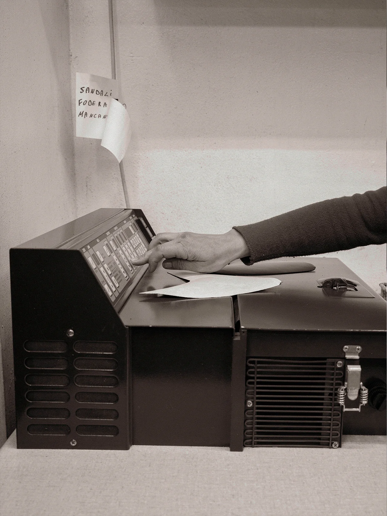
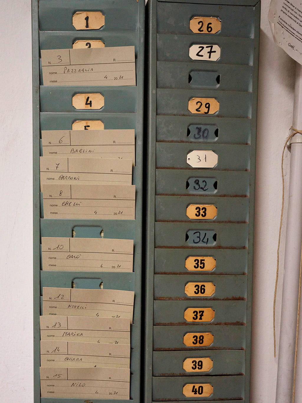
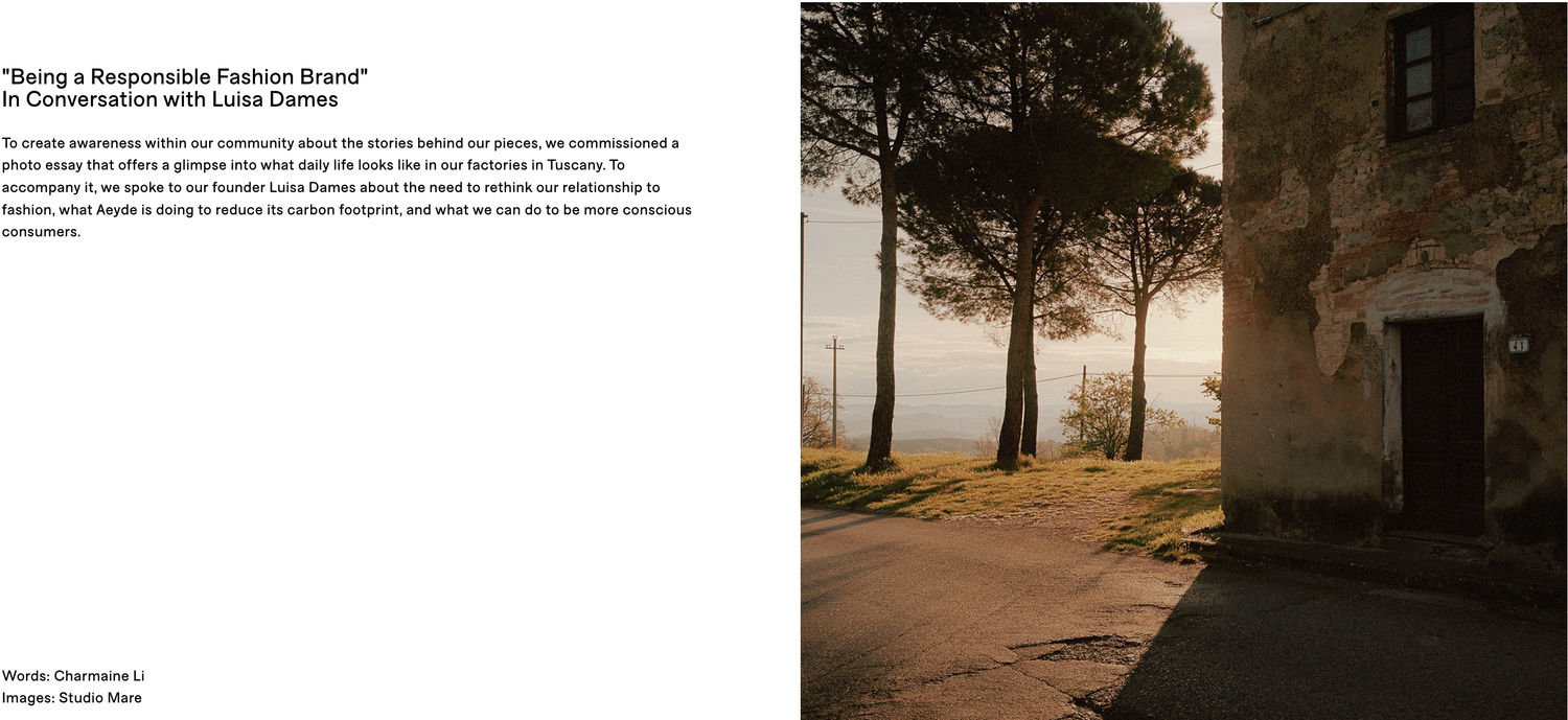
Directed 2019. Commissioned and published 2021. Words: Charlotte.
08 Seal of Quality AND THE CERTIFIED COBBLER
Commitment 04, executed
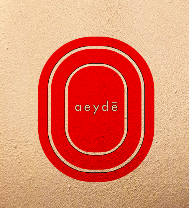
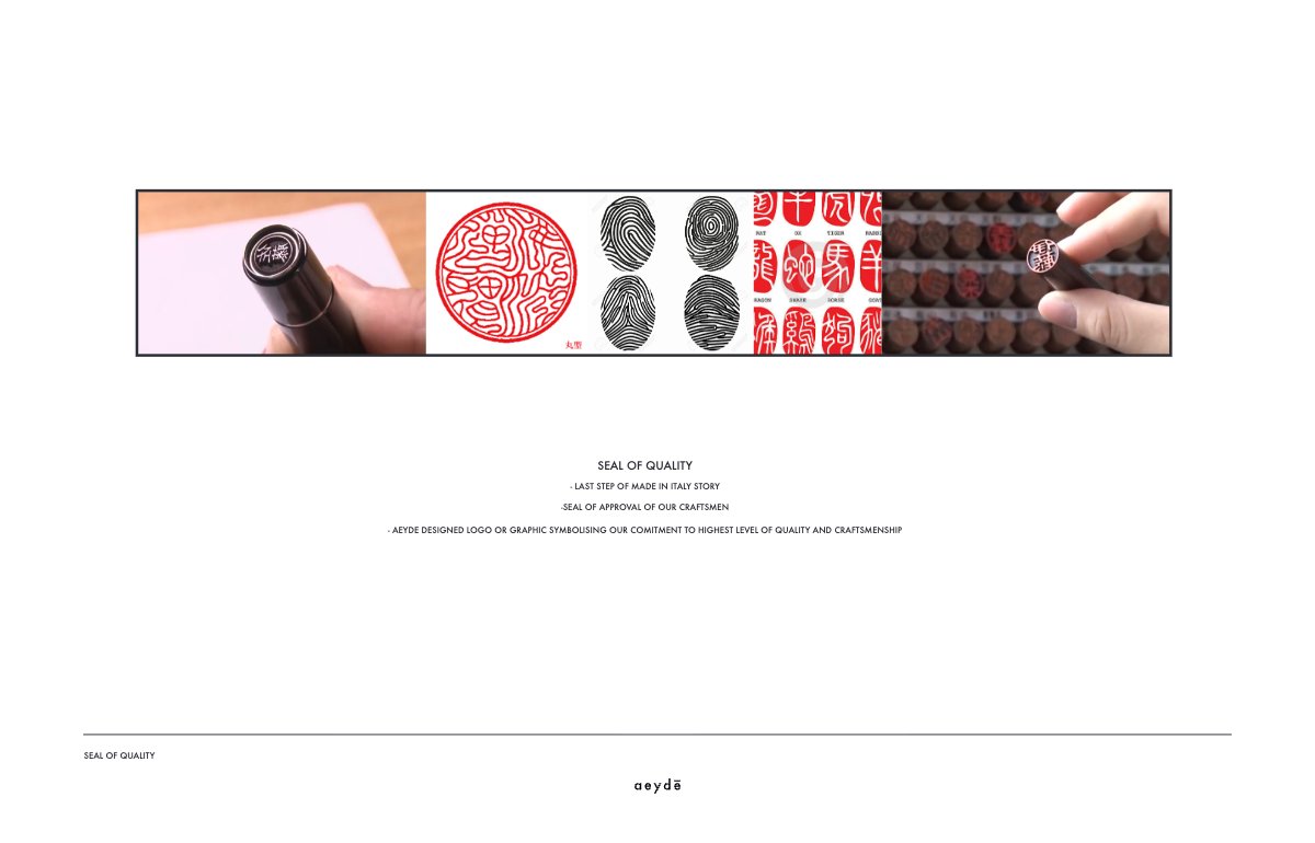
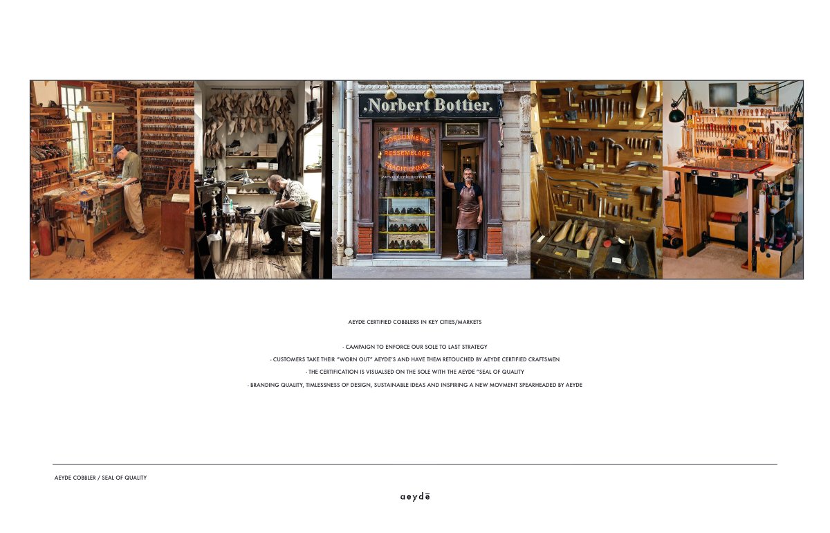
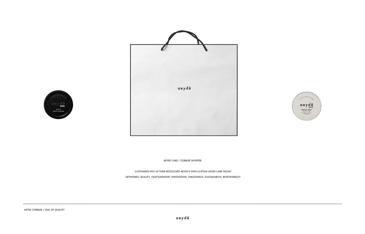
Every pair leaves the factory with one seal of quality. Every repair earns another. As shoes return to a trusted network of cobblers, the growing red imprint becomes a visible record of care—turning longevity into part of the product’s identity.
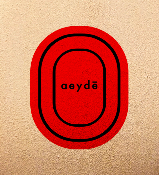
Directed 2019–2020. Not implemented within this period.
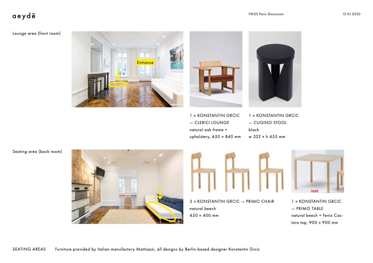
09 Showroom FW20 PARIS — SPECIFIED
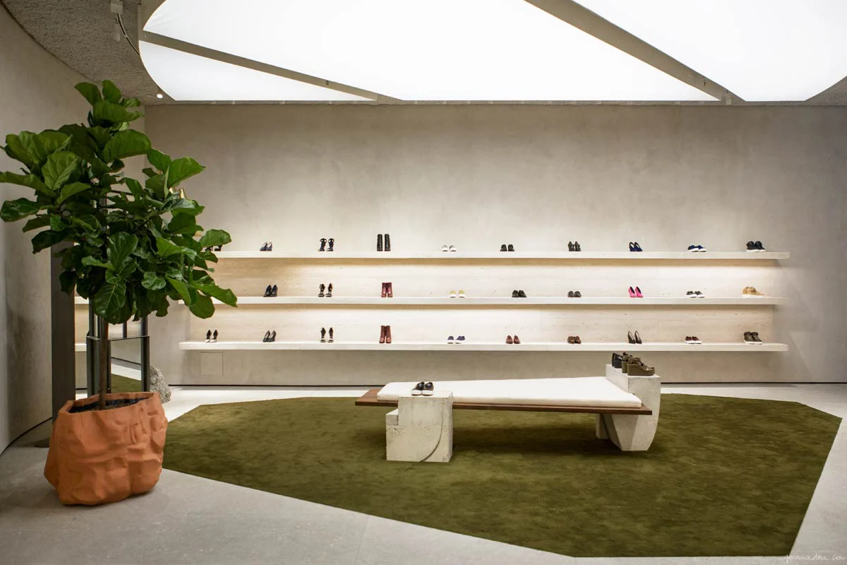
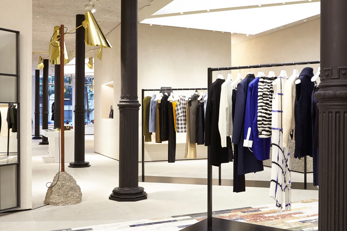
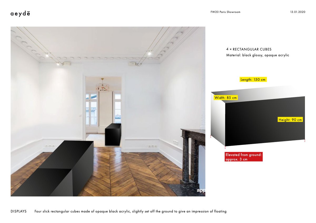
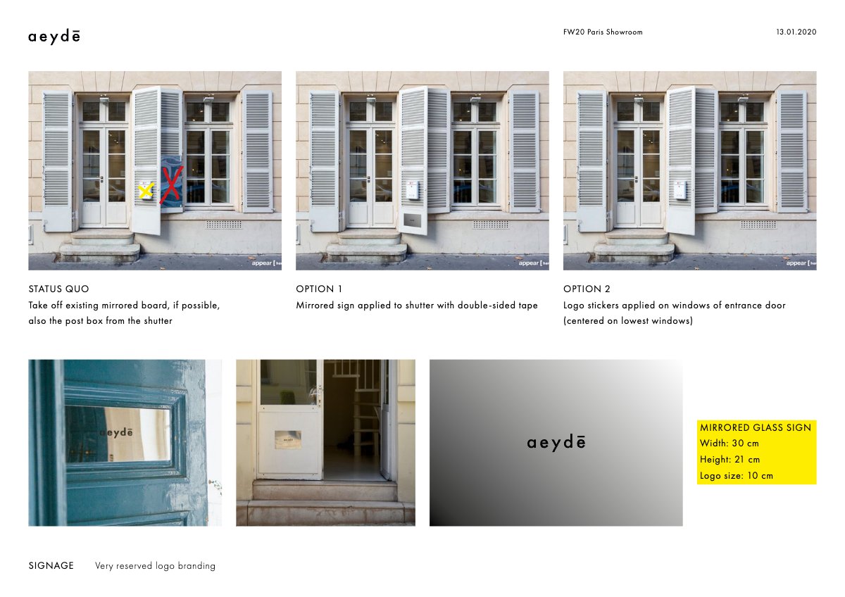
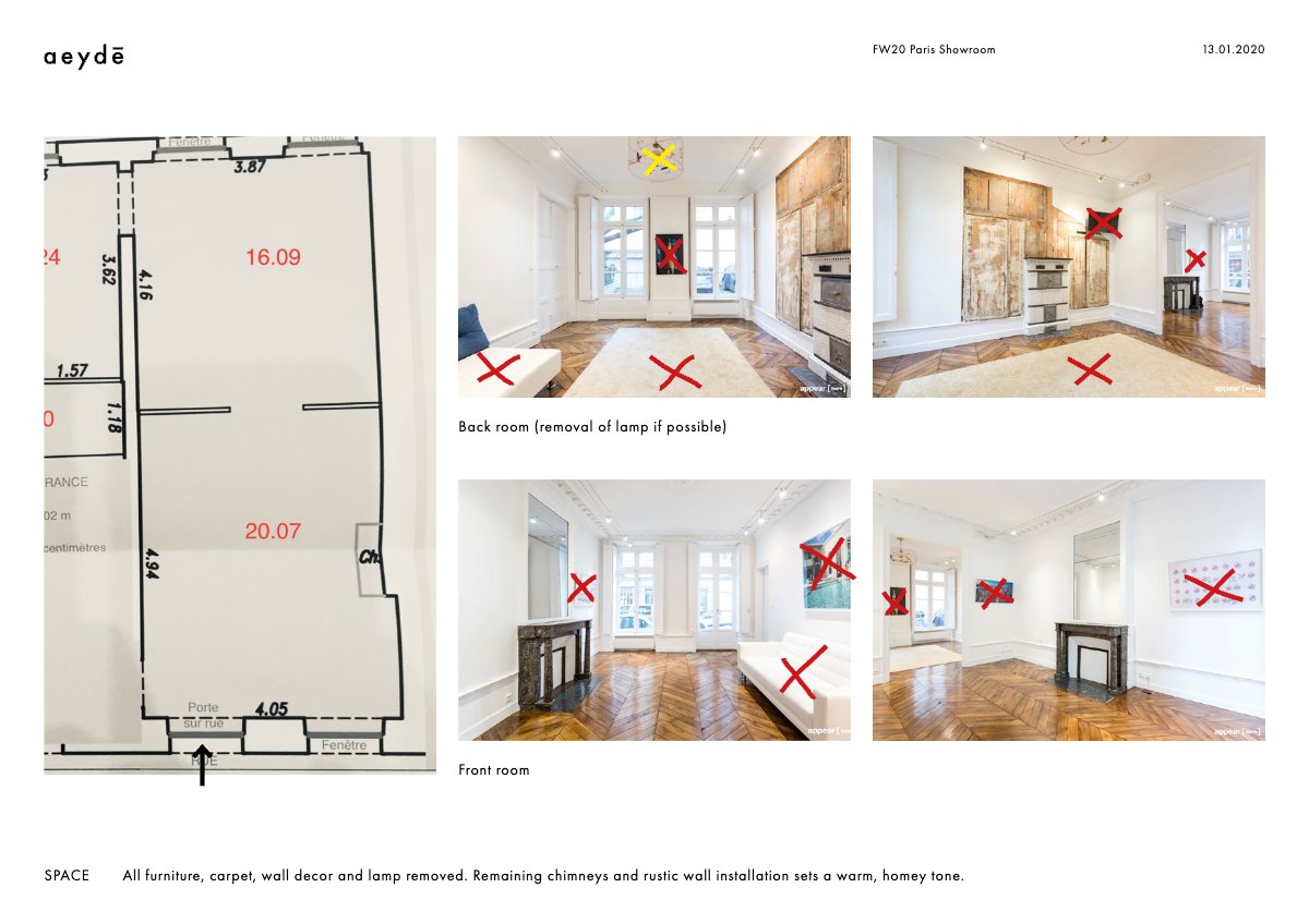
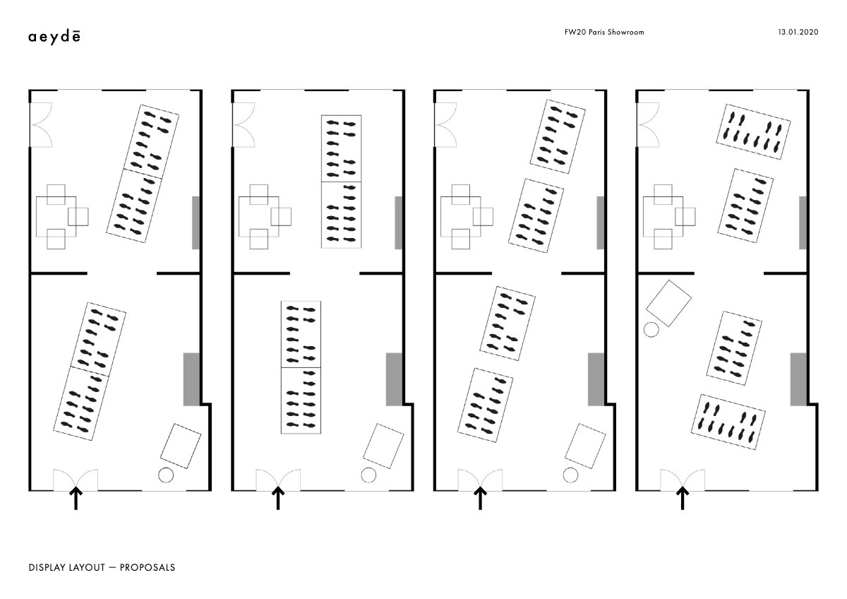
Prior to this, Aeyde had no defined showroom language. I developed a recurring showroom concept centred around four glossy black plinths, creating a consistent visual framework that could be adapted to any space while ensuring every showroom felt unmistakably Aeyde.
10 SS21 CONCEPT TO SPECIFIED SEASON
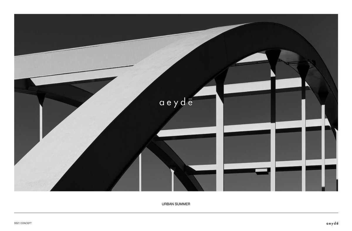
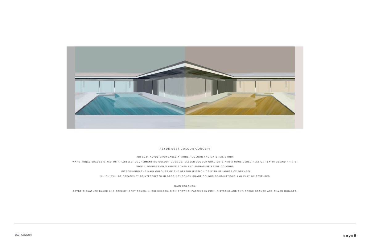
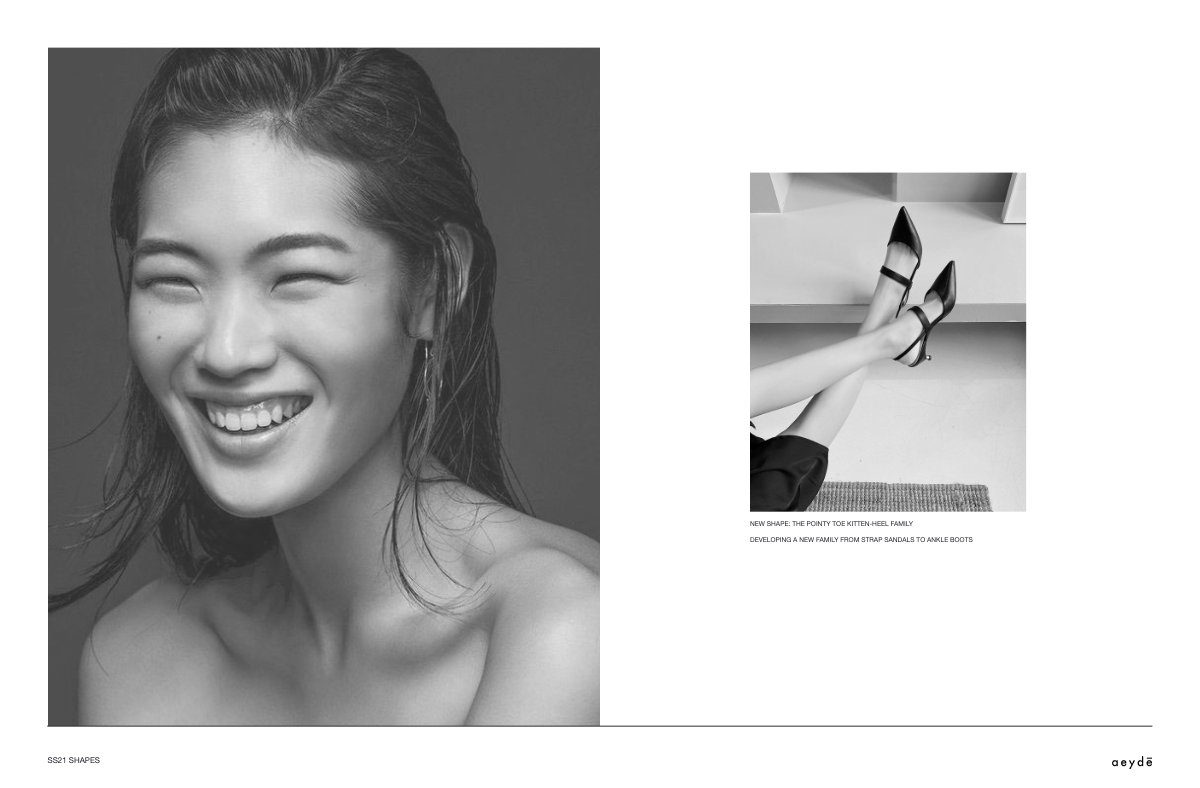
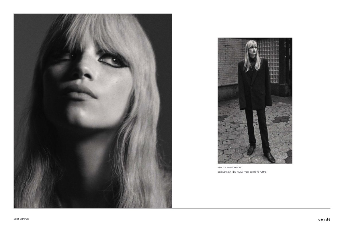
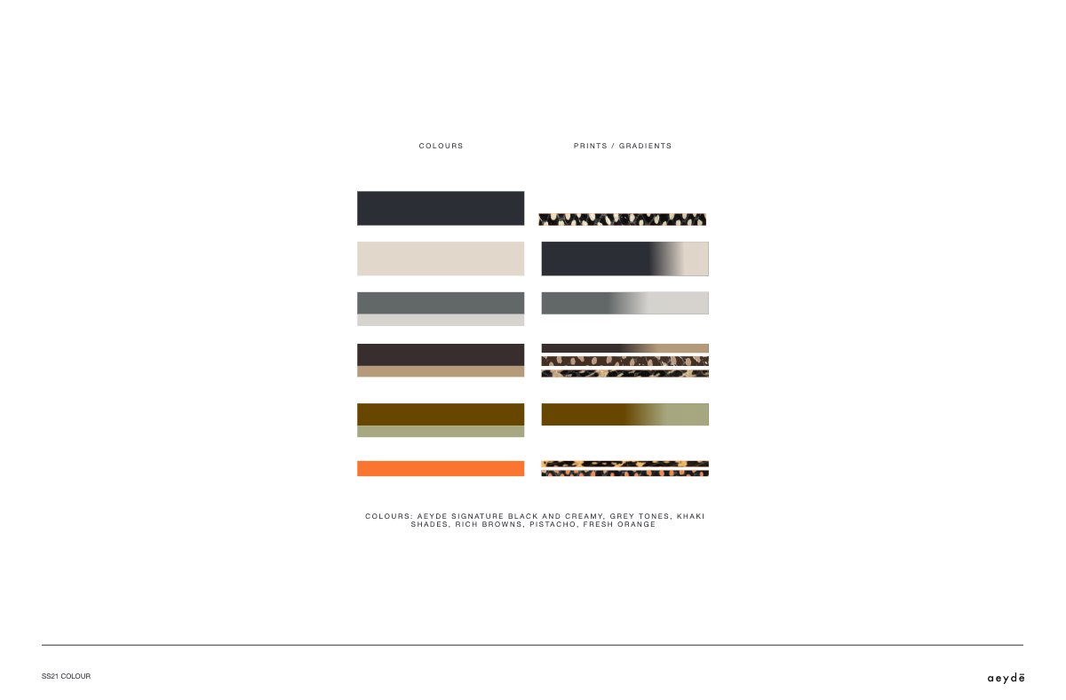
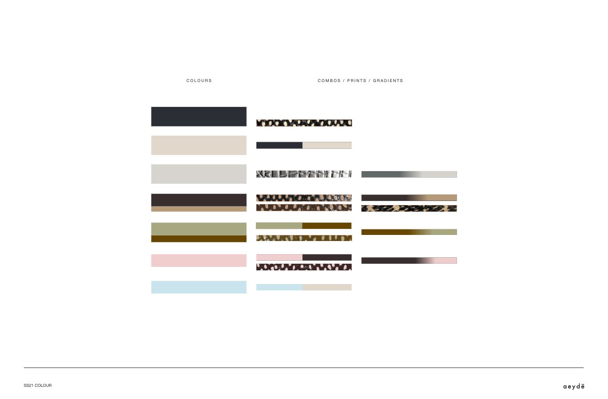
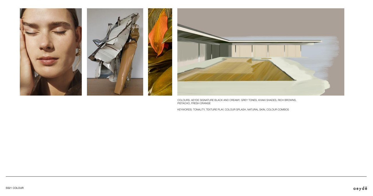
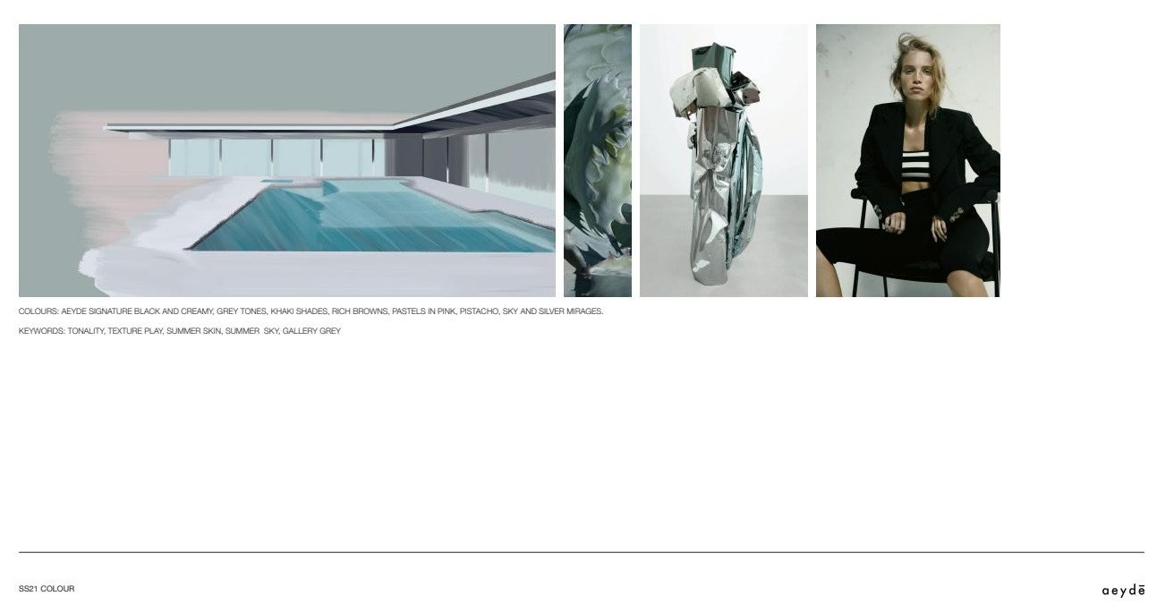
One season, taken from concept to a complete set of specified variants: two new toe families, a colour and material matrix per style, across two drops.
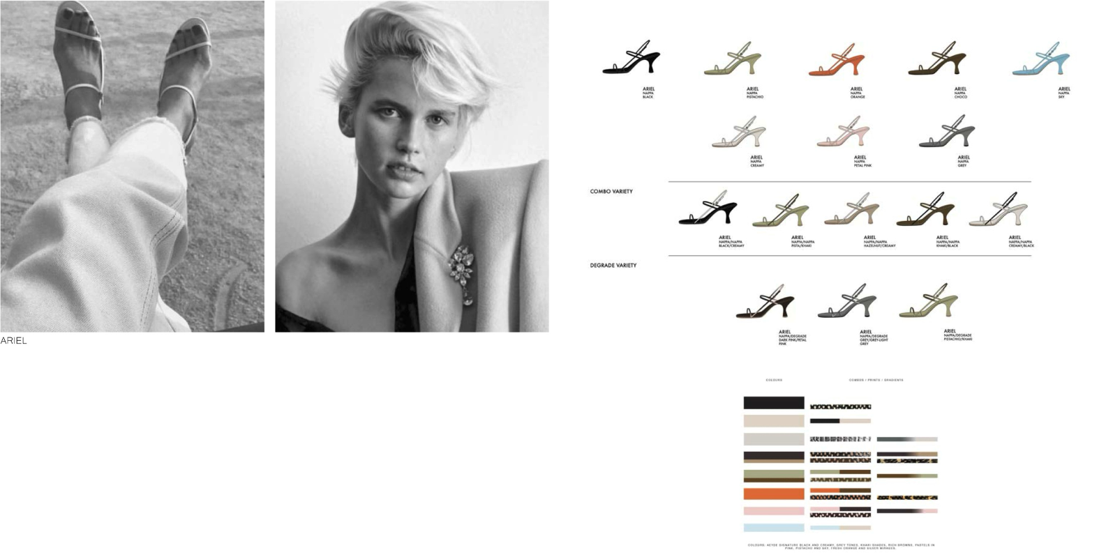
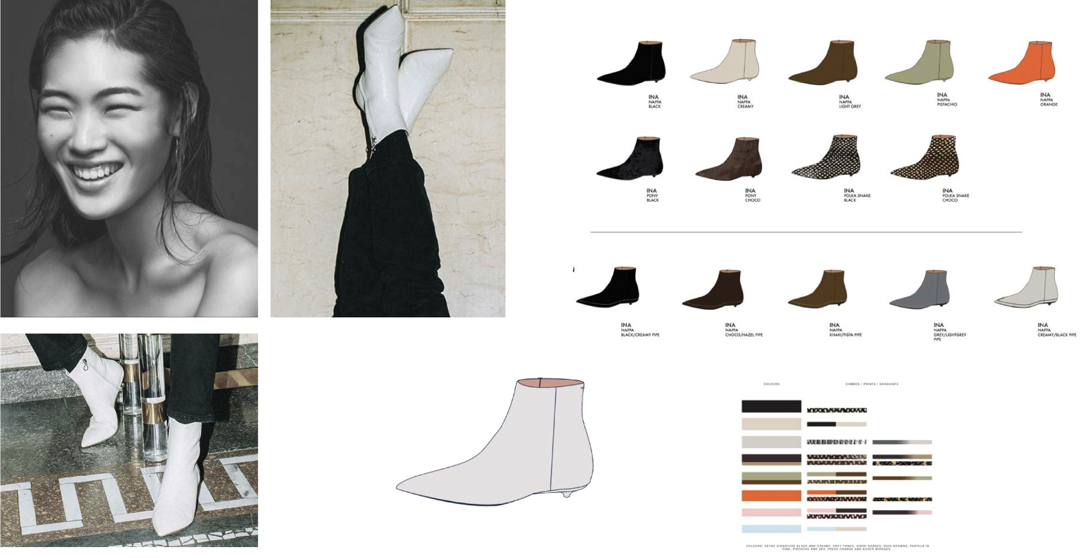
Each style was then issued as a complete matrix — material, colour, piping, combination and degradé — so that a season is a set of specified variants rather than a set of separate products.
11 Camille Charrière THE SYSTEM EXTENDED
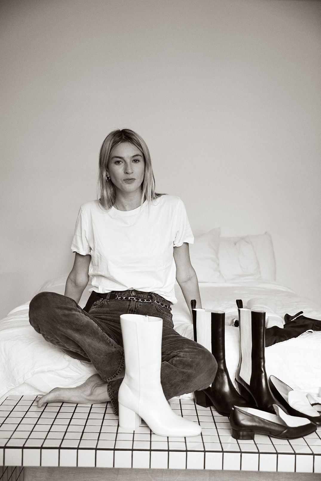
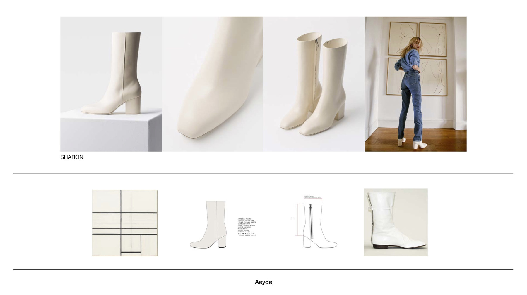
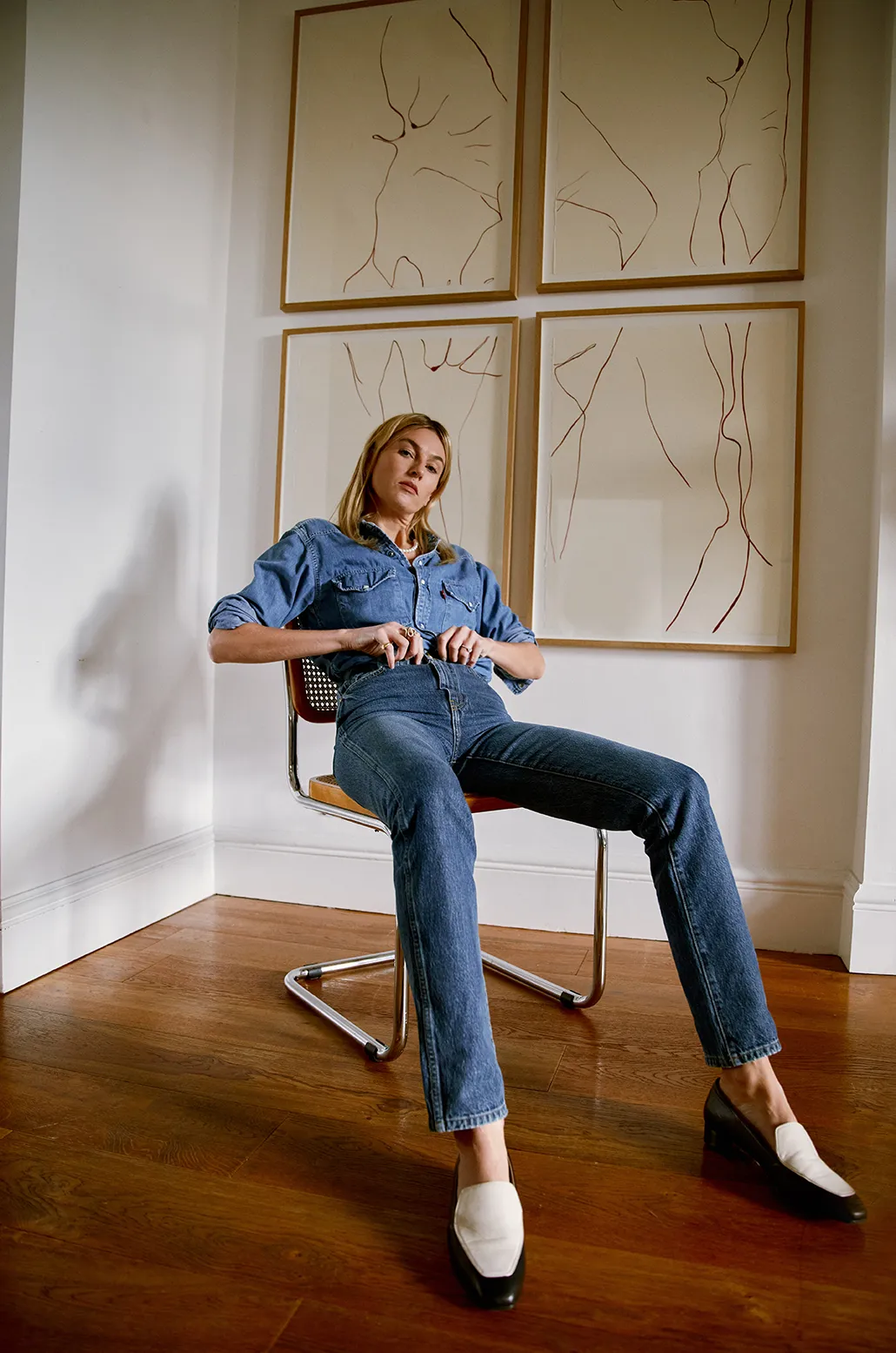
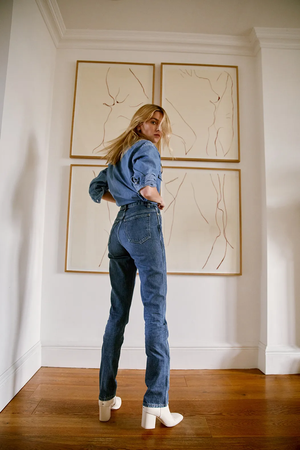
The collaboration extended the product work into a three-piece capsule. Four design routes were developed across the existing silhouette range before any were selected.
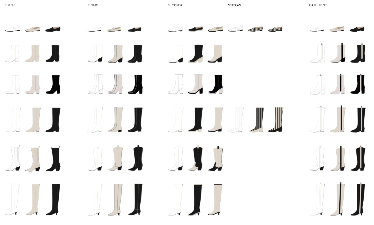
| Route | Verdict | |
|---|---|---|
| 01 | Simple | Developed |
| 02 | Piping | Developed |
| 03 | Bi-colour | Selected |
| 04 | Camille C | Developed |
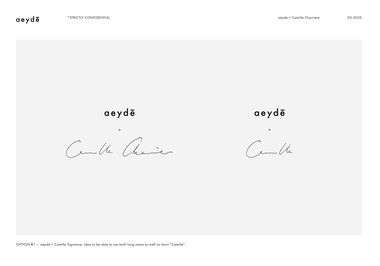
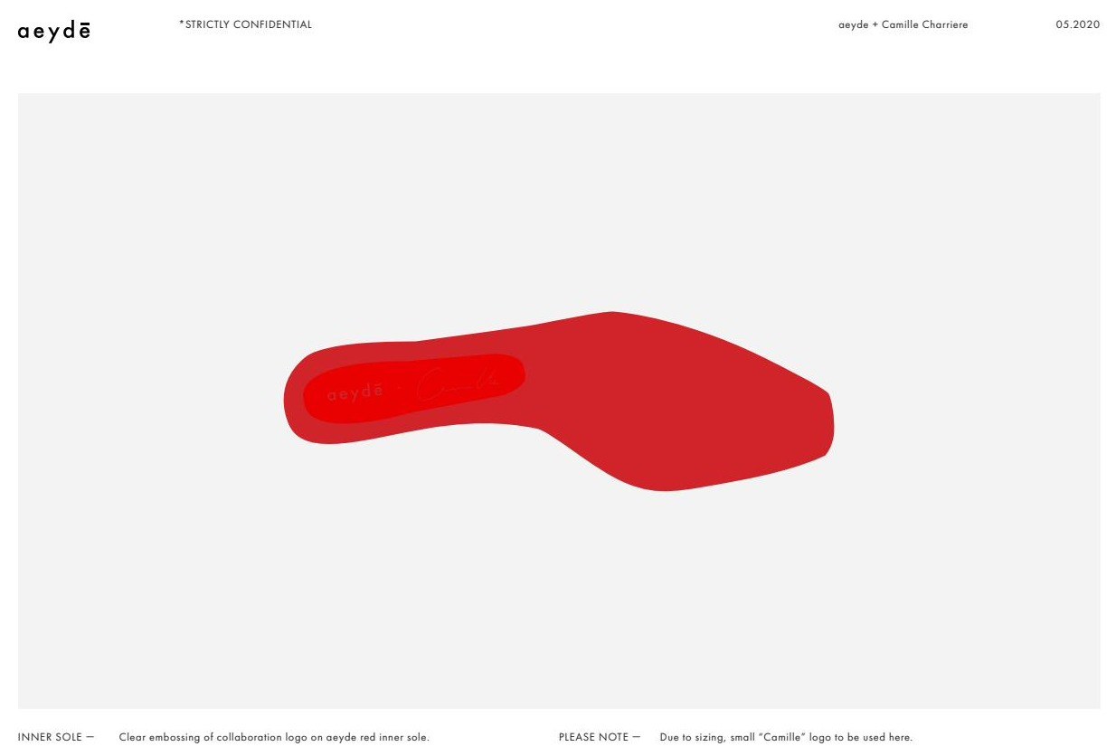
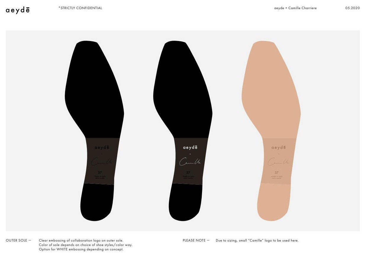
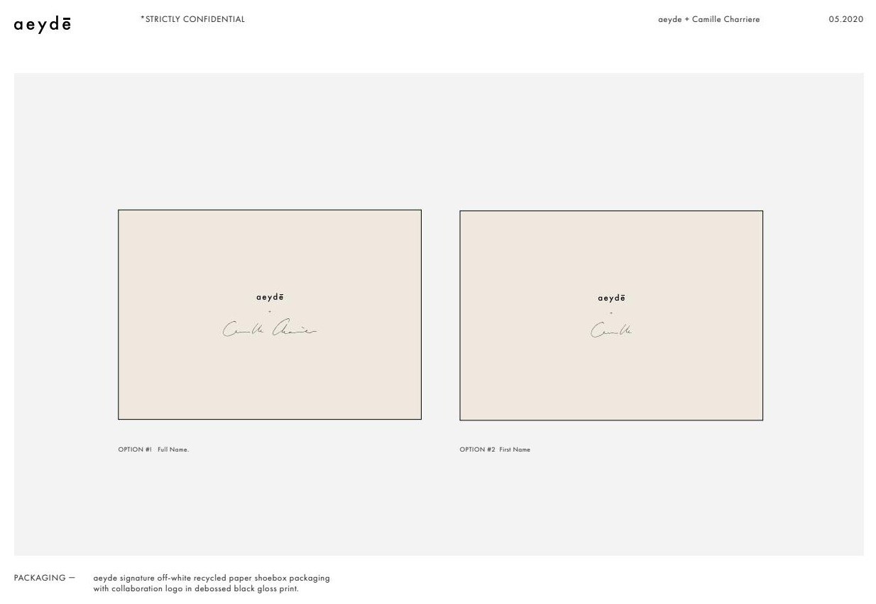
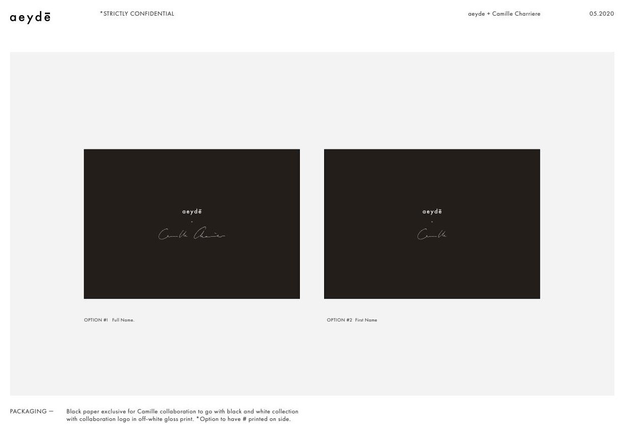
Design concept, execution routes, material direction, monogram, on-product branding and packaging were designed here. The collaboration was run commercially by Aeyde’s founder and marketing team.
WMB Eyewear
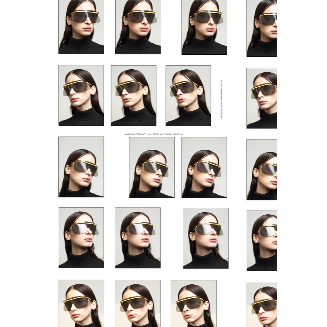
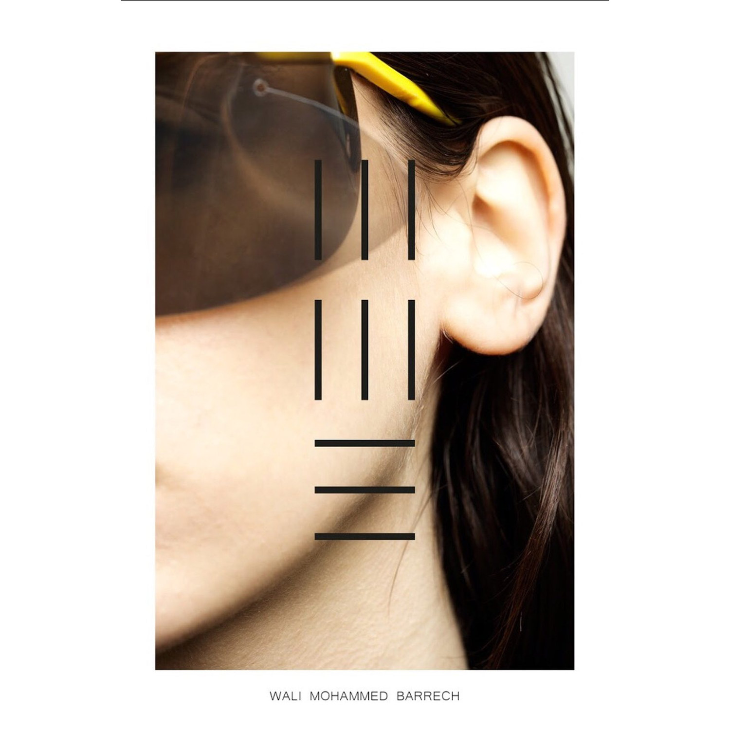
01PositionOne frame, variable lens
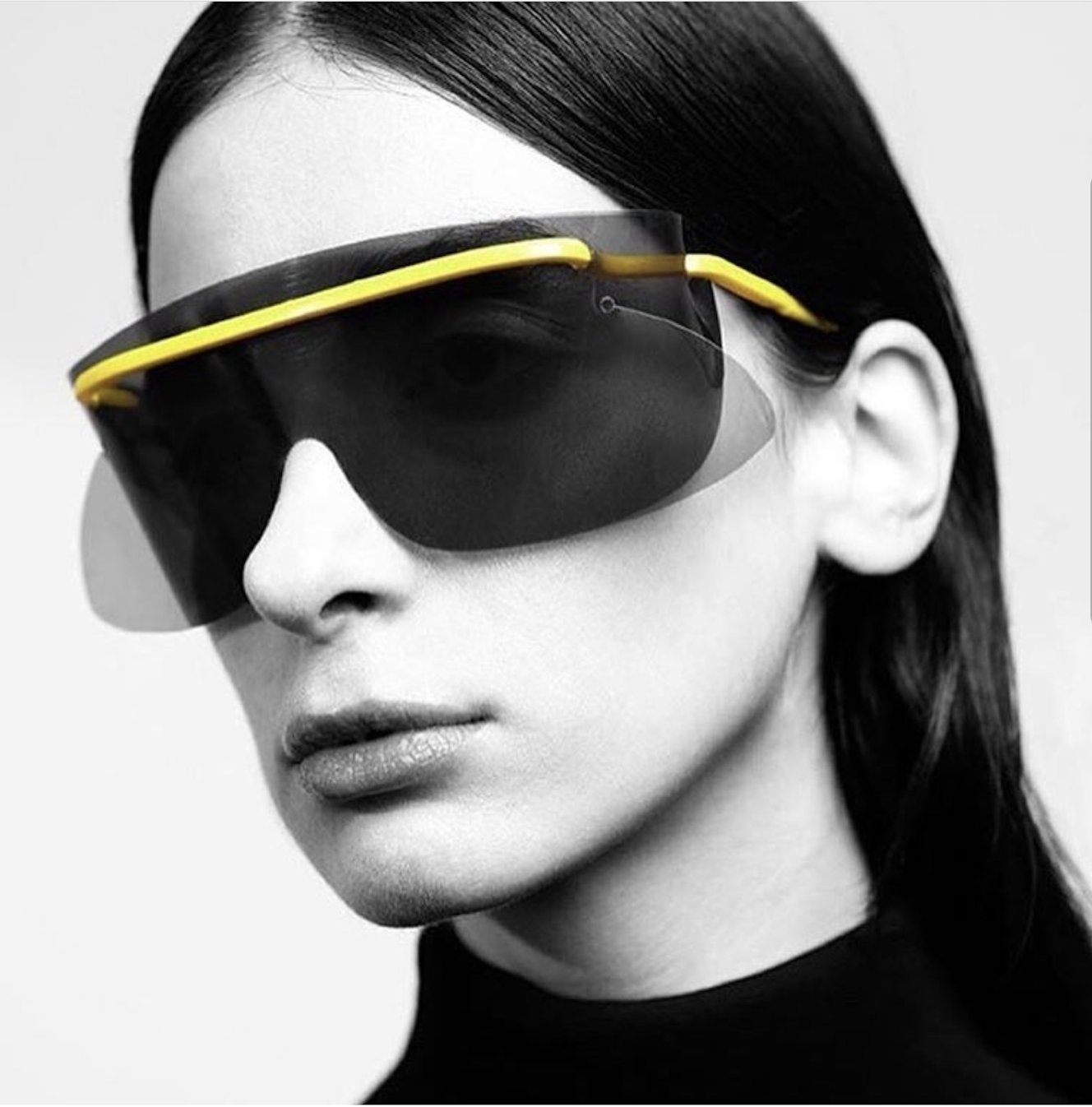
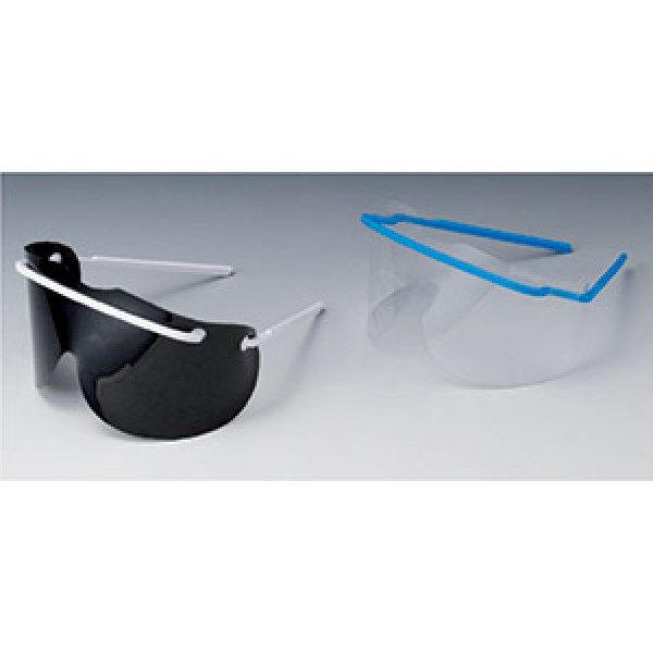
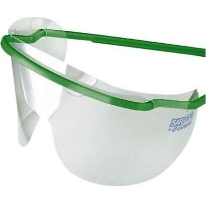
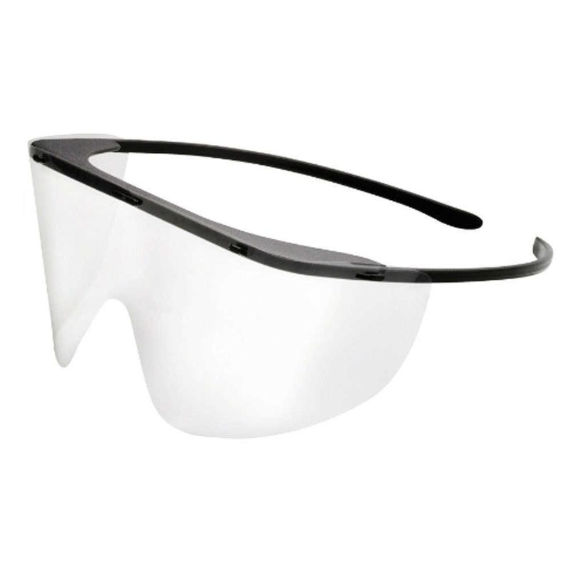
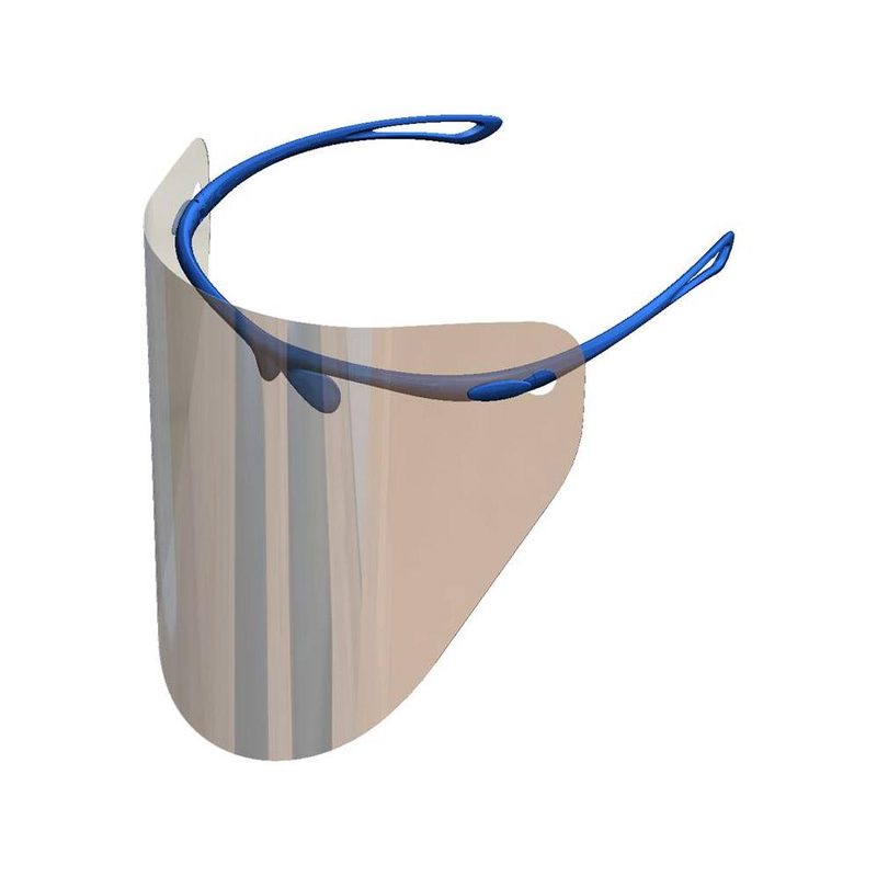
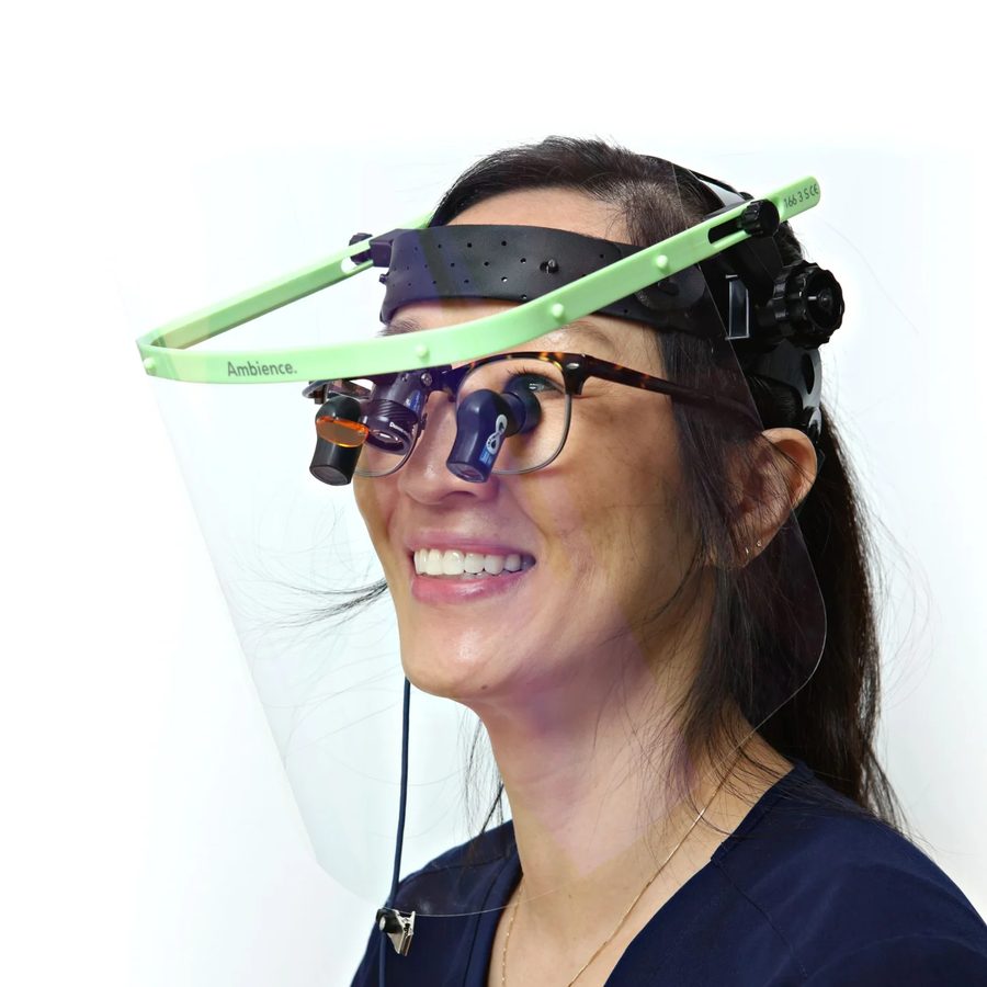
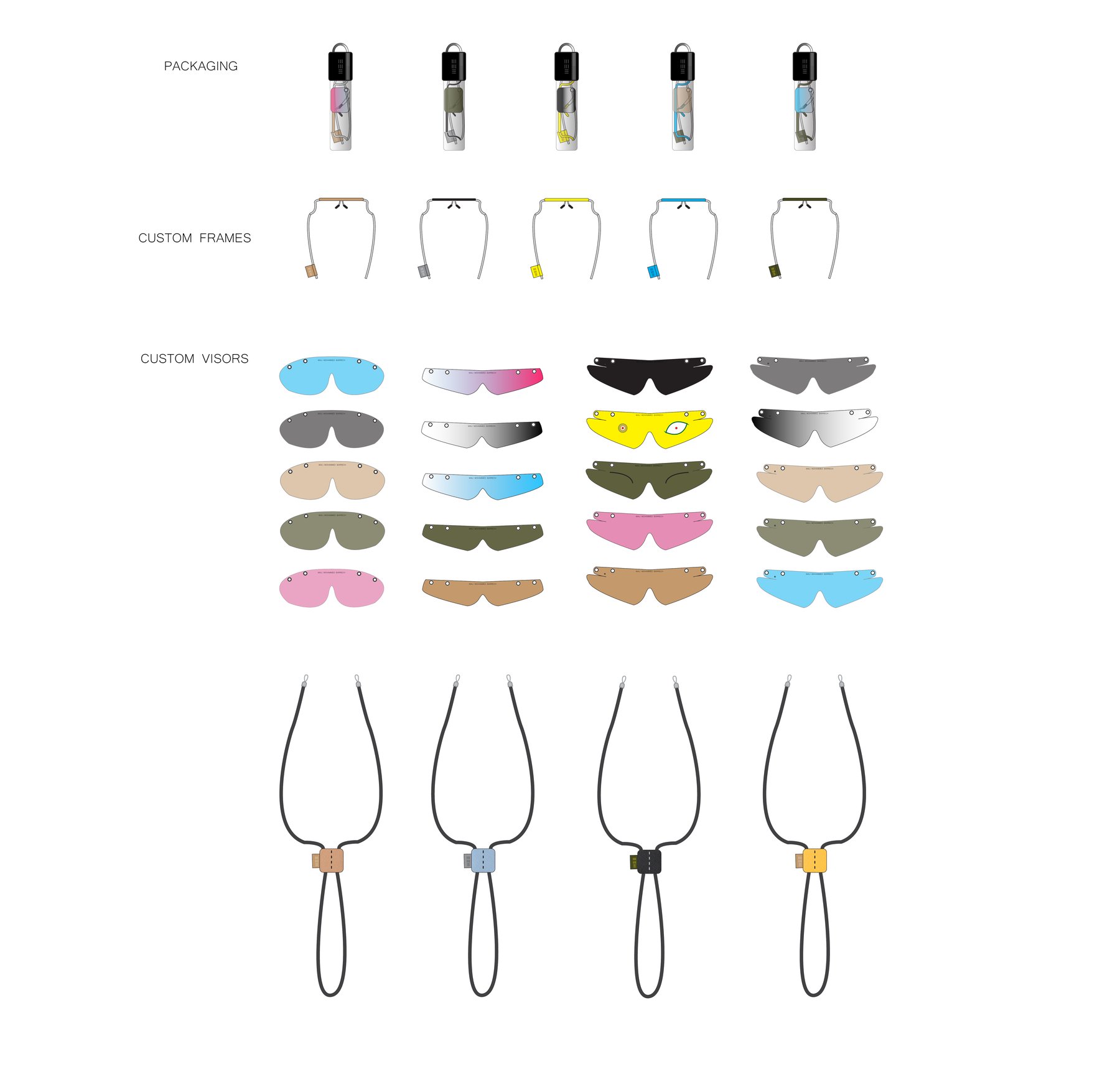
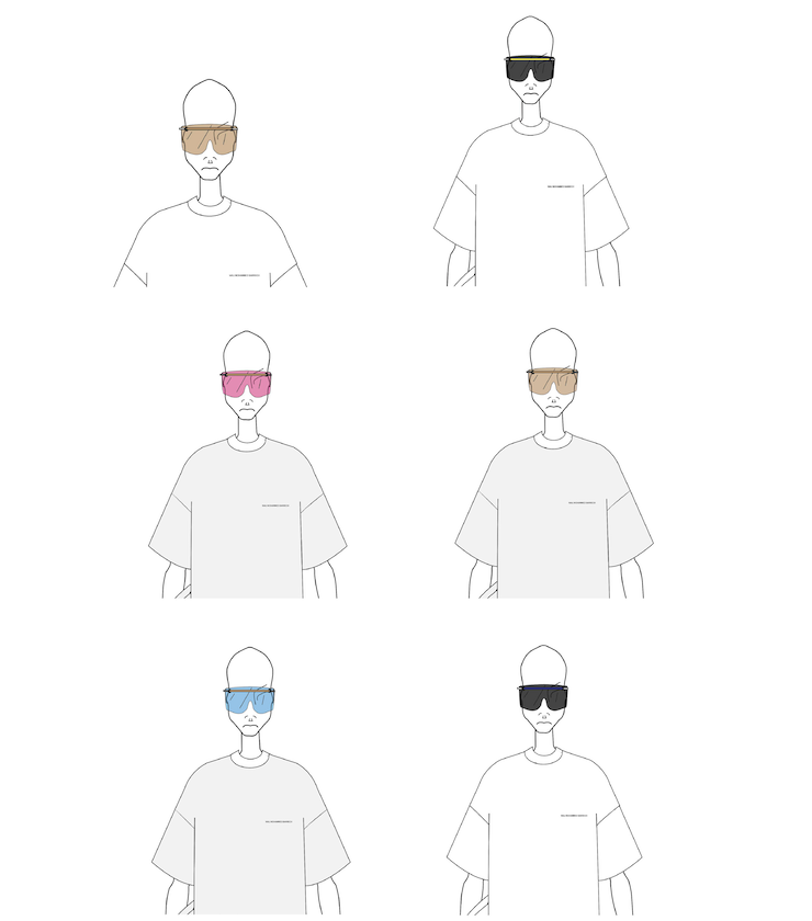
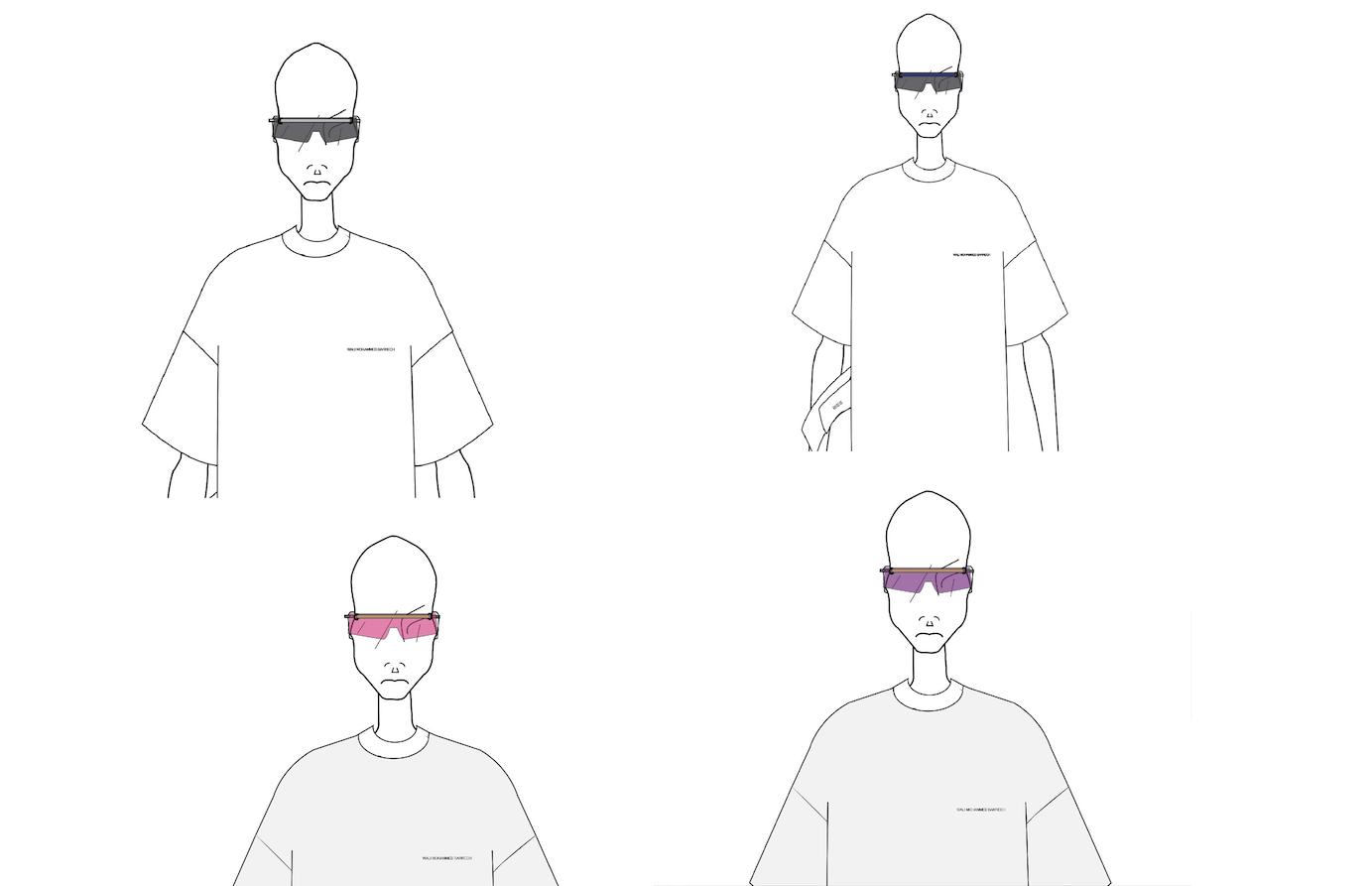
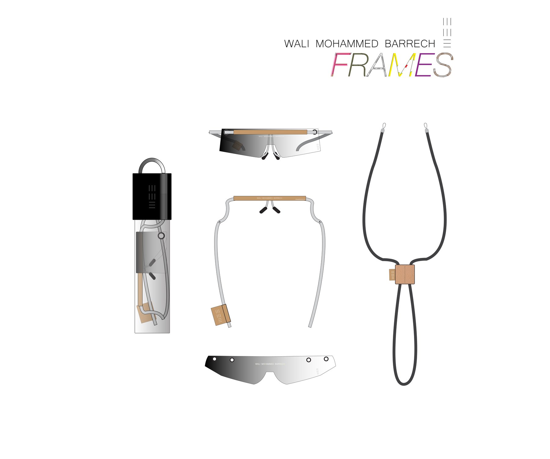
The reference base was industrial — disposable protective spectacles and clinical face shields. The study asked whether that construction logic could carry a designed system: a single frame architecture, an interchangeable lens, a strap, a package.
02ReferencesIndustrial, not stylistic
03SystemFrames, visors, strap, packaging
04DrawingsPresentation masters, July 2018
05Prototype and campaignAntwerp, 2017
WMB Origin
Who is permitted to be visible, and who is permitted to disappear?
A garment decides what is seen. So does a bag, a uniform, a shopfront. Camouflage conceals the soldier and exposes the civilian. A uniform grants identity by removing it. Survival equipment is designed to make you findable. An object you own decides what of yours is public.
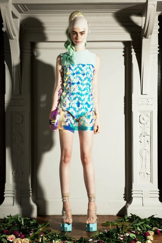
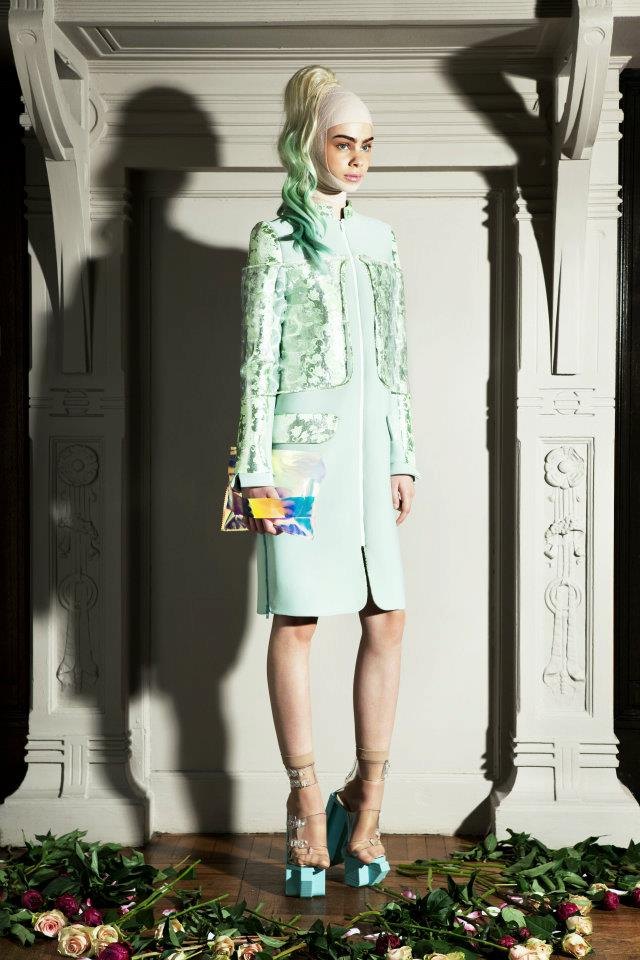
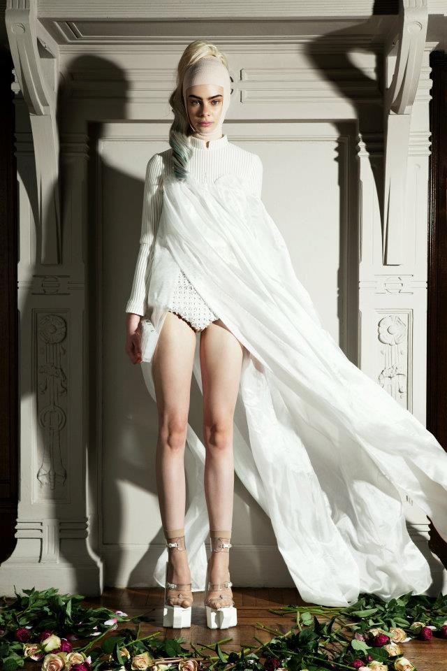
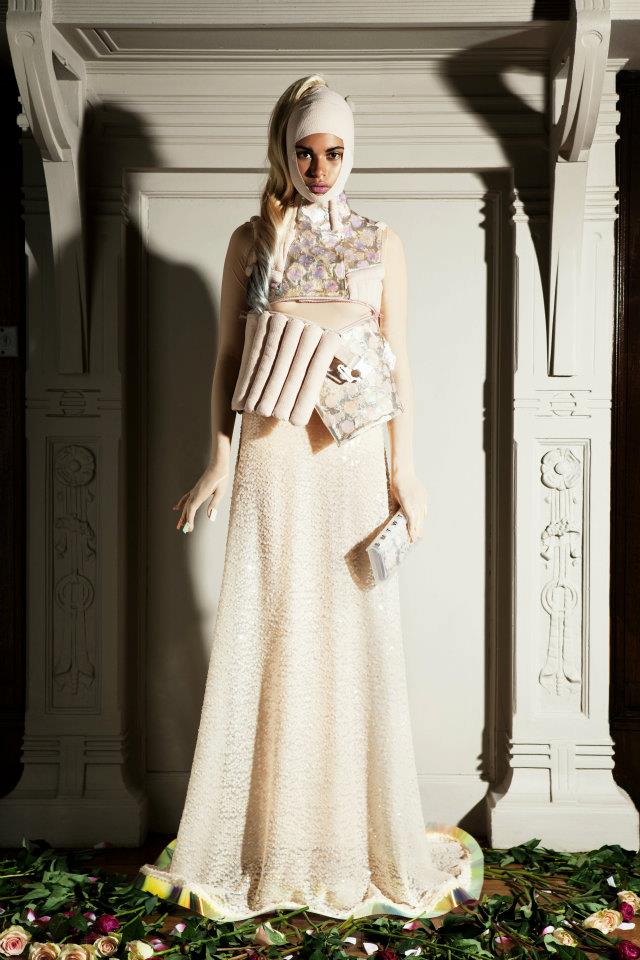
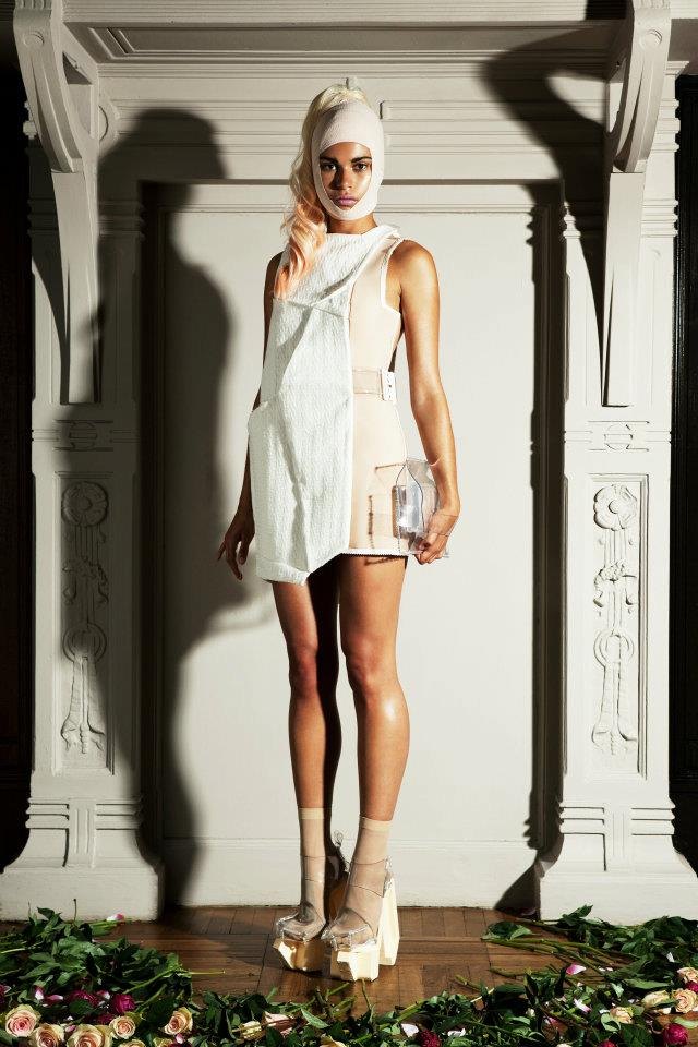
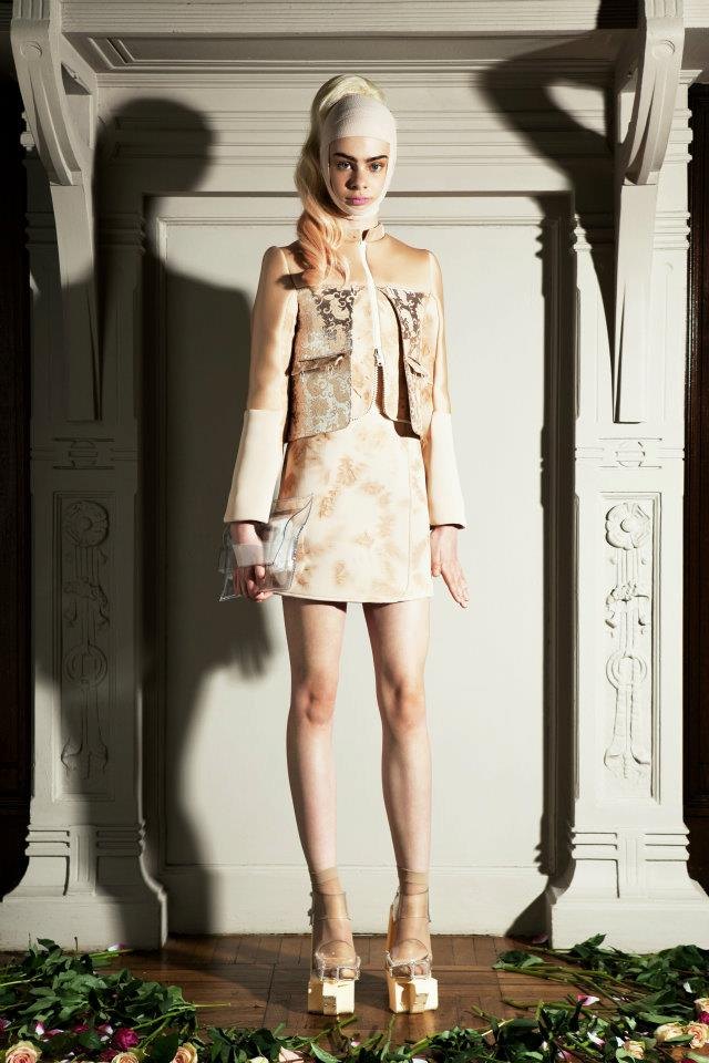
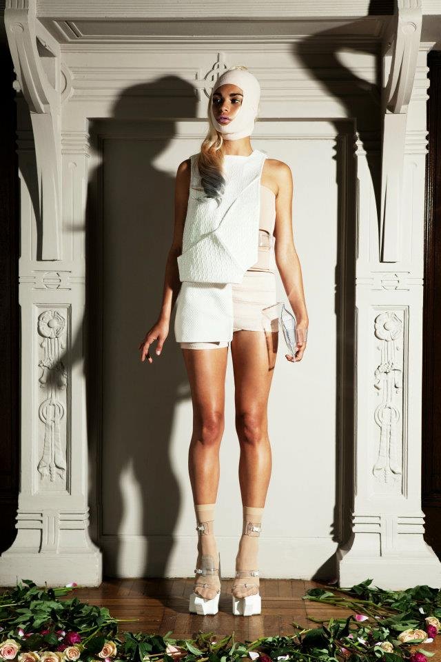
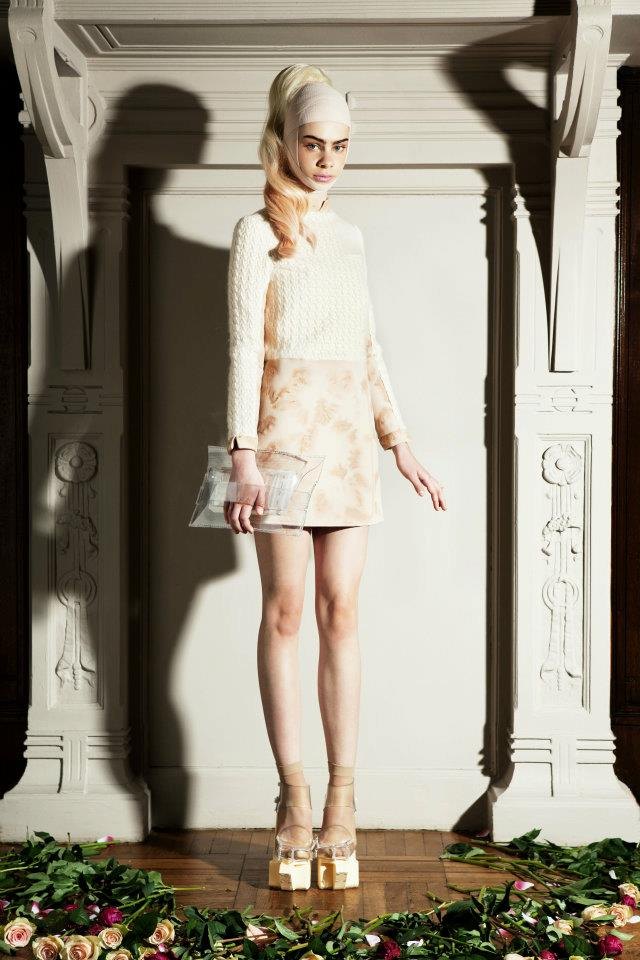
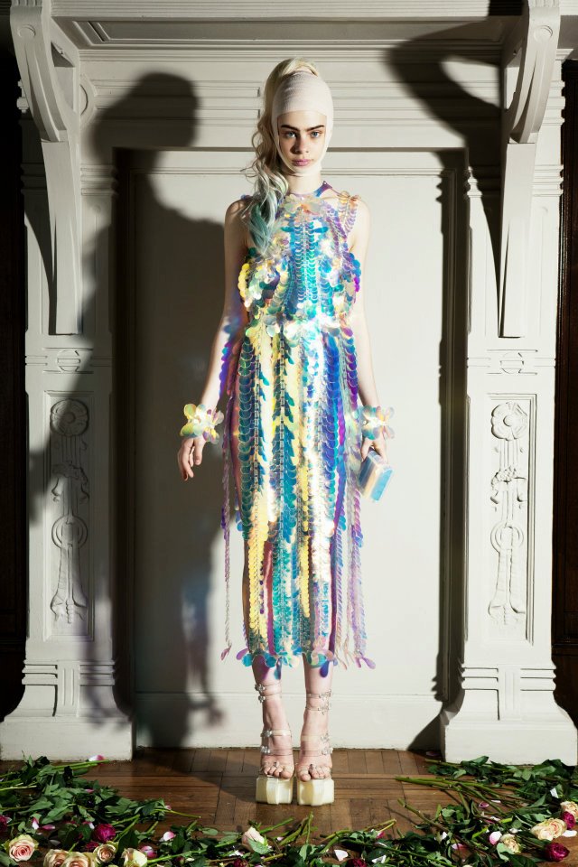
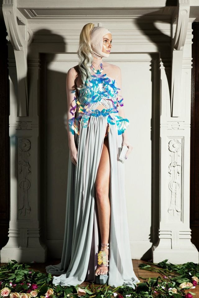
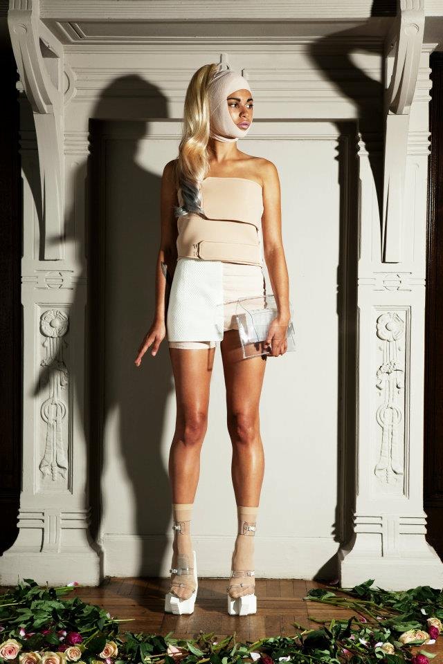
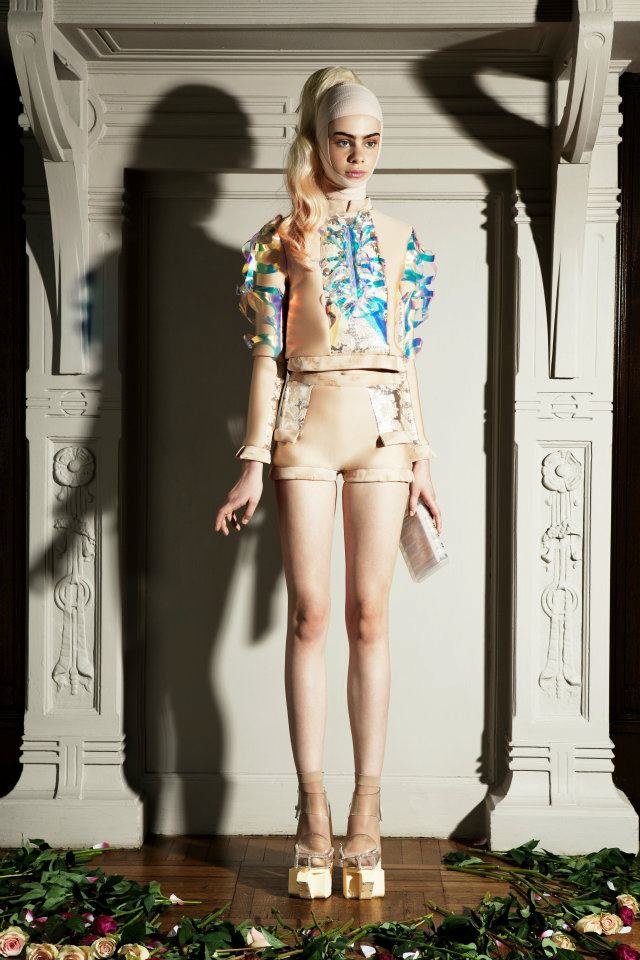
01 Copenhagen THREE CONSECUTIVE SEASONS · 2013–2015
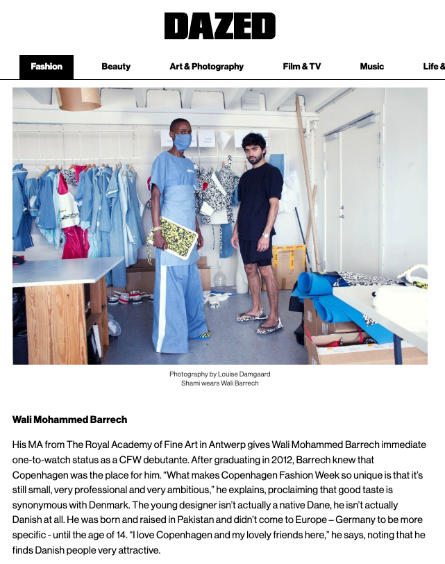
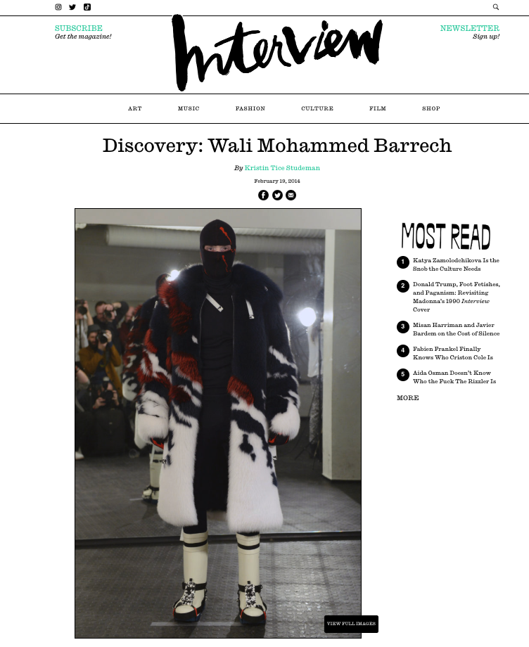
Three consecutive seasons on the Copenhagen Fashion Week calendar, beginning with an independent debut in August 2013 — the closing show of the schedule.
| Season | Collection | Collaboration | |
|---|---|---|---|
| 01 | SS14 | CAUTION | Studio Sabine Marcelis |
| 02 | AW14/15 | ICEBREAKER | SAGA Furs, DUNLOP Protective Footwear |
| 03 | SS15 | S.O.S. | Studio Sabine Marcelis |
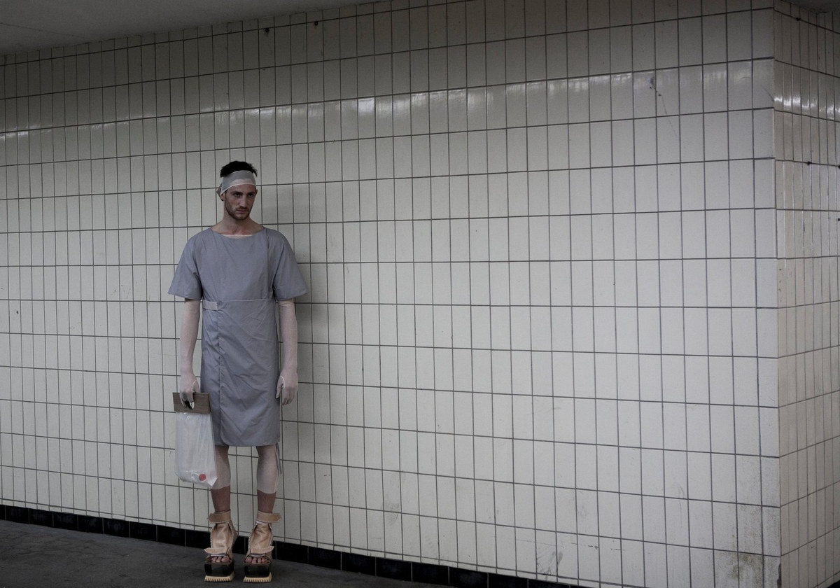
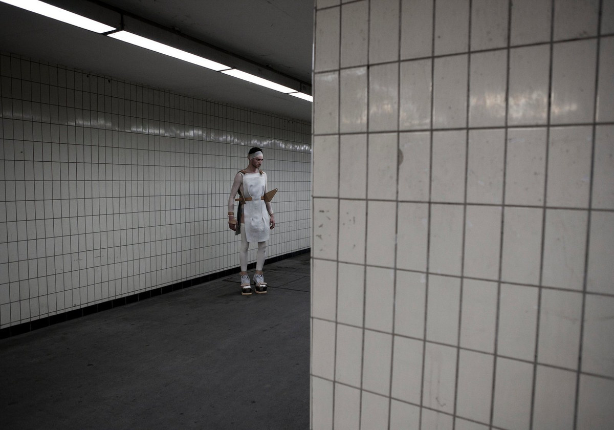
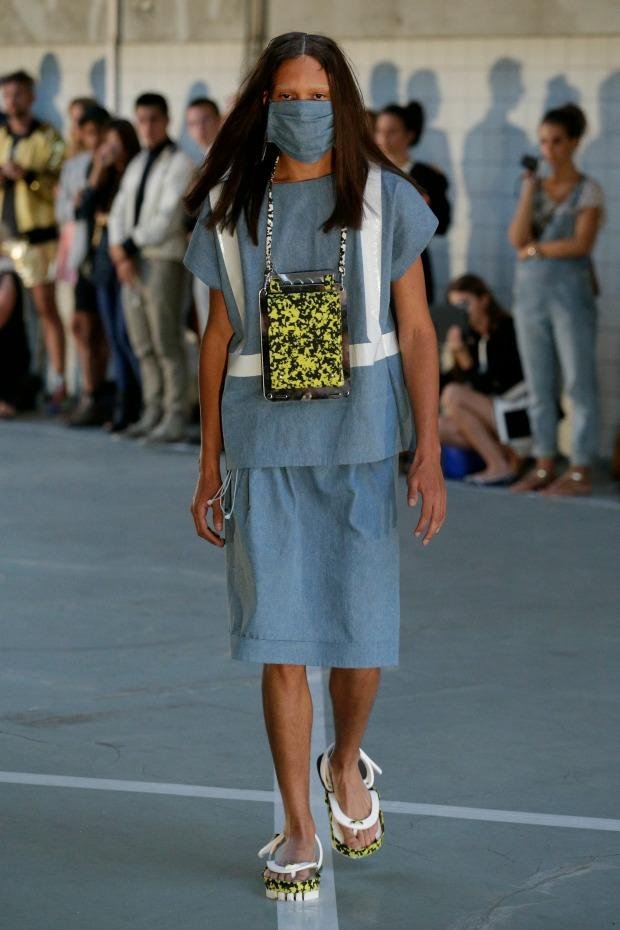
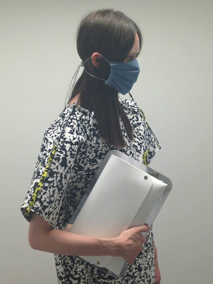
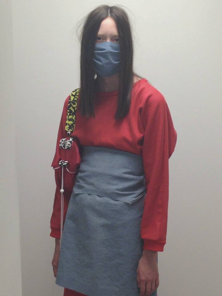
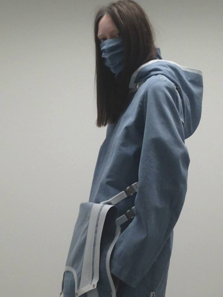
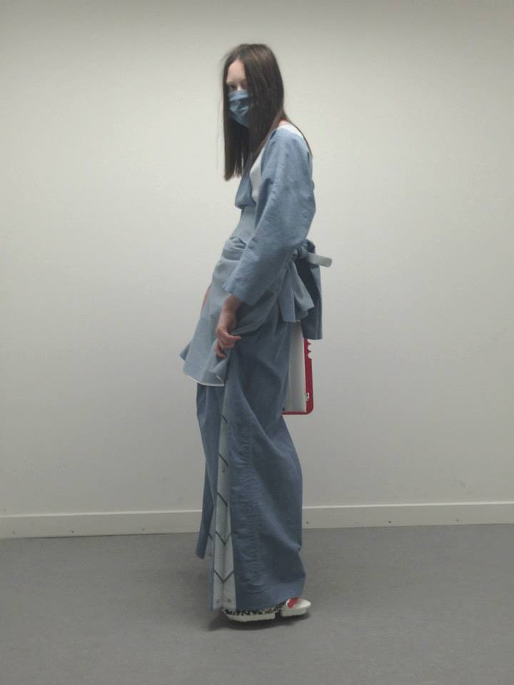
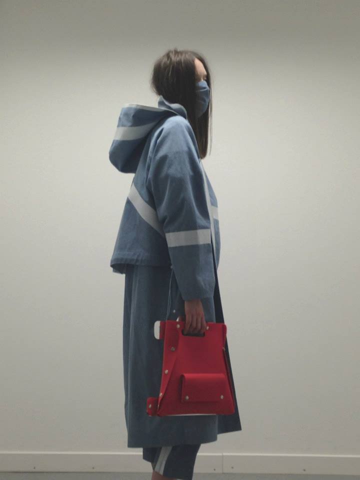
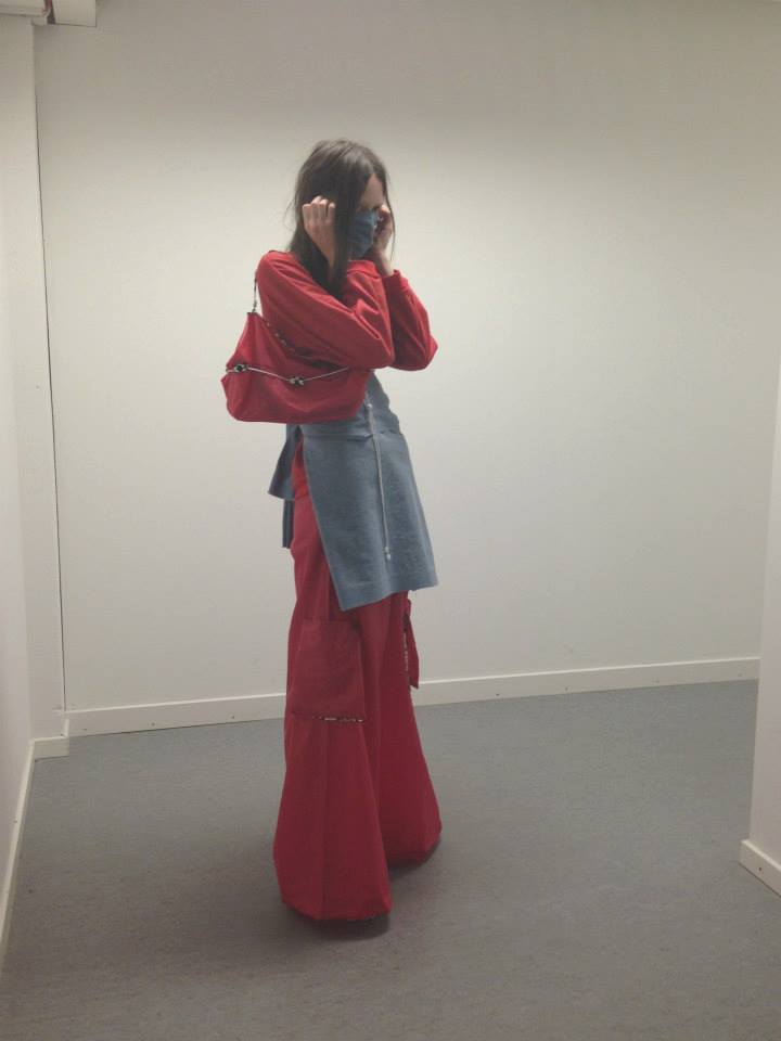
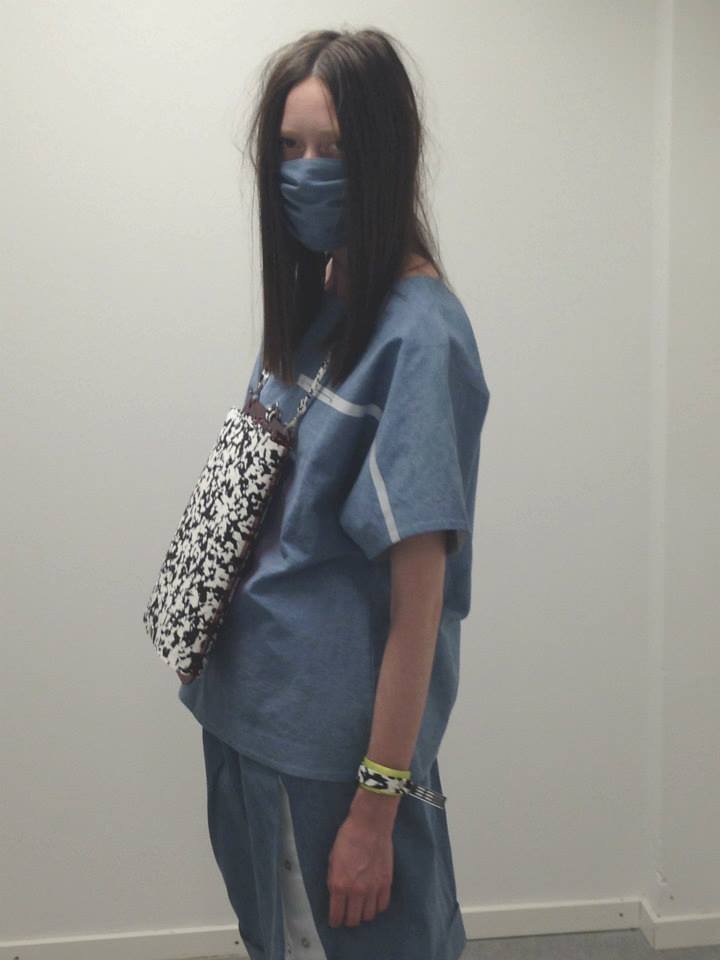
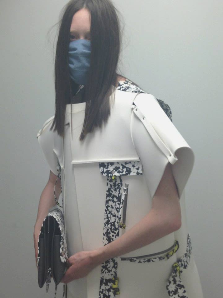
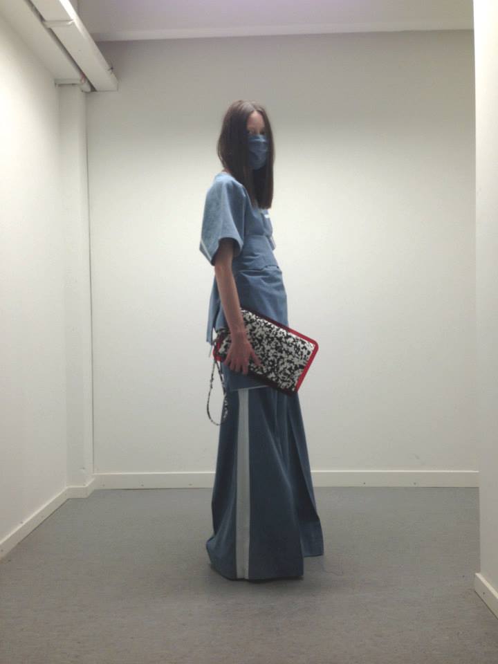
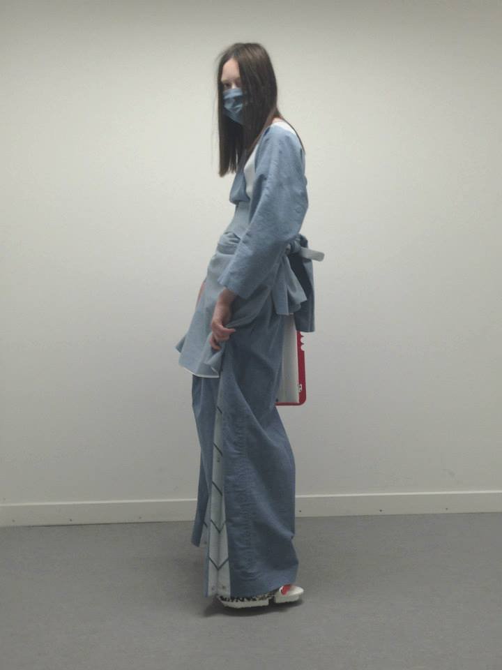
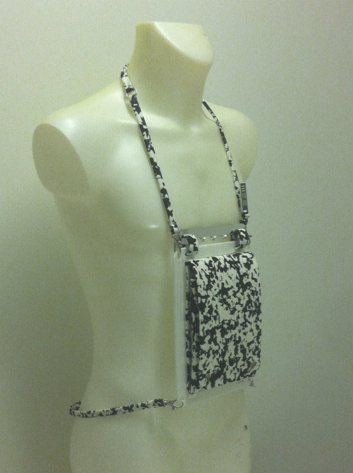
02 CAUTION COPENHAGEN FASHION WEEK · SS14
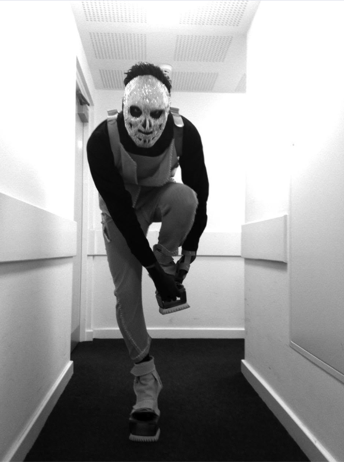
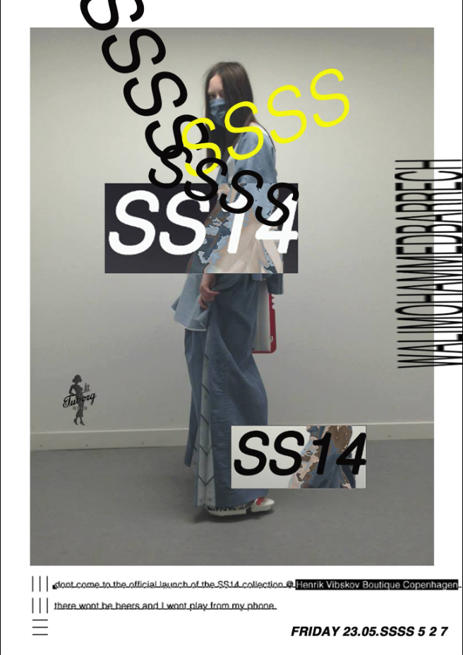
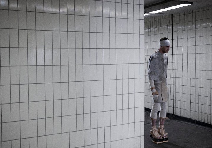
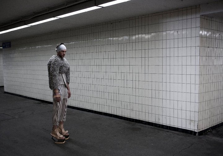
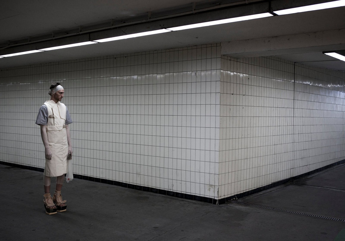
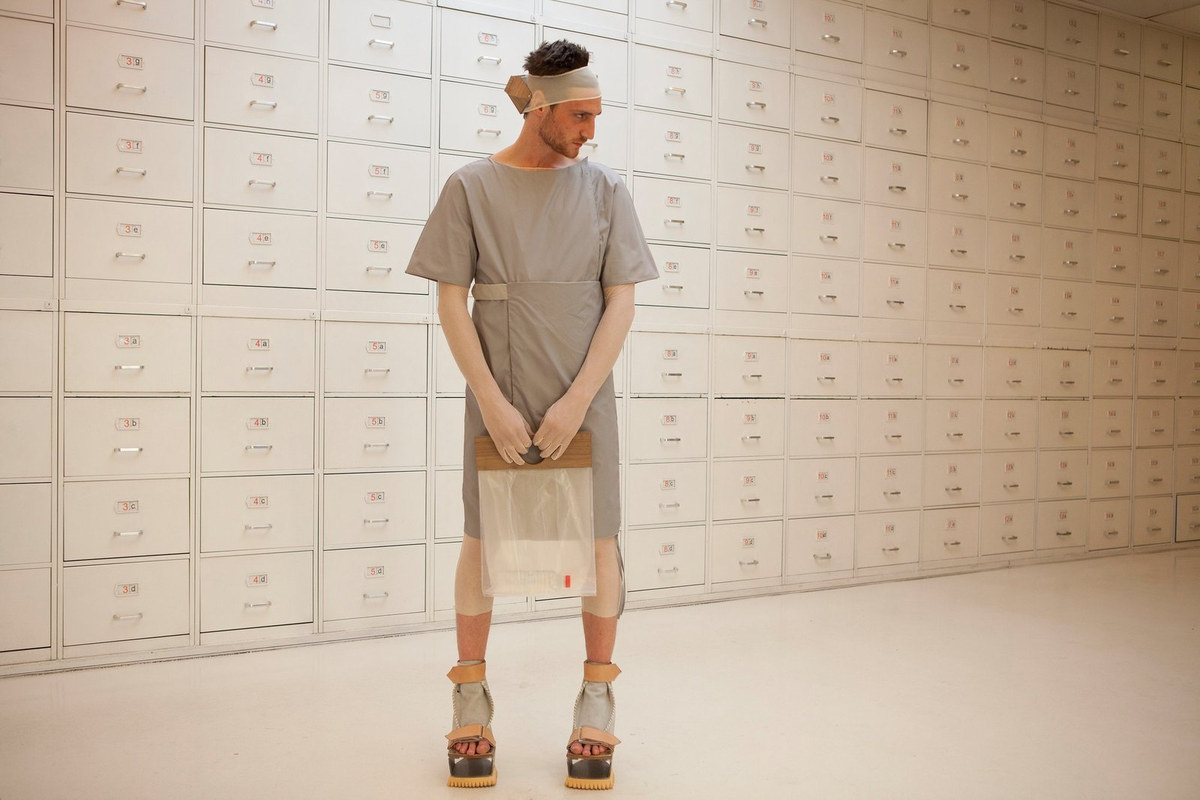
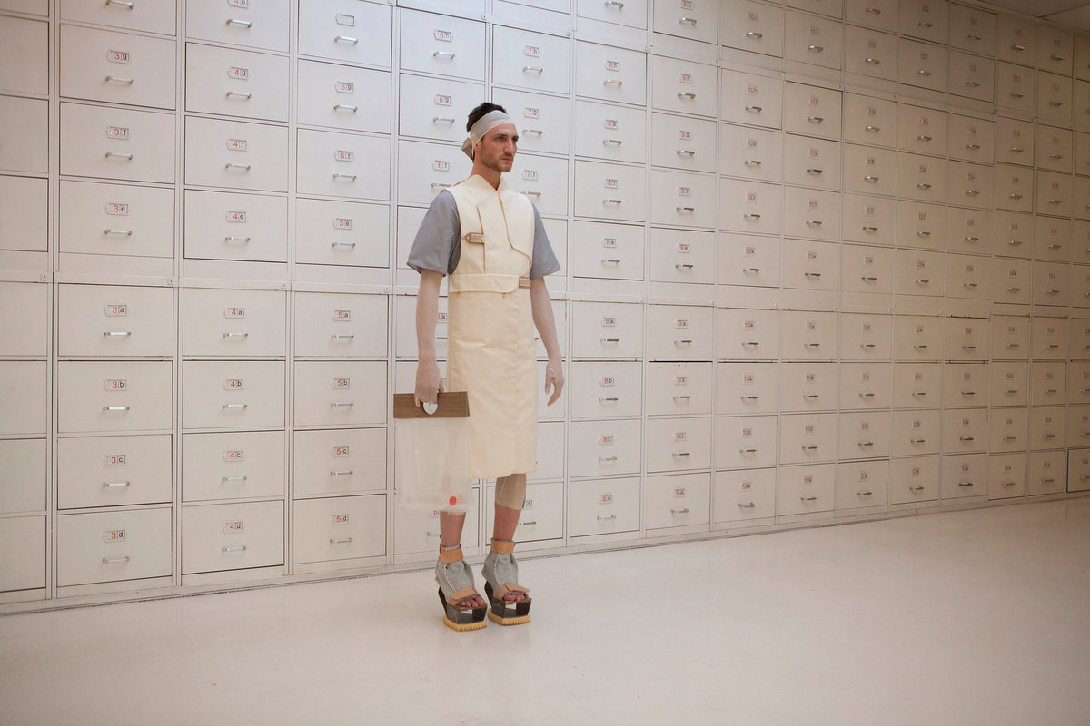
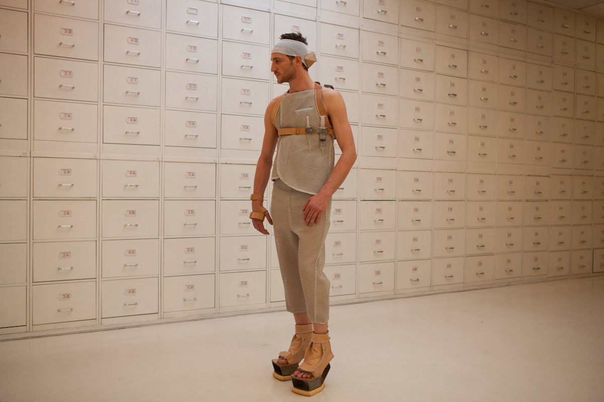
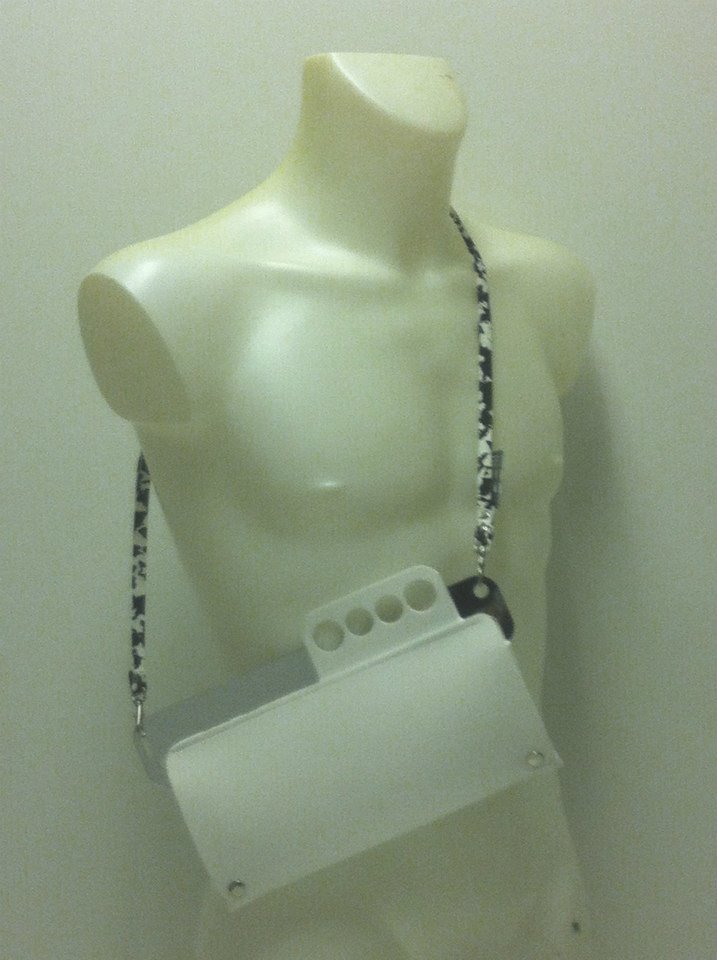
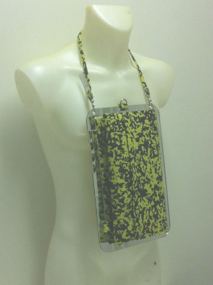
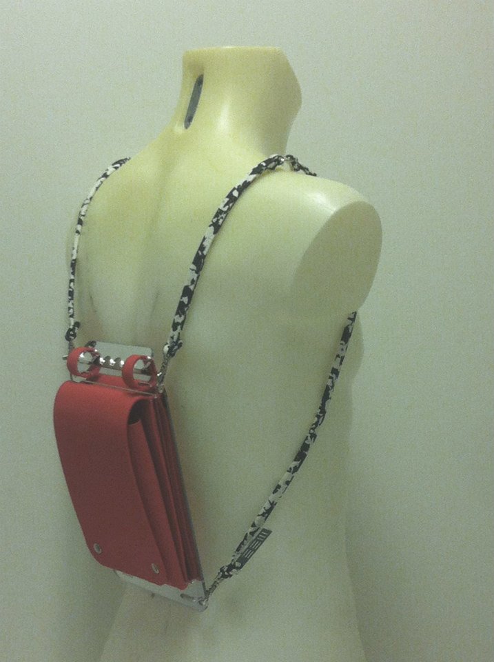
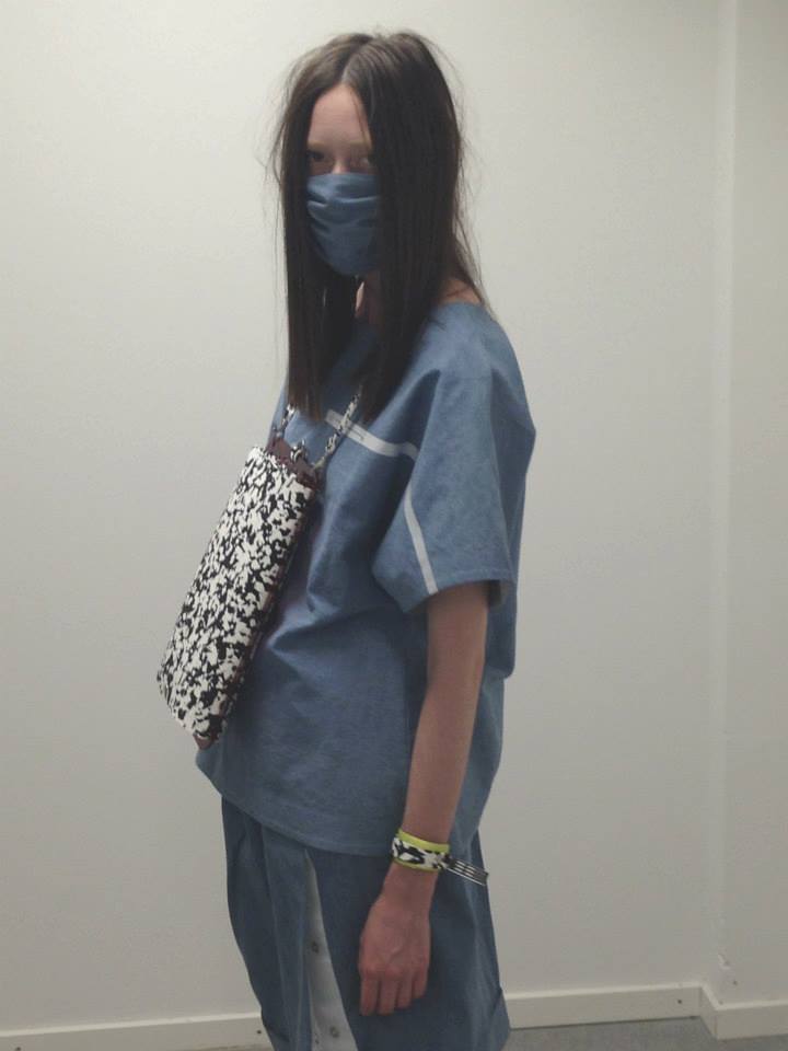
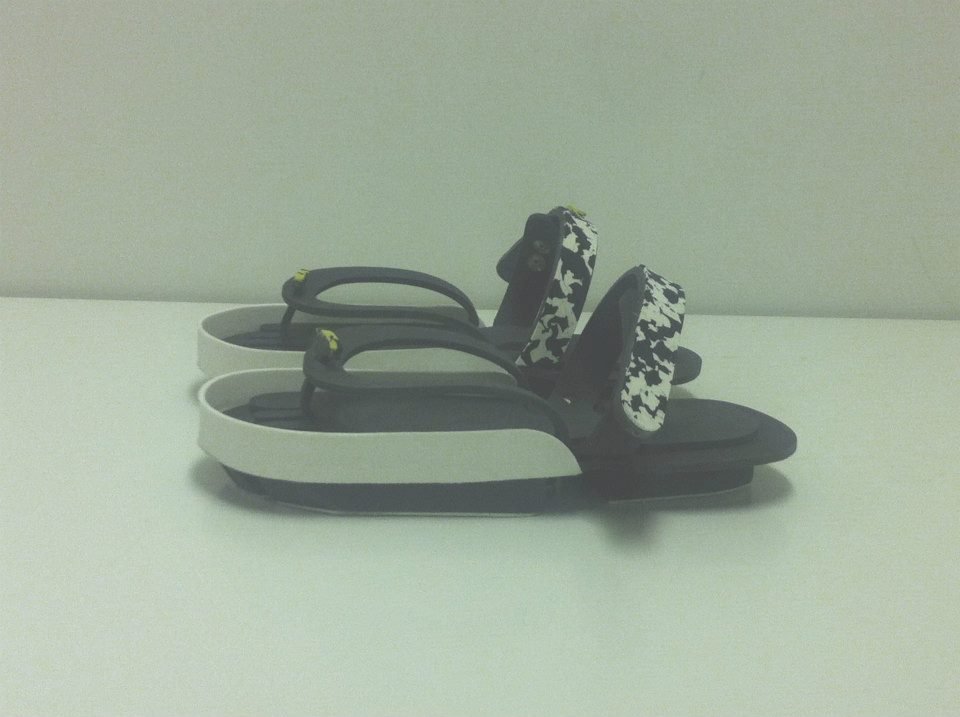
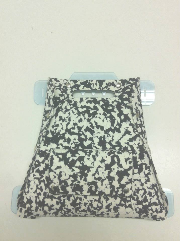
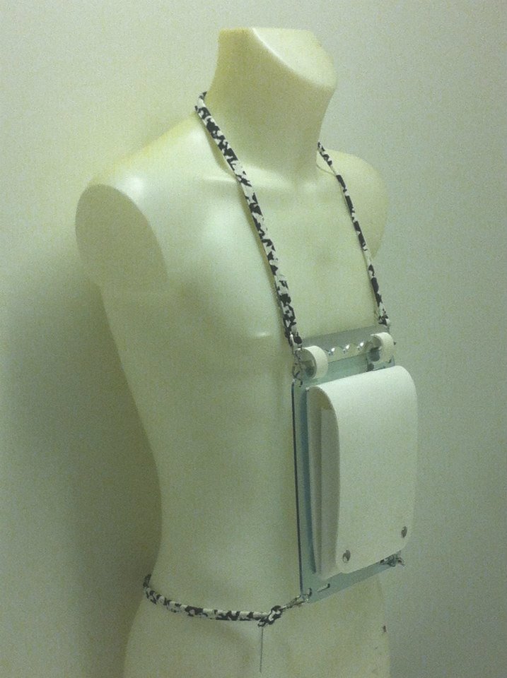
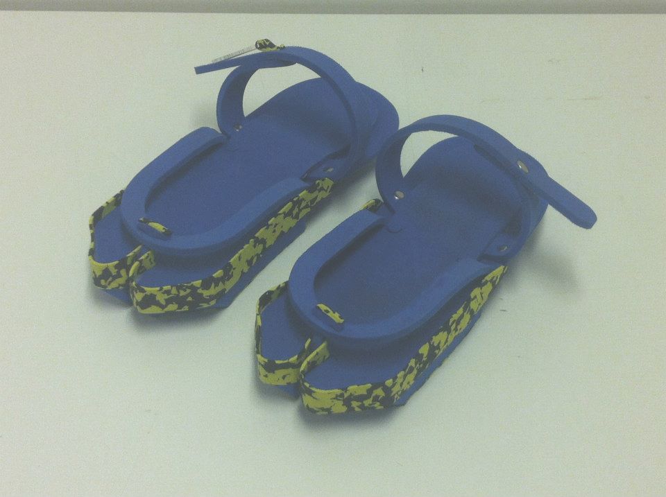
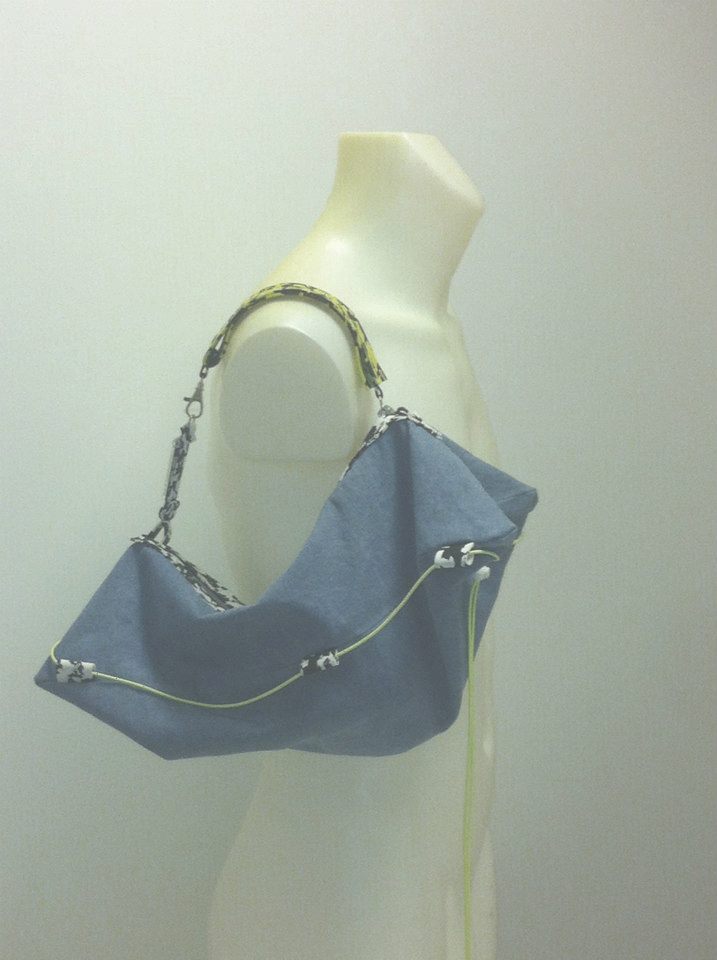
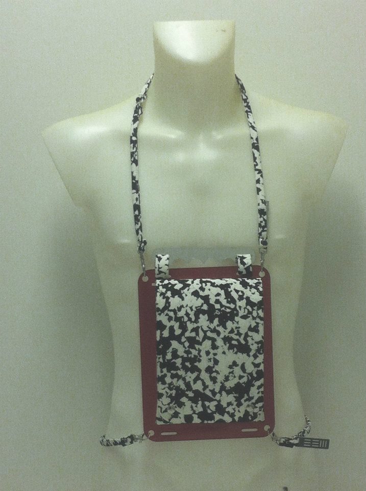
A uniform makes a person legible and anonymous at the same time. CAUTION SS14 took that contradiction as its subject.
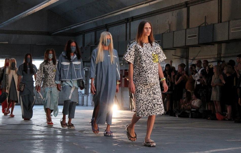
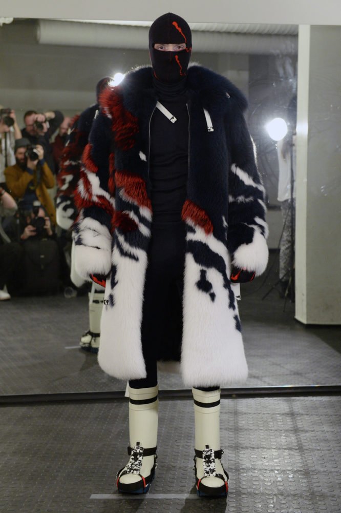
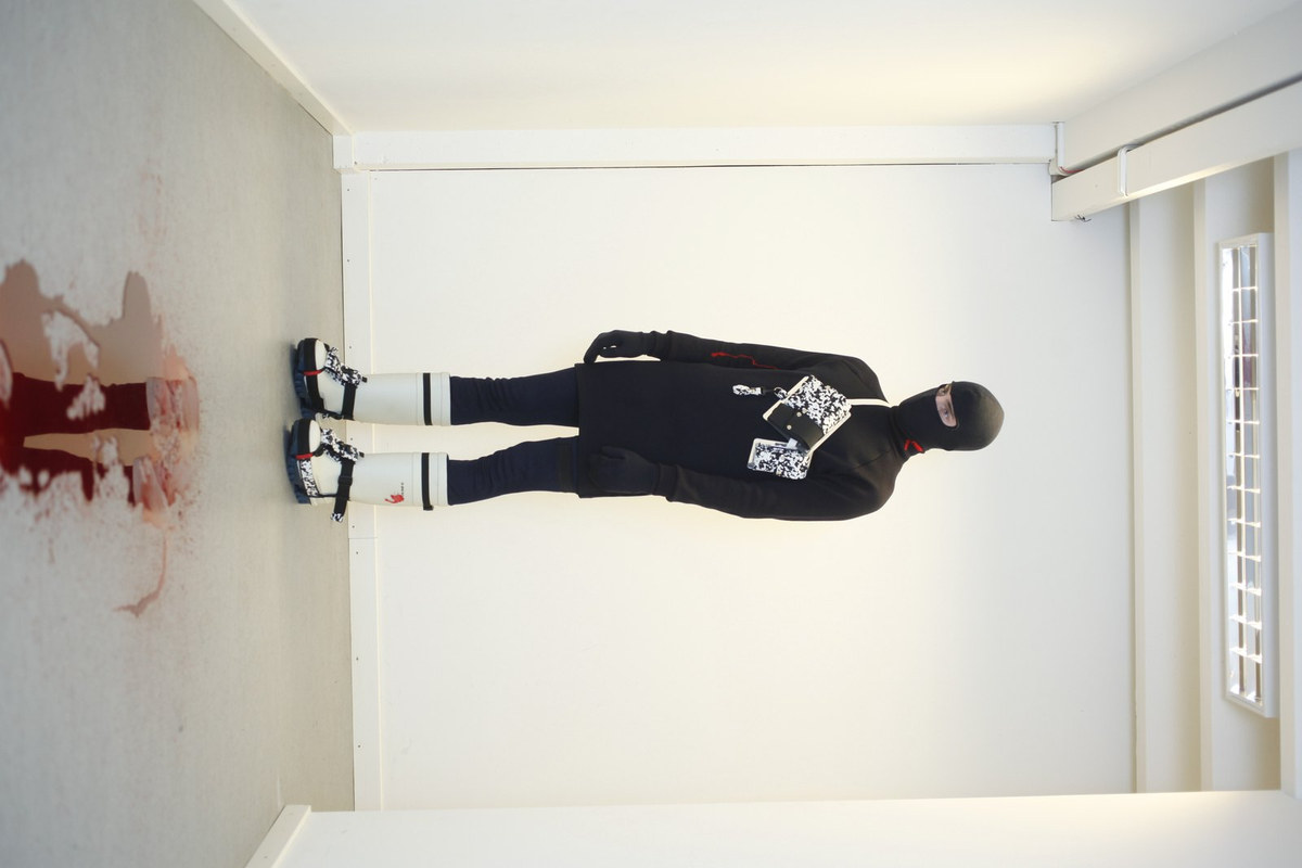
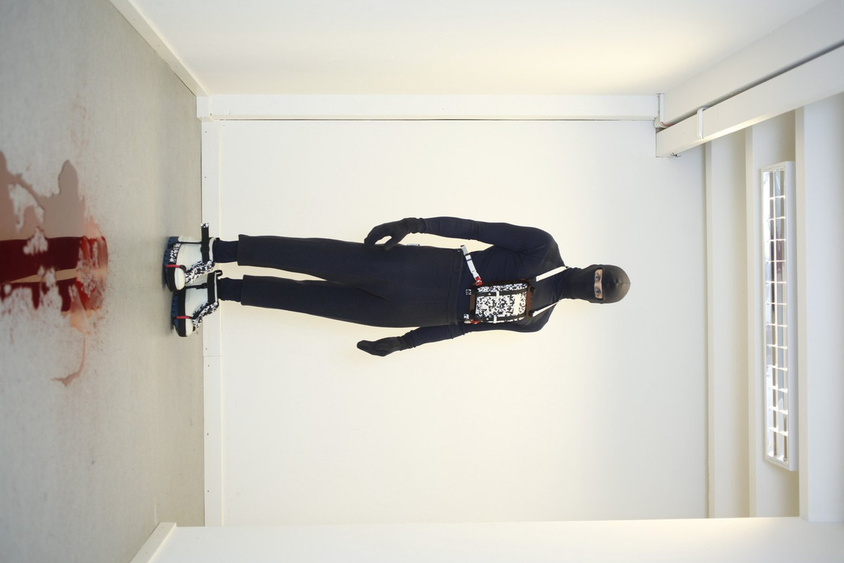
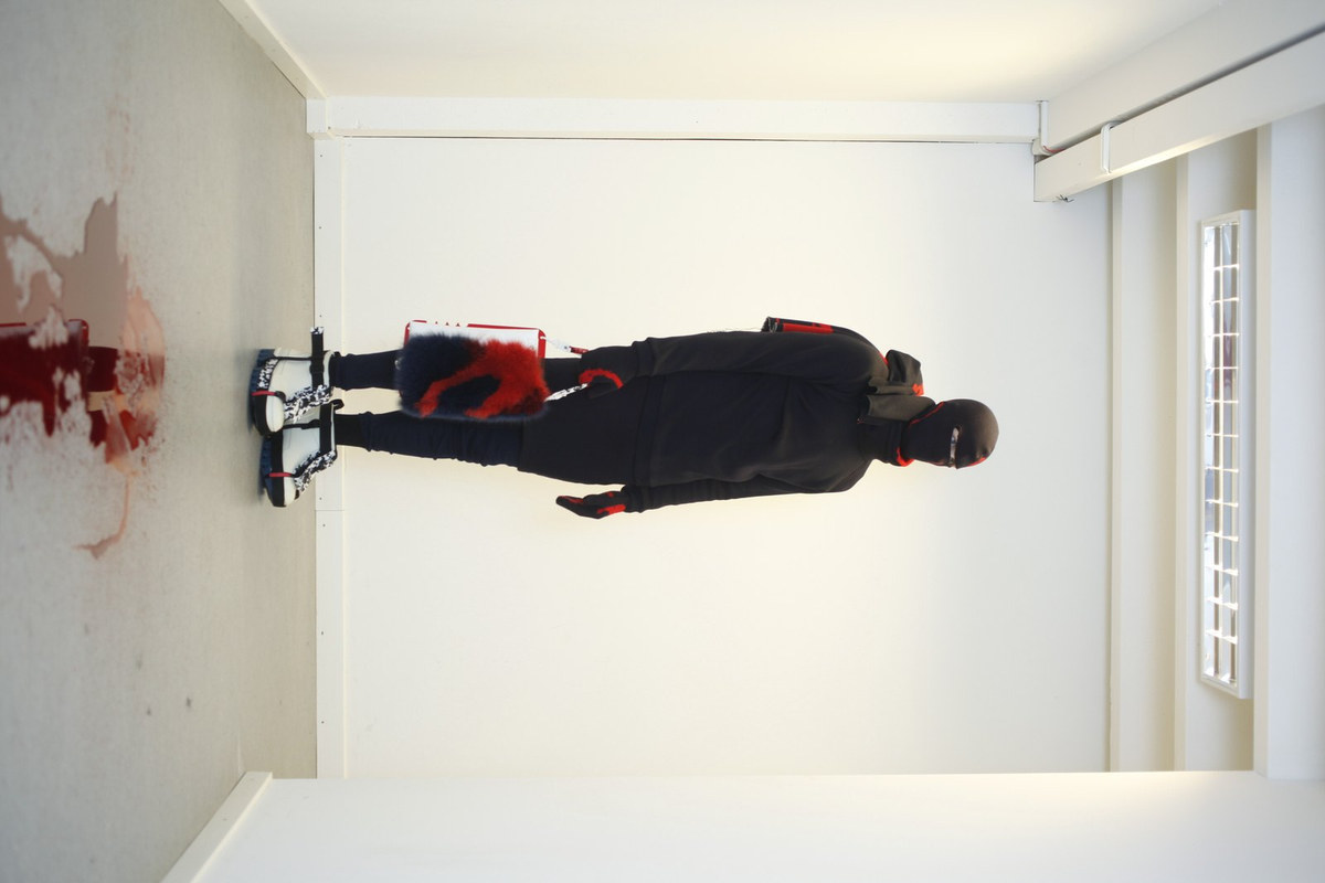
03 ICEBREAKER COPENHAGEN FASHION WEEK · AW14/15
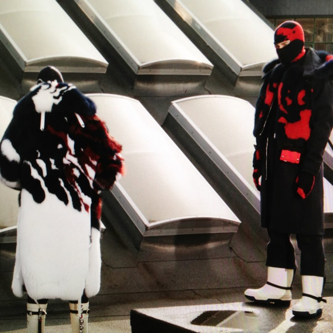
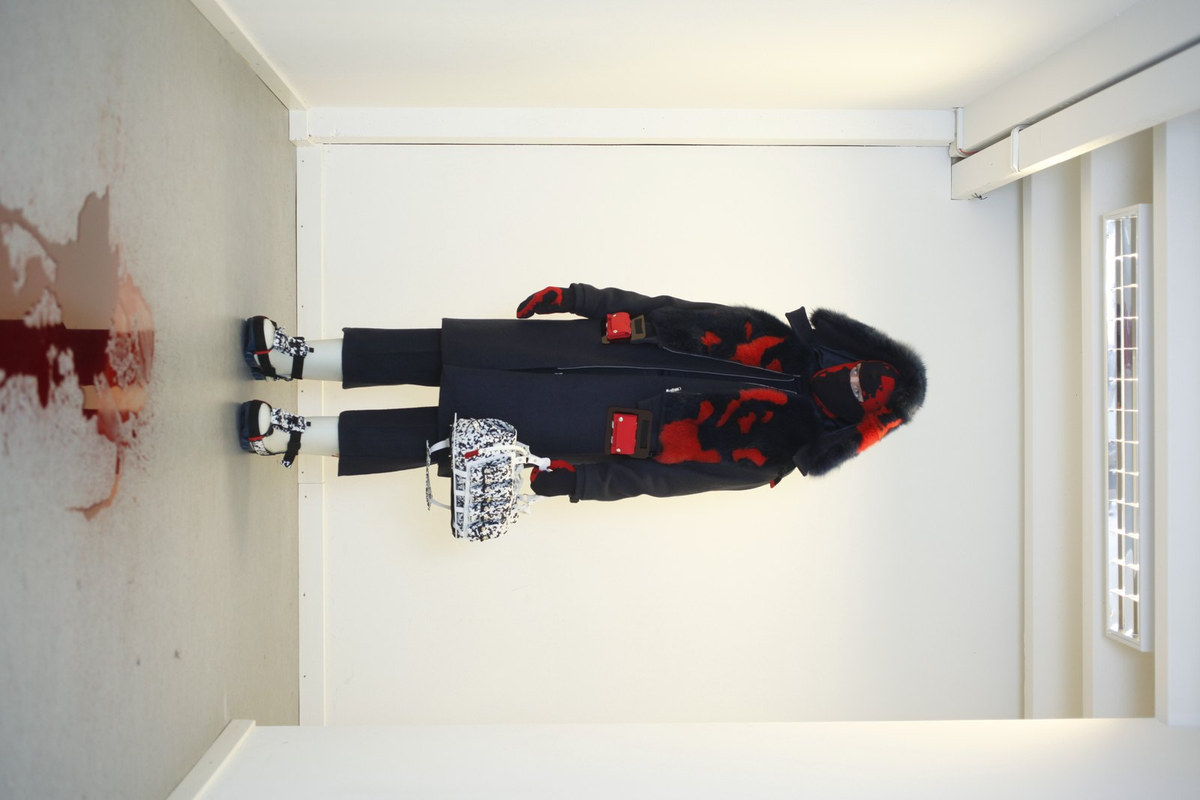
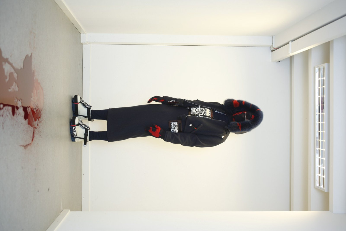
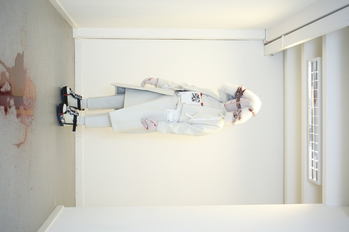
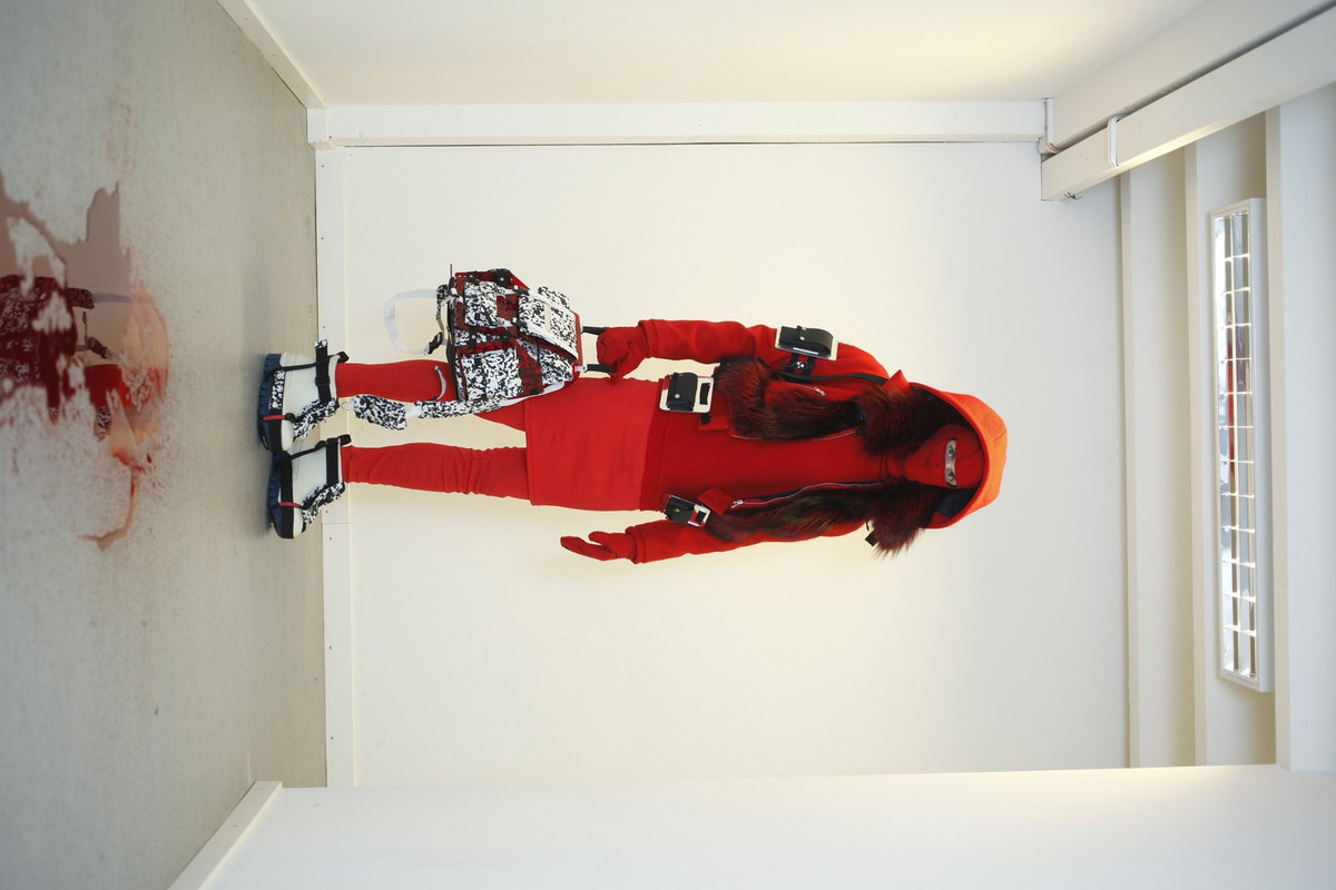
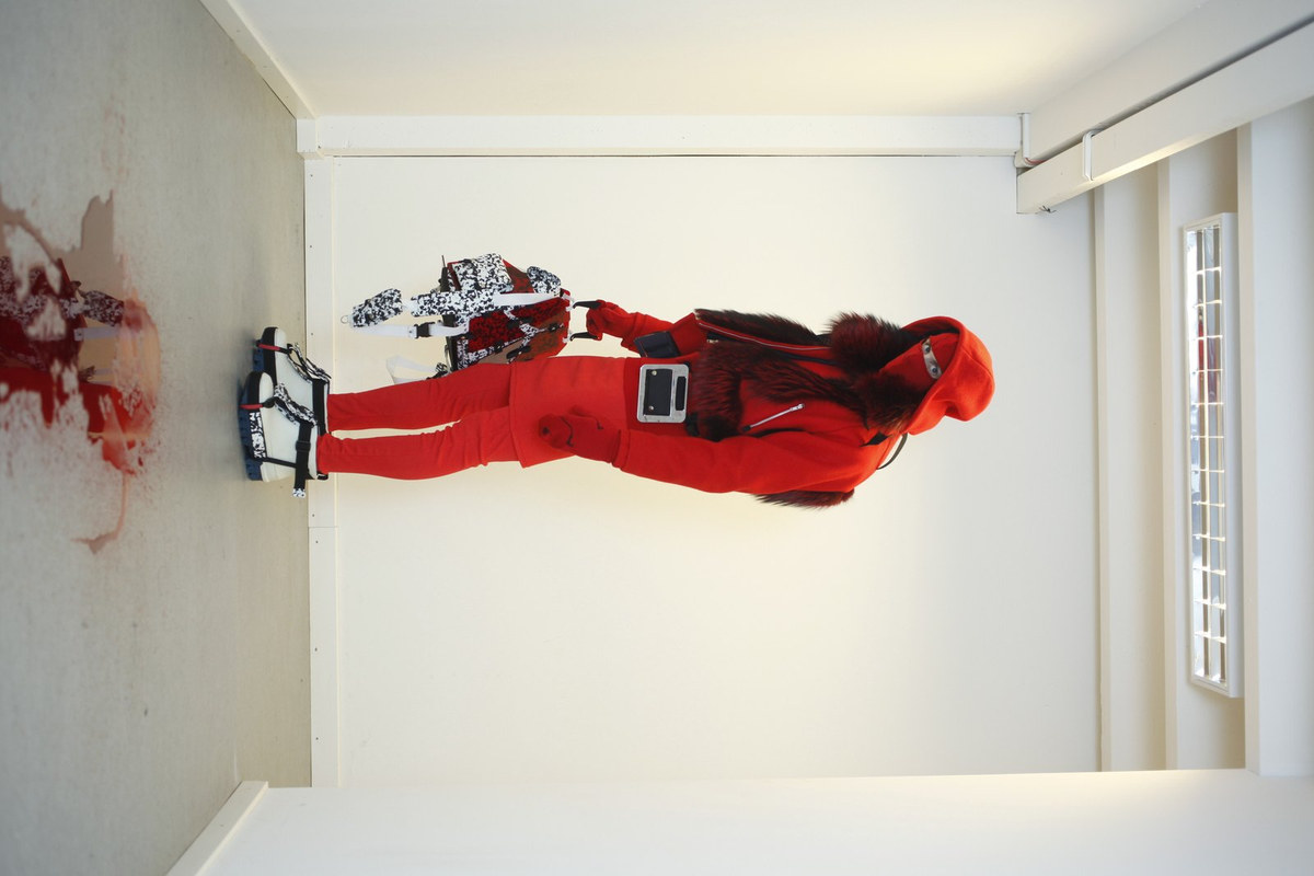
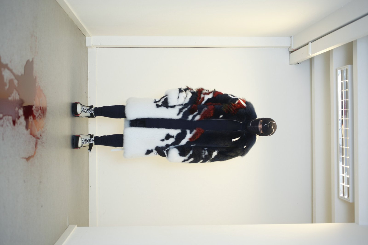
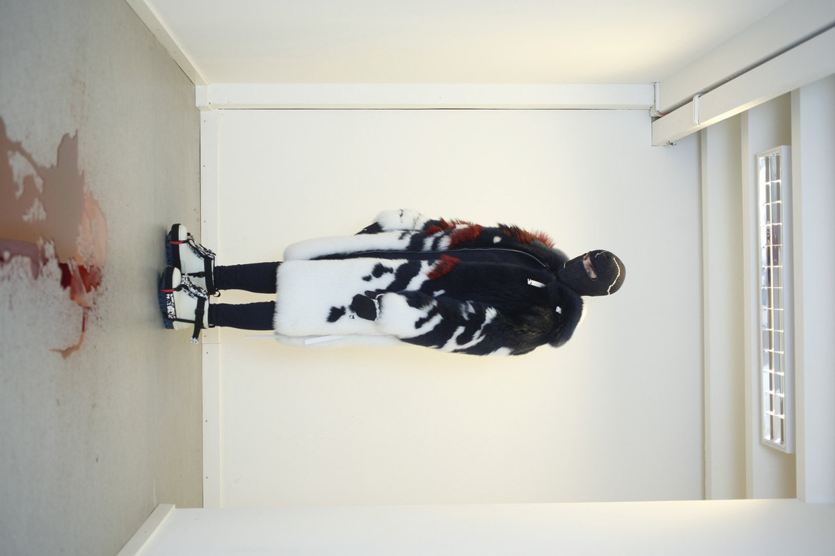
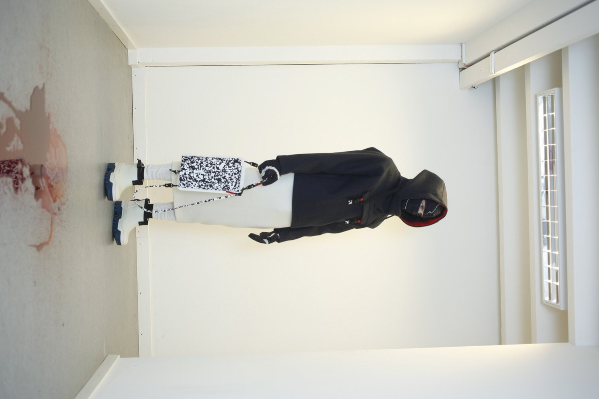
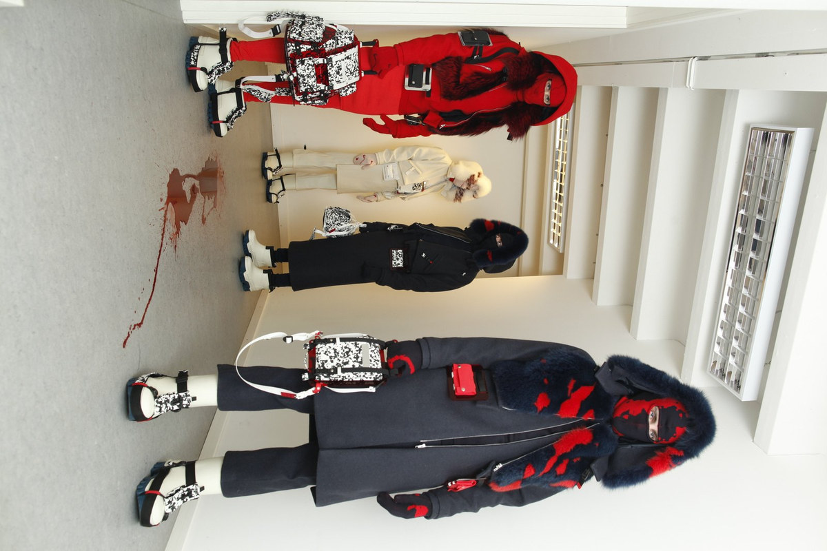
Icebreaker was WMB’s second runway collection, presented at Copenhagen Fashion Week.
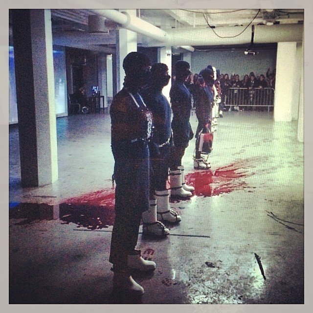
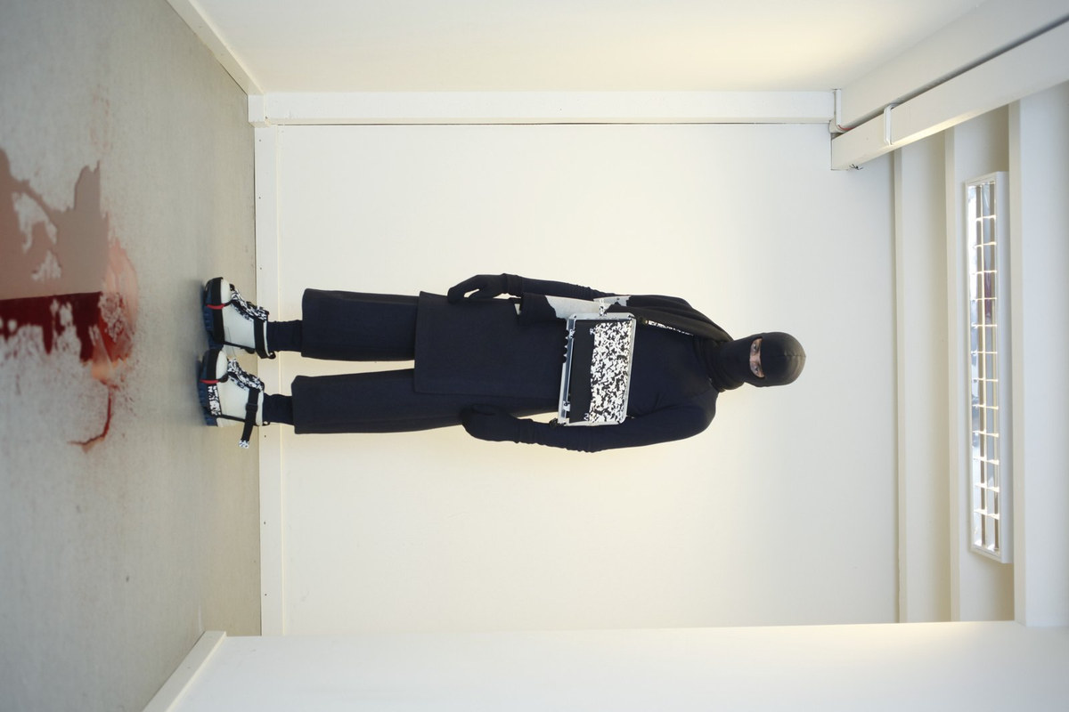
Models tracked bloody bootprints across the runway floor.
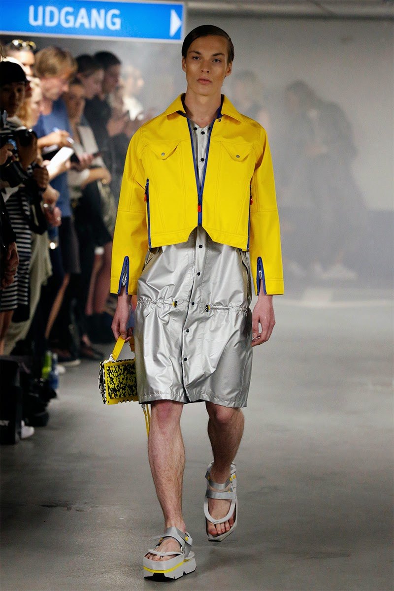
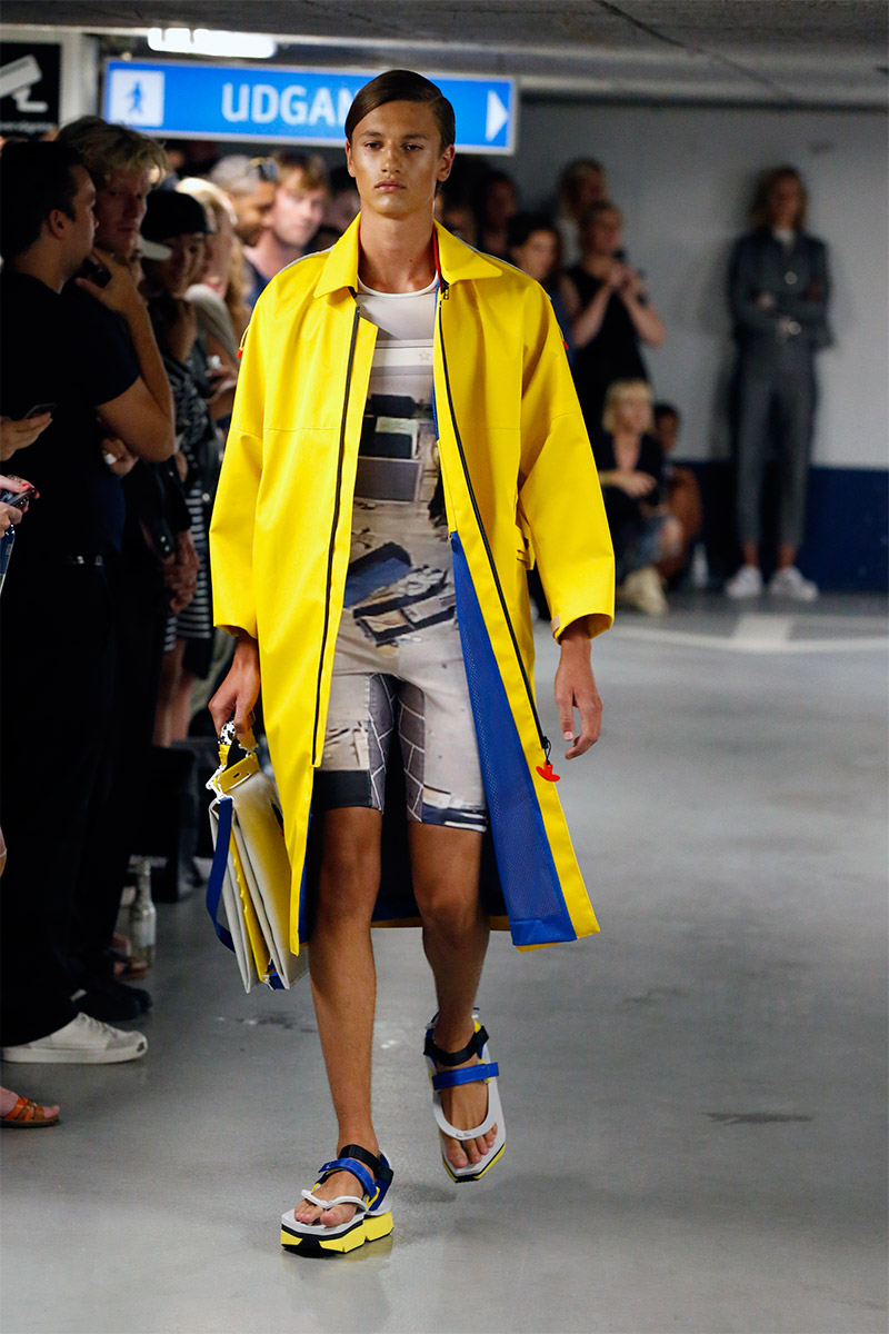
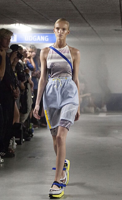
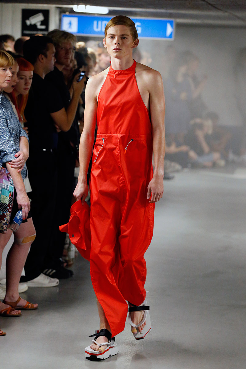
04 S.O.S. COPENHAGEN FASHION WEEK · SS15
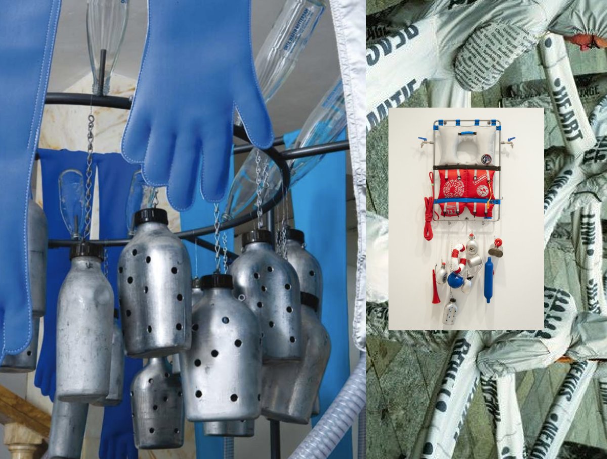
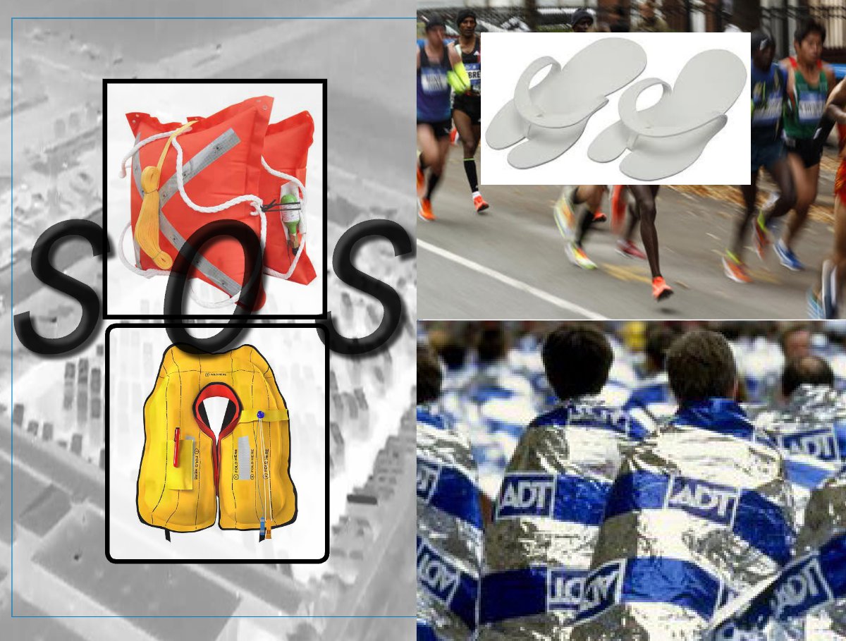
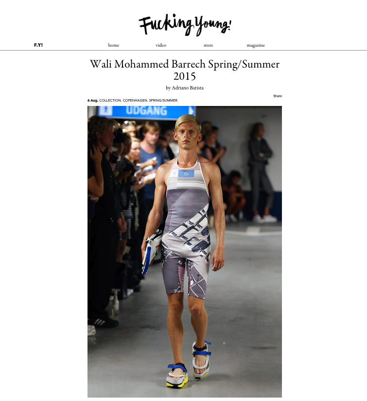
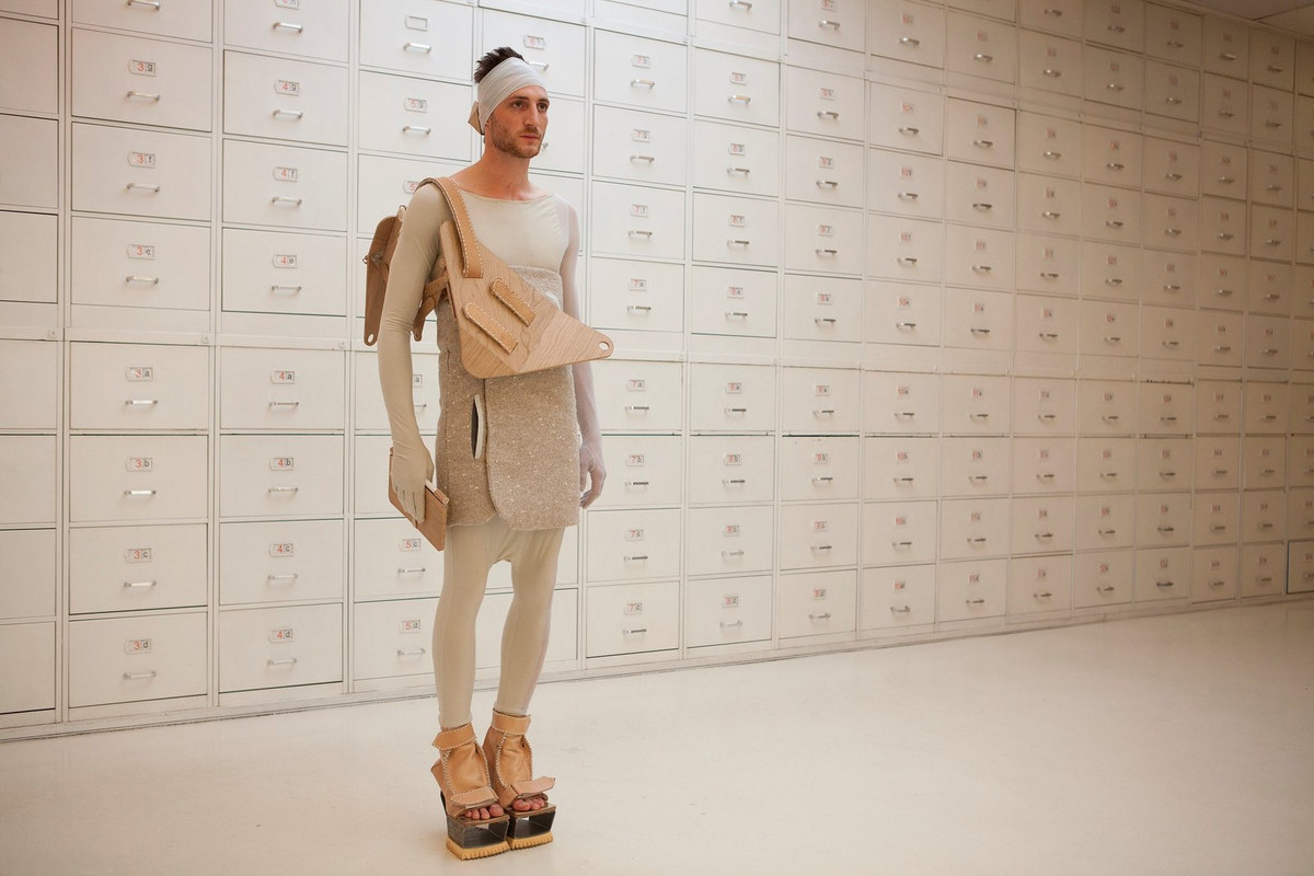
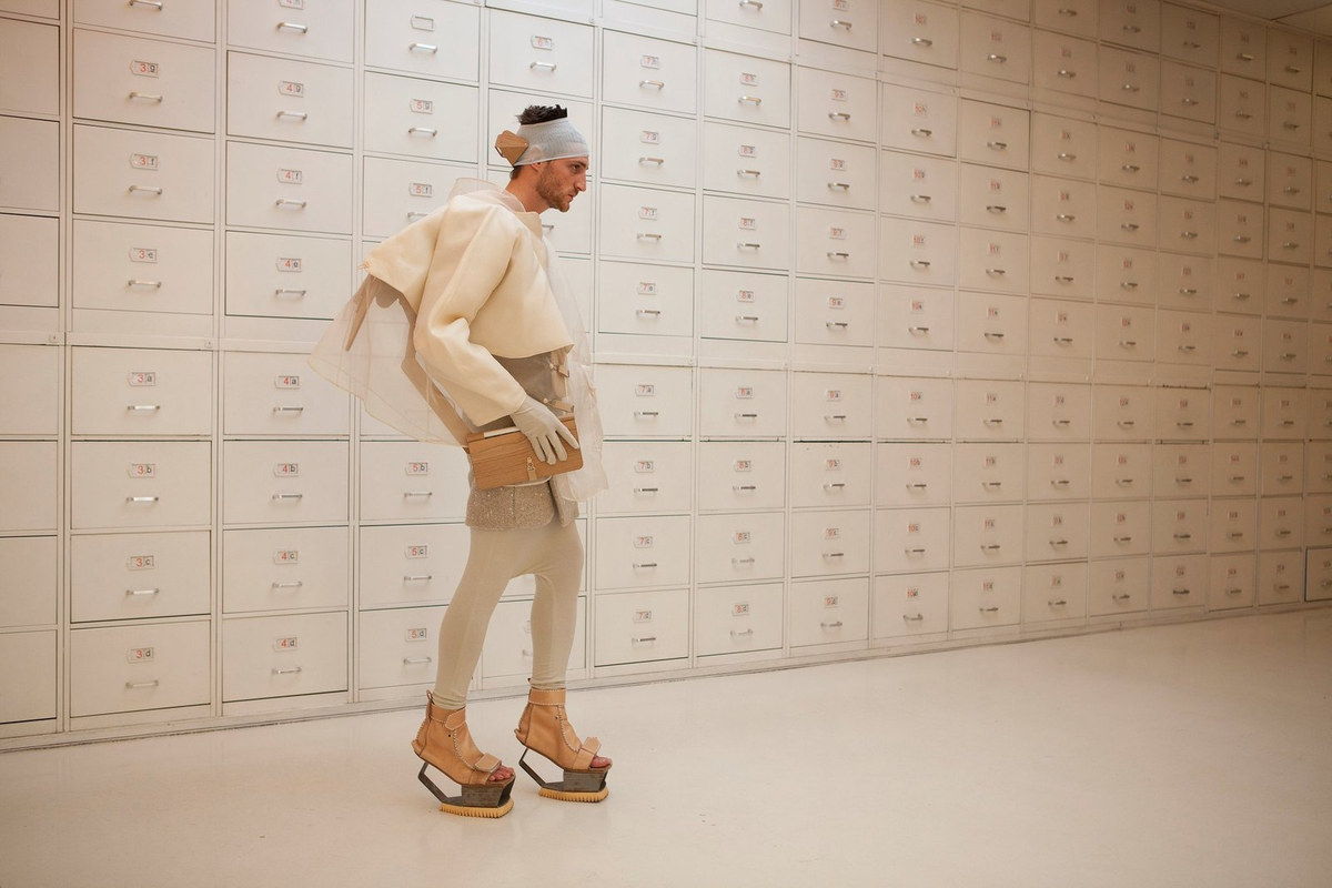
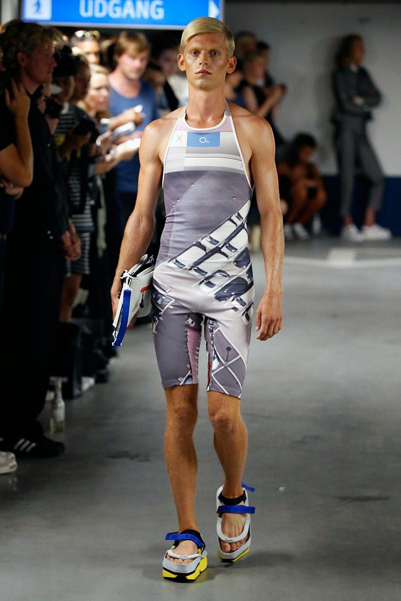
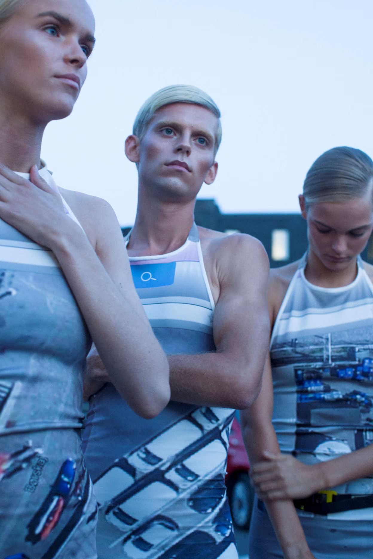
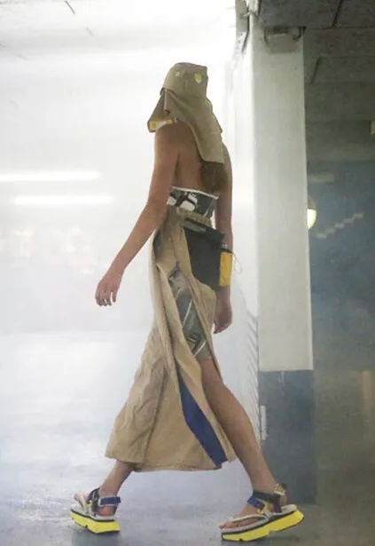
Survival equipment as wearable object — rescue mirror, whistle, foldable slipper — after artist Lucy Orta. The final Copenhagen collection before the return to Antwerp.
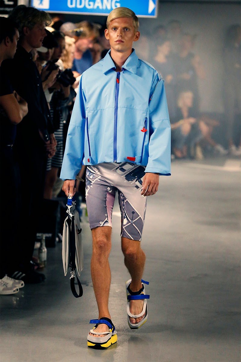
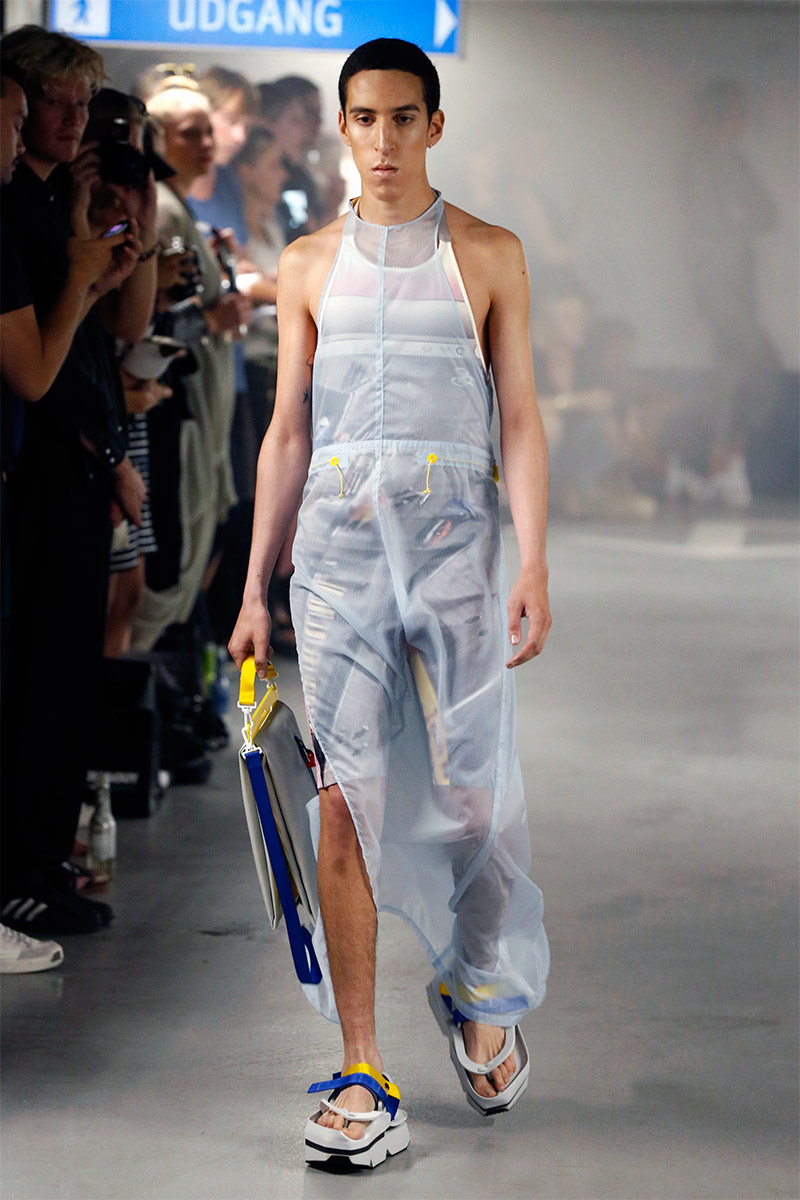
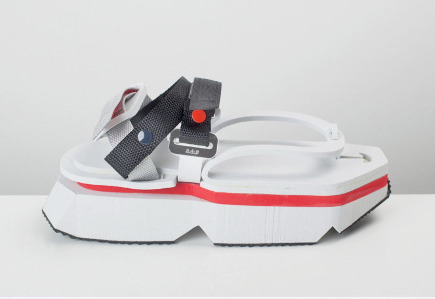
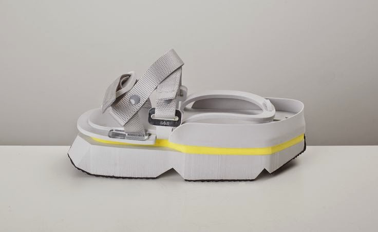
Sandal produced in collaboration with Studio Sabine Marcelis — the third footwear collaboration with her studio.
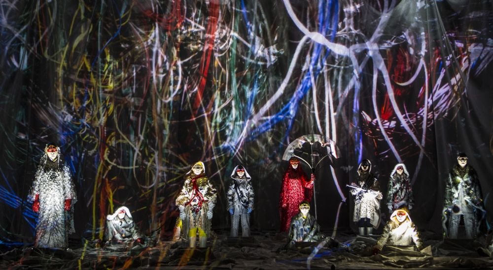
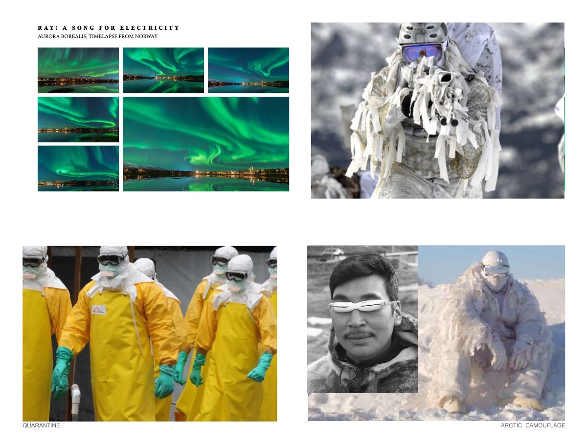
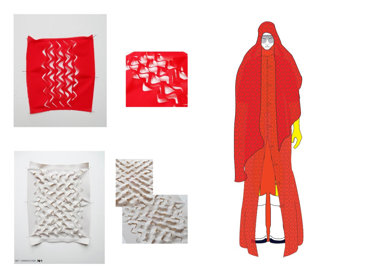
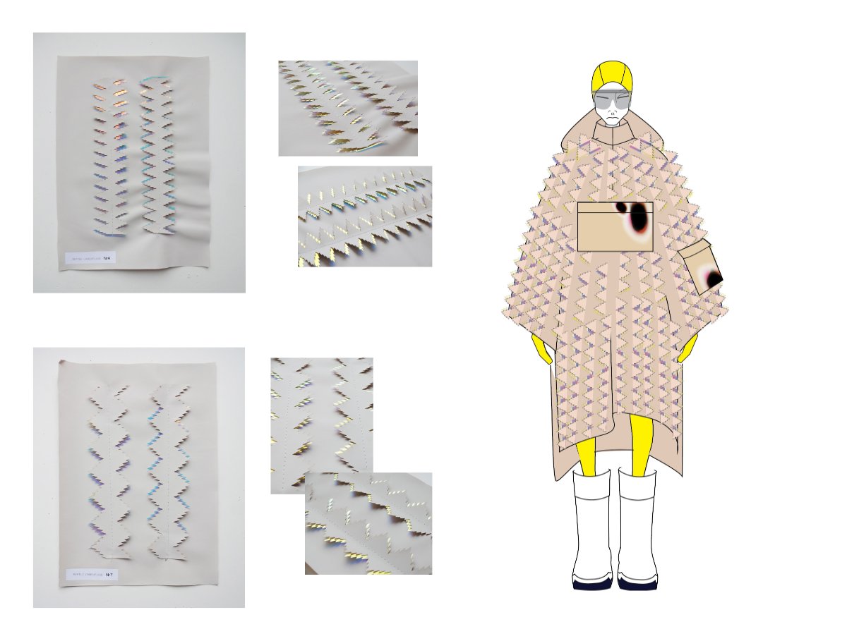
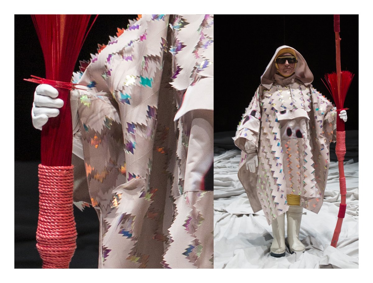
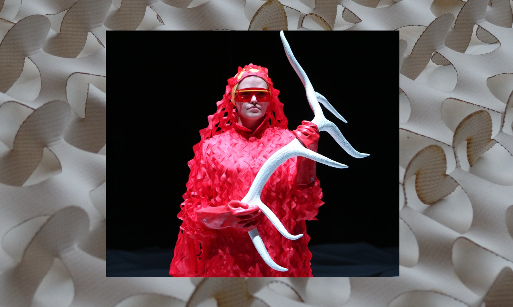
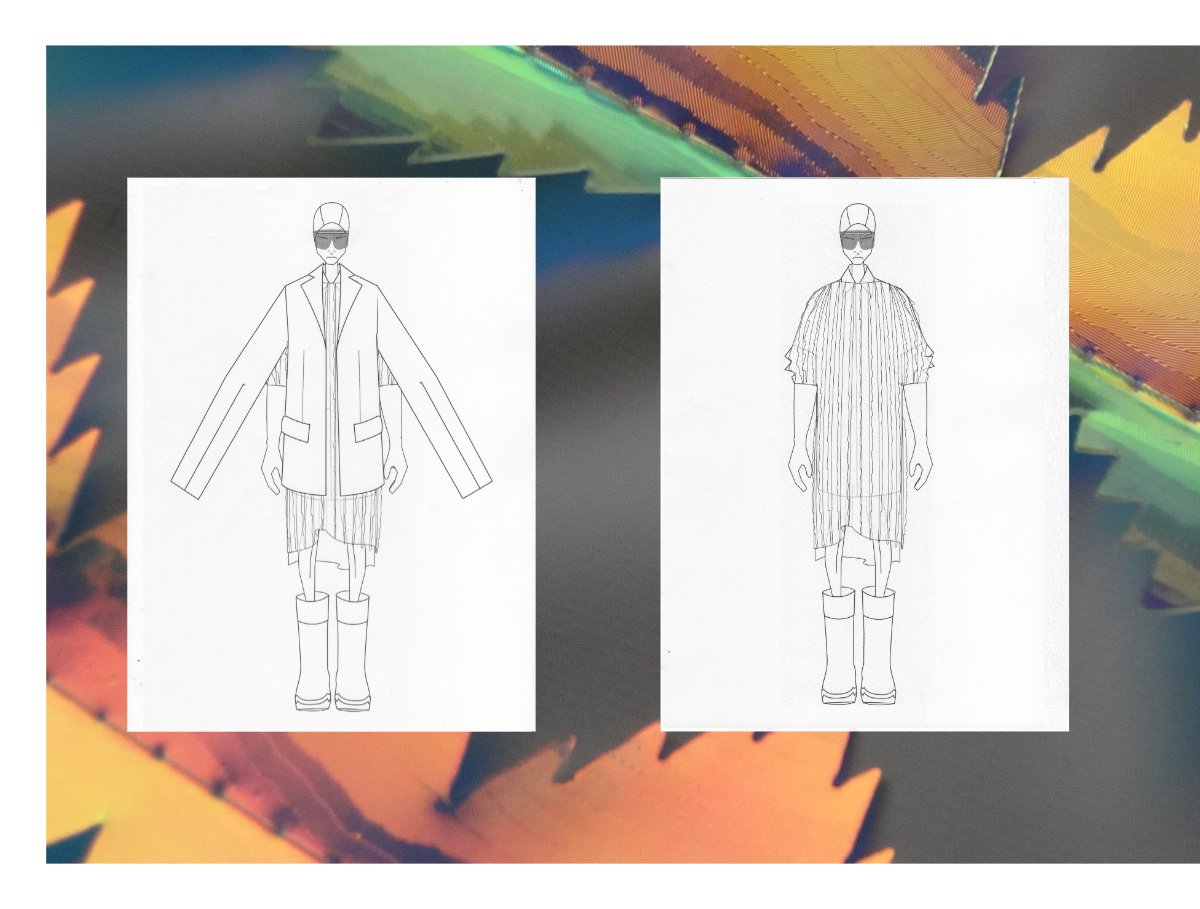
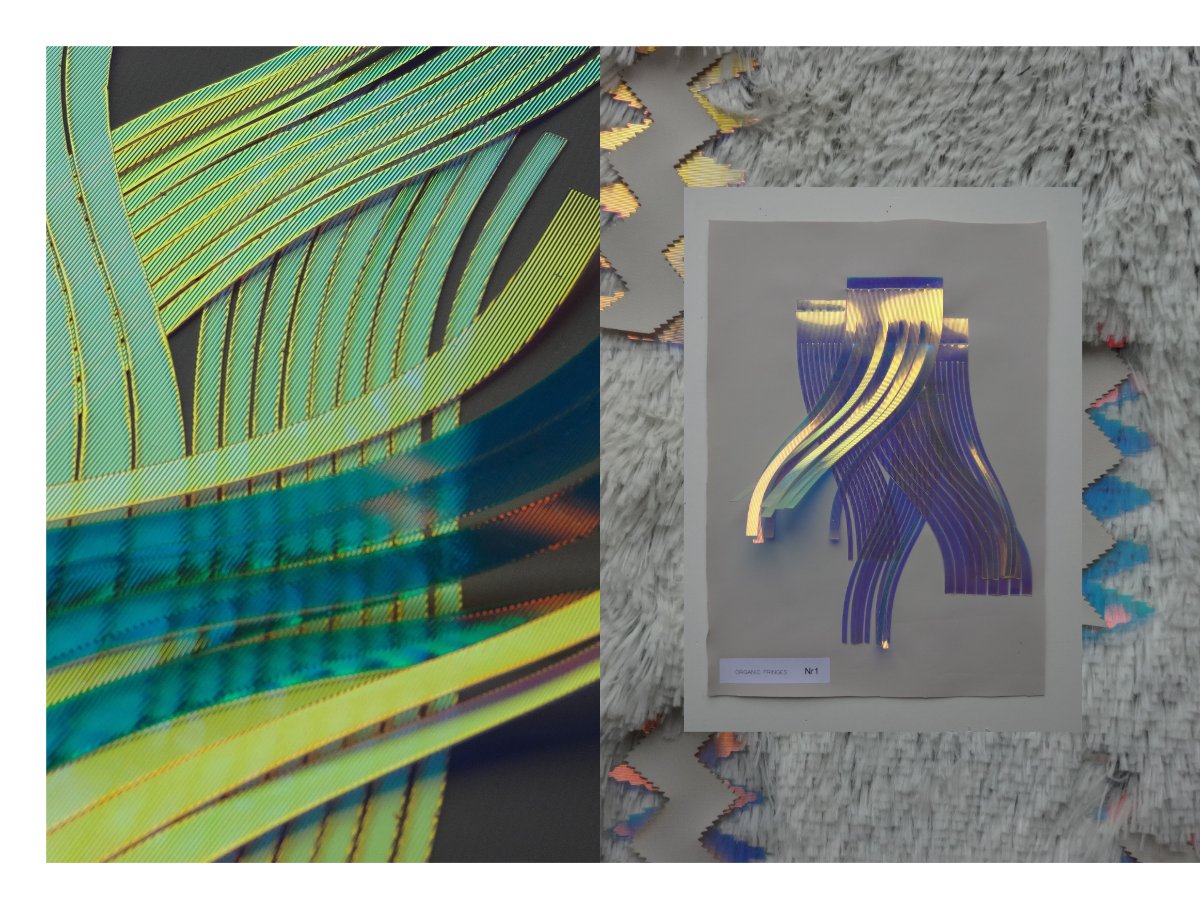
05 NEO ARCTIC HOTEL PRO FORMA · 2014
Costume design for Hotel Pro Forma. Music by Andy Stott, performed with the Latvian Radio Choir.

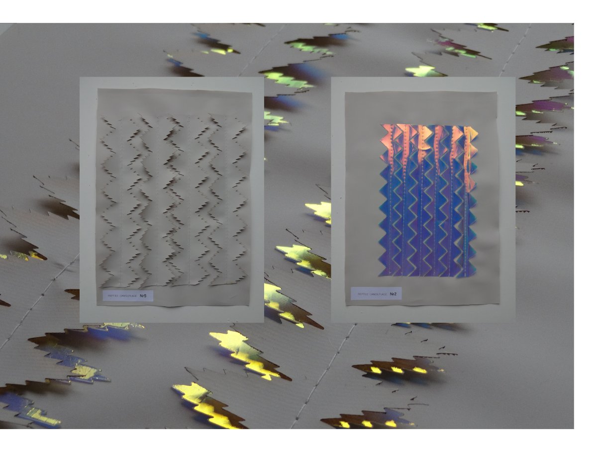
06
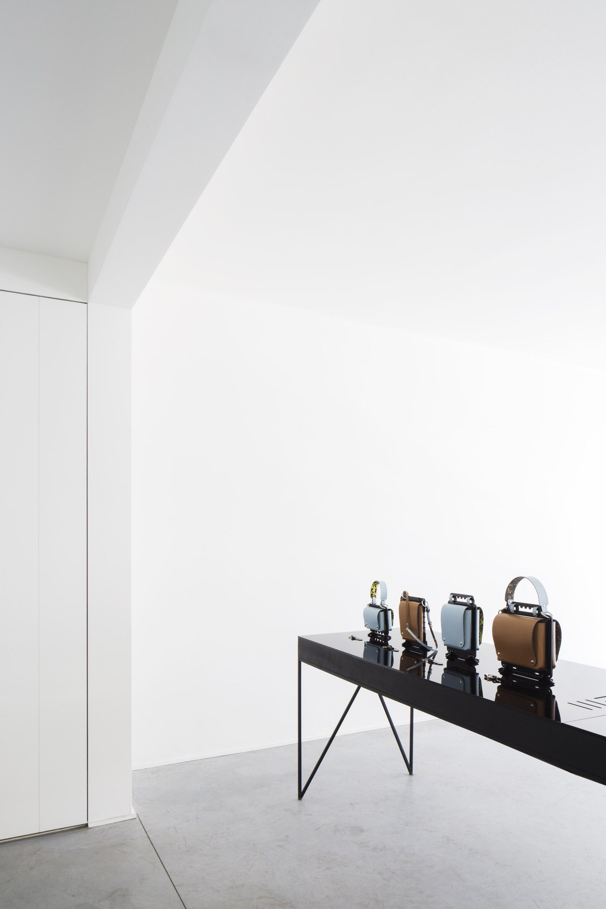
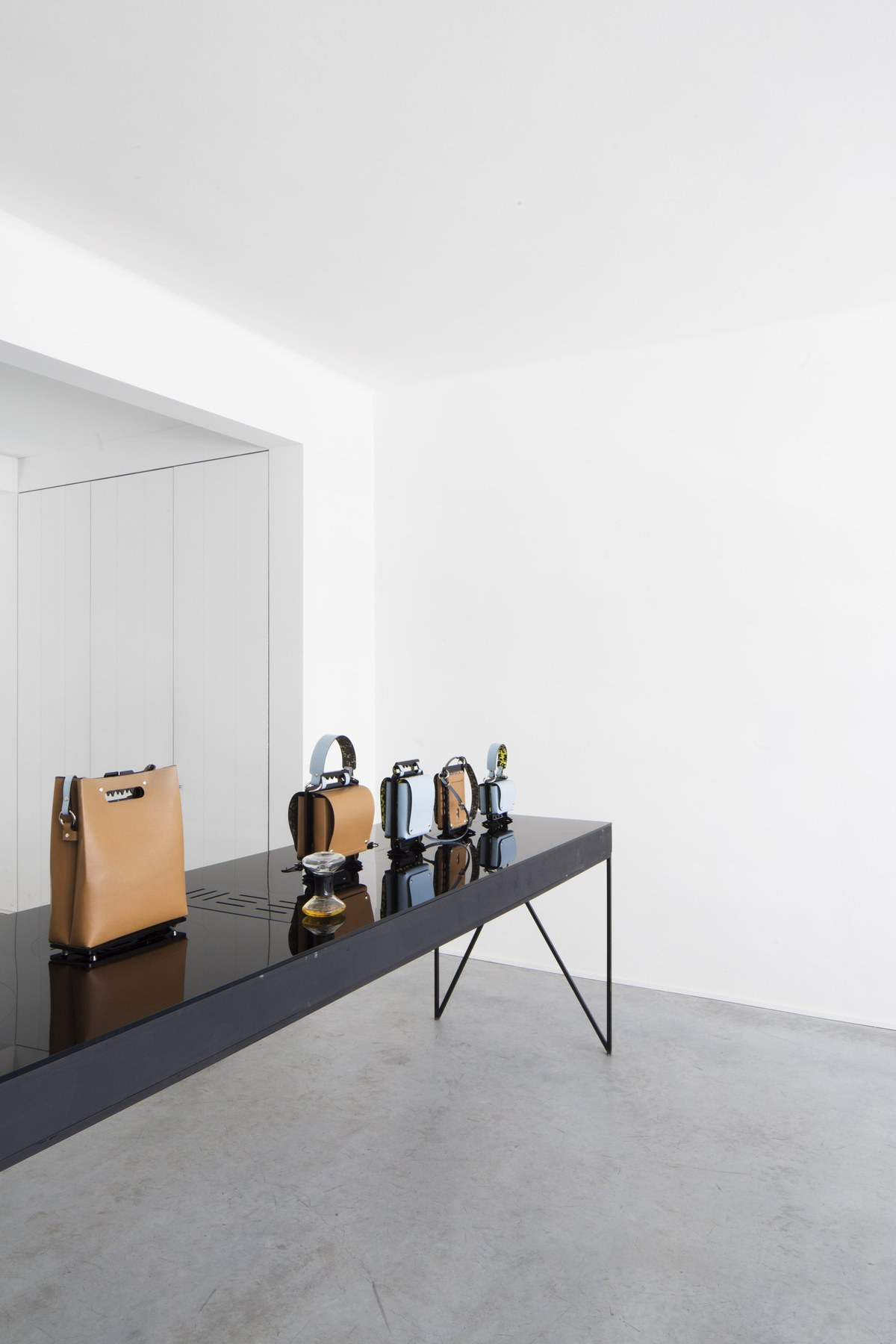
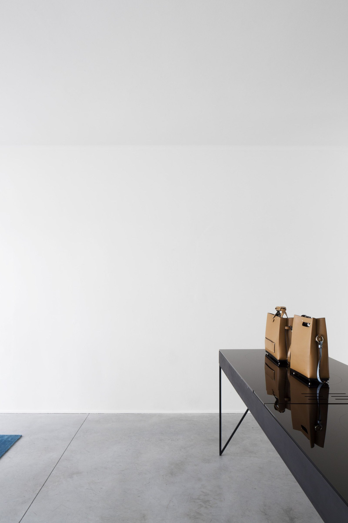
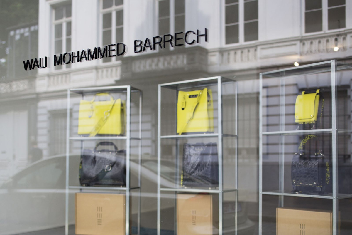
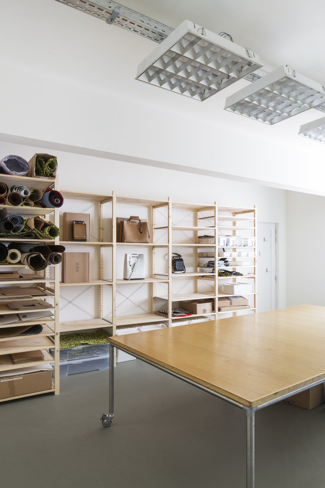
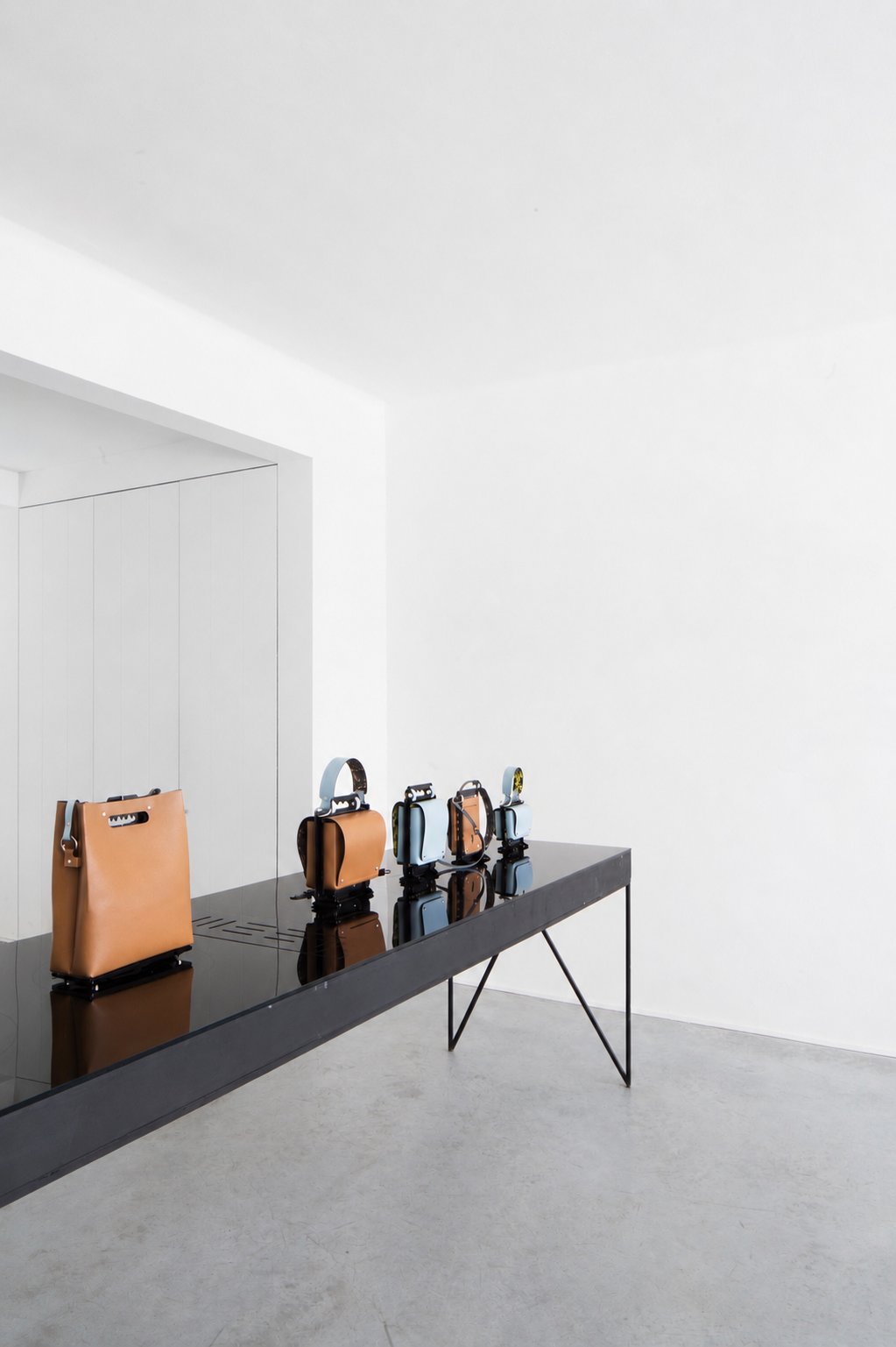
WMB ATELIER ANTWERP FRAMESERIES 01 · 2015–2019
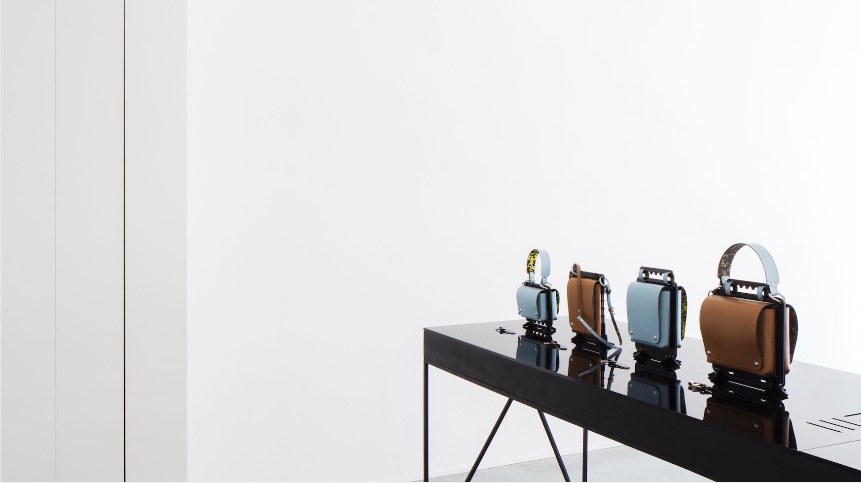
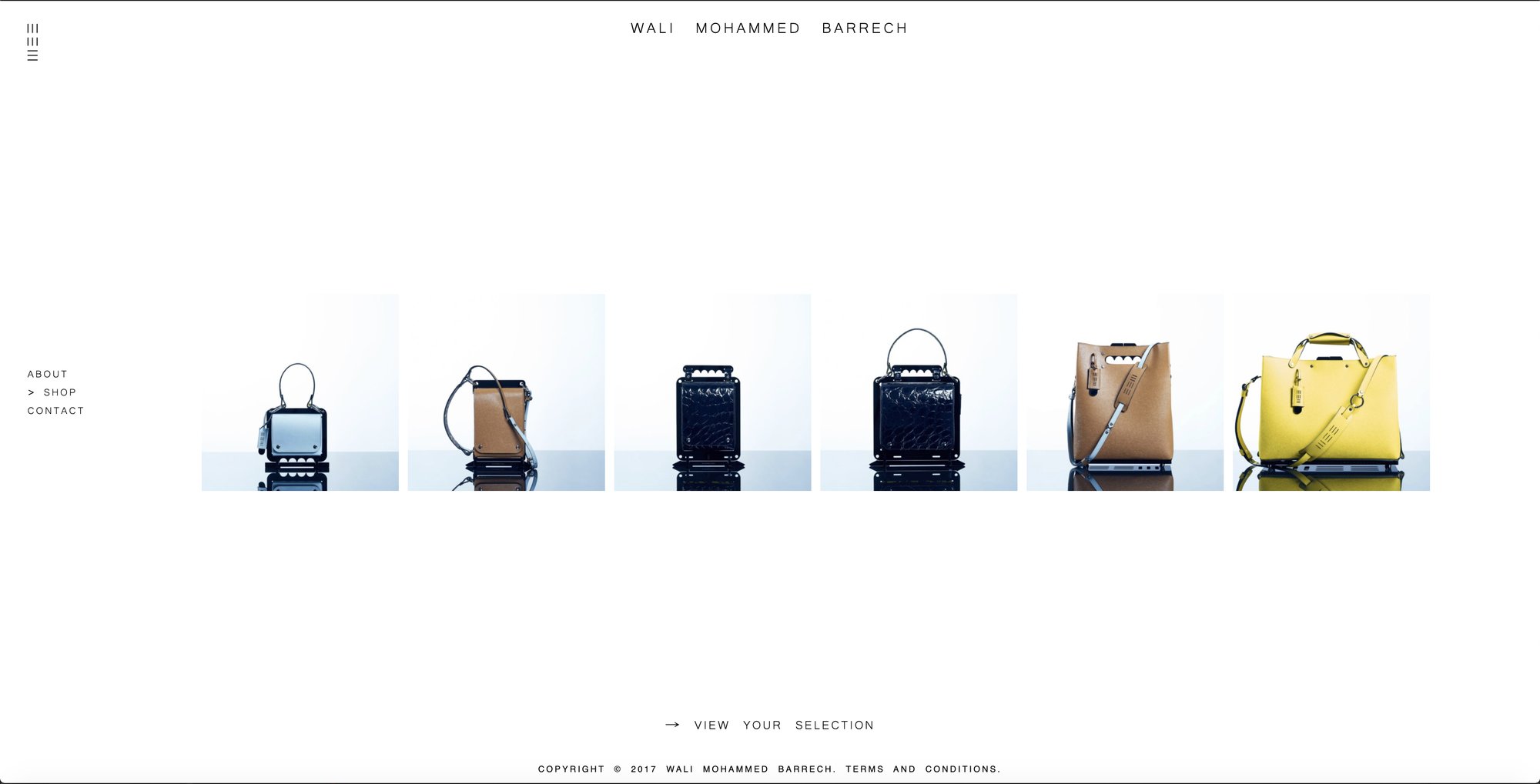
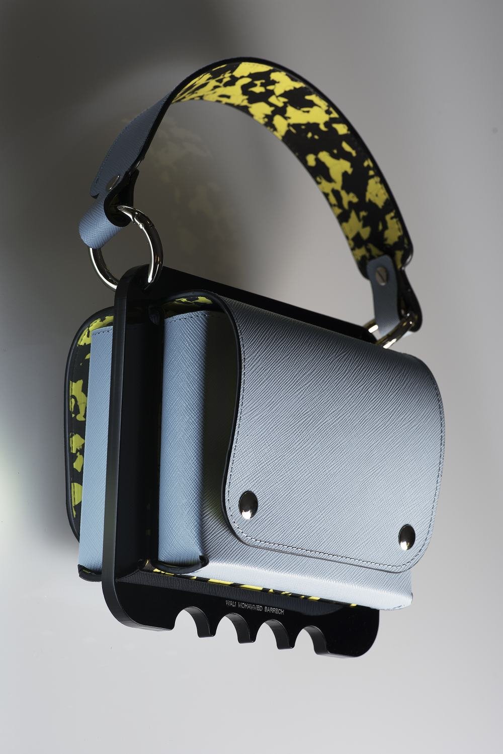
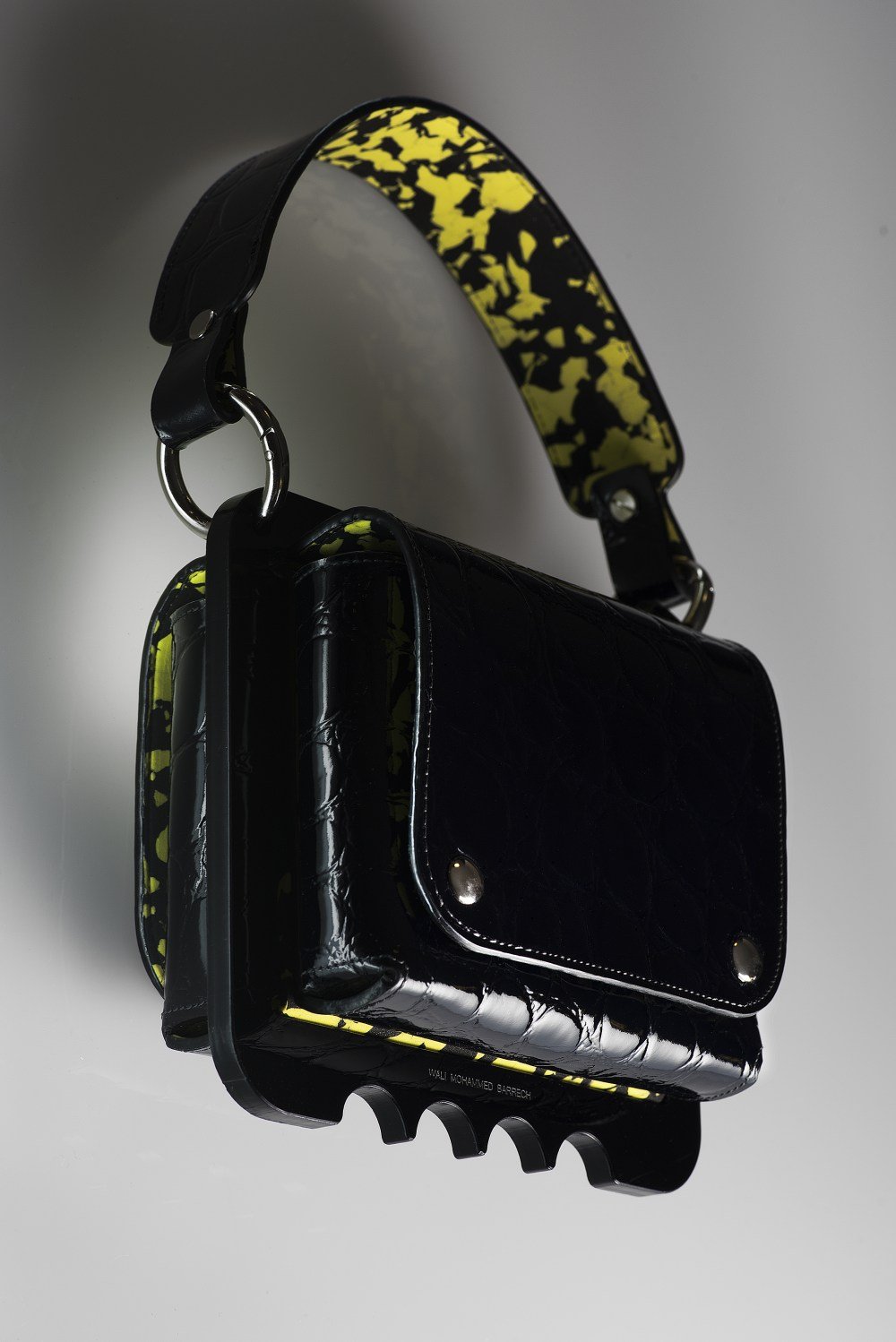
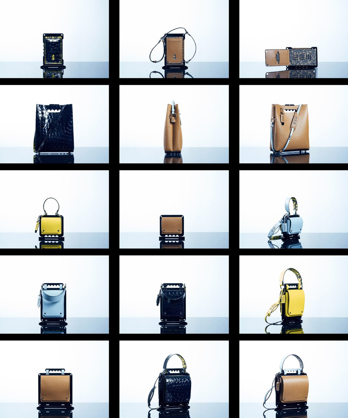
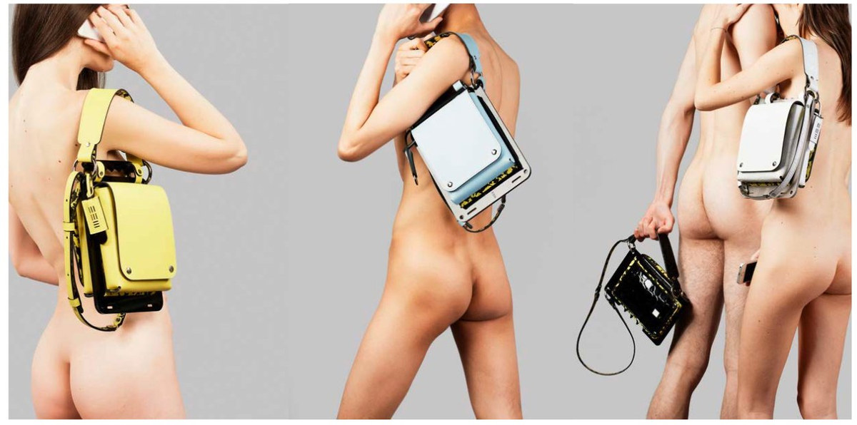
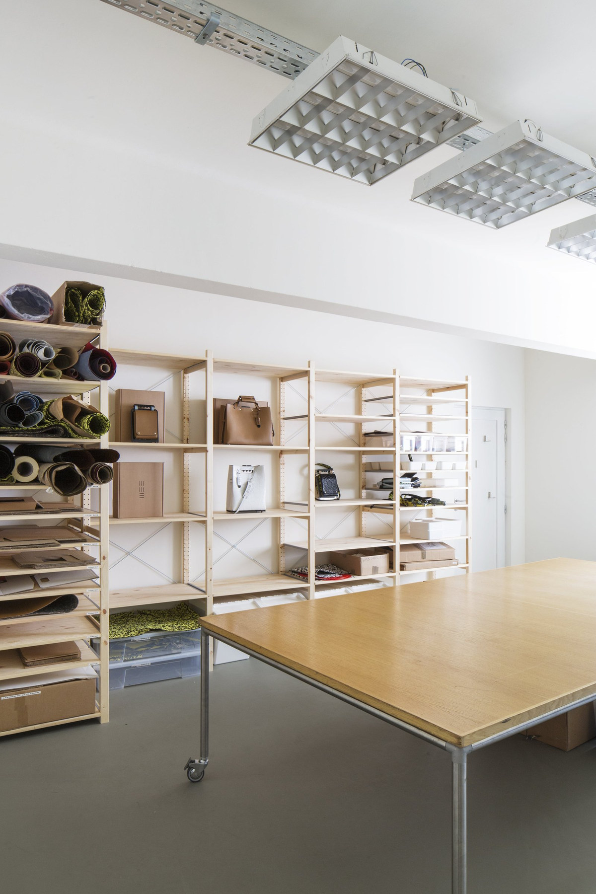
All objects were made to order.
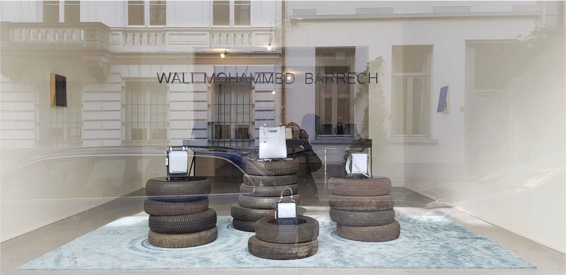
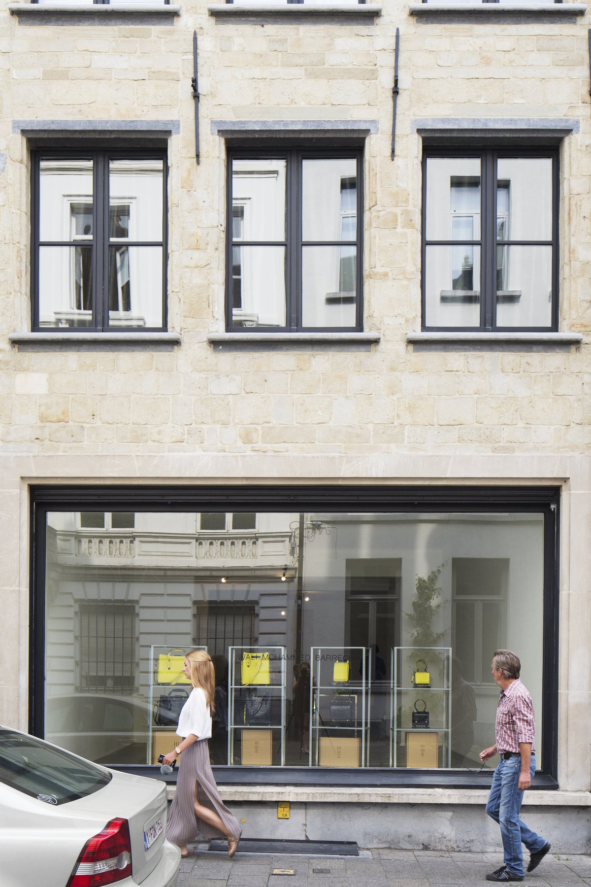
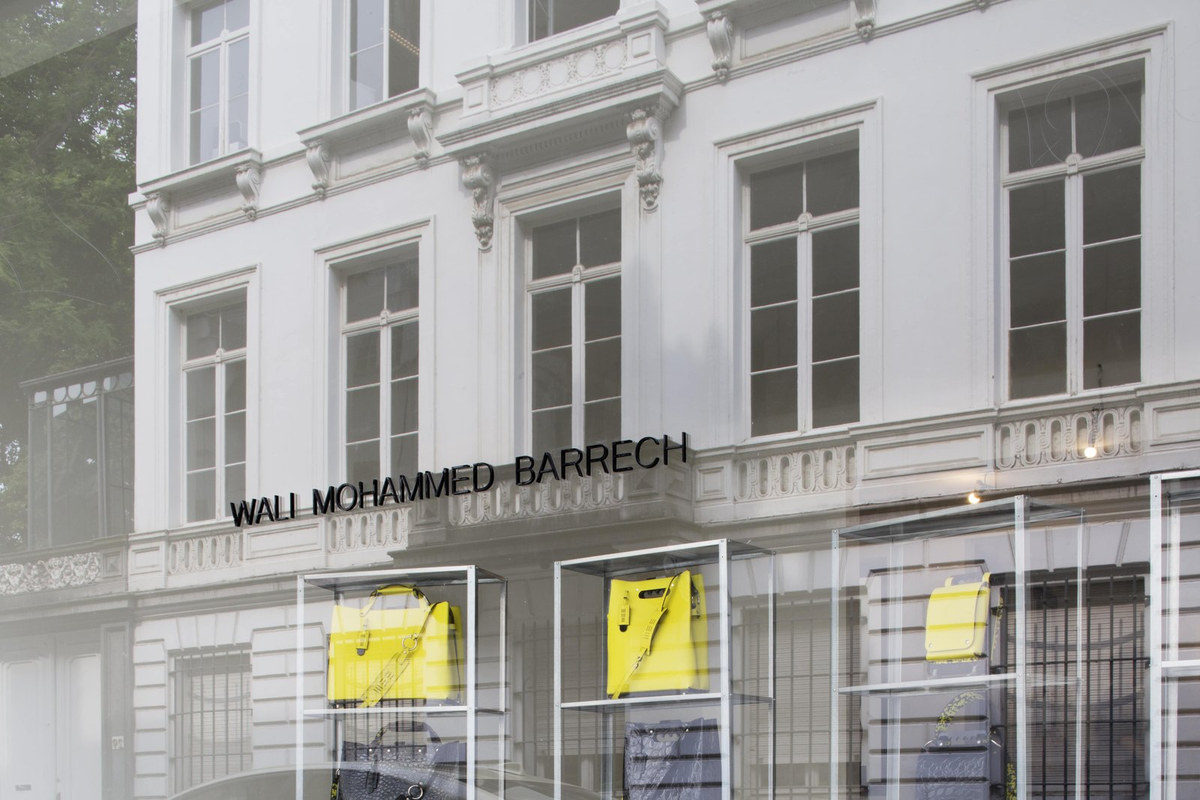
07 The Flagship MUTSAARDSTRAAT, ANTWERP · 2017–2019
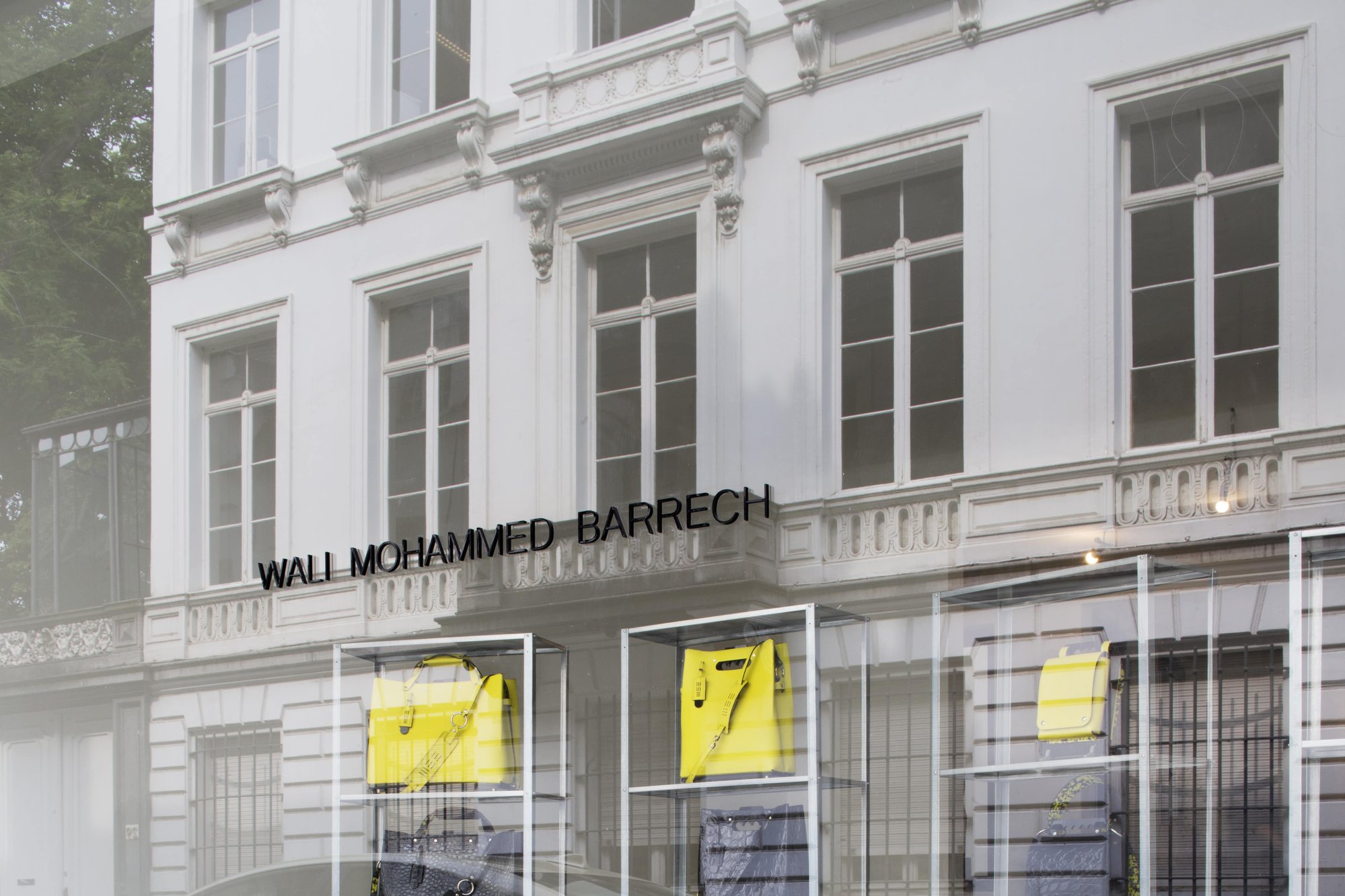
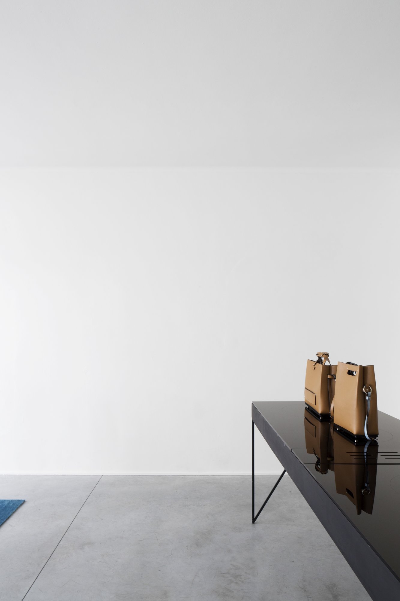
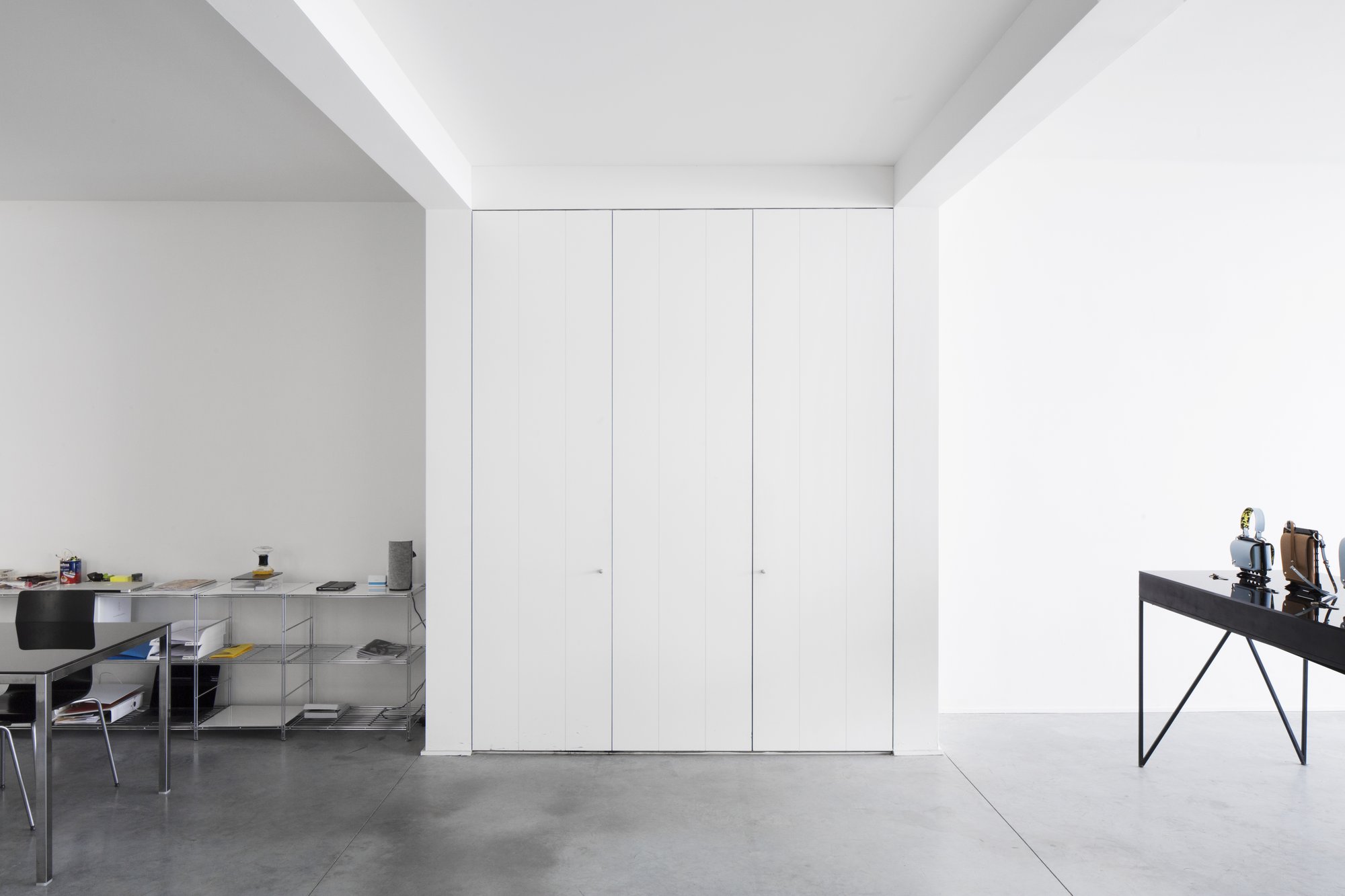
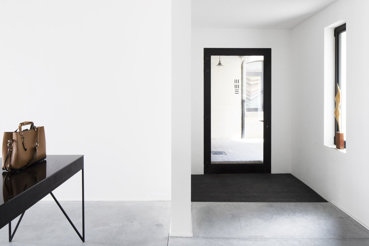
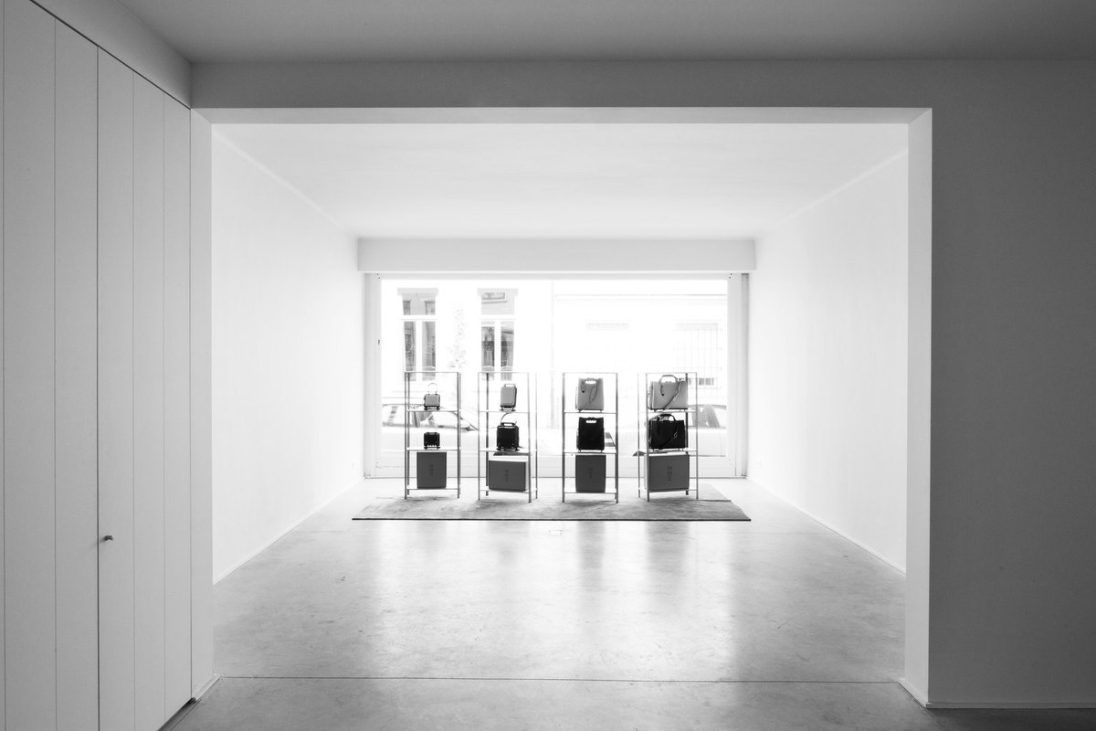
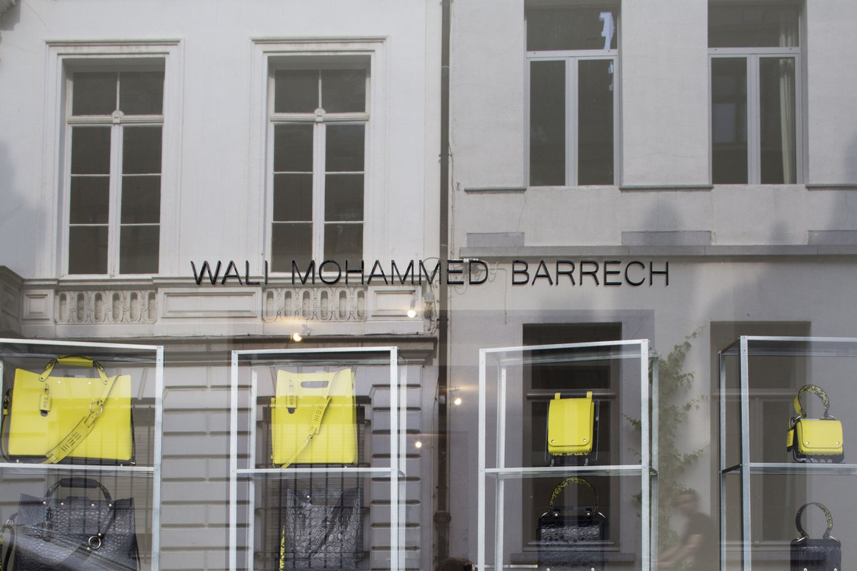
The Antwerp Atelier closed in 2019. The practice moved to Berlin.